
Sign up forms are the trickiest web pages to design. Including and excluding certain form elements affects the conversion rate. The designer’s job is to figure out which elements they should include or exclude.
Confirm Password Fields Lower Conversion Rate
Many think the confirm password field is necessary to include when creating a password. This is because a password field masks the user’s input. If users mistype their password, they won’t recognize it. The confirm password catches typos by prompting users to type their password twice.
While the confirm password field seems sensible, including it can lower your conversion rate. This research study found that the confirm password field was responsible for over a quarter of all users that abandoned their sign up form. It was also responsible for hundreds of user corrections, including field refocuses and deletes.
Once they removed the confirm password field and replaced it with an unmasking option, the number of user corrections decreased. Not only that, but it increased form starts, completions and the conversion rate.
Excluding It is Not Enough
It’s not enough to exclude the confirm password field. Many sites exclude it, but don’t offer an unmasking option. If users mistype their password, the masking will keep users from recognizing it. This leads to failed logins, password resets and user frustration.
You should include an option for users to unmask their password input. This allows them to check what they typed to prevent any errors. Knowing they typed in the correct password can comfort them before they submit the form.
Show Password Toggle
Including a ‘show password’ option is easy to do. Place a text or icon button inside the password field. When users click it, it’ll display their input unmasked. Allow them to toggle it to turn the masking on or off as needed.
Text Button
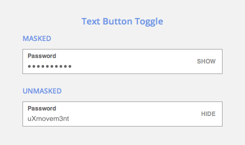
Your text button should say ‘Show’ as the default with a masked password. When the user clicks to unmask the password, it should say ‘Hide’.
Icon Button

An eye icon is an effective way to represent unmasking. When it’s clicked, display the eye icon with a slash over it to represent masking.
R.I.P. Confirm Password Fields
It’s time to lay confirm password fields to rest. What was once a common convention on sign up forms has evolved into something better.
No longer does your sign up form have to suffer from a high corrections and abandonment rate. By giving users control over their password input, you give them the peace of mind to complete your form.