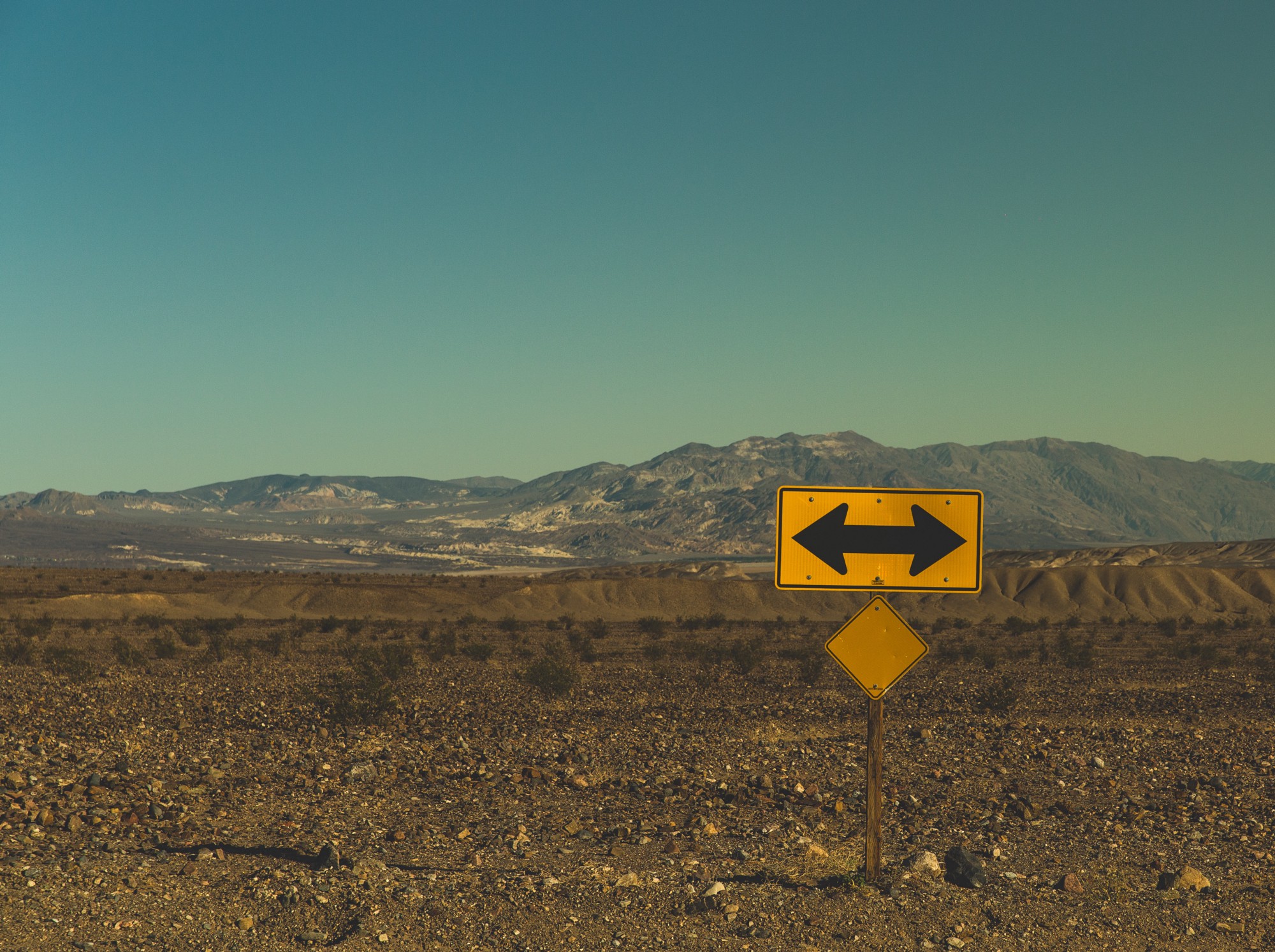
Not all those who wander are lost. But the majority are.
And, when someone gets lost, she’d never dare to go back again.
It’s true for badly designed products, too.
How will you ensure users find what they want without getting lost?
Information Scent
Like animals, we too need scent while foraging the information.
We perceive the scent through how the product establishes connection with us — how it speaks to us.
Scent emerges from the way a product weaves words, visuals and related information bits.
Information Scent is the tension between users’ need and the product’s ability to serve it.
1. Words
Function rules form and fashion.
Design is not just clutter free look. It is, in fact, more about clear information.

Brevity is a virtue. But don’t suck the meaning out of titles and copies by making it too short.
It becomes even more painful for users when they want to compare similar products.
Why?
Similar products have similar titles, with variations at the end. So, a shorter name hinders user from gathering the difference.
One thumb rule is, stick to 10 words. If it still exceeds, use “…” or fading words (better option).
Better copy will:
— Confirm users’ action without tiring them second-guess it
— Dictate page layout and design, not the other way around.
Bad copy makes your product stutter.
2. Visuals
It isn’t just about colors, font size and spacing. It is about how they all orchestrate together.
Airbnb — A change in user action effects a change in map too. User gathers price and distance information simultaneously.
Airbnb

Homeaway
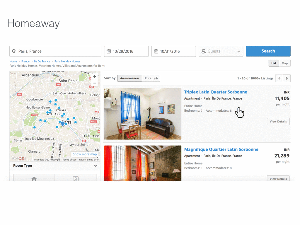
Homeaway has similar structure — home listings with map — as Airbnb. However, the users’ action on listings, though synced with map, is not accessible because the map scrolls with the window.
Better visuals is about:
— Different elements coordinating with each other on the page and, conversing with the user.
— Enabling user to gather multiple information in single action.
Bad visual coordination renders your product mute.
3. Associations
Associations provide sense of direction to the user and nudge her to seek unsaid needs.
Grouping related informations creates good mental concept in users’ mind. It helps themselves understand their difficult to articulate needs.

Search results comparison of Google and Bing for the keyword Snapchat.
Information in Google search page is grouped into three:
- Individual Search Results, like any other search page;
- People also ask— Unsaid needs of user;
- In the news — Latest information to read about.
Even more, for certain searches, Google throws map view with shop address and contact information.
On seeing similar items grouped together with proper labels, it suddenly pops in user’s head that this is what they wanted. It opens new doors to probe unsaid needs.
Bing sticks to the list of search results and occasionally throws in images and video links.
Use associations to:
— Align users’ thought process with the product’s offerings
— Guide them explore interesting new avenues
Bad or no associations make your product dull-witted.