
Salesforce users work with forms day in and day out, whether they are salespeople, admins, or managers. Being able to seamlessly add, edit, and delete information is a key driver of productivity. Improving this experience is one of the UX team’s goals with the new Lightning Experience.
Align Labels & Fields
In Lightning, forms are displayed with labels placed on top of their respective input fields. Top-aligned labels are efficient in that they “only require a single eye fixation to take in both input label & field.” Take a look at editing in Salesforce Classic UI and the new Lightning Experience below.

Aligning everything to the left, to the left
While the new design does take up more vertical space, the label/field pairings are much more clearly delineated in the new design. The user can scan the information top to bottom, rather than left to right to left (new line).
We applied the same principles to the view mode to improve the hierarchy and legibility of the information.

Set Default Values
If you are a salesperson, your work likely involves talking to many prospective customers (a.k.a. “leads”). To track these in Salesforce, you’d first need to create a new lead. A form to create one may look like this:

Creating a new lead in Salesforce
Looks fairly straightforward, doesn’t it? But let’s take a look at this a little more closely. The first editable field in this form is “lead status,” which has the following options: none, contacted, open, qualified, unqualified.

Research shows that “making an option a default… [directs] more people [to choose] the default across a variety of contexts.” Let’s use this concept and imagine that you’re a salesperson who wants to add a new lead to the system. Most new leads would have an “open” status, so rather than leaving the default blank, we can set the default selection to “open.”

Now, any time someone creates a new lead, the status is set to “open” by default. Modifying this choice architecture seems small and it might save one or two seconds per person, but imagine the cumulative savings for an organization with hundreds, or thousands of people. It adds up.
Pre-fill Relevant Fields
Some record detail pages have a “publisher” that allows the user to quickly log a call or create a new task/event. Let’s see this in action:

Logging a call via the publisher

A closer look at the publisher
In an ideal world, users will diligently fill out all the fields with detailed, relevant information. In the real world, users don’t.
In this example, the user is working on a lead named Walter Junior and they want to log a call that just ended. In the publisher, the user is presented with 4 fields: subject, comments, name, and related to. Notice how the “name” field is pre-filled with the lead’s name and the “subject” field is simply filled with “Call.”
In an ideal world, users will diligently fill out all the fields with detailed, relevant information. In the real world, users don’t. Every additional field presents another barrier to the user. To counter this, we design a compromise: the system pre-fills some key information contextually. Doing so removes potential barriers to completing the form, since the user now only needs to fill out two fields instead of four.
Make It Keyboard-friendly & Accessible
The new Lightning Experience is designed and built with accessibility in mind. Users can trigger editing and change every field using only the keyboard. Additionally, each form component is built with a specific keyboard interaction pattern, following the W3C’s Authoring Practices for Design Patterns.
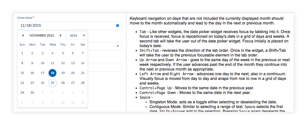
A datepicker component and relevant W3C recommendations
All the aforementioned points are not just good for accessibility, however. Power users, who tend to use keyboards heavily, also benefit from a consistent keyboard experience. A power user can easily tab through the fields and make necessary edits, all without lifting their fingers off the keyboard.
More to Come
The Lightning experience is a major milestone for the Salesforce UX team, but it’s far from the end. We continue to improve the Edit experience, which includes bringing Inline Edit into Lightning.
Regardless of your role, you probably have had to work with forms in some way, shape, or form — whether it’s as simple as a checkbox on a Terms of Service page, or as complex as a CRM web application. Forms are inevitable. They’re particularly essential in enterprise applications, where users interact with them for hours each day. Any gains in efficiency will be significantly magnified.
As a product designer, this is a major opportunity to help your users — while designing forms, think about the contexts in which users interact with them. Craft your designs to suit those experiences.
Remember that well-designed forms aren’t just pretty. They’re also clear, accessible, and efficient.