MOCAheart wants to make keeping track of your cardiovascular health as easy as pressing a button.
The device, which is currently on Kickstarter, was developed by a team led by Naama Stauber and Dr. Daniel Hong, who was a physician at National Taiwan University Hospital, one of the country’s top teaching hospitals, before becoming an entrepreneur. The two met while attending the Design for Service Innovation Program at the Stanford Graduate School of Business, which focuses on developing new software and hardware for healthcare.
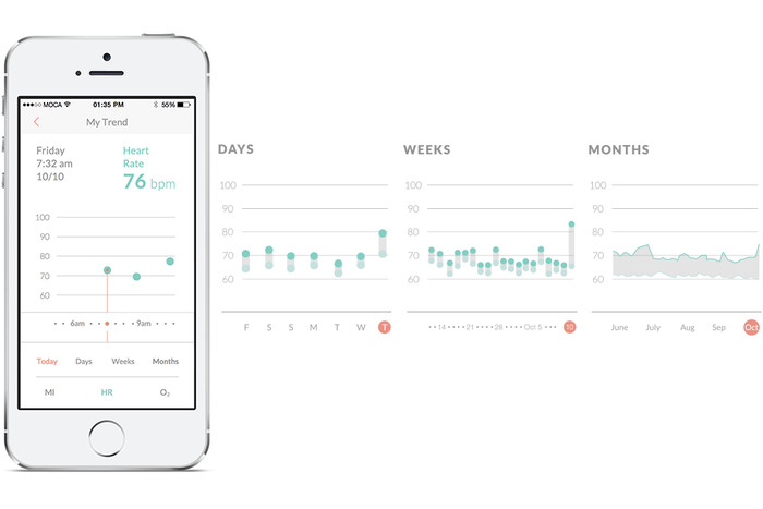
To use MOCAheart, you place your index fingers on top of the device and wait a few seconds for your health data to show up on the connected app.
The lightweight but sturdy MOCAheart, which I saw demoed at MOCA’s Taipei office, contains several sensors within its stainless steel and plastic case. Two are light sensors: one red light and one infrared sensor that measure blood oxygen and blood velocity, respectively. Two EKG sensors track cardiac electronic activity. It also has a G-sensor, or accelerometer, so the MOCAheart can be used as an activity tracker in the future. The app uses pulse transit time (PTT) to estimate the user’s blood pressure.
Instead of telling you your systolic and diastolic pressure measurements, like a blood pressure monitor does, MOCAheart uses a rating scale it calls the MOCA Index, which ranks your heart health (based on blood pressure, blood oxygen, and blood velocity) from 0 to 4. If you score a 0 to 1, that means your blood pressure is probably in the low to ideal range. Two means it is still normal but elevated, while 3 and 4 signify that it may be high enough to warrant a trip to the doctor.
The app also lets you note the time, location, and weather conditions for each reading. The latter is important because very cold weather or high temperatures can put people who have heart disease at risk for heart failure.
Hong says that the MOCAheart app uses its own index instead of giving people their blood pressure measurements because the device currently isn’t FDA-approved as a blood pressure monitor (though the startup might apply in the future). This is a potential drawback for people who need exact measurements, but on the other hand, if you just want an overview of your heart’s vital signs, the MOCA Index is easy to use and understand. The app does give you more precise measurements about your pulse and blood oxygen levels, and can be accessed by caregivers or family members.
The MOCAheart is targeted toward people, including the elderly, who need to keep track of their heart’s health, but can’t remember (or be bothered) to strap themselves into a blood pressure cuff everyday. MOCAheart can be slipped into a keychain holder or clicked into a specially designed smartphone case. Other cuffless blood pressure monitors out there include Viatom’s Checkme and Sotera Wireless’s ViSi Mobile monitor. MOCAheart wants to differentiate with the device’s sleek design and its app, which gives family members a quick way to monitor their love one’s health.
The device was developed partly with people like Hong’s parents in mind.
“When I was in the U.S., I’d call my parents and ask about their health. They kept insisting they were okay, even though my father actually had high blood pressure. Then he had a stroke. As a doctor, I felt I should have known earlier,” says Hong. “I wanted to create something that would make it easy for people to share track health data and share it with their families, so they can be alerted earlier if something needs to be checked out.”
MOCAheart has reached about a third of its $100,000 goal, which it needs to hit by Dec. 25. The device starts at $119 and is estimated to ship in April, a delivery date Hong is confident MOCA will be able to hit because they already have a final working prototype and manufacturers lined up in Taiwan. For more information about MOCAheart, visit its Kickstarter page.
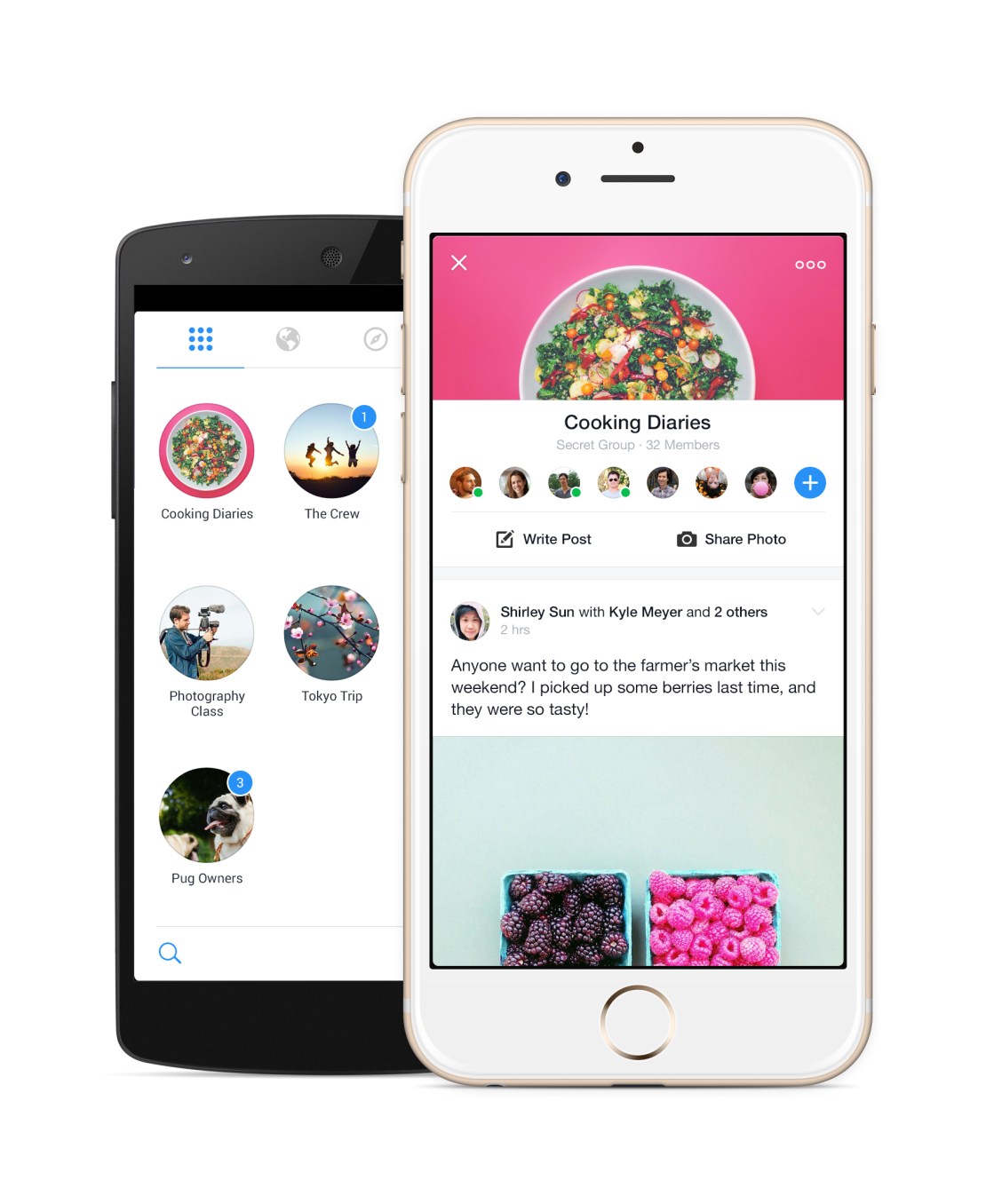
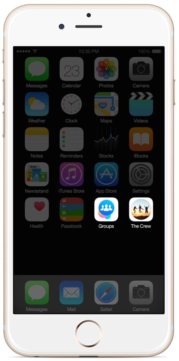
700 million people use Facebook Groups every month, but it’s a second-class experience on mobile, slow and buried in the social network’s main app. So today Facebook is releasing a standalone Groups app with powerful notification controls and a Groups discovery section. You won’t be forced to use it as the Groups feature will remain in the Facebook app, and you won’t be fast-switched to it either.
The Groups app for iOS and Android could be a massive help to admins trying to keep their communities from devolving into chaos, and speed up the consumption experience for everyone from families and friend cliques to study groups and support networks. It’s bright, quick, and could unlock more private sharing outside of the News Feed.
“No one is really doing this out there. We think what we offer is unique”, says the Groups app’s project manager Shirley Sun.
Despite Yahoo and Google fiercely competing to dominate group email lists, there’s a surprising lack of people and rich content-focused social feed groups services, and Facebook is happy to capitalize. Getting more people to organize their personal lives and projects with Groups could also stoke interest in the enterprise “Facebook At Work” product the company is currently piloting. Facebook could end up competing with Slack or Yammer, and this is a stepping stone.
Giving Groups The Spotlight
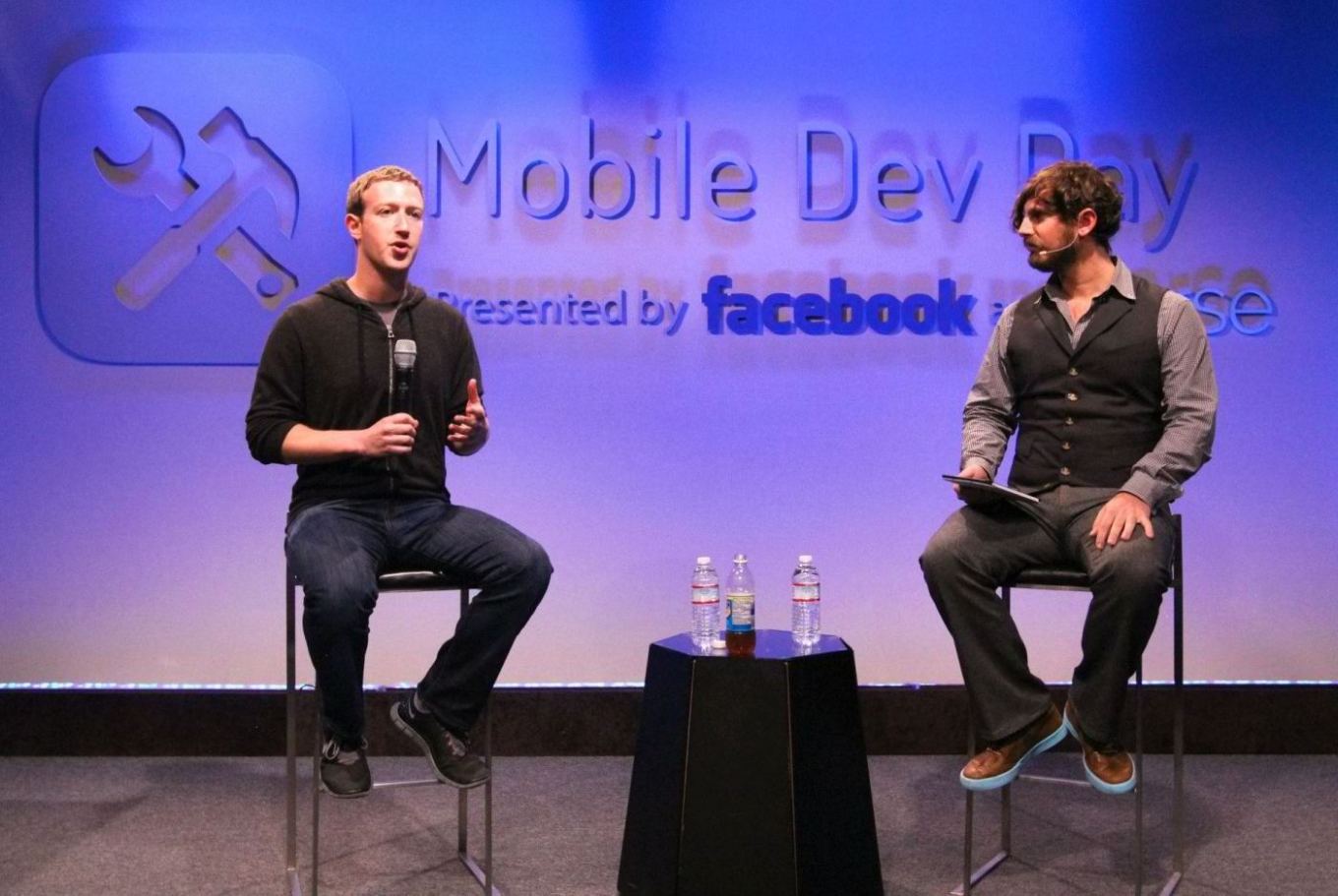
Mark Zuckerberg actually telegraphed the launch of the standalone Groups app a year when I interviewed him on-stage at an internal Mobile Dev Day at Facebook headquarters. He explained “if you have something like Groups, it’s always going to be kind of second-class in the main Facebook app, or even messaging for that matter. In order to make these things really be able to reach their full potential, I do think over time we’re going to have to create more specific experiences.”
Facebook had seen the need for a first-class mobile chat experience way back in 2011 with the launch of Messenger, but many other popular features were left to languish in the hidden menu of the main app.
Groups has been a Facebook feature all the way since the beginning. Back in the 2005 era, they served more as bumper stickers for your profile that organizational communities. College kids would join the “Unidentified Party Injuries” group to trumpet how “cool” they were for getting bruises while drunk.
But in 2010, Facebook relaunched Groups in its modern incarnation as a way to share to a specific set of people, away from the News Feed. Yet despite some face-lifts, the feature hasn’t gotten much love, especially on mobile since.
In January 2014, Facebook revealed its Creative Labs initiative designed to build single-purpose mobile apps and experiment with new functionality starting with Paper, and stylized standalone home for News Feed.
Then in February, Facebook began work on the Groups app. Sun tells me the Facebook Groups’ team’s idea for a standalone app “has always been on our mind”, and the urge just got stronger as more and more users shifted to mobile. The social network now has over 456 million mobile-only users. It was time for Groups to shine.
Using The Groups App
Philosophically, the standalone app doesn’t change what Groups is about. It just makes it cleaner, quicker to access, and more mobile-friendly.
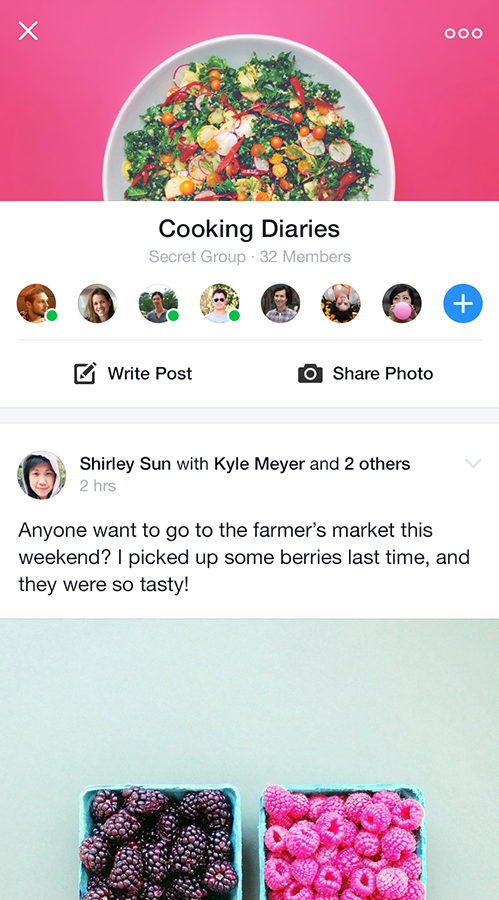
Once you sign-in with Facebook, all your existing Groups will be laid visually in two-wide grid as little circles displaying their titles, cover photos, and notification badges. They’re ordered by how often you use each Group, so ones with new notifications may be below the fold, which could be a bit tricky if you don’t see the pushes new posts or replies trigger.
Tap into any, and you’ll find a sleek Group feed with a sharp white background, rather than the main app’s gray canvas. A special notifications setting lets you mute one or all your Groups for an hour or until the next morning if you need some peace.
It’s also super easy to create a group. Choose what it’s about such a family, class, or teammates, give it a title, select its public/closed/secret visibility setting, and add some friends. If you choose family or close friends as the type, Facebook intelligently defaults your group to be secret. You can also add a home screen shortcut to your favorite groups for even faster access.
One new feature for mobile is the Groups Discovery section, which will help you find ones to join based on your friends, ones active nearby, or communities related to your interests.
To stoke growth, Facebook will slowly begin showing a promo for the app atop the mobile Groups of the feature’s most active users and admins.
There’s no plan for monetization right now, as Facebook is making plenty of money from the News Feed. It’s beat the street its last nine quarters. Down the line, though, Facebook could generate revenue from a frequent Groups use case: commerce.
The African island nation of Mauritius has over one quarter of its population, 250,000 people, in a single Group that acts like a Craigslist classifieds. The company is already working on a Buy button to let you make purchases without leaving Facebook thanks to a credit card on file. That could potentially be expanded to allow peer-to-peer selling.
Sun concludes that Facebook doesn’t need every Groups user on this new app. “This app is a complementary, optional experience, designed for people who are already power users.” She’ll be satisfied if frequent Groups users get even deeper in the feature, and Groups themselves become more lively and active.
A Space For Micro-Sharing
Not everything is fit for the News Feed. Groups works great for purpose-driven communication around projects. But there’s a whole realm of intimate sharing that Groups could host. Facebook tried for years to get people to micro-share to specific friend lists, but the controls can be confusing and there’s always a chance you’ll mis-share to everyone.
Zuckerberg’s law states that people share twice as much every year, but that doesn’t mean they’ll necessarily do it on Facebook. Lots of people are sharing to small sets of friends via apps like Snapchat. If Groups is a hit, it could encourage rapid-fire, off-the-cuff sharing between close Groups of friends, creating a third-space to spend time in between the broadcast feed and private messaging.
That could never happen if Groups stayed locked in the nav menu dungeon.
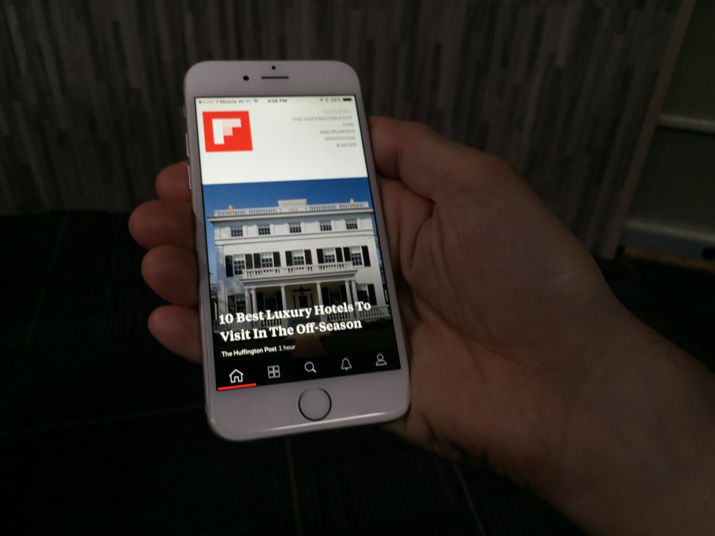
Flipboard has been working hard over the last few years to build an app that makes reading stories on mobile and tablet devices as engaging as flipping through a magazine. With the latest version of its app, users will be able to find and discover content that is relevant to their interests, through the introduction of topics they can follow.
Already, Flipboard has done a good job of getting — and keeping — readers’ attention. It now has more than 100 million readers who have downloaded the app, and is adding 250,000 more each day. Those readers are flipping about 8 billion pages per month, and that number continues to grow. But the new app is aimed at keeping those users engaged through personalization.
When you first open up Flipboard 3.0, the app guides you through the process of picking a series of topics you will receive updates on. It asks “What are you interested in?” and provides a wide range of suggestions that vary from high-level content based around categories like “Technology” down to more granular topics such as “iPad apps.”
Once you’ve chosen several topics of interest, the app opens up to unveil a front page that features stories from multiple sources you can flip through. Stories are tagged by content provider as well as by topic, allowing users to drill down and see more content related to each. You can also choose to follow stories by source or by topic, which would provide even more content served up to users.
At launch, Flipboard will have more than 30,000 different topics to choose from, so there’s something for everyone. And the ability to easily add topics over time could keep casual Flipboard users keep coming back for more as the app becomes more personalized and relevant to them.
Users can click through to see which topics, people, and accounts they follow and drill down on stories shared there. Or they can search for particular topics. And even if readers are following hundreds of topics, the app will work to showcase the most relevant or interesting topics on any given day, according to Flipboard co-founder and CEO Mike McCue.
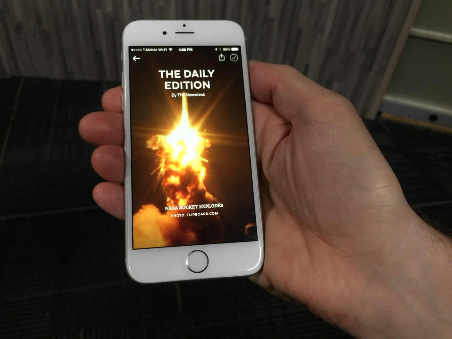
But it’s not all going to be algorithmically programmed. In addition to its topics, the app is also adding a “Daily Edition” of content that has been selected by Flipboard editors. It will be released every day at 7:00 am and will feature all the biggest news from the previous day, as well as a daily photo and “parting GIF” for readers.
Moving Beyond Reader Curation
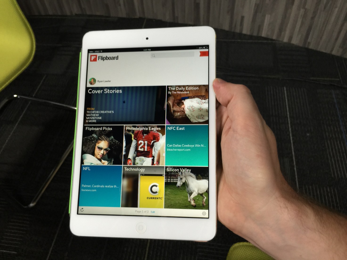
For Flipboard, the move to a topic-following model is a departure from its previous personalization efforts. Last year, the company released a big app update that enabled users to create and subscribe to virtual magazines based on their own interests. By doing so, they could curate stories from multiple different sources and present it in a unified fashion. Readers, meanwhile, benefitted by being able to subscribe to magazines created by other like-minded users to discover content they might not have seen otherwise.
Magazines have been incredibly popular on Flipboard: The company says there have been more than 10 million of them created and curated by readers since launch. They can range from having just a few followers to hundreds and thousands of followers — and the top magazines have generated tens of millions of page flips from readers.
That feature also added a new potential revenue stream by enabling brands and retailers to create shoppable magazines and catalogs of products for sale. That’s on top of advertising CPMs that are closer to print publications than digital properties.
That said, Flipboard’s magazine model wasn’t perfect. After all, it relies on readers to keep updating their magazines over time in order to keep providing fresh content to others. Furthermore, each magazine reflects the interests of the creator or creators and may not be exactly what a reader is looking for.
Zite Acquisition Bears Fruit
The update is designed to improve upon the current experience with a more personalized feed, which users create by following different topics of interest to them. That ensures readers will be kept up to date on the news that’s important to them, without having to rely on another reader to curate a magazine for them.
McCue says the new version blends people-powered curation with algorithmic curation. For that, the app builds on its magazine creation tools and adds features from a couple of acquisitions Flipboard made over the last few years.
The first was its Cover Stories feature, which came about with help from technology it acquired as part of its purchase of Ellerdale several years ago. That gave Flipboard the ability to structure and display content more like a magazine.
It’s the more recent acquisition of Zite which helps to power the app’s new topic-centric following model, however. Zite was acquired from CNN earlier this year, and ever since the combined engineering teams have been working on ways to make Flipboard more personalized and more engaging.
It’s Zite’s technology that is being used to identify and categorize the topics that users can subscribe to. It can do that without its readers building magazines, which opens up a whole lot of new topics and content for readers to discover.
But that’s the whole point. Finding more relevant content is key to Flipboard’s business model, after all.
The more readers flip and the more engaged they are in its magazine-like experience, the more ads they see. The more ads they see, the more money Flipboard makes. And considering that Flipboard has raised more than $160 million since being founded, it’ll need a lot of flips to justify that funding. The good news is, whatever it’s done so far seems to be working.
Fashion and social networking belong together, but so far no one has found the perfect balance between user-generated content and a focus on edgy fashion. That’s where Cloth comes in.
It’s a new app, launched today, that lets users share their favorite outfits in an Instagram-like feed, letting them get feedback from friends (with likes and chat) and saving their favorite outfits to remember later.
Cloth has been in beta for two years now, and today launches into public availability on the App Store. It was founded by Seth Porges, who has been a longtime journalist for organizations like Maxim magazine, Popular Mechanics, Bloomberg News and Men’s Health.
With Cloth, however, Porges shifts to a more entrepreneurial focus, looking to help people record their own best looks and share them with others.
“The goal has always been to make getting dressed easier and more fun,” said Porges. “We wanted to make an app that enhances how people are already using their phones and fashion together, without forcing them into unnatural actions that they aren’t already doing.”
Cloth not only allows you to build out a closet through photos, shared in a stream, but it also allows you to tag them so that others can search for inspiration based on specific guidelines. Plus, Cloth includes weather notifications to help you get dressed each day.
The company has raised a small undisclosed amount from a group of unnamed angel investors thus far.
https://www.youtube.com/watch?v=pKL4PJICS40
We're based in the Mission District of San Francisco. Navdy was founded by entrepreneur Doug Simpson and serial inventor Karl Guttag, and is supported by a highly accomplished veteran team. In 2013 Navdy went through the acclaimed Highway 1 Incubator program and continues to work closely with Highway 1’s parent, PCH International, whose world class supply chain and manufacturing capabilities are used by companies such as Apple, Beats, and Google.
Digg, Milk, and Revision3 founder Kevin Rose recently left Google Ventures to start a new mobile development house called North, and now we have some details on the firm’s first app, Tiiny, which will launch soon. The basic idea is that Tiiny lets you share thumbnail-sized photos and animated GIFs to a grid of pics on your friends’ phones, and they disappear 24 hours later. Rather than making you scroll through full-width photos like Instagram, Tiiny lets you get a constantly-updated look at what lots of your friends are up to in a single glance.
Rose told TechCrunch founder Michael Arrington that the app is currently going through the iOS App Store approval process and should launch very soon. Rose’s team said he’s not ready to talk more about the app just yet, but we’ll have more details on TechCrunch when it’s time.
I did get a quick look at the app yesterday, though, and it’s slick. As you can sort of make out from the photo below, the top of the screen features a 3-wide by 4-tall grid of photos and animated GIFS, with a button to capture and share more at the bottom. Seeing all the moving images on the same screen made the app feel vibrant and alive, which could make it addictive to check compared to more static apps like Instagram or even Vine, which only shows one video at a time. Rather than a replacement or direct competitor to other more public broadcast and direct messaging photo apps, Tiiny seems like it could fit in as a complement.
There’s also supposedly some more functionality but we’ll have to wait until it’s out for that.
North, which we profiled last month, has a peculiar strategy. Rather than languish on building one app, North is trying to use a small team of about 3 people to launch a new mobile app every three months. This scheme lets North quickly throw apps against the wall and see what’s sticky for users. With building social apps being likened to capturing “lightning in a bottle”, this diversified approach means North won’t spend a year building something no one wants. If Tiiny is a flop, the team will just move on to the next app.
Apple has hired industrial designer Marc Newson. Newson will join his friend and Senior Vice President of Design, Jony Ive on the company’s design team creating future Apple products. This hire is huge as it would give Ive someone of his caliber of talent to work with. Steve Jobs was famously hands-on with most aspects of the design of Apple products. This involved spending a lot of time with Ive as the two collaborated on the company’s hardware. Meanwhile, Tim Cook took care of the day-to-day business. CEO Cook is still not nearly as involved in the day-to-day design elements of upcoming products, at least according to The New York Times. Hiring Newson could be a way of giving Ive someone to collaborate with like he did with Jobs.
Which is perfect since Newson and Ive are friends and have already collaborated on numerous projects including a design a special edition Leica for a (RED) organization charity auction. Vanity Fair also notes that Newson has worked with Ive on Apple products in the past.
http://youtu.be/OF1ZzrKpnjg
Plus, who wouldn’t want to hire someone that’s designed a rocketpack? Plus, he already has experience designing time pieces. If an iWatch is announced at theSeptember 9 event, we wouldn’t be surprised if Newson had a hand in the design since he’s consulted on Apple products in the past.
Newson will continue to be based in the United Kingdom, but will make frequent trips to Cupertino.
4 Myths About Apple Design, From An Ex-Apple Designer
WHAT'S LIFE REALLY LIKE DESIGNING FOR APPLE? AN ALUM SHARES WHAT HE LEARNED DURING HIS SEVEN YEARS IN CUPERTINO.
Apple is synonymous with upper echelon design, but very little is known about the company's design process. Most of Apple’s ownemployees aren’t allowed inside Apple’s fabled design studios. So we’re left piecing together interviews, or outright speculating about how Apple does it and what it’s really like to be a designer at the company.
Enter Mark Kawano. Before founding Storehouse, Kawano was a senior designer at Apple for seven years, where he worked on Aperture and iPhoto. Later, Kawano became Apple's User Experience Evangelist, guiding third-party app iOS developers to create software that felt right on Apple's platforms. Kawano was with the company during a critical moment, as Apple released the iPhone and created the wide world of apps.
In an interview with Co.Design, Kawano spoke frankly about his time at Apple--and especially wanted to address all the myths the industry has about the company and about its people.
MYTH #1
Apple Has The Best Designers
“I think the biggest misconception is this belief that the reason Apple products turn out to be designed better, and have a better user experience, or are sexier, or whatever . . . is that they have the best design team in the world, or the best process in the world,” Kawano says. But in his role as user experience evangelist, meeting with design teams from Fortune 500 companies on a daily basis, he absorbed a deeper truth.
“It's actually the engineering culture, and the way the organization is structured to appreciate and support design. Everybody there is thinking about UX and design, not just the designers. And that’s what makes everything about the product so much better . . . much more than any individual designer or design team.”
It has often been said that good design needs to start at the top--that the CEO needs to care about design as much as the designers themselves. People often observe that Steve Jobs brought this structure to Apple. But the reason that structure works isn’t because of a top-down mandate. It’s an all around mandate. Everyone cares.
“It’s not this thing where you get some special wings or superpowers when you enter Cupertino. It’s that you now have an organization where you can spend your time designing products, instead of having to fight for your seat at the table, or get frustrated when the better design is passed over by an engineering manager who just wants to optimize for bug fixing. All of those things are what other designers at other companies have to spend a majority of their time doing. At Apple, it’s kind of expected that experience is really important."
Kawano underscores that everyone at Apple--from the engineers to the marketers--is, to some extent, thinking like a designer. In turn, HR hires employees accordingly. Much like Google hires employees that think like Googlers, Apple hires employees that truly take design into consideration in all of their decisions.
“You see companies that have poached Apple designers, and they come up with sexy interfaces or something interesting, but it doesn’t necessarily move the needle for their business or their product. That’s because all the designer did was work on an interface piece, but to have a really well-designed product in the way Steve would say, this 'holistic' thing, is everything. It’s not just the interface piece. It’s designing the right business model into it. Designing the right marketing and the copy, and the way to distribute it. All of those pieces are critical.”
MYTH #2
Apple’s Design Team Is Infinite
Facebook has hundreds of designers. Google may have 1,000 or more. But when Kawano was at Apple, its core software products were designed by a relatively small group of roughly 100 people.
“I knew every one of them by face and name,” Kawano says.
For the most part, Apple didn’t employ specialist designers. Every designer could hold their own in both creating icons and new interfaces, for instance. And thanks to the fact that Apple hires design-centric engineers, the relatively skeleton design team could rely onengineers to begin the build process on a new app interface, rather than having to initiate their own mock-up first.
Of course, this approach may be changing today.
“For Apple, having a small, really focused organization made a lot of sense when Steve was there, because so many ideas came from Steve. So having a smaller group work on some of these ideas made sense,” Kawano says. “As Apple shifted to much more of a company where there’s multiple people at the top, I think it makes sense that they’re growing the design team in interesting ways.”
Notably, Jony Ive, who now heads usability across hardware and software, is reported to have brought in some of the marketing team to help redesign iOS 7. It's a coup, when you think about it, for marketers to be deep in the trenches with designers and engineers. (That level of collaboration is frankly unprecedented in the industry.)
MYTH #3
Apple Crafts Every Detail With Intention
Apple products are often defined by small details, especially those around interaction. Case in point: When you type a wrong password, the password box shakes in response. These kinds of details are packed with meaningful delight. They're moments that seem tough to explain logically but which make sense on a gut level.
“So many companies try to mimic this idea . . . that we need to come up with this snappy way to do X, Y, and Z. They’re designing it, and they can’t move onto the next thing until they get a killer animation or killer model of the way data is laid out,” Kawano explains. The reality? “It’s almost impossible to come up with really innovative things when you have a deadline and schedule.”
Kawano told us that Apple designers (and engineers!) will often come up with clever interactive ideas--like 3-D cube interfaces or bouncy physics-based icons--during a bit of their down time, and then they might sit on them for years before they make sense in a particular context.
“People are constantly experimenting with these little items, and because the teams all kind of know what other people have done, once a feature comes up--say we need a good way to give feedback for a password, and we don’t want to throw up this ugly dialog--then it’s about grabbing these interaction or animation concepts that have just been kind of built for fun experiments and seeing if there’s anything there, and then applying the right ones.”
But if you're imagining some giant vault of animation ideas hiding inside Apple and waiting to be discovered, you'd be wrong. The reality, Kawano explains, was far more bohemian.
“There wasn’t a formalized library, because most of the time there wasn't that much that was formalized of anything that could be stolen,” Kawano says. “It was more having a small team and knowing what people had worked on, and the culture of being comfortable sharing.”
MYTH #4
Steve Jobs’s Passion Frightened Everyone
There was a commonly shared piece of advice inside Apple--maybe you've heard it before--that a designer should always take the stairs, because if you met Steve Jobs in the elevator, he’d ask what you were up to. And one of two things would happen:
1. He’d hate it, and you might be fired.
2. He’d love it, the detail would gain his attention, and you’d lose every foreseeable night, weekend, and vacation to the project.
Kawano laughs when he tells it to me, but the conclusion he draws is more nuanced than the obvious Catch 22 punchline.
“The reality is, the people who thrived at Apple were the people who welcomed that desire and passion to learn from working with Steve, and just really were dedicated to the customer and the product. They were willing to give up their weekends and vacation time. And a lot of the people who complained that it wasn’t fair . . . they didn’t see the value of giving all that up versus trying to create the best product for the customer and then sacrificing everything personally to get there.”
“That’s where, a lot of times, he would get a bad rap, but he just wanted the best thing, and expected everyone else to want that same thing. He had trouble understanding people who didn’t want that same thing and wondered why they’d be working for him if that was the case. I think Steve had a very low tolerance for people who didn’t care about stuff. He had a very hard time understanding why people would work in these positions and not want to sacrifice everything for them.”
As for Kawano, did he ever get an amazing piece of advice, or an incredible compliment from Jobs?
“Nothing personally,” he admits, and then laughs. “The only thing that was really positive was, in the cafeteria one time, when he told me that the salmon I took looked really great, and he was going to go get that."
“He was just super accessible. I totally tried to get him to cut in front of me, but he’d never want do anything like that. That was interesting too, he was super demanding . . . but when it came to other things, he wanted to be very democratic, and to be treated like everyone else. And he was constantly struggling with those roles.”
Algoriddim is updating its iOS app djay today with a big new feature — integration with Spotify.
This is the first time djay (which the company says has been downloaded 10 million times, making it the world’s bestselling DJ app) has been connected to a streaming music service. This means users will no longer be limited to the music in their collection, and can instead access 20 million tracks in Spotify’s library.
Algoriddim aims to serve both casual users and serious DJs, and on the serious side, this could be the next step away from having to lug crates of vinyl records from club to club. It sounds like an obvious move, but CEO Karim Morsy said there were significant technical challenges, because users aren’t just streaming music from the cloud, but also mixing and applying effects in real-time.
You can see the app in action in the video above — as I watched Morsy show off djay’s different features, the app seemed to work as quickly with Spotify tracks as it did with iTunes music that was stored locally.
In addition to giving djay users access to more songs (they can search or browse different playlists, as well as share playlists of their own), Morsy said the integration allows Algoriddim to introduce two new features. First, there’s Match, which recommends songs that would be the right fit to play after the current track. Morsy’s a DJ himself and he said he’d previously believed that making this kind of song selection could never be automated. But using technology from Spotify’s acquisition of The Echo Nest convinced him that he was wrong.
And users can take that automated approach even further with Automix Radio, which won’t just choose the next song, but will create an entire mix and handle all of the transitions. So you can select a song that sets the mood, then let Automix continue playing automatically. In some ways it’s similar to just creating a station on an Internet radio service like Pandora, but with “beatmatched, DJ-style” transitions between songs.
Users will need a Spotify Premium account to access the Spotify library in djay, but the app includes a 7-day free trial for the premium service. Algoriddim is also promoting the apps by cutting the iPad price in half, to $4.99, and making its iPhone app available for free.
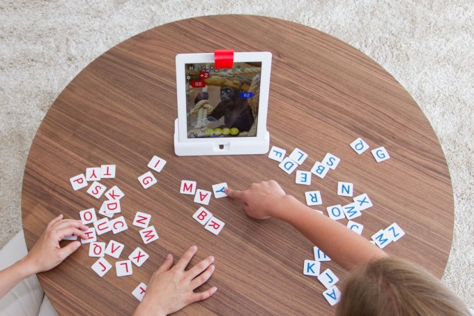
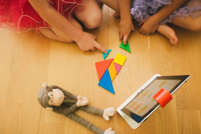
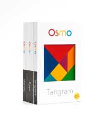
A number of companies have attempted to combine physical objects and the iPad in an effort to create new kinds of children’s games, whether that’s Crayola with their DigiTools coloring pens or games that teach toddlers their shapes, like Tiggly. Today, another digital toymaker, Tangible Play, is entering this space with the launch of a series of high-quality games designed for children ages 6 to 12, including puzzles, word games, and other forms of creative play.
In development for over a year, we first spotted Tangible Play demonstrating its games at a previous TechCrunch Disrupt Startup Alley.
The company was founded by ex-Googlers, including Pramod Sharma, who had earlier seen the intersection of physical and digital when he helped build Google’s book-scanning machine, and Jérôme Scholler, who had worked on Chrome for Android.
Both men are also dads, and like most parents, they have mixed feelings about the way today’s tablet computers engage kids’ attention. On the one hand, technologists generally like to see their kids embracing digital tools at young ages.
But, says Sharma, “[my daughter] could literally spend hours just looking at a screen, and doing nothing else. And as a parent, this is obviously concerning,” he says. That led the founders to create Osmo, the company’s first product built to combine social and creative play with the highly engaging tablet their kids were addicted to.
The games center around a technology which they refer to as “Reflective Artificial Intelligence.” What that means is that the Osmo gaming kit includes a uniquely designed reflective camera that snaps onto the top of the iPad, allowing the app to “see” the shapes and objects placed in front of the tablet on the tablet or other flat surface.
The game kit also includes an iPad stand and two physical games, their app counterparts, as well as third app that’s Osmo’s most recent addition.
While the best way to experience Osmo is to try it for yourself, the general gist of the experience involves playing a game in front of the iPad, following software prompts along the way which guide the gameplay.
In the case of “Words,” children try to quickly guess the word by sliding letter tiles in front of the tablet, while in “Tangram” kids use colorful wooden pieces to try to reproduce the image on the screen by placing shapes together. A third title, “Newton,” lets you engage in more creative play by placing any object in front the iPad – glasses, a pen, your hands, etc. – to turn them into structures inside a game involving bouncing balls and targets.
Though my daughter is only four, and below the target age range for these apps, with some guidance we were able to play some of the Osmo games together. It was easy to see how these games could make the iPad a more social activity - something that’s more like the modern-day equivalent to what was once the family board game night at home.
That being said, the test versions I was able to try (admittedly a few weeks behind the versions of the apps launching today) did have some kinks. I found, for example, that the shapes game “Tangram” would sometimes not see the pieces correctly, lighting up to show a match, then dimming again for no apparent reason, then lighting up again, which was confusing.
The sounds effects and music also need work, as they didn’t seem quite as kid-friendly and engaging as they could be. (They actually sound better in the video above, than in person). But overall, the games work as advertised, provided you have good lighting and a flat surface to play them upon. And Sharma says that now the goal is to make Osmo work on any surface, including floors and tables alike.
The company has been piloting the games in over one hundred schools, many near their home base of Palo Alto. From these early tests, the founders came to better understand the potential for Osmo from an educator’s perspective, explaining that their group play nature could help with a child’s social and emotional learning, while other games taught different concepts, like spatial intelligence and creative thinking.
Crowdfunding Launch
Today, Tangible Play is launching its crowdfunding campaign which will allow it to assemble a core group of early adopters who the team hopes will help to evangelize the product and help Osmo gain traction. Though the gaming kit will eventually retail for $99, crowdfunding backers will be able to get it for a discount at $49, with some limited availability. The goal is to raise $50,000 to help with start-up and manufacturing costs.
However, the company doesn’t really need the crowdfunding in order to get the device to manufacturing, as they’ve previously raised an undisclosed round of seed funding from K-9 Ventures last year.
You can join the new crowdfunding campaign or learn more here: www.playosmo.com.
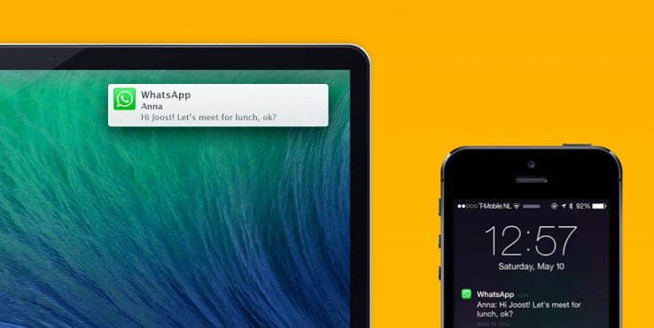
Notifyr lets you receive iOS notifications on your Mac. When I work, I put my iPhone on the table next to my Mac. Every time it buzzes, I look away from my screen to see whether it’s an important notification. I get quite a lot of notifications, and most of the time it’s not important. But it can become problematic if I’m trying to focus and write a long post. I know it’s a first world problem, but Notifyr just solved it.
When I first discovered this new app on Product Hunt yesterday, I immediately installed it. Using Notifyr works a lot like using a Pebble, except that your notifications appear on your Mac instead of on your phone.
First, you need to install the iOS app from the App Store (it costs $3.99), and the free Mac app. When you open the app on your phone, it’ll ask to use Bluetooth. On your Mac, the app will runs as System Preferences pane. You activate Bluetooth on your Mac, pair your iPhone and you’re done.
The app uses Bluetooth Low Energy, which means that it won’t be compatible with iPhone 4 or below. But it also means that it won’t drain your battery too quickly.
Now, every time my phone buzzes, I receive an OS X notification in the corner of my screen. I can also see all my previous iPhone notifications in the Notification Center on my Mac. If you receive the same notifications on your phone and Mac, for example if you have two separate Twitter clients on your laptop and iPhone, you can exclude this particular iPhone app from Notifyr.
It’s really simple, and the setup process is quite easy. Now, I could have solved this problem another way. Maybe I should try to switch off my phone from time to time. Maybe I should work on my attention span so that I don’t stop writing mid-sentence to
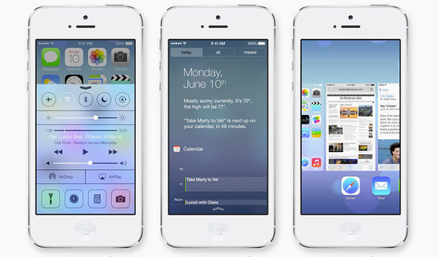
Since we are roughly six months into the general release of iOS 7, and about two months from learning about iOS 8, I thought I’d share my thoughts on iOS 7 as well as my iOS 8 wish list. Overall, I’ve been pretty happy with iOS 7 and haven’t wanted to go back to iOS 6. However, I still think there is room for improvement.
What I like
The new look-and-feel introduced in iOS 7 was controversial, to say the least. For me, I liked the new interface from the beginning. I’m in the developer program and installed the beta the day it was released. I took me a few days to get used to it, but after that there was no going back. I recently had my iPad replaced under warranty. When I got the new one, it had iOS6 installed. It was a jarring moment as I realized then how much I liked the new look and feel.
Being able to flip up (as opposed to flip off, I guess) Control Center and turn Wi-Fi, Bluetooth and the flashlight off and on, as well as have quick access to a calculator, is a nice addition and has also eliminated the need for a separate flashlight app. My one complaint is the touch target for the swipe seems a little narrow.
The Notification Today Screen is a great addition. I’d be lying if I said I used it as much as I should. It’s nice seeing what my day looks like first thing in the morning. Granted, it seems the times I use it the most are the days I’m thinking of calling in when I’m sick and want to see if I have any important meetings. When I swipe down to see the Today Screen, and it tells me “There are 2 events scheduled…” for the next day, I’d like to be able to tap on that sentence and bring up the calendar.
What I also like to see is for them to borrow from Google Now and let me add in sports scores and the like. This week, I fell asleep before the Red Sox won a game in 14 innings. It would have been great if the Today Screen showed the score the next morning. However, I’ve never really used the Missed Notification tab, because I’ve really limited the amount of apps that hit the Notification Center.
I really like the new Multitasking screens. It took a little getting used to it taking up the whole screen, however, the live update is great. Sometimes, I’ll use that to take a quick peek at an app and then scoot back over to the current app.
While I still use 1Password, I’ve become a big fan of iCloud Keychain. What I’d like to see is the ability to have other apps have access to it, too. I still need to keep a copy of my passwords in 1Password because Mail, WordPress, and any other app with a login can’t read the Keychain.
What I’m not sold on
The grouping of photos by Moments in the Photos app is a bit of a hit or miss for me. I’d like the grouping to be a little bit smarter. Over the period of a week, I took photos at a show in Connecticut, near work, and near home. On one view level in Photos, they were grouped all together, When I tapped on a photo it did bring me to the grouping of just the Connecticut show. The reason I’m sold on it is because of that mid-level grouping. I’d prefer it didn’t group the different locations that way. That said, I don’t like it when there’s only a few photos in a collection, so I’m guess I’m just never happy.
iTunes Radio is something I keep forgetting is there. I like the idea of it, and as a iTunes Match subscriber I should be using it more. I usually come close to my data limits each month (my plan is split between three phones) so I have cellular data turned off for Music. Since I do most of my music listening on the ride home from work, listening to iTunes Radio is pretty much out. I should use it at work, though, where I can get on the guest Wi-Fi.
What I don’t like
The fact that Airdrop only works between iOS devices (or two OS X devices) is a let down. Sometimes, I’d like to be able to drop a file from my Mac to my iPad without going through the the iTunes File Share route.
While Siri has gotten better, it’s still a let-down for me. I still seem to be having, “I’m sorry Dave, I can’t do that right now” moments more than I’d like. Either she has a hard time with my Boston accent, or she’s just hard of hearing, because it seems like most text messages have her end up mangling at least one of the words. I use Siri on almost a daily basis and at least twice a day I end up swearing at it. I would also like the Siri APIs opened up for all developers to use.
The folder view on the iPad feels like it should display at least another row of icons. I also don’t like that tapping the home button still leaves me in the folder; I want it to bring me back to Home screen.
GameCenter is still pretty useless for me. I have friends on GameCenter, but I never really interact with them. The Notifications seem wonky, too. My girlfriend plays Scrabble on her iPad a lot, but according to GameCenter, she last played it a year ago. I would also like to be able to tap on the Scrabble icon in GameCenter and challenge her directly.
My iOS 8 wish list
I’d like to see more app parity between OSX and iOS. iOS really needs a Preview app. I can store PDFs in my iCloud, but can’t see them on my iPad. I’m also not sure why there isn’t a calculator or compass on the iPad, either. It’s unlikely we will see this, but I’d love to be able to set default apps for mail and browsing. On the iPad, I’d like to see the landscape view have the same six columns I can have in the springboard. If there’s room there, why isn’t there room on the main display. It also throws my OCD off when the rows don’t line up.
Apple also needs to increase iCloud storage and bring their prices in line with Google’s service ($9.99/mo gives me 1TB of data vs. a max of 50GB of iCloud storage for $100/year. Also, you cannot fully back up 64 or 128GB iOS devices. Granted, some of this data can be redownloaded from iTunes Match, iBookstore and other repositories. I’d like to use iCloud to hold a lot more data than I currently can. I have roughly 30g of guitar magazines I’ve scanned in and I’d like them to sit on iCloud; right now they are on my Google Drive. I would also like to truly start severing the iTunes connection my iOS devices have, and improve how iOS apps sync back to their OS X counterparts. If I add a book on my iPad’s iBooks app from Project Gutenberg, it’s not synced back to iBooks on OS X (to be fair, I don’t think if I open a book on the Kindle app it’s auto-added to my Kindle Personal Documents, either). I would also like to create an album on Photos on my iPad and have it appear in iPhoto on my Mac.
I would also like to be able to write to Reading List from apps not called Safari. I’ve been using as a replacement to Pocket since, and I don’t like that I can’t set my Read Later in Twitter to Reading List. Actually, a share sheet like Android would be great, On my Nexus 7, once I have the Evernote app installed, I can share just about everything with that app.
We will find out June 2nd what Apple’s roadmap for iOS 8 is. Most likely, we will see a few bits of people’s wish lists and then a slew of features we hadn’t though of. What I hope is now that Apple is done (hopefully) with the redesign, iOS 8 will focus on features.
Android and iOS users in the US spend an average of 2 hours and 42 minutes every day using apps on smartphones and tablets (up just four minutes compared to last year). Of that, 86 percent (or 2 hours and 19 minutes) is spent inside apps, while the remaining 14 percent (or 22 minutes, down 6 percentage points compared to last year) is spent on the mobile Web using a browser.
These latest figures come from mobile firm Flurry, which provides analytics and ad tools that developers integrate into their apps. The company collected data between January 2014 and March 2014 and concluded that “apps, which were considered a mere fad a few years ago, are completely dominating mobile” while the browser “has become a single application swimming in a sea of apps.”
Here are the results in graph form:
Just like last year, games took first place with 32 percent of time spent. Social and messaging applications increased their share from 24 percent to 28 percent, entertainment and utility applications maintained their positions at 8 percent each, while productivity apps saw their share double from 2 percent to 4 percent.
It’s worth underlining that Facebook’s share dipped a bit from 18 percent to 17 percent. Nevertheless, Facebook still has the lion’s share of time spent in the US, and was able to maintain its position with the help of Instagram. Flurry argues that position will become even more cemented, if not increased, once the acquisition of WhatsApp closes.
This year, Flurry broke out YouTube separately, which shows us it owns a whopping 50 percent of the entertainment category. We’ll be watching closely to see if it manages to grow its 4 percent share of time spent.
“It is still too early to predict the trajectory apps will take in 2014,” Flurry admits. “But one thing is clear – apps have won and the mobile browser is taking a back seat.” Unless this trend reverses, we can expect many more acquisitions from tech companies the size of Facebook and Google.
It seems as though any time you hear about Web design these days, you can’t help but come across the term “flat design.” While the flat Web design trend has been emerging in recent years, it seemed to have exploded in popularity thanks to large companies and organizations changing their design aesthetic to that of flat design.
But where did flat design come from? And why are we seeing it on the Web? As with anything in design, knowing where a style or technique came from and the history behind it can help you make more educated decisions when it comes to the use of the design aesthetic.
Let’s walk through what flat design is, its influences from previous design periods, and how flat design became so popular today.
What exactly is “flat design?”
For those of you who haven’t heard of the term, “flat design” is mainly the term given to the style of design in which elements lose any type of stylistic characters that make them appear as though they lift off the page.
In laymen’s terms, this means removing stylistic characters such as drop shadows, gradients, textures, and any other type of design that is meant to make the element feel three-dimensional.
Designers today have seem to gravitate toward flat design because it feels crisp and modern, and allows them to focus on what is the most important: the content and the message.
By removing design styles that can easily date their design (or that could quickly cause their design to become outdated), they are “future-proofing” their designs so that they become relevant for longer periods of time. Not to mention, flat design seems to make things more efficient and cuts out the “fluff.”
It isn’t quite fair to have a discussion of what flat design is without discussing the opposite of flat design. The term often given for the opposite of flat design is“rich design,” which is best described as adding design ornaments such as bevels, reflections, drop shadows, and gradients. These things are often used to make elements feel more tactile and usable to users who are navigating the website or using an application.
It is important to note that rich design isn’t Skeuomorphism. Skeuomorphism is the act of making things resemble their physical counterparts to deliberately make them look familiar.
Where did flat design come from originally?
Most anything we see on the Web or digital world today has origins from its print and art ancestries. While it is difficult to determine the exact start of flat design today or where its origins started, there are a few periods of design and art in which flat design takes inspiration from.
Swiss Style of Design
The Swiss style (sometimes called the International Typographic Style) of design is the main period of design that come to mind and deserves attention for any discussion on the history of flat design. The Swiss design style was the dominant design style throughout the 1940’s and 1950’s from which it originated in Switzerland.
Swiss design mainly focused on the use of grids, sans-serif typography, and clean hierarchy of content and layout. During the 40’s and 50’s, Swiss design often included a combination of a very large photograph with simple and minimal typography.
With typography being a major element in Swiss design, the beloved Helvetica typeface was also created in Switzerland in 1957, and was heavily used on just about everything during the time.
Just like how flat Web design today was around for a while before Microsoft and Apple made it popular, the Swiss style of design can be traced as far back as the 1920’s in Germany, but it was the Swiss who made it explode in popularity and earned the namesake (for the Art History buffs, the Bauhaus school in Germanyfocused on architecture and typography, and the typography has similarities to Swiss design but where practicing this design style before the Swiss took claim).
Minimalist Design
Another heavy influence of today’s flat Web design can be found in the history of Minimalism. The term “minimalism” is sometimes used interchangeably with today’s flat design, but minimalism was popular way before the Web was even a thought. Minimalism has its history in architecture, visual art, and design.
Minimalism has an extensive history and covers various mediums, but where flat design takes its influence from is mainly the design and visual art expressions of minimalism. Minimalism is well known for the act of removing everything in a piece, leaving just the necessary and needed elements. Geometric shapes, few elements, bright colors, and clean lines dominate most minimalism style design.
Probably one of the most popular art pieces from the Minimalism period is Yves Klein’s The Blue Epoch (seen below).
It’s safe to say that a mixture of Swiss Design and Minimalism heavily influenced what we see today in the digital world and have named “flat design.”
Emergence of flat design in the digital world
History repeats itself, and the same holds true with the current flat design trend. As we seen above, flat design can be traced back all the way to the 1920’s and have influenced our current adaptation of flat design.
While many designers have worked their way to flat design when creating websites and other design pieces, it is safe to say that the likes of Microsoft and Apple made flat design pretty popular over the last several years.
Microsoft and Metro Design
Microsoft’s dabbing in flat design started before the current “Metro” design aesthetic was dubbed Metro. In trying to compete with Apple’s extremely popular iPod, Microsoft released the Zune media player in late 2006.
With Zune came a unique design style that focused on large, lower-case menu typography and background imagery (imagery was displayed based on the song or content loaded). The Zune desktop software that came paired with the Zune also followed the same design style, creating a fully integrated experience.
The design of the Zune operating system on Zune devices was drastically different than most of Microsoft’s other software availabilities at the time (namely Windows). When Microsoft released Windows Phone 7 in October 2010, it took what the company learned from the design of Zune and applied it plus more to the look and feel of the Windows Phone 7: large, bright, grid-like shapes, simple sans-serif typography and flat icons dominated the style on the Windows Phone 7.
This design would soon be called “Metro” design by its creator, Microsoft.
The design became so popular that Microsoft kept with the Metro design style and introduced it in its Windows 8 operating system, keeping with a strict grid of blocks of content, sharp edges, bright colors, sans-serif typography, and background images. This same design style is still used by Microsoft in nearly all of its software and devices such as the Xbox 360 and its current website (though the Metro name has technically been discontinued).
Apple Shakes Skeuomorphism
While Microsoft was working on its flat design style, Apple had something else up its sleeve. Apple started hinting at moving away from its use of Skeuomorphism, and then completely abandoned the perfected Skeuomorphism in favor of a more flat design with the release of iOS 7 in the summer of 2013.
Since Apple has a pretty strong following with a rather large group of early adaptors of new devices and technology, the design of iOS 7 seemed to have made flat design even more popular than it was before practically overnight.
Apple’s design aesthetic often heavily influences design of websites and apps because most designers feel that the design is appealing and modern. Thus, when Apple switched to a more flat design style, Skeuomorphism seemed to become almost instantly outdated and sites and apps that used the design style quickly found that they needed a redesign.
This is most evident in the different apps that have been updated to work well with iOS 7 — they all follow the flat design aesthetic that users of iOS 7 have become accustomed to throughout the OS.
Responsive Design
It is important to note too one of the reasons flat design has become so popular in recent years as well is the development of responsive design. As more devices are connecting to the Web, with various screen sizes and browser constraints, designers are finding that their tried-and-true design styles that relied heavily on textures, drop shadows, and fixed imagery don’t translate as well when you have to shrink those designs into smaller and smaller viewports.
Flat design allows for Web design to become more efficient. Without extra design elements in the way, websites can load much faster and are easier to resize and form around the content it holds.
This also goes hand in hand with our screens becoming more high-def and the need to display crisper imagery. It is much easier to display crisp boxes and typography than it is to make several different images to accommodate all the various devices and features out there.
The future of flat design
While no one has a crystal ball, it is safe to say that flat design will eventually run its course and will be replaced with something even more new and exciting, just like various other design styles did before it (take Skeuomorphism for example).
There are obvious flaws to flat design in the digital world (such as removing the visual clues that is needed to determine if something is clickable or not), but as designers experiment, test, and learn, flat design will evolve and eventually a new style will emerge that will leave flat design in its dust.
One clue that we may have to what the future holds for flat design (or even after) is the current design work of Google (mainly in their mobile apps). While Google’s applications are showing signs of flat design, it does not seem to be removing elements such as drop shadows; it also still uses gradients in subtle ways. The company seems to be taking the best of flat and rich designs and integrating both in a way that just works. Maybe Google have figured out something we haven’t?
While flat design seems new and exciting, and is a fastly growing trend, it isn’t nothing new in the course of design history. With influences from Swiss design and Minimalism, flat design is just a reincarnation of its print ancestry in our digital lives.
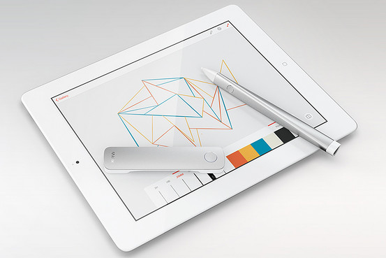
“When people hear that Adobe is getting into hardware, for many the first reaction is ‘why?’,” explained Michael Gough, Adobe’s vice president of experience design, at the South by Southwest conference in Austin, Texas. “But, this really is within our wheelhouse. We’ve always built creative tools and these products are really just another example of that. This isn’t just another stylus.”
Adobe’s pen currently wears the codename Mighty, while the ruler is going by the name Napoleon—because “it’s a short ruler,” Gough said.
The two products, which Gough demoed at SXSW, as you can see in the video above, are built with clean lines and shod in aluminum and white plastic. They look not mistakenly like something Apple would design.
The two devices work in tandem with an iPad drawing app that Adobe is also developing, one that enables the hardware to mimic an architects ruler and wide array of drafting templates—the greenish, flat pieces of plastic you’ve seen if you’ve been down the art aisle in any office supply store.
With a click of the lone button on the ruler, circles, squares, triangles, arcs and other shapes found in drafting templates appear onscreen for the pen to trace—just as architects, designers and engineers have done repeatedly for decades with a paper and pencil in the analog world. The ruler and pen, which features a pressure sensitive tip, also make drawing a straight line easy—something that can be difficult with a tablet stylus.
And while Mighty and Napoleon are built with the needs of architects and designers in mind, Gough said that Adobe’s first hardware wouldn’t have a steep learning curve—something Adobe software is known for.
“This is an opportunity for Adobe to make creativity accessible to everyone, because anyone who can use a pen and a ruler will be able to use this as soon as they pick it up,” he said. “That’s a sweeping, beautiful mission, but it’s also good business sense. We want everyone to be a potential Adobe customer—not just creative professionals.”
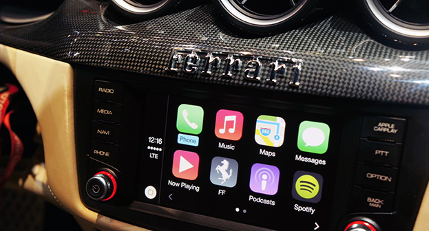
Apple's in-car infotainment system has been a long time coming. After it was announced at the company's annual WWDC conference in June last year, "iOS in the Car" flew under the radar, only to undergo a rebrand and launch publicly yesterday under a new moniker: CarPlay. Sharing part of its name with the company's AirPlay media-streaming protocol, CarPlay combines all of the iPhone's most important features and mirrors them inside the car, allowing car owners to call, text, navigate and listen to music (and more) using touch- or Siri-based voice inputs. The new in-car interface is compatible with new Ferrari, Mercedes and Volvo models unveiled at the Geneva Auto Show, and it's there that we got the chance to test Apple's automotive assistant inside a suitably equipped Ferrari FF coupe.
Will CarPlay force you to buy an iPhone to go with your car (or vice versa)? Not really -- the Ferrari we tried actually deployed Apple's dash system alongside its own, while Mercedes-Benz and Volvo (two of Apple's other partners) have said they'll continue todevelop Android and MirrorLink solutions for their new models. Compatible with the iPhone 5 and up, CarPlay is "loaded" into the Ferrari's built-in navigation system by way of a Lightning adapter located underneath the armrest. Wireless connections are coming, at least from Volvo, but our test was limited to traditional cables. Once it's connected, Ferrari will continue to utilize its own infotainment system, but users can load CarPlay by hitting a dedicated dashboard button, allowing all touch and voice inputs to be diverted to your iPhone. This loads the CarPlay dashboard, which features a familiar array of icons and services you'll recognize from your iPhone. From here, it's a case of using the touchscreen or calling upon Siri to load each of the services -- the latter of which can be summoned with the Siri Eyes Free button located on the reverse of the steering wheel.
The first thing we noticed is how speedy everything is. Apps load quickly, and Siri's contextual algorithms hastily recognized our voice commands and responded appropriately. Apple has also implemented safety features to ensure services do not draw your attention away from the road and push forward its "hands-free" theme. For example, when we sent or received a message from a contact, Siri would only read the message back to us and we never once got the chance to see its contents. An Apple representative was able to talk us through each CarPlay feature, so do make sure you check out our in-depth hands-on video above to get a better idea of what Apple and its car maker buddies are aiming for.
Why can't great smartwatches look like normal watches? Smartwatches, for the most part, can be divided into two categories: vague approximations of the future like the Pebble, Gear, and Gear Fit, or conventionally styled watches from companies like Citizen and Cookoo that offer far less functionality. While it's true the Pebble Steel is making inroads in the aesthetic department, its blocky construction and oversized buttons aren't likely to appeal to the masses.
Gábor Balogh is a freelance designer from Hungary who, like many of us, wants an attractive, watch-like watch that just happens to be smart. The difference between Balogh and the rest of us is he went ahead and designed an interface he believes could enable regular watch designs to include a full bevy of smart features.
After posting his concept for a smartwatch on Behance, Balogh took some time to talk through his interface ideas withThe Verge. The actual watch pictured in the mockups is almost incidental, as the concept simply takes the Swedish watchmaker Triwa's Havana timepiece (with the company's permission) and replaces its face with a circular display. This proposal is about interface paradigms, not product design. "In this concept the UI does not have a predefined style," says Balogh, "but it would match the housing. Only the navigational patterns have to be taken into consideration."
Although the interface itself will be down to watch and phone companies to decide, Balogh offers up some simple but polished ideas that go very well with Triwa's design. Pairing your smartphone to its watch will make the appropriate app icons appear on the display, with notifications, maps, and music information streamed from the device itself. When you don't want it to be a smartwatch, it mostly looks and behaves like a regular watch.
"I LIKE PRODUCTS WITH DISCREET TECHNOLOGY."
"I like products with discreet technology," explains Balogh, "when they serve me, my real needs, and make my life easier rather than simply changing my days." He calls out the Nest thermostat and Apple's Airport Express as prime examples of technology being applied discretely without obscuring functionality. "They're just ticking away in the background, making your life easier."
In an attempt to avoid obfuscation, Balogh's concept doesn't utilize a touchscreen or voice control. Instead, the interface uses the buttons and bezel found on most watches. The bezel is key to this interface. It can rotate to, for example, scroll through a long message or switch functions in an app, or be clicked to make a selection. The rotation element doesn't necessarily need to be physical — Balogh says he could imagine a more classical watch going with a physical dial, or a sporty design opting for an iPod-esque click wheel.
Using the bezel for controlling apps and other smartphone-related tasks frees up the three side-mounted buttons to control "native" functions like time, date, and alarms, as well as switching between modes. This clear separation of native and app functions should make the interface easily accessible to users familiar with how a regular watch works, while the lack of a touchscreen will stop the display from picking up smudges and grime from your fingers, and also stop your fingers from obscuring the display. "The size of the watch is a very limiting factor, so we don't have to make it very smart. I see the watch as a piece of jewelry, and wanted to add an interface that would be familiar on a classic watch."
Of course, Balogh is a designer, not an engineer, and there are technological issues that will need to be overcome before we can hope to wear something like his concept on our wrists. Circular screens, although not impossible, are a rarity, and squeezing a battery and the necessary circuitry into the tiny space that usually contains mechanical watchworks would be difficult. That said, the guts of a Pebble are actually fairly small, and larger watches may be able to contain them.
As a busy freelance designer, it's unlikely Balogh will be able to muster the time or funds to assemble a team and make his concept a reality. But as technology advances it's easy to see a future where tech giants like Samsung rein in their "futuristic" designs and attempt to take on the Breitlings and Tag Hauers of the world with something like Balogh's idea.
Apple CarPlay
Apple’s CarPlay is close to being available in the wild via partnerships with a handful of car manufacturers, and Volvo is already showing off what that will look like in practice. The car maker just posted a video to their YouTube account that provides a glimpse at how the system works.
CarPlay will work with a variety of different kinds of infotainment systems, including those with touchscreens, as displayed in the video, and those that use physical controls. Volvo’s integration also allows them to control features and services using steering wheel-mounted controls, and the first vehicle to sport the interface will be the XC90 SCUV, which is coming to market later this year.
Volvo offers up some interesting technical tidbits about how CarPlay works, too. The connection works via H.264 video streaming, that then gathers touch input from the console screen and relays it back to the connected device. The name ‘CarPlay’ is evocative of Apple’s AirPlay, and it sounds like the tech is similar in some ways between the two.
One final detail shared by Volvo in its press release: while currently CarPlay requires a physical Lightning cable connection, Volvo says Wi-Fi connectivity is coming in the “near future.” That could potentially open up access to devices like the iPhone 4S, which is still on sale but which uses a 30-pin connector, but Apple’s CarPlay site clearly states iPhone 5 and newer required for use, so it’s more likely this will just provide another connectivity option for owners of those devices.
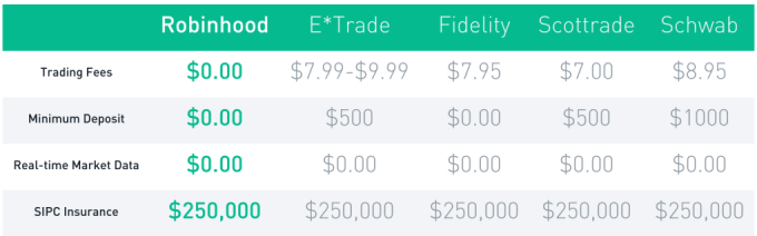
RobinHood is about to let anyone buy and sell stocks for free instead of having to pay E*Trade or Scottrade $7 per transaction. Today RobinHood begins inviting the 160,000 people who’ve signed up to download its glossy new app where you can efficiently track and trade stocks. “It’s by far the most beautiful brokerage app, though that’s not saying much” co-founder Vlad Tenev jokes.
But while RobinHood makes Wall Street look stylish in your pocket, what’s special is what it does, and does for free. That’s letting you trade stocks with zero commission. You might assume it would cost RobinHood money to execute trades, but in fact it can make money by moving yours around. We’ve just been conditioned to assume its something you have to pay for after decades of investors handing Scottrade, E*Trade and other brokerages $7 to $10 for each buy or sell.
Those who want their trading for free can sign up for RobinHood and expect an invitation email over the next few weeks to months. Since you’re trusting it with your savings, RobinHood wants to onboard people with extreme care rather than as fast as possible. But soon it expects to be holding hundreds of millions of dollars for its users so they can make instant trades from their phones.
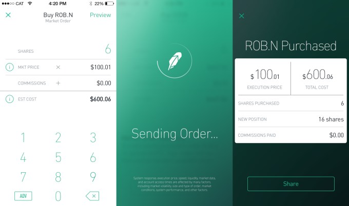
RobinHood gave TechCrunch the first look at its new app, and its investor Google Ventures‘ attention to design is readily apparent. The whole app is themed white or black depending on if the stock market is open or closed. Meanwhile, the app’s chrome goes green or red depending on if the currently viewed stock is up or down that day. This trick tells you at a glance whether you can officially trade or not and how well you’re are doing.
Most finance apps only let you monitor stocks like Yahoo Finance or the first version of RobinHood, or charge you to trade them like those from the big retail brokerages. RobinHood co-founder Baiju Bhatt stresses that if you want to do deep financial research, you probably want to sit down at a desktop. But if you want to check your stocks whenever you have free moment and make some trades when the courage strikes you or whenever something shocks the market, RobinHood lets you do it in a few swipes. [Disclosure: I was friends with Vlad and Baiju in college.]
You can set alerts in case your stocks move a certain percentage, or place limit orders that are executed if the price hits a certain point. When you’re ready to make a live trade, just select how many shares of a stock you want to buy or sell. RobinHood previews how much that will cost or earn you, and you swipe to confirm the trade (which triggers some delightful animations and buzzes). And because security may be the biggest threat to RobinHood, it even lets you set up a special pin code that’s required to open the app.
RobinHood says it will never charge for trading. Right now, it’s supported by over $3 million in funding from Google Ventures, Index Ventures, Andreessen Horowitz, Rothenberg Ventures and some angels. But it plans to quickly become self-sustained by charging other developers for API access, letting users trade on margin (money they’re owed but don’t own yet) for a fee, and through payment for order flow where stock exchanges pay the startup to bring its trading volume to their marketplaces.
For now, though, RobinHood could democratize stock trading. If you were a fat cat trading in the hundreds of thousands or millions, those little $10 fees didn’t mean much. But if you’re not rich and still want to invest, those commissions could add up to eat away at what you earn through smart trading. By replacing brick-and-mortar store fronts and legions of salespeople with an app and a lean engineering team, RobinHood can pass the savings on to its users.
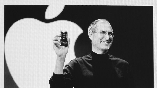
Today marks what would have been Steve Jobs' 59th birthday, and Apple fans around the world are once again remembering the Apple co-founder and CEO more than two years after his death.
Apple CEO Tim Cook is unsurprisingly one of those remembering Jobs today, and Cook has acknowledged the day in a pair of Tweets honoring Jobs and vowing to continue "the work he loved so much".
While remembering Jobs' legacy, Cook may also be indirectly addressing Apple's lack of significant announcements so far in 2014, reminding his followers of Jobs' philosophy on making sure all details are taken care of.
Cook has promised that Apple is working on "some really great stuff" in new product categories, with a smart watch and new television-related products topping the list of rumors. With Apple rarely being a company to rush to market, Cook may be quietly asking for patience as the company continues work on its upcoming products and services.
Coincidentally, today also marks the 14th birthday of MacRumors. Founded in February 2000 before the introduction of the iPad, iPhone, and even the iPod and OS X, the site has grown enormously and fostered the creation of our sister sites TouchArcade andAppShopper. As always, we are grateful to our readers, contributors, sponsors, and all those for whom MacRumors is an online home or a regular stop.

 Groups has been a Facebook feature all the way since the beginning. Back in the 2005 era, they served more as bumper stickers for your profile that organizational communities. College kids would join the “Unidentified Party Injuries” group to trumpet how “cool” they were for getting bruises while drunk.
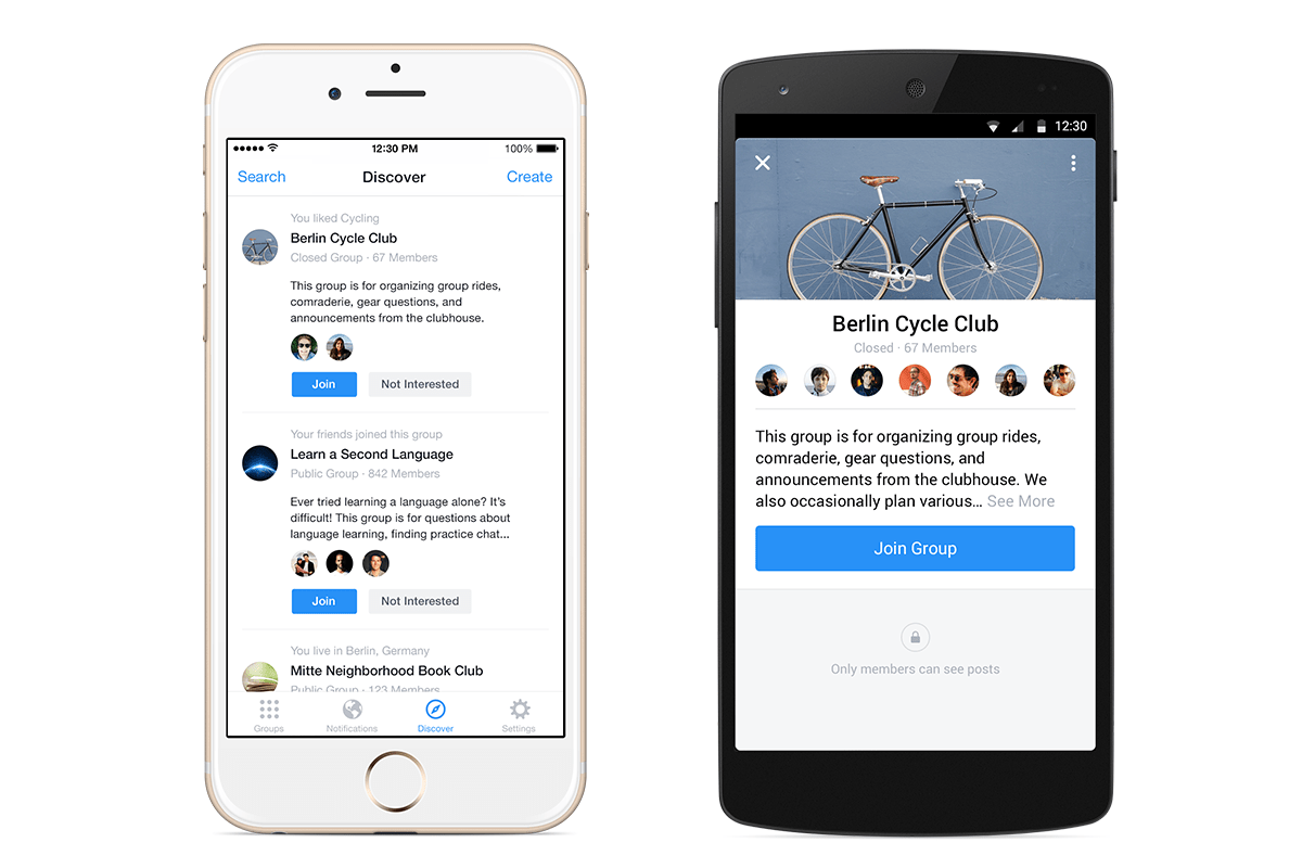
 To stoke growth, Facebook will slowly begin showing a promo for the app atop the mobile Groups of the feature’s most active users and admins.
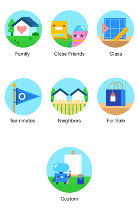 Not everything is fit for the News Feed. Groups works great for purpose-driven communication around projects. But there’s a whole realm of intimate sharing that Groups could host. Facebook tried for years to get people to micro-share to specific friend lists, but the controls can be confusing and there’s always a chance you’ll mis-share to everyone.


 Digg, Milk, and Revision3 founder Kevin Rose recently left Google Ventures to start a new mobile development house called North, and now we have some details on the firm’s first app, Tiiny, which will launch soon. The basic idea is that Tiiny lets you share thumbnail-sized photos and animated GIFs to a grid of pics on your friends’ phones, and they disappear 24 hours later. Rather than making you scroll through full-width photos like Instagram, Tiiny lets you get a constantly-updated look at what lots of your friends are up to in a single glance.


 Both men are also dads, and like most parents, they have mixed feelings about the way today’s tablet computers engage kids’ attention. On the one hand, technologists generally like to see their kids embracing digital tools at young ages.