The following manifesto represents my answer to the question — “As a UX or UI, designer, how do I know when and where to implement motion to support usability?”
Over the last 5 years, it has been my privilege to coach and mentor UX & UI designers in over 40 countries, and at hundreds of the top brands and design consultancies through my workshops and tutorials on UI Animation.
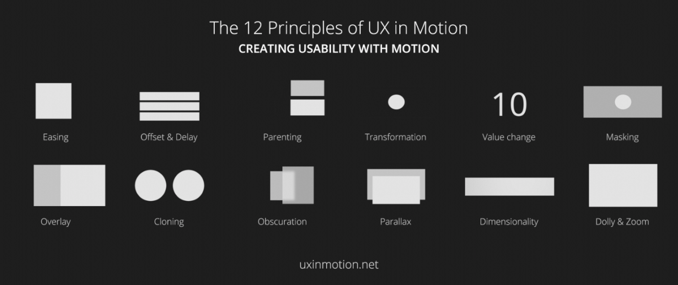
After over fifteen years studying motion in user interfaces, I have come to the conclusion that there are 12 specific opportunities to support usability in your UX projects using motion.
I call these opportunities ‘The 12 Principles of UX in Motion,’ and they can be stacked and combined synergistically in a myriad of innovative ways.
I’ve broken the manifesto into 5 parts:
- Addressing the topic of UI Animation — it’s not what you think
- Realtime vs non-realtime interactions
- Four ways that motion supports usability
- Principles, Techniques, Properties and Values
- The 12 Principles of UX in Motion
As a quick plug, if you want me to speak at your conference or lead an onsite workshop for your team on the exciting topic of motion and usability, go here. If you want to attend a class in your city go here. Finally, if you want me to consult on your project, you can go here. To get added to my list, go here.
It’s not about UI Animation
Because the topic of motion in user interfaces is mostly understood by designers to be ‘UI Animation’—which it is not — I feel like I need to create a bit of context before we jump into the 12 Principles.
‘UI Animation’ is typically thought of by designers as something that makes the user experience more delightful, but overall doesn’t add much value. Thus, UI Animation is often treated like the red-headed stepchild of UX (apologies to red-headed stepchildren everywhere). If at all, it usually comes at the end, as a final lipstick pass.
Additionally, motion in the context of user interfaces has understandably been held to be under the domain of Disney’s 12 Principles of Animation, something I argue against in my article ‘UI Animation Principles — Disney is Dead.’
In my manifesto, I will be making the case that UI Animation is to the ‘12 UX in Motion Principles’ as construction is to architecture.
By this I mean, that while a structure needs to be physically built to exist (requiring construction), the guiding hand which determines what gets built comes from the domain of Principles.
Animation is all about tools. Principles are the practical application of ideas that guide the usage of tools and as such, Principles provide high leverage opportunities for designers.
What most designers think of as ‘UI Animation’ is in fact the execution of a higher modality of design: the temporal behavior of interface objects during realtime and non-realtime events.
Realtime vs non-realtime interactions
At this juncture, it is important to distinguish between ‘state’ and ‘act.’ The state of something in UX is fundamentally static, like a design comp. The act of something in UX is fundamentally temporal, and motion based. An object can be in the state of being masked or it can be in the act of being masked. If it is the latter, we know that motion is involved and in a way that could support usability.
Additionally, all temporal aspects of interaction can be thought of as happening in realtime or non-realtime. Realtime means that the user is directly interacting with the objects in the user interface. Non-realtime means that the object behavior is post-interactive: it occurs after a user action, and is transitional.


This is an important distinction.
Realtime interactions can also be though of as ‘direct manipulation,’ in that the user is interacting with the interface objects directly and immediately. The behavior of the interface is happening as the user is using it.
Non-realtime interactions happen only after input from the user and have the effect of briefly locking the user out of the user experience until the transition completes.
These distinctions will give us leverage as we continue our journey into the world of the 12 Principles of UX in Motion.
Motion supports usability in four ways
These four pillars represent the four ways where the temporal behavior of user experiences supports usability.
Expectation
Expectation fall into two areas — how users perceive what an object is, and how it behaves. Another way of saying this is that as designers, we want to minimize the gap between what the user expects, and what they experience.
Continuity
Continuity speaks both to the user flow and to the ‘consistency’ of the user experience. Continuity can be thought of in terms of ‘intra-continuity’ — the continuity within a scene, and ‘inter-continuity’ — the continuity within a series of scenes that make up the total user experience.
Narrative
Narrative is the linear progression of events in the user experience that results in a temporal/spatial framework. This can be thought of as the series of discreet moments and events that connect together throughout the user experience.
Relationship
Relationship refers to the spatial, temporal, and hierarchal representations between interface objects that guide user understanding and decision making.
Principles, Techniques, Properties, and Values
Tyler Waye says it as good as any when he writes, “Principles… are the underlying premises and rules of function giving rise to any number of techniques. These elements remain consistent, no matter what is happening.” It bears repeating that Principles are agnostic of design.
From there, we can imagine a hierarchy with Principles at the top, Techniques further down, Properties below that, and Values at the bottom.
Techniques can be thought of as the various and unlimited executions of Principles and/or combination of Principles. I think of technique as akin to ‘style.’
Properties are the specific object parameters that are being animated to create the technique. These include (and are not limited to) position, opacity, scale, rotation, anchor point, color, stroke-width, shape, etc.
Values are the actual numeric property values that vary over time to create what we call ‘animation.’
So to land the plane here (and jumping ahead a bit), we could say that a hypothetical UI animation reference is using the Obscuration Principle with a ‘blurred glass’ Technique that affects the Blur and Opacity Properties at a Value of 25px and 70% respectively.
Now we have some tools to work with. And more importantly, these linguistic tools are agnostic of any specific prototyping tool.
The 12 Principles of UX in Motion
Easing and Offset & Delay relate to timing. Parenting relates to object relationship. Transformation, Value Change, Masking, Overlay, and Cloning all relate to object continuity. Parallax relate to temporal hierarchy. Obscuration, Dimensionality and Dolly & Zoom both relate to spatial continuity.

Principle 1: Easing
Object behavior aligns with user expectations when temporal events occur.

All interface objects exhibiting temporal behavior (whether realtime or non-realtime), ease. Easing creates and reinforces the ‘naturalism’ inherent in the seamlessness of user experiences, and creates a sense of continuity when objects behave as users expect them to. Incidentally, Disney refers to this as ‘Slow In and Slow Out.’

The example on the left has linear motion and looks ‘bad.’ The first example up top has eased motion and looks ‘good.’ All three above examples have the exact number of frames and take place over the exact same amount of time. The only difference is in their easing.
As designers concerned with usability, we need to require of ourselves rigor and inquire, aside from aesthetics, which example supports usability more?
The case I am presenting here is that a certain degree of skeuomorphism is inherent in easing. You can imagine an ‘easing gradient’ wherein behaviors that fall outside user expectations result in less usable interactions. In the case of properly eased motion, users experience the motion itself as seamless and largely invisible — which is a good thing in that it is non-distracting. Linear motion is visibly obvious and feels somehow off, unfinished, and jarring, and distracting.
Now I’m going to completely contradict myself here and talk about the example on the right. The motion isn’t seamless. In fact, it has a ‘designed’ feel to it. We notice how the object lands. It feels different, yet it still feels more ‘correct’ than the example with linear motion.
Can you employ easing and still have it not support (or worse case undermine) usability? The answer is yes, and there are several ways. One way is timing. If your timing is too slow (mushy to borrow from Pasquele), or too fast, you can break expectation and distract user attention. Similarly, if your easing is misaligned with the brand or overall experience, this can also negatively impact expectation and seamlessness.
What I want to open you to is a world of opportunity when it comes to eased motion. There are literally an infinite number of ‘easings’ that you as a designer can create and implement in your projects. All of these easings have their own expectation response they trigger in users.
To summarize: when to use easing? Always.
Principle 2: Offset & Delay
Defines object relationships and hierarchies when introducing new elements and scenes.

Offset & Delay is the second of only two UX in Motion Principles that is influenced by Disney’s Animation Principles, in this case from ‘Follow Through and Overlapping Action.’
It is important to note, however, that the implementation, while similar in execution, differs in purpose and outcome. While Disney’s Principles result in ‘more appealing animations,’ the UI Animation Principles result in more usable experiences.
The utility of this principle is that it pre-consciously sets the user up for success by ‘telling’ the user something about the nature of the objects in the interface. The narrative in the above reference is that the top two objects are united and the bottom object is separate. Perhaps the top two objects could be a non-interactive image and text, while the bottom object is a button.
Even before the user registers what these objects are, the designer has already communicated to her—through motion — that the objects are somehow ‘separate.’ This is extremely powerful.

Credit: InVision
In the above example, the floating action button (FAB) transforms into header navigation elements comprised of three buttons. Because the buttons are ‘offset’ from each other temporally, they end up supporting usability through their ‘separateness.’ Said differently, the designer is using time itself to say — even before the user registers what the objects are — that the objects are separate. This has the effect of telling the user, completely independent from the visual design, part of the nature of the objects in the interface.
To better show you how this works, I’ll show you an example that breaks the Offset & Delay Principle.

Credit: Jordi Verdu
In the above example, the static visual design tells us that there are icons over a background. The presumption is that the icons are all separate from each other and do different things. However, the motion contradicts this.
Temporally, the icons are grouped into rows and behave like a single object. Their titles are likewise grouped into rows, and also behave like a single object. The motion is telling the user something other than what her eyes see. In this case, we can say that the temporal behavior of the objects in the interface are not supporting usability.
Principle 3: Parenting
Creates spatial and temporal hierarchal relationships when interacting with multiple objects.

Parenting is a powerful Principle that ‘relates’ objects in the user interface. In the above example, the ‘scale’ and ‘position’ property of the top or ‘child’ object is parented to the ‘position’ property of the bottom or ‘parent’ object.
Parenting is the linking of object properties to other object properties. This creates object relationships and hierarchies in ways that support usability.
Parenting also allows designers to better coordinate temporal events in the user interface, while communicating to users the nature of the object relationships.
Recall that object Properties include the following — Scale, Opacity, Position, Rotation, Shape, Color, Value, etc. Any of these Properties can be linked to any other Properties to create synergistic moments in the User Experience.

Credit: Andrew J Lee, Frank Rapacciuolo
In this above left example, the ‘y-axis’ Property of the ‘face’ element is the ‘child’ to the ‘x-axis’ Property of the round indicator parent. When the round indicator element moves along the horizontal axis, its ‘child’ element moves along with it horizontally and vertically (while being Masked — another Principle).
The result is a hierarchal temporal narrative framework that occurs all at the same time. Of note is that the ‘faces’ object works as a series of ‘lockups’ in that, at each number, the ‘face’ is fully and not partially visible. The user experiences this seamlessly, though we can make the claim there is a subtle ‘usability cheat’ in this example.
Parenting functions best as a ‘realtime’ interaction. As the user directly manipulates the interface objects, the designer communicates to the user — via motion — how the objects are linked, and the relationship between them.
Parenting occurs in 3 forms: ‘direct parenting’ (see above two examples, ‘delayed parenting,’ and ‘inverse parenting,’ see below).


Inverse Parenting (Credit: AgenceMe)
Principle 4: Transformation
Creates a continuous state of narrative flow when object utility changes.

Much has already been written about the UX in Motion Principle ‘transformation.’ In some ways, it is the most obvious and penetrable of the animation principles.
Transformation is the most discernible, largely because it stands out. A ‘submit’ button changing shape to become a radial progress bar and finally changing shape again to become a confirmation check mark is something that we notice. It grabs our attention, tells a story, and has completion.

Credit: Colin Garven
What Transformation does is seamlessly transition the user through the different UX states or ‘is’s’ (as in this is a button, this is a radial progress bar, this is a check mark) which eventually result in a desired outcome. The user has been drawn through these functional spaces to the ultimate destination.
Transformation has the effect of ‘chunking’ cognitively separate key moments in the user experience into a seamless and continuous series of events. This seamlessness results in better user awareness, retention, and followthrough.
Principle 5: Value change
Creates a dynamic and continuous narrative relationship when value subject changes.

Text based interface objects, that is to say numbers and text, can change their values. This is one of those ‘elusive obvious’ concepts.
Text and number changes are so common that they pass us by without us bringing to them distinction and rigor to assess their role in supporting usability
So what is the user experiencing when values change? In user experiences, the 12 UX in Motion Principles are opportunities to support usability. The three opportunities here are to connect the user to the reality behind the data, the concept of agency, and to the dynamic nature of the values themselves.
Let’s look at the example of a user dashboard.


When value based interface objects load with no ‘value change,’ what this conveys to the user is that the numbers are static objects. They’re like painted signs displaying a speed limit of 55 mph.
The numbers and values are representations of things that are happening in reality. That reality could be time, income, game scores, business metrics, fitness tracking, etc. What we are distinguishing through motion is that the ‘value subject’ is dynamic and the values are reflecting something from that dynamic value set.
Not only does this relationship get lost with static objects comprised visually of values, but another deeper opportunity is also lost.
When we employ representations of dynamic systems in the form of motion based values, it activates a sort of ‘neurofeedback.’ Users, grasping the dynamic nature of their data can now be cause in altering those values and are empowered to become agents. When the values are static, there is less connection to the reality behind the values, and users lose their agency.


Credit: Barthelemy Chalvet, Gal Shir, Unknown
The Value Change Principle can occur both in realtime and non-realtime events. In realtime events, the user is interacting with the objects to change values. In non-realtime events, such as loaders and transitions, the values change without user input to reflect a dynamic narrative.
Principle 6: Masking
Creates continuity in an interface object or object group when utility is determined by which part of the object or group is revealed or concealed.

The act of masking asking can be thought of as a relationship between the shape of the object and it’s utility.
Because designers are familiar with ‘masking’ in the context of static design, it behooves us to bring distinction to the UX in Motion Principle ‘Masking’ as it occurs in time, as an act, and not as a state.
Through the temporal use of revealing and concealing regions of an object, utility transitions in a continuous and seamless way. This also has the effect of preserving narrative flow.

Credit: Anish Chandran
In the above example, the header image changes bounding shape and position but not the content, and becomes an album. This has the effect of changing what the object is, while preserving the content within the mask — a fairly neat trick. This occurs in non-realtime, as a transition, that is activated after a user takes an action.
Remember, UI Animation Principles occur temporally and support usability through continuity, narrative, relationship, and expectation. In the above reference, while the object itself remains unchanged, it also has boundary and location, and these two factors determine what the object is.
Principle 7: Overlay
Creates narrative and object spatial relationship in visual flatland when layered objects are location dependent.

Overlay supports usability by allowing users to utilize flatland ordering properties to overcome a lack of non-spatial hierarchies.
To land the plane a bit, Overlay allows designers to use motion to communicate location dependent objects that exist behind or in front of others in non 3D space.

Credit: Bady,

Credit: Javi Pérez
In the example on the left, the foreground object slides to the right to reveal the location of additional background objects. In the example on the right, the entire scene slides down to reveal additional content and options (while using the Offset & Delay Principle to communicate the individuality of the photo objects).
To a certain degree, as designers, the idea of ‘layers’ is so obvious as to be self-evident. We design with layers and the concept of layers are deeply internalized. However, we must be careful to distinguish between the process of ‘making’ verses ‘using.’
As designers who are continually engaged in the process of ‘making,’ we are intimately familiar with all of the pieces of the object (including the hidden pieces) we are designing. As a user, however, those non visible pieces are by definition and practice, hidden both visually and cognitively.
The Overlay Principle allows designers to communicate relationship between ‘z-axis’ positioned layers and in so doing, promote spatial orientation to their users.
Principle 8: Cloning
Creates continuity, relationship and narrative, when new objects originate and depart.
When new objects are created in current scenes (and from current objects), it is important to narratively account for their appearance. In this manifesto, I argue forcefully for the importance of creating a narrative framework for object origin and departure. Simple opacity fades tend to not achieve this result. Masking, Cloning, and Dimensionality are three usability based approaches to produce strong narratives.

Credit: Jakub Antalík,

Credit: Jakub Antalík,

Credit: Unknown
In the above three examples, new objects are created from existing hero objects during the time the user’s attention is focused on those objects. This two fold approach — the directing of attention, and then leading the eye through the creation of a cloned new object — has the strong effect of communicating a clear and unambiguous chain of events: that action ‘x’ has the result ‘y’ of the creation of new child objects.
Principle 9: Obscuration
Allows users to spatially orient themselves in relationship to objects or scenes not in the primary visual hierarchy.

Similar to the UX in Motion Principles of Masking, Obscuration lives as both a static and temporal phenomena.
This can be confusing to designers who don’t have experience thinking temporally — that is, the moments between moments. Designers typically design screen to screen or task to task. Think of Obscuration as the act of being obscured and not the state of being obscured. A static design represents the state of being obscured. Introducing time gives us the act of an object being obscured.

Credit: Virgil Pana,

Credit: Apple
From the above two examples, we can see that obscuration, which looks liketransparent objects or overlays, is also a temporal interaction involving multiple properties in time.
Various common techniques of this involve blur effects and a lessoning of overall object transparency. The user is made aware of an additional non primary context that she is operating in — that there is another world, as it were, ‘behind’ her primary object hierarchy.
Obscuration allows designers to compensate for a single unified field of view, or ‘objective view,’ in user experiences.
Principle 10: Parallax
Creates spatial hierarchy in visual flatland when users scroll.

‘Parallax,’ as a UX in Motion Principle describes different interface objects moving at different rates.
Parallax allows user to focus on primary actions and content while maintaining design integrity. Background elements ‘recede’ perceptually and cognitively for the user during a Parallax event. Designers can use Parallax to separate out immediacy content from ambient or supportive content.

Credit: Austin Neill

Credit: Michael Sevilla
The effect this has on the user, is to clearly define for the duration of the interaction, the various object relationships. Foreground objects, or objects that move ‘quicker’ appear to the user as ‘closer.’ Likewise, background objects or objects that move ‘slower’ are perceived as being ‘further away.’
Designers can create these relationships, using time itself, to tell the user what objects in the interface are higher priority. Therefore it makes sense to push background or non-interactive elements further ‘back.’
Not only does the user perceive the interface objects as now having a hierarchy beyond that which is determined in the visual design, but this hierarchy can now be leveraged into having the user grasp the nature of the user experience before being consciously aware of the design/content.
Principle 11: Dimensionality
Provides a spatial narrative framework when new objects originate and depart.

Critical to User Experiences is the phenomenon of continuity as well as the sense of location.
Dimensionality provides a powerful way to overcome the flatland non-logic of User Experiences.
Humans are remarkably adept at using spatial frameworks to navigate both in the real world and in digital experiences. Providing spatial origin and departure references helps reinforce mental models of where users are in the UX.
Additionally, the Dimensionality Principle overcomes the layering paradox in visual flatland wherein objects lacking depth exist on the same plane but occur as ‘in front of’ or ‘behind’ other objects.
Dimensionality presents itself in three ways — Origami Dimensionality, Floating Dimensionality, and Object Dimensionality.
Origami Dimensionality can be thought of in terms of ‘folding’ or ‘hinged’ three dimensional interface objects.

Examples of Origami Dimensionality (Credit: Eddie Lobanovskiy

Examples of Origami Dimensionality (Credit: Virgil Pana
Because multiple objects are combined into ‘origami’ structures, the hidden objects still can be said to ‘exist,’ spatially even though they are not visible. This effectively renders the User Experience as a continuous spatial event that the user navigates and creates an operating context both in the interaction model itself, and in the temporal behavior of the interface objects themselves.
Floating Dimensionality gives interface objects a spatial origin and departure, making the interaction models intuitive and highly narrative.

Example of Floating Dimensionality (Credit: Virgil Pana)
In the above example, Dimensionality is achieved through the use of 3D ‘cards.’ This provides a strong narrative framework that supports the visual design. The narrative is extended by ‘flipping’ the cards to access additional content and interactivity. Dimensionality can be a powerful way to introduce new elements in ways that minimize abruptness.
Object Dimensionality results in dimensional objects with true depth and form.

Examples of Object Dimensionality (Credit: Issara Willenskomer

Examples of Object Dimensionality Credit: Creativedashr
Here, multiple 2D layers are arranged in 3D space to form true dimensional objects. Their dimensionality is revealed during realtime and non-realtime transitional moments. The utility of Object Dimensionality is that users develop a keen awareness of object utility based on non-visible spatial locations.
Principle 12: Dolly & Zoom
Preserves continuity and spatial narrative when navigating interface objects and spaces.

Dolly and Zoom are filmic concepts referring to the movement of objects relevant to the camera, and the size of the image itself in the frame smoothly changing from a long shot to a close up shot (or vice versa).
In certain contexts, it is impossible to tell if an object is zooming, if it is moving towards the camera in 3D space, or if the camera is moving towards the object in 3D space (see below references). The below three examples illustrate the possible scenarios.

Is the layer dollying, zooming, or is the camera moving?
As such, it is appropriate to treat the instances of ‘dollying’ and ‘zooming’ as separate but similar in that they involve continuous element and scenic transformations, and meet the requirements of the UX in Motion Principles: they support usability through motion.


The two images on the left are dollying, while the image on the right is zooming
Dolly is a film term and applies to camera movement either toward or away from a subject (it also applies to horizontal ‘tracking’ movement as well, but is less relevant in a usability context).

Credit: Apple
Spatially in UX, this motion could refer either to a change in the viewers perspective, or to the perspective remaining static while the object changes position. The Dolly Principle supports usability through continuity and narrative, seamlessly transitioning between interface objects and destinations. Dolly can also incorporate the Dimensionality Principle, resulting in a more spatial experience, more depth, and communicating to the user additional areas or content that is ‘in front’ or ‘behind’ the current view.
Zoom refers to events where neither the perspective nor the object is moving spatially, but rather the object itself is scaling (or our view of it is decreasing, resulting in the image enlarging). This communicates to the viewer that additional interface objects are ‘inside’ other objects or scenes.

Credit: Apple
This allows for seamless transitions — both realtime and non-realtime — that support usability. This seamlessness employed in the Dolly & Zoom Principle is quite powerful when it comes to creating spatial mental models.