
I’ve always been a huge fan of Starbucks; my favorite drink as a kid was a Caramel Frappuccino (shout-out to mom & dad for allowing me to have all that sugar), my go-to study spot was the corner table at Starbucks off Oceanside Blvd, and my very first job in high school was as a Starbucks barista. It only makes sense that the Starbucks app is one of my favorites and is one I use often.
Though I’m quite familiar with the app, there are still things about its navigation that I think could use some work. To figure out if other users have experienced similar issues, I set out to test some Starbucks drinkers to see if I could uncover ways to improve the app’s user experience.
The Challenge
Run a guerrilla usability test to identify pain points in navigating the Starbucks app for mobile ordering.
Step 1: Identify & Understand Users
To figure out who I should run my guerrilla usability tests on, I came up with provisional personas of who I believe are the core Starbucks app users. This helped me understand the mindset of the users and further prioritize their needs and goals.

Usability Testing
Using my personas, I went out to find 6 Starbucks drinkers to run through a usability test on the Starbucks app.
Each user was given questions and scenarios/tasks to help me identify their main objectives for using the app and pain points within the app.
Prior to running through the app, each user was asked what they use the app for or why they would download the app in the first place. Once that was answered, each user was tasked with:
- Navigate the homepage to order a drink for pick-up
- Find a nearby store to order drinks for pick-up
- Pick a drink and make modifications to it
- Confirm the order
Step 2: Synthesize
After reviewing my usability tests, I sorted each pain point to identify trends.

(L) Pain points sorted by users (R) Pain points sorted by categories
The following 5 pain points were the main issues I came across:
- Store and Order Navigation
Users who clicked on the “stores” button had trouble figuring out how to place their mobile order at their preferred store.
2. Homepage layout
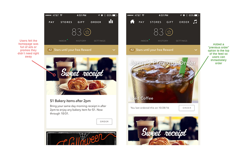
Users felt the homepage was “just full of ads”; they voiced they only needed the pay, order, and reward options to have a “good app”.
3. Menu layout
All users said it was difficult to find specific drinks and the image menu was not organized in an intuitive way.
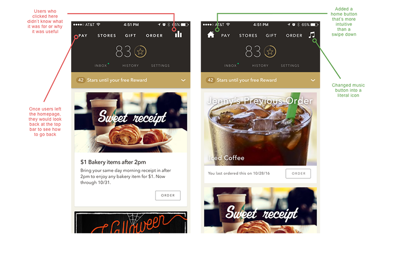
4. Missing home/back button
All users hesitated before realizing they could swipe down to get back to the homepage. Some users swiped down and accidentally brought their iPhone notifications menu down instead.
5. Customizations
Users who made customizations to their drinks before updating drink size had to re-do all their customizations since ingredient ratios (i.e. standard amount of espresso shots, syrups, foam, etc.) were dependent on drink size.

Step 3: Ideate Solutions
Upon reviewing the pain points, I felt the biggest takeaway was to make the app as easy as possible to order drinks ahead of time. Given that all pain points were connected to this, I decided to tackle all 5 problems to create a better experience for users and to ultimately help Starbucks sell more coffee.
Disclaimer: in a more realistic scenario, this would depend on time and resources. In the case that I was limited with both, I would prioritize on creating solutions for those that fall higher up in the top right quadrant in the 2x2.
Solution 1: Add an “order for item pick-up” button to the “stores” navigation
Currently if a user chooses “stores” to find a store to order ahead, they only have options to get directions, place a call, or add it as a wallet favorite.
To place a mobile order, they would have to go back and click on “order”, find a store within the “order” navigation, then confirm their order.
Current task flow:

By adding an “order for item pick-up” button, the dead-end is eliminated and a user can skip directly to ordering with their preferred store already in place.
Redesigned task flow:


Solution #2: Include a “previous order” (this could also be swapped in with “favorites”) on the home screen
Users felt the homepage was full of unnecessary “ads”. To fix this, I thought it was helpful to include a “previous order” screen on the homepage feed to enable a more efficient ordering process.
I also decided to keep the promos/ads on the same page, partially above-the-fold, so users who are looking for promotions or rewards would know they’re still available.
Solution #3: Add a starring system so users can see “favorites” on the menu
Currently the menu has random items populated on the menu page. With favorites, users can see their go-to items at glance, saving them time from having to filter through unwanted menu items.

Solution #4: Add a visible home button
Swiping down to get back to the homepage was not intuitive. To make it easier, I included a home icon. In addition, I also changed the music icon to a music note, as some users voiced they did not understand what the bars meant.
Solution #5: Make the size options more visible
Half of the users skipped on picking their size first, which ultimately lead them to re-input all their customizations.
To encourage users to choose a size first, I laid out all 3 sizes on the page so users would not have to click on “grande” (all drinks are defaulted to grande) to see them.

Step 4: Validate
To validate my redesigns, I tasked 6 users with the same tasks as those in step 1. I also included new questions regarding the starring system to see if they understood the purpose of the stars.
Using my interactive prototype, users were able to complete the tasks without the pain points from the beginning.
Check out my interactive prototype here!
One thing that did come up during testing that I’d be interested to look into in the future is how effective starring is for a user with multiple favorites (i.e. if a user stars 6+ drinks and the menu screen is full of solid white stars).With more time, I’d like to A/B test different UIs to see what works best.
Conclusion
Doing a guerrilla usability test on Starbucks was a great way to help me work on my design process. It was a challenge to take on an app that already has great reviews (4.5 stars on iTunes). However, I hope my design suggestions show that with time & research, there’s always ways to find improvements for an app’s user experience.
Thanks so much for checking out my post! I hope it was a fun read and I encourage all Starbucks lovers out there to use the app and see if there’s anything else you’d like to improve.