Designers know that design is more than good looks. Design also covers how users engage with a product, whether it’s a website or app. It’s like a conversation. Navigation is a conversation. Because it doesn’t matter how good your site or app is if users can’t find their way around it.
Why Bottom Navigation is so Important?
Steven Hoober in his research of mobile devices usage, found that 49% of people rely on a one thumb to get things done on their phones. In figure below, the diagram that appears on the mobile phones’ screens are approximate reach charts, in which the colors indicate what areas a user can reach with the thumb to interact with the screen. Green indicates the area a user can reach easily; yellow, an area that requires a stretch; and red, an area that requires users to shift the way in which they’re holding a device.

Representation of the comfort of a person’s one-handed reach on a smartphone. Image Source: uxmatters
It’s important to place top-level and frequently-used actions at the bottom of the screen, because they are comfortably reached with one-thumb interactions.
Tab Bar
Many apps follow this rule and use the bottom navigation (a.k.a. tab bar) for the most important app’s features. Facebook makes main pieces of core functionality available with one tap, allows rapid switching between features.

Facebook bottom tab bar for iOS
3 Crucial Moments for Bottom Navigation Design
Navigation is generally the vehicle that takes users where they want to go. And bottom navigation should be used for the top-level destinations of similar importance. These destinations requiring direct access from anywhere in the app.
Good bottom navigation design follows these three rules.
1. Show Only the Most Important Destinations
Use three to five top-level destinations in bottom navigation. If there are fewer than three destinations, consider using tabs instead.

Avoid using more than five destinations in bottom navigation as tap targets will be situated too close to one another. Putting too many tabs in a tab bar can make it physically difficult for people to tap the one they want. And with each additional tab you display, you increase the complexity of your app.

If your top-level navigation has more than five destinations, provide access to destinations not covered in bottom navigation through alternative locations.
Avoid Scrollable Content
Partially hidden navigation is a pretty obvious solution for small screens — you don’t have to worry about the limited screen estate, just place your navigation options into a scrollable tab. But scrollable content is less efficient, since you have to scroll once before you’re even allowed to see the option you want.

“Out of sight, out of mind” problem in Rookie Cam app for iOS.
2. Communicate the Current Location
Failing to indicate the current location is probably the single most common mistake to see on apps menus. “Where am I?” is one of the fundamental questions users need to answer to successfully navigate.
Users should know how to go from point A to point B based on their first glance and without any guidance from the outside. You should use the proper visual cues (icons, labels and colors) so that the navigation doesn’t require any explanation.
Icons
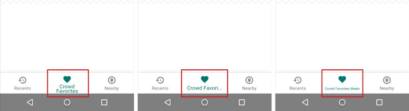
Because bottom navigation actions are presented as icons, they should be used for content that can be suitably communicated with icons. There are a universal icons that users know well, mostly those representing functionality like search, email, print and so on. Unfortunately “universal” icons are rare. And app designers often hide functionality behind icons that are actually pretty hard to recognize.

Previous version of Bloom.fm app for Android. It’s really hard to understand current location for user.
I’ve highlighted this problem in article Icons as Part of an Awesome User Experience.
Color
Avoid using different colored icons and text labels in your bottom tab bar. Instead use the app’s primary color to indicate the view in focus.

Left: Different colored icons makes your app look like a christmas tree. Right: Use only one primary color insead.
Follow a simple rule — tint the current bottom navigation action (including the icon and any text label present) with the app’s primary color.

Bottom bar menu in Twitter app for iOS. Messages view is active
If the bottom navigation bar is colored, make the icon and text label of the current action black or white.

Left: Avoid pairing colored icons with a colored bottom navigation bar. Right: Use black or white iconography.
Text Labels
Text labels should provide short and meaningfully definitions to navigation icons. Avoid long text labels as these labels do not truncate or wrap.
Avoid wrapping, truncating and shrinking text labels.
Menu elements should be easy to scan. Users should be able to understand what exactly happens when they tap on a element.
Target Size
Make targets big enough to be easily tapped or clicked. To calculate the width of each bottom navigation action, divide the width of the view by the number of actions. Alternatively, make all bottom navigation actions the width of the largest action.
Android guideline suggest following dimensions for the bottom navigation bar on mobile.

Fixed bottom navigation bar on mobile. Units in density-independent pixels (dp). Source: Material Design.
Badge on a Tab
You can display a badge on a tab bar icon to indicate that there is new information associated with that view or mode.

Consider badging a tab bar icon to communicate unobtrusively.
3. Make Navigation Self-Evident
Good navigation should feel like an invisible hand that guides the user along their journey. After all, even the coolest feature or the most compelling content is useless if people can’t find it.
Behavior
Each bottom navigation icon must lead to a target destination, and may not open menus or other pop-ups. Tapping on a bottom navigation icon should guide user directly to the associated view, or refreshes the currently active view.

Don’t use a tab bar to give users controls that act on elements in the current screen or app mode. If you need to provide controls use a toolbar instead.

Toolbar for iOS.
Strive for Consistency
As much as possible, display the same tabs in every orientation. It’s best when you can give users a sense of visual stability by providing the same tabs in every orientation.
Don’t remove a tab when its function is unavailable. If you remove a tab in some cases but not in others, you make your app’s UI unstable and unpredictable. The best solution is to ensure that all tabs are enabled, but explain why a tab’s content is unavailable. For example, if the user doesn’t have offline files, the Offline tab in the Dropbox app displays a screen that explains how to have them. This feature called Empty state.
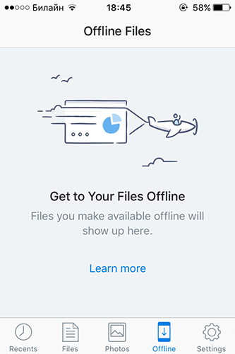
Empty state screen for Dropbox app.
Hide It
If the screen is a scrolling feed, the tab bar can be hidden when people scrolling for new content and revealed if they start pulling down trying to get back to the top.
The bottom navigation bar can appear and disappear dynamically upon scrolling.
Visual Delight
Avoid using lateral motion to transition between views. Transition between active and inactive views should use a cross-fade animation.
Cross-fade animation. Source: Material Design.
Takeaways
- Bottom navigation should be
- Visible and Well-Structured (Use three to five top-level destinations and avoid scrollable content in bottom navigation).
- Clear (Bar elements should be easy to scan and targets should be big enough to be easily tapped).
- Simple (Make sure that each navigation icon lead to the proper destination and use all elements, including bottom navigation, across your application consistently).
Conclusion
Helping users navigate should be a high priority for almost every site and app. The goal behind this moments is to create an interaction system that naturally aligns with the user’s mental models.
You’re designing for your users. Always think about your user persona, think about the goals they have when using your app, and use your navigation to help them meet those goals. The easier your product is for them to use, the more likely they’ll be to use it.