
A journey in design & storytelling
A little more than a year ago I joined the Facebook Photos team with the goal of exploring what could be the future of storytelling on Facebook. We felt like it was time for us to modernize our platform and better help people share their stories. We gathered a small team and started doing some research and prototyping.
The Problem
Telling a good story is hard. Photos and videos go a long way (even though we didn’t support letting you post both at the same time), but it’s only when they’re ordered and presented in the right way with the right context that suddenly a story becomes interesting for the viewer. People usually end up sharing all of their photos from a moment into an album, without curating or captioning, which is often quite hard to consume/relate to for the viewer.
We uncovered the problem by working with our Research team and Data Analysis team on identifying what were the main issues today that were preventing people from telling their stories. Our findings indicated that a lot of photos in people camera rolls were photos they took with the intention to share them, but never did. People often pointed out how difficult it is to pick the best photos out of a moment: once you’ve taken tons of selfies, five or six photos of that same waterfall… picking the few photos that will really show your friends how great your hiking trip or your dinner party was feels like a lot of work — and people very often end up forgetting to share the story. This seemed like a problem we could try to tackle and help people share the photos that mattered to them the most.

As we take more and more photos, picking which ones to share has become a lot harder.
Our process
Based on our research, our team worked on figuring out some principles that would guide us through our design journey. When building a product, a lot of decisions have to be made on a daily basis that will influence a lot the final outcome. A good set of design principles can add a point of view and influence every decision, to make sure they’re aligned with the original problem you’re trying to solve.
We agreed that we wanted to build a product that would:
- Help people remember they have stories to share
- Make it fast and easy to share a rich & visual story
- Design a format that makes people proud of the story they share, and makes the consumption experience engaging & fast.
We then started exploring what the ideal consumption experience could be. After a few white-boarding sessions, we came up with a few ideas that we started designing and prototyping: a flip-book, a long vertical story with blocks of texts, maps and photos, a book-like interface, a collage, a video…
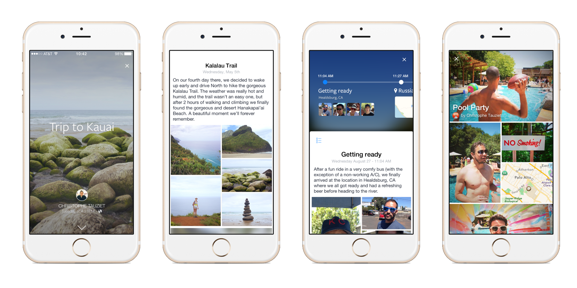
A few early concepts I designed and prototyped for the consumption experience
Design Prototyping
It’s no secret that many of us on the Facebook Design team use prototyping tools to create high-fidelity demos that show how a feature would look and feel when actually using it. To design collage, I mainly used Framer.js and Origami, and prototyped end-to-end demos of some of these concepts and interactions. Building quick prototypes allowed us to get a better feeling of what would be the experience for someone consuming one of these stories on their phone. While some interactions felt very compelling — for example, swiping down to reveal an interactive timeline of the story — we knew we needed to build a flexible system that would require as little input as possible from the user. We also worked on stripping away the distractions and focus on what really mattered.
Prototyping allowed us to quickly eliminate the concepts that didn’t feel good enough, and to validate/test the ones that had more potential.
A dozen of prototypes later, we settled on the collage grid as being the most flexible foundation for our product. We realized this format had the benefits of supporting all kinds of media types (photos, videos, text, maps…), and was very dense, which meant stories would be fast to scroll through and consume, and the individual photos and/or videos wouldn’t have to stand on their own and be high quality.
As we were making progress on the consumption experience, we started thinking about what would be an easy way for people to create these stories. We also decided to only focus on photos and videos at first, and started exploring how to automatically generate drafts of the stories people would then be able to curate and share.

A few concepts I prototyped for the photo picker experience.
Designing our North Star
As our Director of Design Julie Zhuo suggests in her article “Design’s North Star”, it’s very important in the design process of a product to communicate what the high-level narrative of your vision is. What do you want your product to look like 2 years from now? Why is this product so exciting and how will it improve people’s lives?
Combining all of the learnings we had made during our explorations, we started designing what we imagined the final state of our product would be, putting aside the details or technical constraints, and shared it internally with the other teams at Facebook to kick off some discussions.
Research & Internal Testing
Once we had defined our North Star, we started working on simplifying our product to its core minimum.
- What were the fundamental things that this product was doing that Facebook wasn’t offering already?
- Out of all these things, which ones were most likely to immediately provide value to people?
We designed our minimum viable product and started working with our Research team on how we could validate some of our assumptions by putting our designs into real people’s hands. To make sure people would interact with a prototype that would use their actual camera roll, our engineers built a standalone iOS app that would group photos and videos in the camera roll by time and location, and would display each moment as a collage.
In our usability testing lab, our Research team helped us identify a number of valuable criteria about how people perceived their photos and what they consider interesting to share. We also had a chance to answer some of our questions: What do people consider a good story? What curation tools do people need? What do people want to see in their News Feed?
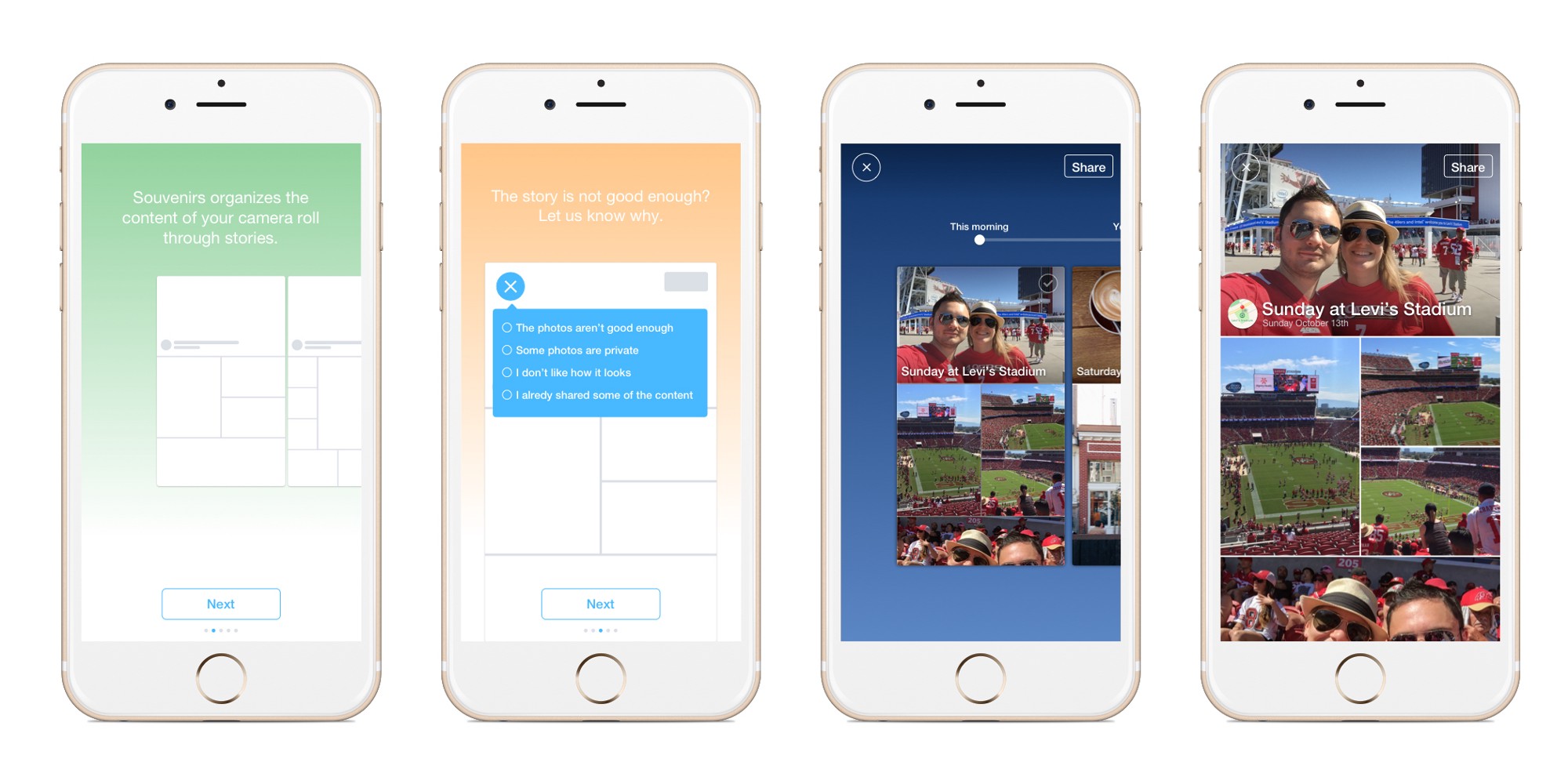
We also made the feature available to all Facebook employees and started gathering feedback. Employees were able to look at their camera roll organized through stories, and give us the feedback wether a story was shareable or not, and why. Using this data and what we had learned in the Research lab we started to tweak our algorithm and make some improvements to the stories themselves. We quickly identified that people didn’t want to share collages that had a bunch of the same photo repeated again and again, so we worked to combine similar photos into animated slideshows — people loved this.
The internal prototype we built as a standalone app.
Building the real thing
Now that we had something we felt pretty good about, we started moving some of our code into the main Facebook app. It was also time for me, as a designer, to start polishing some of the elements of the UI and craft the interactions and layouts.

We started refining the details of our MVP, stripping out the elements that weren’t needed, and making sure we had the best solution we could come up with for every step of the flow. As part of this refinement, I designed dozens of entry points for the suggestions, dozens of headers for the stories, or attachments for the News Feed post that would go with a story. Making all of these iterations and explorations is long and hard process that forces the designer to never fall in love with any of any single design, and to continuously look for a better solution.
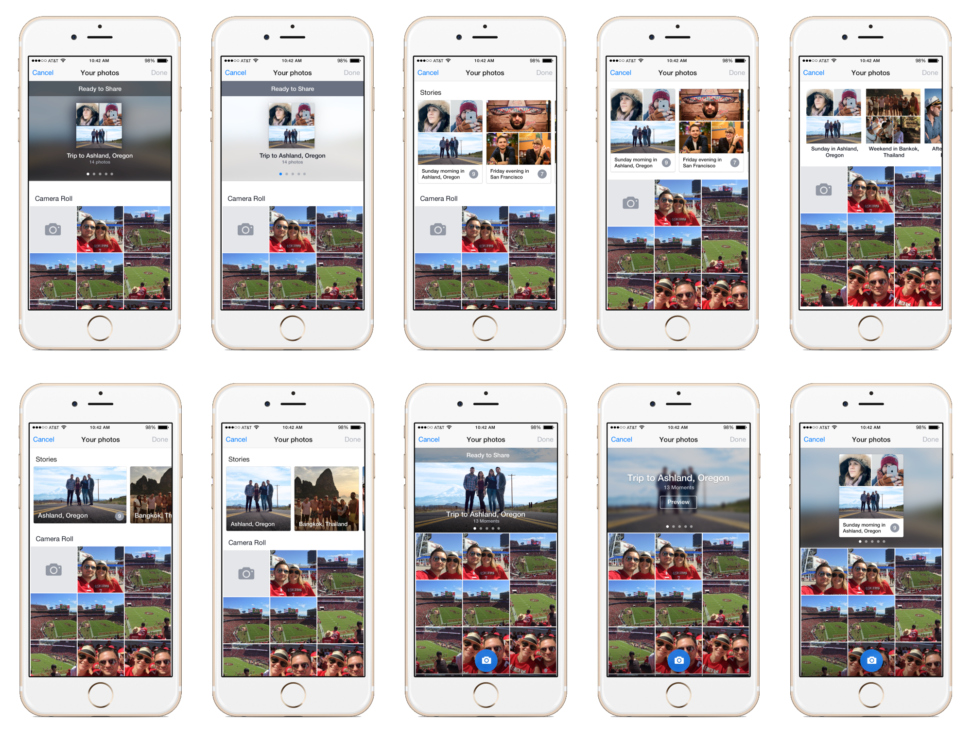
Some of our explorations of the visual treatment for displaying our story suggestions at the top of the camera roll.
Public test
When building products at scale, you make tons of design decisions on a daily basis that are mostly based on hypothesis and your understanding of the problem. There is nothing more effective than testing these hypothesis by launching some public experiments and getting data as early as possible. Usability testing can go a long way and help unblock some difficult design decisions. But a public test will give you a sense of what impact your product or feature has on the overall system. It will also give you a better understanding of how people interact with the product:
- When and where are people dropping out of the flow?
- Do people easily discover X or Y, etc. How do they use Z?
It’s also usually a good way to test the performance and stability of your product without breaking the experience for all of your users.
As we often do at Facebook, we ran a public test for our product. Our main goal was to confirm that our product was actually helping people by solving the problems we had identified, as well as testing some of our hypothesis and better understand how people would use our features. We launched the product in Sweden, Norway and Denmark so we could see the social effects of launching this brand new format.
Designing the web and Android experience was essential to launching a public test.
Shipping
Alongside running the test in Scandinavia, we continued polishing our experience, mainly by focusing on our set of curation tools, and on the performance and stability of the product. We also started ramping up our marketing efforts, working with our research, marketing and content strategy teams on finding a name (Collage!), preparing screenshots, shooting a video... and other efforts to get ready for launch.
Lessons learned
When designing products, it’s always good to look back at the journey and try to identify the things you could have done better, so you can apply your learning to your future projects. It’s also important to reflect on the learnings you’ve made about people’s behaviors, since that’s often the key to identifying the next set of problems to solve.
We gathered as a team, and looked back at our original goals. We ran a survey with the people who had used the product, which helped us better understand how close we got to achieving our goals:
- Support people, and give them control — we were able to create a product that suggests stories to people by organizing their photos and videos into Collages, reduces the number of duplicates, and offers them the tools to be creative and give their voice to their stories.
- Create a way to share pride — Photos are pride. We found time and time again in testing this product that people loved that we made it fast and easy to share a rich & visual story that makes them proud of their photos.
We live in an age of information overload. Everyone takes a bazillion photos. Over time, it has become a real need to be reminded of what you’ve taken. Memories are meant to be shared, and it’s important for technology to help us figure out what and how we can share our daily moments.
While designing Collage, we learned there’s no perfect way to generate stories that will satisfy every user. A subset of people will be perfectly fine with a few blurry selfies they took at the mall and are okay with sharing them, while other users will only care about sharing the photos of their travels. We also learned that people are generally happy with auto-generated stories that aren’t perfect as long as you provide straightforward tools to curate/craft them. Finally, we learned that building a product that impacts the rest of the system is hard to get right, and will often expose the product to a lot of internal feedback.
Designing Collage has been an incredible adventure so far, and I’m looking forward to improving the product over the next few months, and to seeing the great stories people will share on Facebook.
https://www.facebook.com/facebook/videos/10154229637801729/