Credits: Hanna Jung
Cards are neat little containers for information. They became almost a default option when it comes to balancing clear aesthetics with simple usability. First introduced by services like Pinterest and Facebook, today the influence of cards is spreading out across multiple industries.

Pinterest introduced the idea that all the most relevant information about a single topic can be organized into a single container
Implemented correctly, cards can improve the UX aspect of an app. In this article, I’ll desribe 5 useful techniques for cards and provide some helpful examples.
1. Follow a Rule “One Card, One Concept”
All content within a card should relate to only one idea. Card can contain multiple elements within a design, but each should focus on only one bit of information or content. This gives users the opportunity to select the parts of your content they want to consume or share.
One block (or card) “contains” one chunk of user interaction
2. Make the Entire Card Clickable
Follow the Fitts’s Law and allow the user to click/tap any part of the card, not just the text link or image. Larger touch zone substantially improves usability on both touchscreen devices and mouse-based devices.
Tip: It’s good when cards use a slight drop shadow to show depth, which is a visual signifier of clickability.

Card design uses a slight drop shadow as a signifier that the entire card is clickable. Credits: nngroup
3. Make Card Visually Pleasing
What makes cards work is good design and great usability. By giving cards a bit of aesthetic polish, your card design feels familiar yet still creative.

Credits: Piper Lawson
When it comes to the actual design of cards, you’ll need to focus on following moments:
Images
Going heavy on images is a strength of card-based design. Studies confirmthat images elevate design. Thus, emphasis on using images makes card-based design more attractive to users.

Credits: Dave Gamache
Shadows and Gradients
Shadows and gradients go a long way in making users relate to the cards as they would with their physical counterparts. But consider carefully how you use shadows and gradients: if the shadows are cast at all corners and sides, then the illusion of card being a physical object is ruined.

Card design with rounded corners visually resembles a playing card. Credits: Material Design
Typography
You can also draw users’ attention with the use of text. Everything about a card design should be easy to read and understand. You should design for maximum readability:
- Opt for simple typefaces and easy to read color schemes (text is most legible when placed on a solid color background with a sufficient contrast ratio to the text).
- Try to limit the number of typefaces as well. For most card projects a single typeface is enough.
Tip: A sans-serif typeface with normal weight works great for card body copy.

Credits: maconprinting
4. Limit Content in Card
A card is usually short and offers a linked entry point to further details, rather than the full details themselves. When you try to put into a card too much content, to the point that the card starts to get too wide or too long, it loses its original metaphor since it doesn’t look like a card anymore.
Below you can see an example of a card-based user interface. Notice the card in the center. The problem here is that it’s full of information and this makes it difficult to scan.
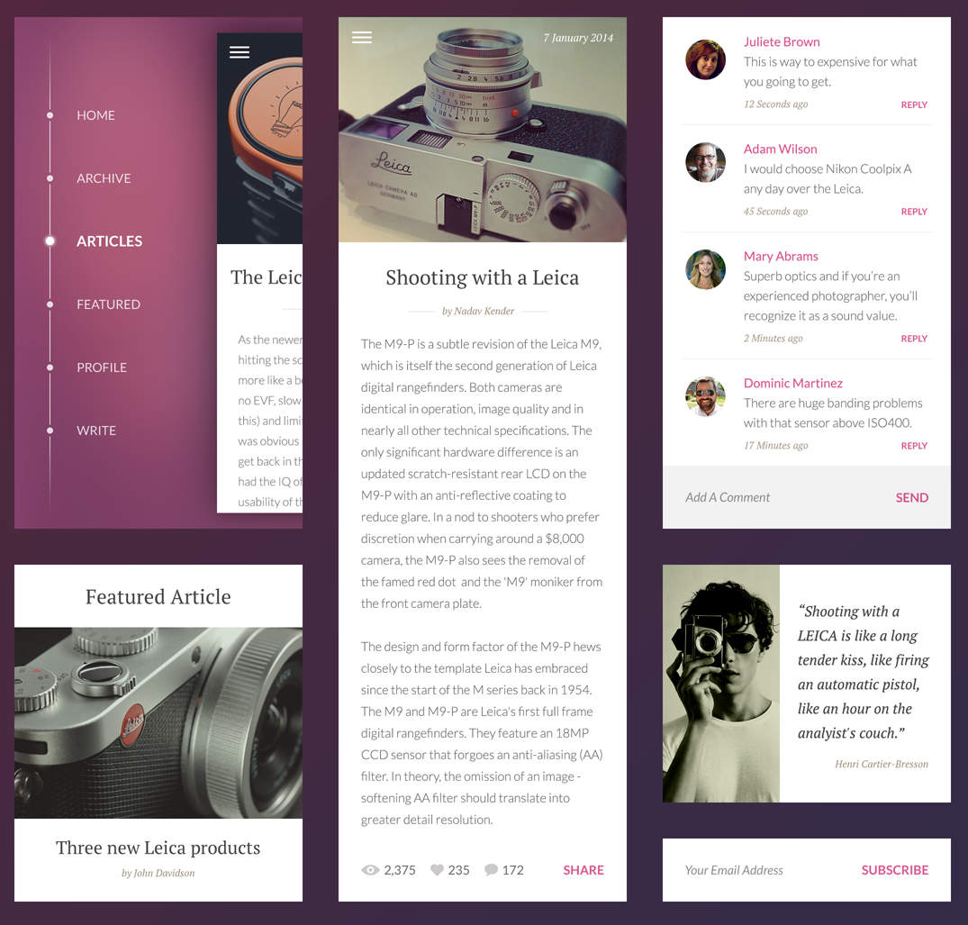
Credits: Piotr Adam Kwiatkowski
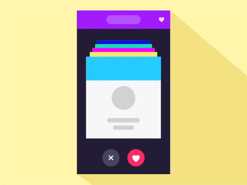
5. Take Advantage of Animation and Movement
Animation can contribute heavily to the user experience if used correctly. It helps people orient themselves within the card-based interface and establishvisual relationships between different states for each card.
Visual Hints
Visual hints assist users to better understand how to interact with user interface. This type of animation is used when you need to demonstrate how certain functionality in the design operates.

Hint to exhibit navigation functionality. Credits: Barthelemy Chalvet
Visual Feedback
Visual feedback is extremely important in UI design. It works because it appeal to the user’s natural desire for acknowledgement. In real life, objects respond to our interaction, and this is how people expect things to work. For desktop apps or sites you can use hover effect to show that the element is interactive. Hover animation adds a level of discoverability, and at the same time makes the experience more fun.

Apply hover animations to the cards. Credits: uxpin
Using hover effect you can also reveal options. In example below hover effect allow user to make color tagging, reply, forward or delete message.

Credits: Roman Shkolny
Zoom In
This animation creates a transition between preview and detailed view: a user selects an item (card) and immediately sees a detailed information that is associated with that selection. The challenge here is to make sure the user feels they are stay in the given context.

Animation helps you associate a thumbnail with its detailed view. Credits: Charles Patterson
Conclusion
Cards are then new creative canvas. They are more than just a look, cards are one of the most flexible layout formats for creating rich content experiences.