If you are an experienced designer, you probably agree that being inspired by others is not stealing in UI design. It’s best practice research. It’s using design patterns. It’s following the guidelines. It’s making sure to use patterns that your users are familiar with to create usable interfaces.
Some might say that sticking to the guidelines and following others will kill creativity and, at the end of the day, all apps will look the same. From a UX perspective I see a different problem. Getting used to adapting best practices might make you believe that Google / Facebook / Instagram / [your favorite app here] is always right, their design goals are the same as yours and you fail to question them. Here are a few patterns that are (or used to be) considered best practices and yet might not be as good as you’d think at first sight.
1. Hidden navigation
At least half million posts have been written about the hamburger menu, mostly by designers, arguing against it. If you missed all, read one or two, but in a nutshell, it’s not about the icon itself but rather about hiding the navigation behind an icon.

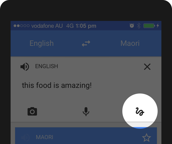
A slide menu is flexible and convenint to use
This solution is pretty tempting and convenient for a designer: you don’t have to worry about the limited screen estate, just squeeze your whole navigation into a scrollable overlay that is hidden by default.
Experiments show, however, that exposing menu options in a more visible way increases engagement, user satisfaction and even revenue. That’s why now all the big players are shifting from hamburger menus towards making the most relevant navigation options always visible.

YouTube navigation change annotated by Luke Wroblewski
If your navigation is complex, hiding it does not make it mobile friendly. Prioritization does.
2. Icons, icons everywhere
Due to the limited screen estate, it also seems a no brainer to save space by replacing text labels with icons wherever possible. Pictograms take less space, they don’t have to be translated, and people are familiar with these after all, right? And every other app does that.
With this assumption in mind, app designers sometimes hide functionality behind icons that are actually pretty hard to recognize. Would you guess, for example, that you can send direct messages behind this icon in Instagram?

Or, assuming that you never used Google Translate before, what functionality would you expect to access by tapping the pictogram below?
It’s a common mistake to assume that your users are either familiar with abstract pictograms or they’re willing to spend extra time exploring and learning them.

Mysterious tab bar on Bloom.fm
If you have designed an icon and you feel that a popover label is required to make it usable, you’re doing it wrong. Even if you’re Foursquare and your users will learn it anyway.

Icon hint in Swarm app
This doesn’t mean that you should not use icons at all. There are plenty of icons that your users know pretty well, mostly those representing common functionality like search, video play, email, settings and so on. (But the users can still be unsure, for instance, what exactly happens when they tap on a heart icon.)

Some icons are recognized by the majority of the users and can be considered universal
Complex and abstract features, however, should always be displayed with a proper text label. In such cases, icons are still useful as they can enhance the discoverability of the menu items and they can also add a nice touch and personality to your app.

Pixelmator navigation
Basic funtionality can be effectively represented by icons but for complex features, text labels should be used. (And if you use icons, always have them usability tested.)
3. Gesture based navigation
When Apple introduced the iPhone in 2007, multi-touch technology got mainstream attention and users learned that they could not only point and tap on the interface but also zoom, pinch and swipe it.
Gestures became popular among designers and there were many apps that were designed around experimenting with gesture controls.

Gesture navigation in Clear app
Just like hiding the navigation and using icons instead of text labels, gestures seem sometimes tempting for designers looking to save some screen estate. (“There should not be a delete button, people will just swipe left. Or right. We’ll decide.”)
The first thing to know about gestures is that they are always hidden. People need to remember them. Just like in case of the hamburger menu: if you hide an option, less people will use it.
In addition, gestures have the same problem as icons do: there are common ones that most users understand like tapping, zooming and scrolling, and there are those that need to be discovered and learned for each app.
Unfortunately, most gestures are not standard and consistent across apps yet— it’s still a pretty new area of touch interface design. Even a simple gesture like swiping over an email might work differently in various mail apps.
Swiping an email to the right reveals the Mark as Unread option in Apple Mail

The same gesture archives the mail in Mailbox

Or, consider that shaking your device might mean both Undo (in iOS) and Send feedback (Google Maps), too.
Never forget that gestures are hidden controls and have to be memorized which needs tons of effort on your users’ end. If you’re Tinder, you might be able to teach the whole world what swiping right means — but only if it’s an essential ingredient of your app’s concept.
4. Tutor overlays as onboarding
Onboarding, a recently hot UX topic, refers to the first encounter between the user and the app. In many cases, this simply means showing some overlay tutorials to the user to explain the interface:

Coach marks in dcovery app
Why is it a bad solution? Because many users will skip your intro; they just want to get started with the app. And even if they notice your tutorial, they usually forget everything as soon as they close the overlay. (Especially if the screen is stuffed with information.) And last but not least: adding coach marks to your interface does not make it more intuitive. Remember this:

A user interface is like a joke. If you have to explain it, it’s not that good. Source: Startup Vitamins
The onboarding flow can be designed in many other ways that might be more useful to your users. Slack, for instance, uses the first screen to create some context. They simply introduce themselves, focusing on benefits instead of screens and features.

A more interactive way to engage first time users is progressive onboarding. Duolingo does not explain how the app works: users are encouraged to jump in and do a quick test in the selected language (even without signing up) because people learn best by doing. Also, it’s a much more engaging way to show the value of the app.

Remember how swipe gestures were different in Mailbox than in Apple Mail? This is how their progressive onboarding works: users get a walkthrough where they have to try each gestures before actually starting to use the app:

Before designing your coach marks on a semi-transparent overlay, stop and think about what the experience of the first time users should be. Focus on the context. In most of the cases, there is a better way to welcome your users.
5. Creative but unintuitive empty states
An empty state is something that is easily overlooked by inexperienced designers, however, they can be an important factor when it comes to an app’s overall user experience.
Sometimes designers see error messages and empty states as blank canvases where there’s a good opportunity to do something creative.
Take this empty state screen from Google Photos:

Empty state screen in Google Photos
At first sight, it seems great, right? Well composed layout following the guidelines, with a beautiful graphics on it.
At a second glance, though, there are some strange things here:
- Why is there a prominent search button if there’s no collections? Why would you want to search in nothing?
- The second most prominent element, the image is obviously not tappable (although many would try).
- The hint says I should be looking for the ‘+’ sign on the top which is super awkward. Why does the hint itself not contain an Addbutton? It’s like saying “click on the Continue button to continue”.
This empty state screen above simply doesn’t help users understand the context:
- What are collections? Why are they useful?
- Why don’t I have any?
- What can I do about it (if I should do anything at all)?
When it comes to creativity, less is sometimes more. The empty state below does an excellent job when it comes to being useful. (Let’s ignore the “Now tap the button below” instruction for now.)

Empty state in Lootsy
Don’t forget that empty states (similar to 404 pages on the web) are not only about visual aesthetics and brand personality. They have a more important role in usability, too. Make them intuitive.
Question everything
Don’t get me wrong: design patterns and best practices are still your friends. Keep in mind though that apps and users are different: one solution might work for well in an app and fail in yours. It’s not a one-size-fits-all thing. Plus, you never know why an app was designed in a certain way.
Do your own thinking. Do your own design. Do your own research.
Measure, test, validate — and don’t be afraid to unfollow the guidelines if that makes more sense.