UX
4 steps to finding a true human insight about your audience /
By observing a sample audience, finding a source of tension, and testing your hypotheses, you can land on a true human insight.
Read MoreUsing Motion For User Experience On Apps And Websites /

Digital experiences are emulating real life more and more every day. This may seem counterintuitive, considering the hate that rains down on skeuomorphic visual design, but there’s a lot more to emulating real life than aesthetics. Interface designers can emulate real-life physics and movement on a digital screen. This type of motion is becoming more common, which is why it’s becoming easier for people to understand computers. We’re not getting better, the interfaces are!
A quick and common example is how iOS opens and closes apps. The transitions are very subtle, but they’re realistic. Tapping an app icon doesn’t just snap a new app on to the screen. Instead, users see the app physically grow out of the icon. In reverse, pressing the home key shrinks the app back into the icon.
Those interactions are based on properties of the real world. The app appears to come from somewhere physical and disappear back to that place. The high quality and realistic transitions here go a long way toward helping the user understand what’s happening and why.
Opening an iOS app without a transition vs. with the transition.
In this article, I’ll cover a little bit of the history of motion on the web, why that’s important, and what the future of motion on the web will look like. (Hint: motion is really important for usability, and it’s changing everything.) Then I’ll explain the CSS behind motion and how to use motion well.
The History Of Motion On The Web
It was only 2011 when all major browsers officially recognized CSS animation, and even now it requires browser prefixes to work everywhere. In large part, the push for CSS-driven animation was sparked by the death of Flash, where “movement was common” is an understatement.
In the days of Flash, some websites were basically movies. There was a lot of movement and animation, but most of it was unnecessary to navigate and absorb the content. It was for wow effect at best.
Flash was eventually forced out of the picture, but designers and developers were left without any really good tools for movement and animation on the web.
JavaScript and jQuery became really popular, and they were huge leaps forward, but there are all kinds of reasons not to rely on JavaScript for your site to function. Plus, JavaScript animation was, and in some ways still is, taxing for browsers. Some motion was possible, but it needed to be used sparingly.
It wasn’t long before the CSS3 animation and transitions specs were accepted and implemented by modern browsers.
Designers now have the ability to take advantage of hardware accelerationand can control movement with their style sheets, further separating content and visual markup. In addition, today’s average computers are more than capable of rendering complex animations, and even phones are powerful enough to process an impressive amount of movement.
The Future Of Motion On The Web
The combination of capable machines and evolving CSS specs means things are going to change in interface design. Websites and apps are going to start taking advantage of motion and what it can do for usability. It’s already happening in a lot of ways, but here are some examples to look out for.
LAYERS
Layers are everywhere in modern web and app interfaces. Apple really pushed the concept of layers with iOS7. An example is the Control Center, which slides up from the bottom as a new layer that partially covers whatever’s on the screen.
The iOS Control Center slides in over the current screen as a new layer.
Although layers aren’t movement in themselves, they go hand in hand because they work best when they animate in and animate out.
Layers are important because designers can keep information hidden on another layer until it’s called on, instead of refreshing the entire page to display large amounts of new information. This allows users to think less and understand more. It gives them context, which is the next thing you’ll start to see a lot of with motion.
CONTEXT
Context is a broad term. For this discussion, I use it to refer to elements and pages that don’t just snap from one state to another without showing where they came from and why. Context helps us remove the digital mystery and therefore it helps users’ brains focus less on interpreting the interface and more on the content and their goals.
To illustrate how transitions can convey context, take a look at the Instacart iOS app. Tapping on an item to see more detail about it doesn’t just snap open a new view with the item details.
While that would likely be understood by most users, take a look at the GIF below to see what happens instead. We see the item’s picture move from its current position to a new position above the details view. We completely understand what happened and how it relates to the previous view. In fact, this doesn’t even feel like we’re switching from one view to another. This seems much more natural than that.
The transition into the detail view in the Instacart app helps to give the user context.
The effect is subtle, but it has huge usability implications. Another example is the newly popular drawer menu, where clicking a hamburger icon reveals a full menu.
If the user taps the icon and their entire screen is instantly replaced by the menu, they have no context as to where that menu came from and why. It won’t completely derail anyone, but it’s not a good user experience.
All it needs is to slide in from the left and suddenly the user has context for what’s happening: “Oh, the menu was just sitting offscreen, waiting to be called.”
You can see a drawer menu example in almost every popular app these days and on most mobile versions of websites. The GMail and Facebook apps are both excellent examples of this concept.
THE SINGLE PAGE APPLICATION
The next trend we’ll see are single page applications (SPAs). As we add motion and transitions to parts of our user interfaces, we’ll start to want more control of the interface as a whole (not the interface within each page). Websites can now handle all kinds of transitions from state to state within a page, but what about the transition from page to page? Any small gap when the screen goes white or shifts content around hurts usability.
That explains the rising popularity of the single page application. Right now, there are a lot of popular frameworks to build SPAs, and they’re more like native mobile applications than webpages (at least in some ways).
The sign-in and sign-up process for Dance It Yourself (an SPA I’m currently building) illustrates this well. If you go to http://app.danceityourself.com, you’ll see the page initially loads like a normal website, but if you tap the Sign Up button, instead of refreshing the page, the content either slides up from the bottom (on smaller screens) or in from the left (larger screens). The technique uses JavaScript to add a class to the Sign Up page, which triggers a CSS transition.
The result is a smooth, fast and logical transition from one screen to another. Once you sign in to the app, the entire experience is treated the same way. All the movement and transitions are driven by logic and context, and they make this web application feel more like a native application than a website.
How To Do CSS Motion
Single page applications present a good opportunity to take advantage of CSS motion, but there are plenty of other places to use it, including potentially every element on every website you make from now on. But how do we actually do it? What does the CSS look like?
To understand the basics of CSS motion, it’s important to start simple. What follows are explanations with examples, but they’re definitely minimum viable examples. Follow some of the links to learn much more about the in-depth aspects of each type of CSS motion.
CSS TRANSITIONS
There are many times when a little transition can go a long way. Instead of changing properties of an element in a split second, a transition gives the user some real context and a visual clue as to what’s happening and why.
This helps usability because it removes the mystery behind digital state change. In real life, based on physics, there is always a transition from any one thing to another. The human brain understands this, so it’s important to translate that visual information into our interfaces.
To start explaining CSS transitions, let’s first look at a state change without any transition.
button {
 margin-left:0;
}

button:hover {
 margin-left:10px;
}
When the user hovers over the button, it jumps 10 pixels to the right. Check out the demo to see it in action.
Now let’s add the most basic form of a transition. I’ve left out browser prefixes, but they’re in the demos, because we still need to use them in production code.
button {
 margin-left:0;
 transition: margin-left 1s;
}

button:hover {
 margin-left:10px;
}
That code will animate the margin-left CSS property when a user hovers over the button. It will animate from 0 to 10px in 1 second.
Here’s a demo for that. Notice how unnatural it looks, though.
Next, we’ll make the motion look a little more realistic with just a small adjustment.
button {
 margin-left:0;
 transition: margin-left .25s ease-out;
}

button:hover {
 margin-left:10px;
}
Here’s that demo. This example looks nice and natural. There’s probably little reason to animate the margin-left property of a button. You can imagine how this can apply to many different circumstances.
The last important thing to know about CSS transitions (and CSS animation for that matter), is that we can’t animate every CSS property. As time goes on, we’ll be able to animate more and more, but for now, we need to stick to a select few. Here’s a list of all the properties that will animate using the CSS transition property.
When we talk about the hover state, it’s easy to see how CSS transitions apply, but also consider triggering transitions by adding an additional class to an element. This trick will come in handy. How the class gets added has to do with your implementation, but any time a class is added or removed, it will trigger the CSS transition.
button {
 margin-left:0;
 transition: margin-left .25s ease-out;
}

button.moveRight {
 margin-left:10px;
}
CSS ANIMATIONS
The basic CSS for an animation is a little more complicated, but it’s similar to CSS transitions in a lot of ways.
The reasons to use CSS animations are also similar to transitions, but there are some different applications. We want to emulate real life as much as possible so that human brains can do less work to understand what’s going on. Unlike transitions, however, animations can be looped and can move independently of user input. Therefore, we can use animation to draw attention to elements on a page. Or we can add subtle movement to illustrations or background elements to give our interfaces some life.
Animation benefits may seem less tangible, but they’re equally as important. It pays to add some fun to our interfaces. Users should love to use our products, and animation can have a big impact on the overall user experience.
Here’s a shorthand example of a CSS animation. We use a block of CSS keyframes and give it a name, and we assign that keyframe animation to an element. Again, since browser prefixes add a lot of code, I didn’t include them. I did, however, include them in the demo, because, unfortunately, we still need to include all browser prefixes in the real world.
div.circle {
 background:#000;
 border-radius:50%;
 animation:circleGrow 800ms ease-in-out infinite alternate both;
}

@keyframes circleGrow {
 0% {
height:2px;
width:2px;
 }
 50% {
height:40px;
width:40px;
 }
 100% {
height:34px;
width:34px;
 }
}
Here’s the animation demo.
To break it down, there are really only two things going on here.
First, there’s the animation property itself. It’s very much like the transitionproperty, but it has a lot more that we can control. I used the shorthand version in my example, but just like the transition property, each part can be controlled as a separate CSS property (you probably do this with background all the time).
The shorthand animation property breaks down like this:
animation: [animation name (from keyframe block)] [duration] [timing function] [delay] [number of times the animation repeats] [animation direction] [fill mode]
→ Here’s a more thorough explanation of all the different CSS animation properties.
The second thing going on is the keyframes block. At a very basic level, this is self explanatory. Set any number of percentages from 0–100 to represent how far through the animation we are from start (0%) to finish (100%). Then add any styles for that stage of the animation. When the animation runs, all styles will animate between the values you specify at each percentage number.
Again, not all properties animate, but as times goes on, we’ll be able to do more and more.
How To Do CSS Motion Well
Now that you know how to write the CSS for motion, it’s time to think about using motion well. All of the concepts here will fail if executed improperly. Transition and animation need to feel real. If they don’t, they’ll be surprisingly distracting, and the distraction will actually hurt usability.
The trick to making motion look natural is two-fold: easing and object weight.
EASING
You may have noticed the easing part in the code examples. In real life, objects start moving gradually and slow to a stop. Things don’t just start moving at 100% speed. That’s where the third property for the transition style comes in from the examples: ease-out or ease-in. Sometimes, your best bet is actually ease-in-out (here’s a list of all the possible easing (timing) functions).
WEIGHT
Weight, on the other hand, is not a specific property of the transition or animation style. Weight mainly affects motion speed, and the basic concept is that smaller objects would have less physical weight in real life, so they’d move faster than larger objects. That’s why we increased the transition speed on the button from the second to the third example above. A small button seems really slow when it takes 1 second to move 10 pixels. A quarter of a second seems much more natural. (You can also use milliseconds, as in the example below.)
transition: margin-left 250ms ease-out;
A Tip If You’re Just Getting Started
This all may seem like a lot. If you’re new to CSS transitions and animation, I’d recommend one important thing. Build in steps. If you write an entire, complex keyframes block in one shot and then add timing, easing and looping into the animation property, you’ll find out very quickly that you’re confused. It will be hard to tweak and edit that animation. Start simple, and build the animation up by testing and iterating.
Coming Full Circle
When you’re up and running and using CSS motion, you’ll start to notice all kinds of different uses for these techniques. In most cases, it’s much more than a bell and whistle or a superfluous add-on. Movement is a tool, and it conveys context, meaning, importance and more. It can be just as important as any other usability technique that we use today.
As interface designers take advantage of motion, and as interfaces start to behave more like objects and environments in the real world, usability and user experience will improve as well. Humans will have to think less about computer interfaces and therefore the interfaces will be easier to learn and easier to use. Users may feel like they’re getting smarter or more tech savvy, but really, the interfaces are just conforming more to the ideas and concepts they’re already familiar with in real life.
So take advantage of CSS motion as a usability tool. Help your users by giving them realism and context. The world on the small screen doesn’t have to be so different from the real world around us, and the more similar it is, the easier it is for users to understand it.
Source: http://www.smashingmagazine.com/2015/01/19/using-motion-for-ux-on-apps-and-websites/
How Prototyping is Replacing Documentation /

Working at a design consultancy, documentation is often the primary deliverable we hand off to clients. When dealing with complex interactions, it’s not uncommon for documents to be over 100 pages long. Drafting these types of deliverables takes serious care, attention to detail, and significant time working at high fidelity in programs like Illustrator and Photoshop.
The big concern is that when designers ship their work to clients, the final documentation doesn’t become the final product regardless of how well it’s crafted.
“Documentation could be overlooked, ignored, or simply out of date by the time it comes to actually implement a feature if we’re working with a very agile development team.”
This is something Jason Frasier, design director at DesignMap, said when he stopped by Tradecraftlast year to share his perspectives on prototyping. He discussed how it's replacing documentation as a UX deliverable, and how we can utilize prototyping in our design process.
Documentation is inflexible. Often, the effort involved keeping things consistent when changes are made can be more challenging than creating the design itself. In all, documentation can’t always meet the evolving needs of a client when they prepare to ship their product and that is problematic.
Prototypes are Powerful
"People don’t read products, they interact with them."
Creating a prototype as a final deliverable allows for greater interaction with the product and a deeper-level understanding of how the product is experienced. It can also easily be adopted for usability testing and iterated on quickly and efficiently to push out new versions.
Prototyping is also an impactful way to present to your client. People know how to interact with products. Demonstrating interactions with a prototype helps to spark well-informed discussions with clients and can lead to better design more quickly.
When discussing prototyping, it’s important to understand the methods and know when to use them. Jason went over five prototyping techniques that he thought were important to utilize at different parts of the design process.
How to Utilize Prototypes
Here’s Jason’s breakdown of how to use prototypes as you move through the design process.
Paper Prototype
- Creating rough, hand-drawn sketches of UIs to put in front of users for testing.
- When to Use: When you want to validate basic design ideas and understand rough interactions before going forward at a higher fidelity.
- Presentation: Paper cutouts
Vision Prototype
- Creating a presentation that quickly runs through an interaction at high fidelity.
- When to use: When you want to wow your client. When it’s more about the polish than the actual experience. If you need to sell an idea.
- Presentation: Keynote
Click-Through Prototype
- Creating a set of static wireframe slides and discussing slide interactions.
- When to use: When working with developers and project managers to demonstrate a linear flow through an experience quickly and efficiently.
- Presentation: Invision, PDF
Wireframe Prototype
- Creating a clickable wireframe prototype that can be put in front of users.
- When to use: When conducting user testing or demonstrating interactions to clients at a higher fidelity.
- Presentation: InVision
High Fidelity Prototype
- Creating a prototype that closely resembles the real product.
- When to use: When your product is nearly ready to ship.
- Presentation: Web browser, mobile device, InVision.
Conclusion
If you’re a UX designer, knowing how and when to prototype is already a requisite skill. Now, teams are transitioning from documentation to prototypes as final deliverables. Prototyping can make your design process more agile, allow you to express complex interactions elegantly, and present your work to your client in a more dynamic and iterative way. Avoid 100+ page documents and start prototyping.
Gestures & Animations: The Pillars of Mobile Design /

Pointing and clicking? That seems like an awful lot of work …
The ease and functionality of mobile devices is shifting the way we think about interactivity. Smartphones, tablets, and laptop hybrids are ushering in a new age of UI that favors a more direct form of interaction, one where mouses are optional. While a few years ago you could chalk up mobile devices’ popularity to being new and different, today we’re forced to admit there’s something else behind their lasting success. Users are finding that the control system of gestures—made viable by animation—are more than merely entertaining, they’re useful.
Gestures: The Intuitive Mouse
A study by Dan Mauney, Director of Human Factors & Research at HumanCentric, shows us that gestures might be more intuitive than we once thought. According to the notes by Luke Wroblewski, the study asked 40 people in nine different countries to create gestures for 28 tasks like deleting, scrolling, zooming, etc.

While this is a topic worthy of its own article, the important thing to note here is that the gestures tended to be similar across culture and experience. For example, when prompted to “delete,” most people—regardless of nationality or proficiency with mobile devices—tried dragging the object off screen. The differences between cultures and familiarity with touch devices was slim (although the Chinese seemed to favor symbolic gestures). The biggest differences arose in scrolling, where some gestured up and others gestured down, depending on which mobile device, if any, they were more familiar with.
What this tells us is that gesture-based controls seem to come naturally to us, or at least can be picked up quickly. If that alone isn’t reason enough to embrace it, let’s take a more practical look.
- Less Clutter: As if the size limitations on mobile devices weren’t bad enough, the common lack of a keyboard means often the UI control panel is squeezed onto the screen, sacrificing valuable content space. But the more an app/site relies on gesture controls, the less buttons on-screen, and thus more content.
- More Fun: While this may not seem like a practical factor in making a business decision, the fact is people will choose a fun app/site over a slightly more useful one.
- More Potential: Every corner of mouse pointing-and-clicking has pretty much been explored by now, and it’s rare to see something new with it these days. However, gesture controls are still very much new and exciting, and can be interpreted in many more ways. With a little ingenuity and imagination, you can create something no one’s ever done before. If you have doubts about this, just look at the diversity of touch-based video games.
To be fair, there are downsides to gestures. As Thomas Joos, managing partner of Little Miss Robot, points out, one of the biggest drawbacks to gesture controls is the learning curve. Because there is so much potential and room for interpretation, gestures can also be confusing, especially when users switch between devices with contrasting controls. In fact, the more you rely on gestures over visible buttons, the greater the possibility for confusion.
There are several ways around this, but Max Rudberg, co-founder of Filibaba, advises against walkthroughs. In a post titled “If You See a UI Walkthrough, They Blew It,” he explains that too much information at once might lead to more confusion. The safer option, then, is to explain the trickier gestures slowly and over time, preferably with subtle visual cues instead of flat-out explanations.
Animation: Completing the Illusion
One of the main reasons gesture controls feel so natural and intuitive to us is because they resemble interacting with a real object. To throw out a used tissue, we select it, move it over the trash can, then release it. As discussed in Web UI Patterns 2014, that interaction is just more satisfying than a traditional drag and drop action. But in order to recreate these life-like sensations digitally, well-executed animation is no less than necessary.
When paired with gesture-controls, animations essentially trick the brain into thinking, at least somewhat, that it’s interacting with something tangible. So when animations visually mimic the real-life reactivity to our gestures, we become that much more immersed in the experience. But be careful, because this works both ways: one false step, and the illusion—along with our immersion—is shattered.

Simulating realistic responses digitally is by no means easy, but when done correctly it is rewarding. Rachel Hinman, Mobile UX Researcher at Intel, compiled a list of the 12 basic principles for animation, taken straight from the 1981 book The Illusion of Life: Disney Animation, but adapted to mobile design.
- Squash & Stretch: Be mindful of an object’s mass and rigidity, displayed by how it “squashes” or “stretches” when moved. Will your object move as a solid block, or will it display some flexibility?
- Anticipation: Visually anticipating the next action can help alleviate some user confusion, as well as make the UX more enjoyable.
- Staging: Presenting your content properly will help anchor your user so that they feel more comfortable interacting with your app/site.
- Straight-Ahead and Pose-to-Pose: Use straight-ahead animation to capture dynamic and complex movement, and pose-to-pose to cover more predictable movement.
- Follow-Through and Overlapping Action: Most movement isn’t stagnant throughout; pay attention to the differences between different areas, for example, a man walking moves his arms differently than he does his legs.
- Slow In and Out: Adding more frames to the beginning and end of, say, scrolling through a menu, will give the impression that the app/site follows the laws of inertia like any other real-world object.
- Arcs: Movement along an arc feels more organic, while movement along straight lines seems mechanical.
- Secondary Action: In the real world, actions have multiple consequences; a good example of a secondary action in a mobile app/site would be, if the user opens a new window, animate the old window closing.
- Timing: There is no one-rule for timing, as different speeds convey different tones. Fast might work best for light, fun apps/sites, while slow might be better for more structured and complex ones.
- Exaggeration: Don’t be afraid to take things bigger—just because you’re following reality doesn’t mean you can’t bend the rules when appropriate.
- Solid Drawing: Make use of 3D space, weight, and volume, as a real world object does.
- Appeal: A more theoretical principle, give your app/site some personality and charisma. A personal touch can go a long way in improving UX.
MOCAheart Makes Keeping Track Of Your Heart’s /
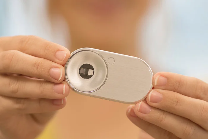
MOCAheart wants to make keeping track of your cardiovascular health as easy as pressing a button. The device, which is currently on Kickstarter, was developed by a team led by Naama Stauber and Dr. Daniel Hong, who was a physician at National Taiwan University Hospital, one of the country’s top teaching hospitals, before becoming an entrepreneur. The two met while attending the Design for Service Innovation Program at the Stanford Graduate School of Business, which focuses on developing new software and hardware for healthcare.
To use MOCAheart, you place your index fingers on top of the device and wait a few seconds for your health data to show up on the connected app.
The lightweight but sturdy MOCAheart, which I saw demoed at MOCA’s Taipei office, contains several sensors within its stainless steel and plastic case. Two are light sensors: one red light and one infrared sensor that measure blood oxygen and blood velocity, respectively. Two EKG sensors track cardiac electronic activity. It also has a G-sensor, or accelerometer, so the MOCAheart can be used as an activity tracker in the future. The app uses pulse transit time (PTT) to estimate the user’s blood pressure.
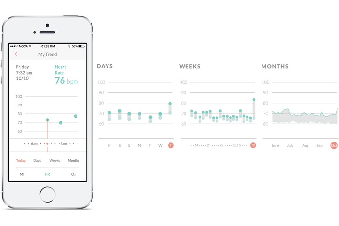
Instead of telling you your systolic and diastolic pressure measurements, like a blood pressure monitor does, MOCAheart uses a rating scale it calls the MOCA Index, which ranks your heart health (based on blood pressure, blood oxygen, and blood velocity) from 0 to 4. If you score a 0 to 1, that means your blood pressure is probably in the low to ideal range. Two means it is still normal but elevated, while 3 and 4 signify that it may be high enough to warrant a trip to the doctor.
The app also lets you note the time, location, and weather conditions for each reading. The latter is important because very cold weather or high temperatures can put people who have heart disease at risk for heart failure.
Hong says that the MOCAheart app uses its own index instead of giving people their blood pressure measurements because the device currently isn’t FDA-approved as a blood pressure monitor (though the startup might apply in the future). This is a potential drawback for people who need exact measurements, but on the other hand, if you just want an overview of your heart’s vital signs, the MOCA Index is easy to use and understand. The app does give you more precise measurements about your pulse and blood oxygen levels, and can be accessed by caregivers or family members.
The MOCAheart is targeted toward people, including the elderly, who need to keep track of their heart’s health, but can’t remember (or be bothered) to strap themselves into a blood pressure cuff everyday. MOCAheart can be slipped into a keychain holder or clicked into a specially designed smartphone case. Other cuffless blood pressure monitors out there include Viatom’s Checkme and Sotera Wireless’s ViSi Mobile monitor. MOCAheart wants to differentiate with the device’s sleek design and its app, which gives family members a quick way to monitor their love one’s health.
The device was developed partly with people like Hong’s parents in mind.
“When I was in the U.S., I’d call my parents and ask about their health. They kept insisting they were okay, even though my father actually had high blood pressure. Then he had a stroke. As a doctor, I felt I should have known earlier,” says Hong. “I wanted to create something that would make it easy for people to share track health data and share it with their families, so they can be alerted earlier if something needs to be checked out.”
MOCAheart has reached about a third of its $100,000 goal, which it needs to hit by Dec. 25. The device starts at $119 and is estimated to ship in April, a delivery date Hong is confident MOCA will be able to hit because they already have a final working prototype and manufacturers lined up in Taiwan. For more information about MOCAheart, visit its Kickstarter page.
Source: http://techcrunch.com/2014/11/27/mocaheart/
Livefyre Studio Puts The Company’s Focus On User /
At this point, I should probably stop calling Livefyre a commenting platform.
Actually, the company has been expanding beyond comments for a while. It launched its StreamHub product, which included more social media widgets, back in 2012. And it acquired social media curation startup Storify last year.
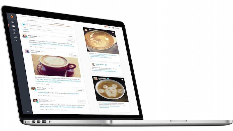
But the company is taking another big step in this direction with the relaunch of its core platform, which it’s now calling Livefyre Studio. The idea, basically, is to allow online publishers (whether they’re news organizations or brand marketers) to gather user generated content from anywhere online, and then to republish it anywhere in turn.
In some ways, it’s similar to what Storify already does, but it sounds like the aim here is to provide that kind of social media curation on a bigger scale, with more automation, and often for more marketing-centric uses. (This could also turn Livefyre into more of a competitor for startups like Chute and Percolate.)
In a quick demo, founder and CEO Jordan Kretchmer showed me how a customer could search for different types of content on Facebook, Twitter, Instagram, and across the web; hand-select the content or set up rules for automated gathering and filtering; then publish it to a customized media wall on their own site, their mobile apps, or in an ad. (The search part, by the way, is powered by Storify — Kretchmer said it’s the first integration of Storify into the main Livefyre platform.)
Livefyre Studio also includes the ability to ask users for the rights to their content, and analytics capabilities to see how these campaigns are actually performing.
The company has actually been testing the platform for months, Kretchmer said, and it went live for all customers last week. For example, it was used to create Sony’s “Greatness Awaits” page highlighting content from the PlayStation 4 community, as well as Unilever’s sustainability initiative Project Sunlight.
It can be useful for news organizations, too — Fox News took advantage of the ability to include this content in custom apps, creating an election map highlighting related tweets and Instagram photos.
But judging from our conversation, as well as Kretchmer’s blog post announcing Livefyre Studio (which does mention comments, if only very briefly), the emphasis seems to be pretty clearly on the marketing side. In fact, Kretchmer told me that in the past year brands have grown from to 0 to 30 percent of Livefyre’s revenue.
And he argued that all the user generated content posted on social media presents a big opportunity for companies to connect with consumers, both on their own sites and elsewhere, but “brands don’t have internal resources for managing this stuff.”
“We have to make it as easy as humanly possible to let brands access all of these great applications,” he added.
Introducing Livefyre Studio from Livefyre on Vimeo.
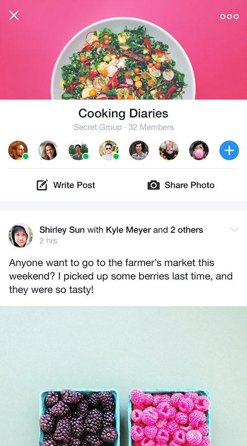
Facebook Launches Standalone Groups App /

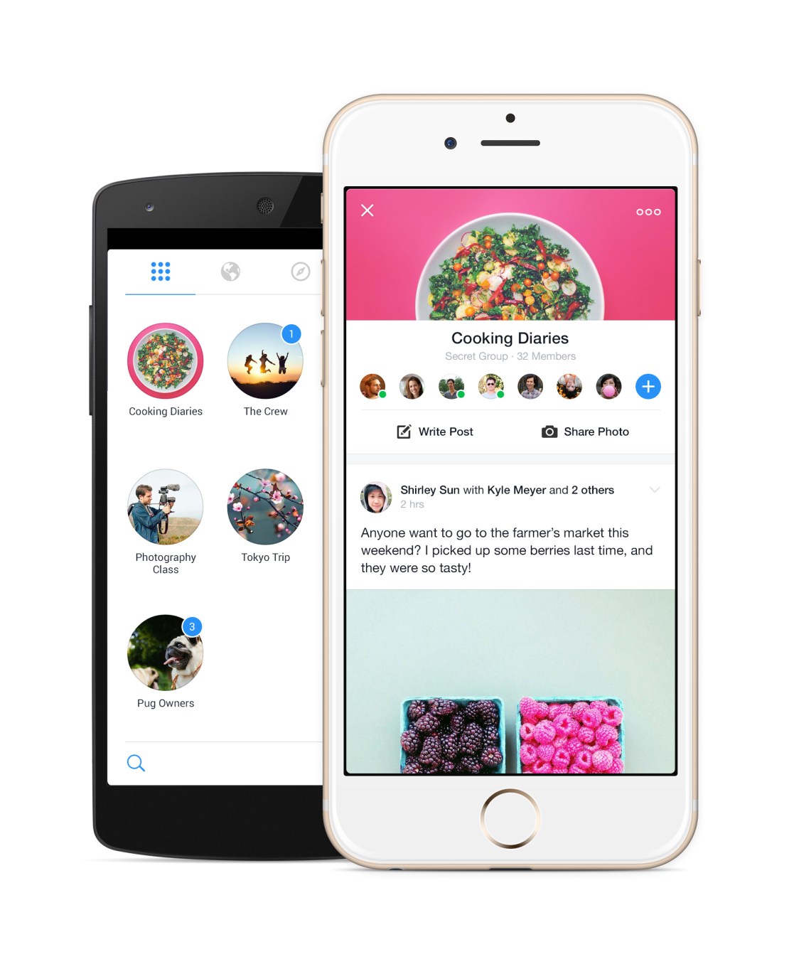
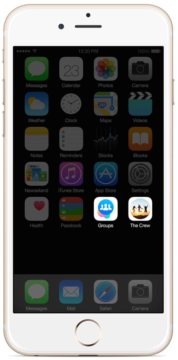
700 million people use Facebook Groups every month, but it’s a second-class experience on mobile, slow and buried in the social network’s main app. So today Facebook is releasing a standalone Groups app with powerful notification controls and a Groups discovery section. You won’t be forced to use it as the Groups feature will remain in the Facebook app, and you won’t be fast-switched to it either.
The Groups app for iOS and Android could be a massive help to admins trying to keep their communities from devolving into chaos, and speed up the consumption experience for everyone from families and friend cliques to study groups and support networks. It’s bright, quick, and could unlock more private sharing outside of the News Feed.
“No one is really doing this out there. We think what we offer is unique”, says the Groups app’s project manager Shirley Sun.
Despite Yahoo and Google fiercely competing to dominate group email lists, there’s a surprising lack of people and rich content-focused social feed groups services, and Facebook is happy to capitalize. Getting more people to organize their personal lives and projects with Groups could also stoke interest in the enterprise “Facebook At Work” product the company is currently piloting. Facebook could end up competing with Slack or Yammer, and this is a stepping stone.
Giving Groups The Spotlight
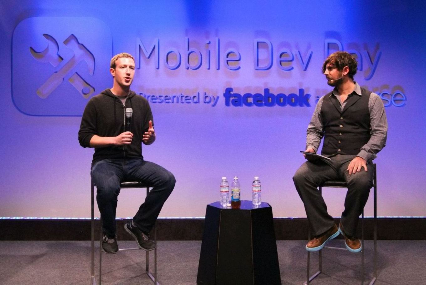
Mark Zuckerberg actually telegraphed the launch of the standalone Groups app a year when I interviewed him on-stage at an internal Mobile Dev Day at Facebook headquarters. He explained “if you have something like Groups, it’s always going to be kind of second-class in the main Facebook app, or even messaging for that matter. In order to make these things really be able to reach their full potential, I do think over time we’re going to have to create more specific experiences.”
Facebook had seen the need for a first-class mobile chat experience way back in 2011 with the launch of Messenger, but many other popular features were left to languish in the hidden menu of the main app.
 Groups has been a Facebook feature all the way since the beginning. Back in the 2005 era, they served more as bumper stickers for your profile that organizational communities. College kids would join the “Unidentified Party Injuries” group to trumpet how “cool” they were for getting bruises while drunk.
But in 2010, Facebook relaunched Groups in its modern incarnation as a way to share to a specific set of people, away from the News Feed. Yet despite some face-lifts, the feature hasn’t gotten much love, especially on mobile since.
In January 2014, Facebook revealed its Creative Labs initiative designed to build single-purpose mobile apps and experiment with new functionality starting with Paper, and stylized standalone home for News Feed.
Then in February, Facebook began work on the Groups app. Sun tells me the Facebook Groups’ team’s idea for a standalone app “has always been on our mind”, and the urge just got stronger as more and more users shifted to mobile. The social network now has over 456 million mobile-only users. It was time for Groups to shine.
Using The Groups App
 Philosophically, the standalone app doesn’t change what Groups is about. It just makes it cleaner, quicker to access, and more mobile-friendly.
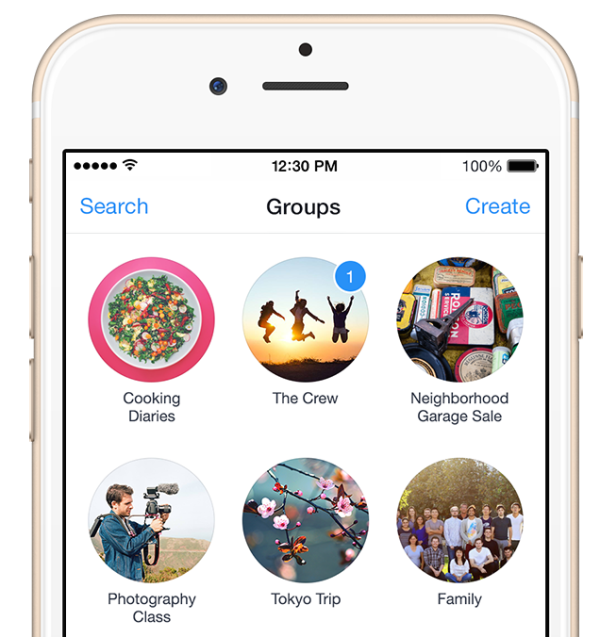
Once you sign-in with Facebook, all your existing Groups will be laid visually in two-wide grid as little circles displaying their titles, cover photos, and notification badges. They’re ordered by how often you use each Group, so ones with new notifications may be below the fold, which could be a bit tricky if you don’t see the pushes new posts or replies trigger.
Tap into any, and you’ll find a sleek Group feed with a sharp white background, rather than the main app’s gray canvas. A special notifications setting lets you mute one or all your Groups for an hour or until the next morning if you need some peace.
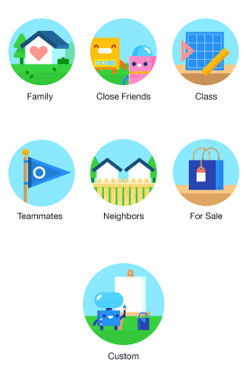
It’s also super easy to create a group. Choose what it’s about such a family, class, or teammates, give it a title, select its public/closed/secret visibility setting, and add some friends. If you choose family or close friends as the type, Facebook intelligently defaults your group to be secret. You can also add a home screen shortcut to your favorite groups for even faster access.
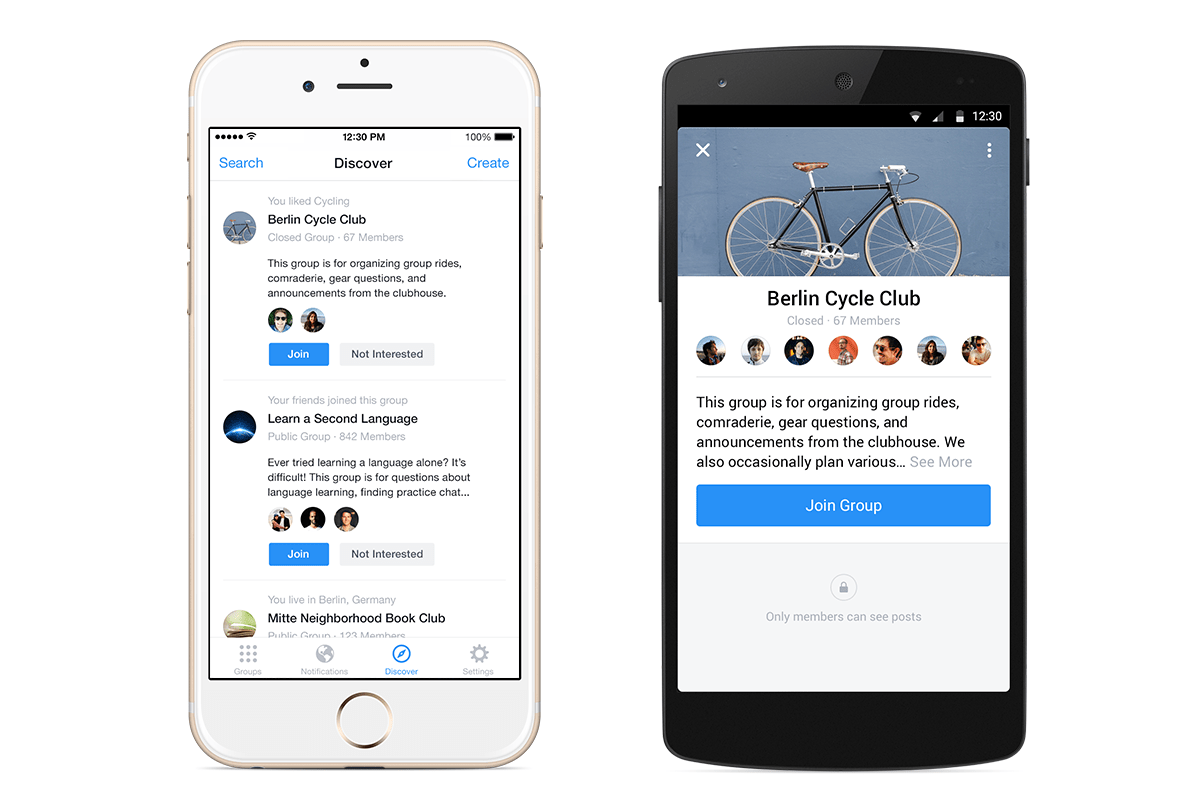
One new feature for mobile is the Groups Discovery section, which will help you find ones to join based on your friends, ones active nearby, or communities related to your interests.
 To stoke growth, Facebook will slowly begin showing a promo for the app atop the mobile Groups of the feature’s most active users and admins.
There’s no plan for monetization right now, as Facebook is making plenty of money from the News Feed. It’s beat the street its last nine quarters. Down the line, though, Facebook could generate revenue from a frequent Groups use case: commerce.
The African island nation of Mauritius has over one quarter of its population, 250,000 people, in a single Group that acts like a Craigslist classifieds. The company is already working on a Buy button to let you make purchases without leaving Facebook thanks to a credit card on file. That could potentially be expanded to allow peer-to-peer selling.
Sun concludes that Facebook doesn’t need every Groups user on this new app. “This app is a complementary, optional experience, designed for people who are already power users.” She’ll be satisfied if frequent Groups users get even deeper in the feature, and Groups themselves become more lively and active.
A Space For Micro-Sharing
 Not everything is fit for the News Feed. Groups works great for purpose-driven communication around projects. But there’s a whole realm of intimate sharing that Groups could host. Facebook tried for years to get people to micro-share to specific friend lists, but the controls can be confusing and there’s always a chance you’ll mis-share to everyone.
Zuckerberg’s law states that people share twice as much every year, but that doesn’t mean they’ll necessarily do it on Facebook. Lots of people are sharing to small sets of friends via apps like Snapchat. If Groups is a hit, it could encourage rapid-fire, off-the-cuff sharing between close Groups of friends, creating a third-space to spend time in between the broadcast feed and private messaging.
That could never happen if Groups stayed locked in the nav menu dungeon.
Source: http://techcrunch.com/2014/11/18/facebook-launches-standalone-groups-app/
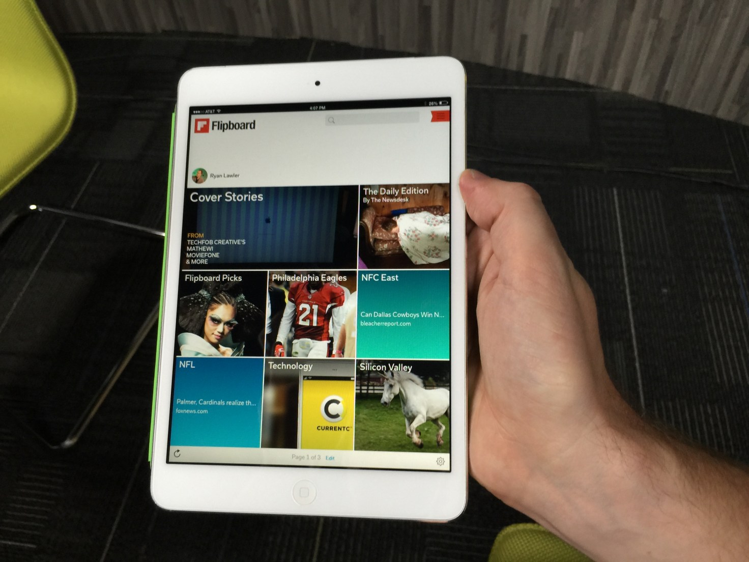
Flipboard’s New App Gets Personal By Making Topics... /

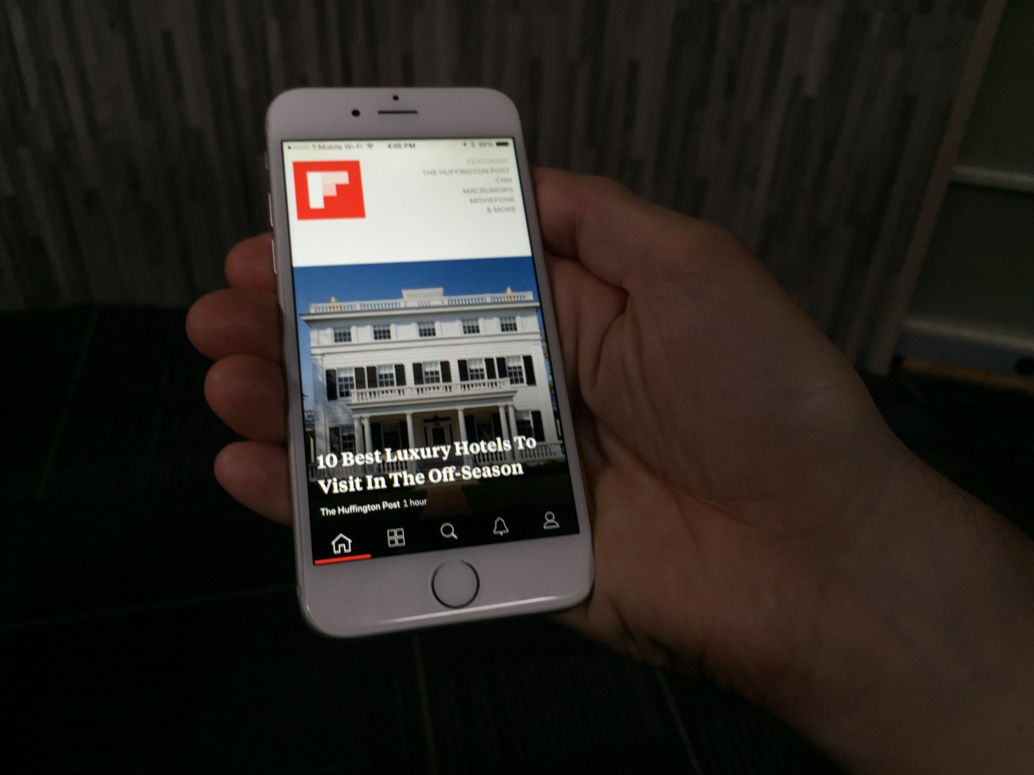
Flipboard has been working hard over the last few years to build an app that makes reading stories on mobile and tablet devices as engaging as flipping through a magazine. With the latest version of its app, users will be able to find and discover content that is relevant to their interests, through the introduction of topics they can follow. Already, Flipboard has done a good job of getting — and keeping — readers’ attention. It now has more than 100 million readers who have downloaded the app, and is adding 250,000 more each day. Those readers are flipping about 8 billion pages per month, and that number continues to grow. But the new app is aimed at keeping those users engaged through personalization.
When you first open up Flipboard 3.0, the app guides you through the process of picking a series of topics you will receive updates on. It asks “What are you interested in?” and provides a wide range of suggestions that vary from high-level content based around categories like “Technology” down to more granular topics such as “iPad apps.”
Once you’ve chosen several topics of interest, the app opens up to unveil a front page that features stories from multiple sources you can flip through. Stories are tagged by content provider as well as by topic, allowing users to drill down and see more content related to each. You can also choose to follow stories by source or by topic, which would provide even more content served up to users.
At launch, Flipboard will have more than 30,000 different topics to choose from, so there’s something for everyone. And the ability to easily add topics over time could keep casual Flipboard users keep coming back for more as the app becomes more personalized and relevant to them.
Users can click through to see which topics, people, and accounts they follow and drill down on stories shared there. Or they can search for particular topics. And even if readers are following hundreds of topics, the app will work to showcase the most relevant or interesting topics on any given day, according to Flipboard co-founder and CEO Mike McCue.
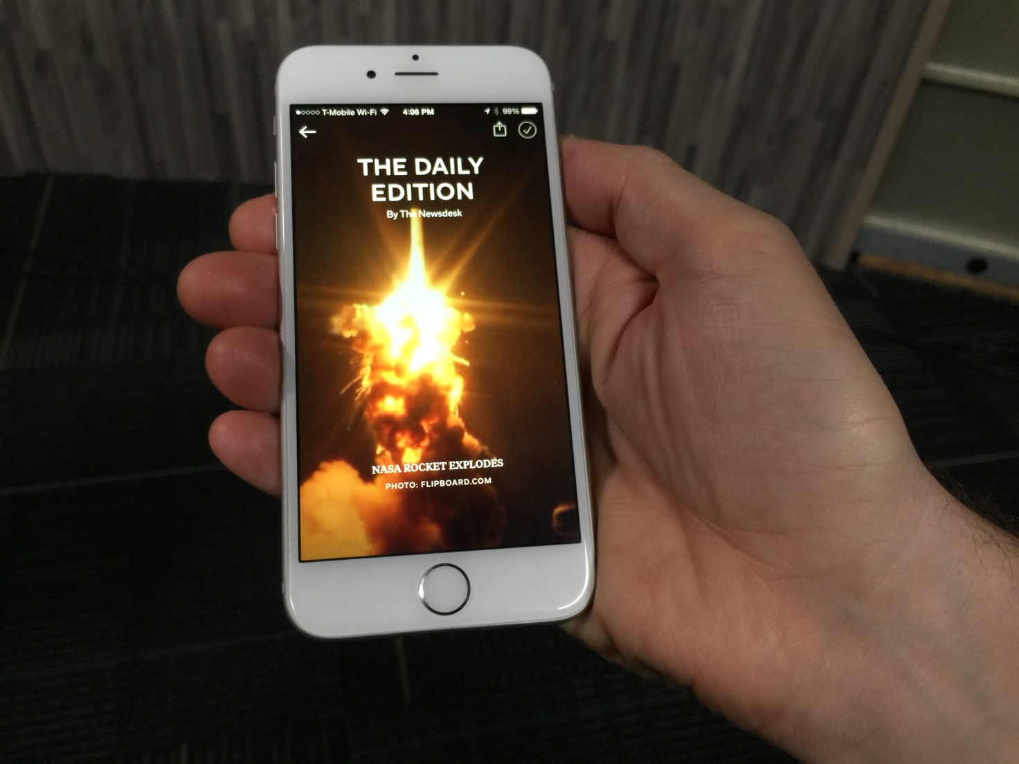
But it’s not all going to be algorithmically programmed. In addition to its topics, the app is also adding a “Daily Edition” of content that has been selected by Flipboard editors. It will be released every day at 7:00 am and will feature all the biggest news from the previous day, as well as a daily photo and “parting GIF” for readers.
Moving Beyond Reader Curation
For Flipboard, the move to a topic-following model is a departure from its previous personalization efforts. Last year, the company released a big app update that enabled users to create and subscribe to virtual magazines based on their own interests. By doing so, they could curate stories from multiple different sources and present it in a unified fashion. Readers, meanwhile, benefitted by being able to subscribe to magazines created by other like-minded users to discover content they might not have seen otherwise.
Magazines have been incredibly popular on Flipboard: The company says there have been more than 10 million of them created and curated by readers since launch. They can range from having just a few followers to hundreds and thousands of followers — and the top magazines have generated tens of millions of page flips from readers.
That feature also added a new potential revenue stream by enabling brands and retailers to create shoppable magazines and catalogs of products for sale. That’s on top of advertising CPMs that are closer to print publications than digital properties.
That said, Flipboard’s magazine model wasn’t perfect. After all, it relies on readers to keep updating their magazines over time in order to keep providing fresh content to others. Furthermore, each magazine reflects the interests of the creator or creators and may not be exactly what a reader is looking for.
Zite Acquisition Bears Fruit
The update is designed to improve upon the current experience with a more personalized feed, which users create by following different topics of interest to them. That ensures readers will be kept up to date on the news that’s important to them, without having to rely on another reader to curate a magazine for them.
McCue says the new version blends people-powered curation with algorithmic curation. For that, the app builds on its magazine creation tools and adds features from a couple of acquisitions Flipboard made over the last few years.
The first was its Cover Stories feature, which came about with help from technology it acquired as part of its purchase of Ellerdale several years ago. That gave Flipboard the ability to structure and display content more like a magazine.
It’s the more recent acquisition of Zite which helps to power the app’s new topic-centric following model, however. Zite was acquired from CNN earlier this year, and ever since the combined engineering teams have been working on ways to make Flipboard more personalized and more engaging.
It’s Zite’s technology that is being used to identify and categorize the topics that users can subscribe to. It can do that without its readers building magazines, which opens up a whole lot of new topics and content for readers to discover.
But that’s the whole point. Finding more relevant content is key to Flipboard’s business model, after all.
The more readers flip and the more engaged they are in its magazine-like experience, the more ads they see. The more ads they see, the more money Flipboard makes. And considering that Flipboard has raised more than $160 million since being founded, it’ll need a lot of flips to justify that funding. The good news is, whatever it’s done so far seems to be working.
Source: http://techcrunch.com/2014/10/29/flipboard-3-0/
Cloth Is Where Instagram And Your Closet Collide /

http://vimeo.com/108715739
Fashion and social networking belong together, but so far no one has found the perfect balance between user-generated content and a focus on edgy fashion. That’s where Cloth comes in.
It’s a new app, launched today, that lets users share their favorite outfits in an Instagram-like feed, letting them get feedback from friends (with likes and chat) and saving their favorite outfits to remember later.
Cloth has been in beta for two years now, and today launches into public availability on the App Store. It was founded by Seth Porges, who has been a longtime journalist for organizations like Maxim magazine, Popular Mechanics, Bloomberg News and Men’s Health.
With Cloth, however, Porges shifts to a more entrepreneurial focus, looking to help people record their own best looks and share them with others.
“The goal has always been to make getting dressed easier and more fun,” said Porges. “We wanted to make an app that enhances how people are already using their phones and fashion together, without forcing them into unnatural actions that they aren’t already doing.”
Cloth not only allows you to build out a closet through photos, shared in a stream, but it also allows you to tag them so that others can search for inspiration based on specific guidelines. Plus, Cloth includes weather notifications to help you get dressed each day.
The company has raised a small undisclosed amount from a group of unnamed angel investors thus far.
Source: http://techcrunch.com/2014/10/29/cloth-is-where-instagram-and-your-closet-collide/
Feels Like Driving In The Future /

https://www.youtube.com/watch?v=pKL4PJICS40 We're based in the Mission District of San Francisco. Navdy was founded by entrepreneur Doug Simpson and serial inventor Karl Guttag, and is supported by a highly accomplished veteran team. In 2013 Navdy went through the acclaimed Highway 1 Incubator program and continues to work closely with Highway 1’s parent, PCH International, whose world class supply chain and manufacturing capabilities are used by companies such as Apple, Beats, and Google.
Share Little Photos That Disappear In 24 Hours /

 Digg, Milk, and Revision3 founder Kevin Rose recently left Google Ventures to start a new mobile development house called North, and now we have some details on the firm’s first app, Tiiny, which will launch soon. The basic idea is that Tiiny lets you share thumbnail-sized photos and animated GIFs to a grid of pics on your friends’ phones, and they disappear 24 hours later. Rather than making you scroll through full-width photos like Instagram, Tiiny lets you get a constantly-updated look at what lots of your friends are up to in a single glance.
Rose told TechCrunch founder Michael Arrington that the app is currently going through the iOS App Store approval process and should launch very soon. Rose’s team said he’s not ready to talk more about the app just yet, but we’ll have more details on TechCrunch when it’s time.
I did get a quick look at the app yesterday, though, and it’s slick. As you can sort of make out from the photo below, the top of the screen features a 3-wide by 4-tall grid of photos and animated GIFS, with a button to capture and share more at the bottom. Seeing all the moving images on the same screen made the app feel vibrant and alive, which could make it addictive to check compared to more static apps like Instagram or even Vine, which only shows one video at a time. Rather than a replacement or direct competitor to other more public broadcast and direct messaging photo apps, Tiiny seems like it could fit in as a complement.
There’s also supposedly some more functionality but we’ll have to wait until it’s out for that.
North, which we profiled last month, has a peculiar strategy. Rather than languish on building one app, North is trying to use a small team of about 3 people to launch a new mobile app every three months. This scheme lets North quickly throw apps against the wall and see what’s sticky for users. With building social apps being likened to capturing “lightning in a bottle”, this diversified approach means North won’t spend a year building something no one wants. If Tiiny is a flop, the team will just move on to the next app.
Instagram’s New Hyperlapse App /

http://vimeo.com/104362903
The app, which is due to be released at 10 AM PT today, offers iPhone users a way to make professional-looking timelapses without expensive photography equipment like pro cameras, steady-mounts or tripods, and takes advantage of image stabilization tech that makes use of movement data gathered by gyroscopes to mimic the effect of ultra-expensive motion stabilization software used by film studios, but using a fraction of the processor power to get it done.
One impulse at Instagram was to build it into its existing app, but doing so would’ve hidden the functionality too much for those really eager to try it, and made it virtually invisible to the average user who might not realize they even want it, per Wired. To me, this sounds like Instagram learned a lesson from Instagram Video and Direct, and wanted to give this cool new tech the attention it deserved as its own app, where it stands a good chance of going viral rather than being adopted by just some of Instagram’s existing user community.

Instagram’s Hyperlapse is, like its original product, focused on simplicity – the only thing that you can change about your captures is the speed of playback. You use a slider to control how fast the video you eventually share will play at, from standard 1x speed (i.e. the normal speed at which it was recorded) to 12x. Even at 1x, you get to take advantage of the advanced image stabilization techniques, but the same video is bound to produce an extremely different final effect depending on what playback speed you combine with the automatic stabilization effects.
This looks to be one of the coolest new mobile apps released in a while, particularly from the Facebook/Instagram crowd. The app is live now for iPhone owners (Android users will have to wait for a later version, unfortunately), and we’ll soon post our impressions regarding this new stabilization tech and its effectiveness.
Source: http://techcrunch.com/2014/08/26/instagram-hyperlapse
Lean UX: Getting out of the deliverables business /

http://uxlx.23video.com/video/7867094
In this talk your team will learn:
- How user experience and interaction design evolve in an agile, continuous world
- Why creating a cross-functional design process increases the viability and success of your products
- How to focus your teams on creating digital experiences instead of documentation
Speaker: Jeff Gothelf
Designers have long relied on heavy documentation to communicate their vision for products and experiences. As technology has evolved to offer more complex and intricate interactions, the deliverables we've been creating have followed suit. Ultimately though, these deliverables have come to serve as bottlenecks to the creation process and as the beginning of the negotiation process with our team mates -- a starting point for conversation on what could get built and launched.
Lean UX aims to open up the user experience design process with a collaborative approach that involves the entire team. It's a hypothesis-based design approach that tests design ideas early and often and, along the way, builds a shared understanding with our team mates that eliminates the dependencies on heavy documentation and challenging communications. Lean UX is a solution for the challenge of Agile and UX integration while it also works effectively in traditional waterfall and other hybrid environments.
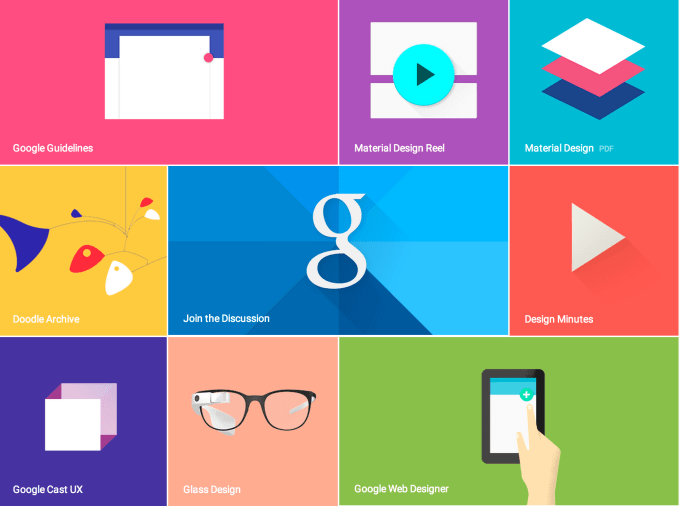
Google: Material Design /

We challenged ourselves to create a visual language for our users that synthesizes the classic principles of good design with the innovation and possibility of technology and science. This is material design. This spec is a living document that will be updated as we continue to develop the tenets and specifics of material design.
Goals
Create a visual language that synthesizes classic principles of good design with the innovation and possibility of technology and science.

Develop a single underlying system that allows for a unified experience across platforms and device sizes. Mobile precepts are fundamental, but touch, voice, mouse, and keyboard are all first-class input methods.

Principles

Material is the metaphor
A material metaphor is the unifying theory of a rationalized space and a system of motion. The material is grounded in tactile reality, inspired by the study of paper and ink, yet technologically advanced and open to imagination and magic.
Surfaces and edges of the material provide visual cues that are grounded in reality. The use of familiar tactile attributes helps users quickly understand affordances. Yet the flexibility of the material creates new affordances that supercede those in the physical world, without breaking the rules of physics.
The fundamentals of light, surface, and movement are key to conveying how objects move, interact, and exist in space in relation to each other. Realistic lighting shows seams, divides space, and indicates moving parts.

Bold, graphic, intentional
The foundational elements of print-based design—typography, grids, space, scale, color, and use of imagery—guide visual treatments. These elements do far more than please the eye; they create hierarchy, meaning, and focus. Deliberate color choices, edge-to-edge imagery, large-scale typography, and intentional white space create a bold and graphic interface that immerses the user in the experience.
An emphasis on user actions makes core functionality immediately apparent and provides waypoints for the user.

Motion provides meaning
Motion respects and reinforces the user as the prime mover. Primary user actions are inflection points that initiate motion, transforming the whole design.
All action takes place in a single environment. Objects are presented to the user without breaking the continuity of experience even as they transform and reorganize.
Motion is meaningful and appropriate, serving to focus attention and maintain continuity. Feedback is subtle yet clear. Transitions are efficient yet coherent.......
Source:
Google Unveils New Cross Platform Design Language “Material Design” /

Google announced a new universal design language, called Material Design, as part of the forthcoming “L” release of Google’s Android mobile operating system. The design is meant to offer a more consistent, universal look-and-feel across mobile, tablets, desktop and “beyond,” the company explains.
“We imagined… what if pixels didn’t just have color, but also depth? What if there was a material that could change its texture? This lead us to something we call ‘material design,” says Matias Durate, Director of Android operating system User Experience at Google, during the keynote this morning.
Some of the key features of the new design include an updated version of the system font, Roboto, as well as bold and dramatic colors and highly polished animations.
Durate also quickly walked through the changes in the new framework, which it’s also releasing publicly today at google.com/design. The idea is to put this framework in the hands of developers who build on Google’s platforms, so all apps have a consistent look, similar to how Apple has its own design guidelines for Mac and iOS developers.
The company is also introducing new redesigned versions of Google’s flagship apps using this new language, including Gmail and Calendar, for both Android and the web. You may recall reading about these changes recently, when some blogsgot a hold of leaked versions of screenshots showing Gmail’s redesign, featuring a cleaner and simpler interface.
On Android, the new look is called “Material,” and it supports a variety of new animation capabilities, has built-in realtime UI shadows, and “hero” elements that can be passed from screen-to-screen.
The open-sourced framework Polymer, which highlighted during the last Google I/O, was also mentioned as being a way for developers to create building blocks which work with this new design language. Polymer offers a prototyping tool that lets you build responsive websites using predefined, customizable building blocks, and was recently discussed as being a part of Google’s forthcoming design changes we covered here when it was known as its internal codename “Quantum Paper.”
On the Google Design website, the company references its goals for Material Design as follows:
- Create a visual language that synthesizes classic principles of good design with the innovation and possibility of technology and science.
- Develop a single underlying system that allows for a unified experience across platforms and device sizes. Mobile precepts are fundamental, but touch, voice, mouse, and keyboard are all first-class input methods.
Google describes the new design as being “inspired by the study of paper and ink, yet technologically advanced and open to imagination and magic.”
The design uses familiar tactile means of interacting with its many parts, with visual cues that are grounded in reality, Google says. Its elements also recall print-based design typography, with “deliberate color choices, edge-to-edge imagery, large-scale typography, and intentional white space create a bold and graphic interface that immerses the user in the experience.”
Motion is another key element of the design, but is meant to be. “Motion is meaningful and appropriate, serving to focus attention and maintain continuity,” Google adds.
More broadly speaking, the design refresh is about making the experience of using Google’s products and services, including Android, more enjoyable for end users. Apple is well-known for having stricter design guidelines for its developer partners, and that has helped shaped how consumers perceive Apple — that is, as being a design-focused company.
Now Google is stepping up to show that it’s ready to compete on design, as well.
The move comes at a time when Apple is also moving into areas Google dominates – like cloud services. That has worried Google, sources say, since it seemed like Apple was getting better at infrastructure than Google was getting at design. Material Design is Google’s effort to change that.
Source: http://techcrunch.com/2014/06/25/google-unveils-new-cross-platform-design-language-material-design/?utm_campaign=fb&ncid=fb
Ideo Releases A New Photoshop For Interaction Design /

THE DESIGN AGENCY OFFERS AN IMPROVED VERSION OF ORIGAMI, THE OPEN-SOURCE UX PROTOTYPING TOOL FACEBOOK RELEASED EARLIER THIS YEAR.
A few months ago, Facebook released a bit of open-source code called Origami, which lets designers create and test user interfaces without any coding.
Now, Ideo has released a free sequel. The design firm calls it Avocado, and it builds on the functionality of Origami, creating an even faster UX prototyping tool. "We wanted to build Avocado as something for our designers to be useful for them, and then put it out there to see if it’s helpful to others," explains Design Director Chris Nyffeler.
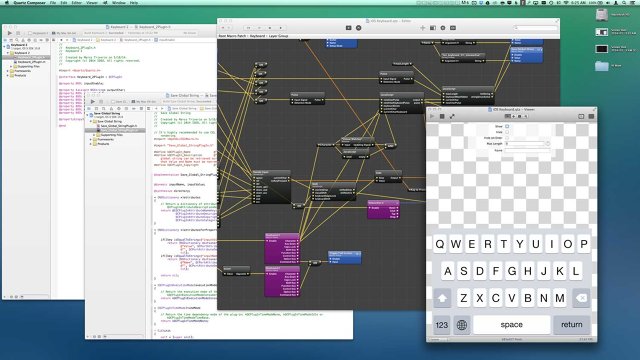
If Origami provides the Lego blocks for a prototyping interface, Avocado provides fully formed Lego kits. “We don’t want to reinvent components from scratch every time,” explains Avocado creator, and Ideo interaction designer and software engineer Marco Triverio.
For Ideo, Avocado was a natural extension of its rapid prototyping process. The design firm has a fierce addiction to Post-it notes, sketching out ideas to get at the very best design. Avocado was a way to refine the firm's rapid prototyping--to create that sweet spot between quick and pretty.
Origami sits on top of Apple’s age-old Quartz Composer software, and Avocado sits on top of Origami. Avocado contains a few common user interface components that make building prototypes quicker. Among them: a carousel interface, which creates a framework for photos you swipe through left and right, and animations like jiggling, jumping, and pulsating, which are extremely popular across interfaces. Each template--called a "patch"--is as easy to implement as dragging and dropping into your Quartz Composer desktop. From there, you link the media assets (like images) you’d like to manipulate, and use controls like sliders and nobs to tweak the intensity and nuance of the core animation. “You can code that animation, but you would need the understanding of 2-D and 3-D transformations,” Triverio says, referring to the deep understanding of geometry needed to animate well within code. “Avocado abstracts the complexity behind creating such an animation. It gives you simple controls.”
The resulting creation isn't a true app. But it is a detailed, full-motion mockup of how an interface could work. In this sense, Avocado projects sit halfway between Post-it mockups and fully functional coded applications. They're meant to prove or iterate a concept before you invest in actually building a piece of software.
Source:http://www.fastcodesign.com/3031560/ideo-releases-a-new-photoshop-for-interaction-design
Everybody there is thinking about UX and design, not just the designers... /

4 Myths About Apple Design, From An Ex-Apple Designer
WHAT'S LIFE REALLY LIKE DESIGNING FOR APPLE? AN ALUM SHARES WHAT HE LEARNED DURING HIS SEVEN YEARS IN CUPERTINO.
Apple is synonymous with upper echelon design, but very little is known about the company's design process. Most of Apple’s ownemployees aren’t allowed inside Apple’s fabled design studios. So we’re left piecing together interviews, or outright speculating about how Apple does it and what it’s really like to be a designer at the company.
Enter Mark Kawano. Before founding Storehouse, Kawano was a senior designer at Apple for seven years, where he worked on Aperture and iPhoto. Later, Kawano became Apple's User Experience Evangelist, guiding third-party app iOS developers to create software that felt right on Apple's platforms. Kawano was with the company during a critical moment, as Apple released the iPhone and created the wide world of apps.

In an interview with Co.Design, Kawano spoke frankly about his time at Apple--and especially wanted to address all the myths the industry has about the company and about its people.
MYTH #1
Apple Has The Best Designers
“I think the biggest misconception is this belief that the reason Apple products turn out to be designed better, and have a better user experience, or are sexier, or whatever . . . is that they have the best design team in the world, or the best process in the world,” Kawano says. But in his role as user experience evangelist, meeting with design teams from Fortune 500 companies on a daily basis, he absorbed a deeper truth.
“It's actually the engineering culture, and the way the organization is structured to appreciate and support design. Everybody there is thinking about UX and design, not just the designers. And that’s what makes everything about the product so much better . . . much more than any individual designer or design team.”
It has often been said that good design needs to start at the top--that the CEO needs to care about design as much as the designers themselves. People often observe that Steve Jobs brought this structure to Apple. But the reason that structure works isn’t because of a top-down mandate. It’s an all around mandate. Everyone cares.

“It’s not this thing where you get some special wings or superpowers when you enter Cupertino. It’s that you now have an organization where you can spend your time designing products, instead of having to fight for your seat at the table, or get frustrated when the better design is passed over by an engineering manager who just wants to optimize for bug fixing. All of those things are what other designers at other companies have to spend a majority of their time doing. At Apple, it’s kind of expected that experience is really important."
Kawano underscores that everyone at Apple--from the engineers to the marketers--is, to some extent, thinking like a designer. In turn, HR hires employees accordingly. Much like Google hires employees that think like Googlers, Apple hires employees that truly take design into consideration in all of their decisions.
“You see companies that have poached Apple designers, and they come up with sexy interfaces or something interesting, but it doesn’t necessarily move the needle for their business or their product. That’s because all the designer did was work on an interface piece, but to have a really well-designed product in the way Steve would say, this 'holistic' thing, is everything. It’s not just the interface piece. It’s designing the right business model into it. Designing the right marketing and the copy, and the way to distribute it. All of those pieces are critical.”
MYTH #2
Apple’s Design Team Is Infinite
Facebook has hundreds of designers. Google may have 1,000 or more. But when Kawano was at Apple, its core software products were designed by a relatively small group of roughly 100 people.
“I knew every one of them by face and name,” Kawano says.
For the most part, Apple didn’t employ specialist designers. Every designer could hold their own in both creating icons and new interfaces, for instance. And thanks to the fact that Apple hires design-centric engineers, the relatively skeleton design team could rely onengineers to begin the build process on a new app interface, rather than having to initiate their own mock-up first.
Of course, this approach may be changing today.
“For Apple, having a small, really focused organization made a lot of sense when Steve was there, because so many ideas came from Steve. So having a smaller group work on some of these ideas made sense,” Kawano says. “As Apple shifted to much more of a company where there’s multiple people at the top, I think it makes sense that they’re growing the design team in interesting ways.”
Notably, Jony Ive, who now heads usability across hardware and software, is reported to have brought in some of the marketing team to help redesign iOS 7. It's a coup, when you think about it, for marketers to be deep in the trenches with designers and engineers. (That level of collaboration is frankly unprecedented in the industry.)
MYTH #3
Apple Crafts Every Detail With Intention
Apple products are often defined by small details, especially those around interaction. Case in point: When you type a wrong password, the password box shakes in response. These kinds of details are packed with meaningful delight. They're moments that seem tough to explain logically but which make sense on a gut level.
“So many companies try to mimic this idea . . . that we need to come up with this snappy way to do X, Y, and Z. They’re designing it, and they can’t move onto the next thing until they get a killer animation or killer model of the way data is laid out,” Kawano explains. The reality? “It’s almost impossible to come up with really innovative things when you have a deadline and schedule.”
Kawano told us that Apple designers (and engineers!) will often come up with clever interactive ideas--like 3-D cube interfaces or bouncy physics-based icons--during a bit of their down time, and then they might sit on them for years before they make sense in a particular context.
“People are constantly experimenting with these little items, and because the teams all kind of know what other people have done, once a feature comes up--say we need a good way to give feedback for a password, and we don’t want to throw up this ugly dialog--then it’s about grabbing these interaction or animation concepts that have just been kind of built for fun experiments and seeing if there’s anything there, and then applying the right ones.”
But if you're imagining some giant vault of animation ideas hiding inside Apple and waiting to be discovered, you'd be wrong. The reality, Kawano explains, was far more bohemian.
“There wasn’t a formalized library, because most of the time there wasn't that much that was formalized of anything that could be stolen,” Kawano says. “It was more having a small team and knowing what people had worked on, and the culture of being comfortable sharing.”
MYTH #4
Steve Jobs’s Passion Frightened Everyone
There was a commonly shared piece of advice inside Apple--maybe you've heard it before--that a designer should always take the stairs, because if you met Steve Jobs in the elevator, he’d ask what you were up to. And one of two things would happen:
1. He’d hate it, and you might be fired. 2. He’d love it, the detail would gain his attention, and you’d lose every foreseeable night, weekend, and vacation to the project.
Kawano laughs when he tells it to me, but the conclusion he draws is more nuanced than the obvious Catch 22 punchline.
“The reality is, the people who thrived at Apple were the people who welcomed that desire and passion to learn from working with Steve, and just really were dedicated to the customer and the product. They were willing to give up their weekends and vacation time. And a lot of the people who complained that it wasn’t fair . . . they didn’t see the value of giving all that up versus trying to create the best product for the customer and then sacrificing everything personally to get there.”
“That’s where, a lot of times, he would get a bad rap, but he just wanted the best thing, and expected everyone else to want that same thing. He had trouble understanding people who didn’t want that same thing and wondered why they’d be working for him if that was the case. I think Steve had a very low tolerance for people who didn’t care about stuff. He had a very hard time understanding why people would work in these positions and not want to sacrifice everything for them.”
As for Kawano, did he ever get an amazing piece of advice, or an incredible compliment from Jobs?
“Nothing personally,” he admits, and then laughs. “The only thing that was really positive was, in the cafeteria one time, when he told me that the salmon I took looked really great, and he was going to go get that."
“He was just super accessible. I totally tried to get him to cut in front of me, but he’d never want do anything like that. That was interesting too, he was super demanding . . . but when it came to other things, he wanted to be very democratic, and to be treated like everyone else. And he was constantly struggling with those roles.”
Source: http://www.fastcodesign.com/3030923/4-myths-about-apple-design-from-an-ex-apple-designer
Algoriddim’s Djay App Gives iOS DJs Access To Millions Of Tracks /

Algoriddim is updating its iOS app djay today with a big new feature — integration with Spotify.
This is the first time djay (which the company says has been downloaded 10 million times, making it the world’s bestselling DJ app) has been connected to a streaming music service. This means users will no longer be limited to the music in their collection, and can instead access 20 million tracks in Spotify’s library.
Algoriddim aims to serve both casual users and serious DJs, and on the serious side, this could be the next step away from having to lug crates of vinyl records from club to club. It sounds like an obvious move, but CEO Karim Morsy said there were significant technical challenges, because users aren’t just streaming music from the cloud, but also mixing and applying effects in real-time.
You can see the app in action in the video above — as I watched Morsy show off djay’s different features, the app seemed to work as quickly with Spotify tracks as it did with iTunes music that was stored locally.
In addition to giving djay users access to more songs (they can search or browse different playlists, as well as share playlists of their own), Morsy said the integration allows Algoriddim to introduce two new features. First, there’s Match, which recommends songs that would be the right fit to play after the current track. Morsy’s a DJ himself and he said he’d previously believed that making this kind of song selection could never be automated. But using technology from Spotify’s acquisition of The Echo Nest convinced him that he was wrong.
And users can take that automated approach even further with Automix Radio, which won’t just choose the next song, but will create an entire mix and handle all of the transitions. So you can select a song that sets the mood, then let Automix continue playing automatically. In some ways it’s similar to just creating a station on an Internet radio service like Pandora, but with “beatmatched, DJ-style” transitions between songs.
Users will need a Spotify Premium account to access the Spotify library in djay, but the app includes a 7-day free trial for the premium service. Algoriddim is also promoting the apps by cutting the iPad price in half, to $4.99, and making its iPhone app available for free.
Source: http://techcrunch.com/2014/05/22/algoriddim-djay-spotify-integration/
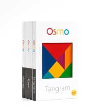
Former Googlers Launch Osmo, A Gaming Device That Combines Real-World Play With The iPad /

A number of companies have attempted to combine physical objects and the iPad in an effort to create new kinds of children’s games, whether that’s Crayola with their DigiTools coloring pens or games that teach toddlers their shapes, like Tiggly. Today, another digital toymaker, Tangible Play, is entering this space with the launch of a series of high-quality games designed for children ages 6 to 12, including puzzles, word games, and other forms of creative play.
In development for over a year, we first spotted Tangible Play demonstrating its games at a previous TechCrunch Disrupt Startup Alley.
The company was founded by ex-Googlers, including Pramod Sharma, who had earlier seen the intersection of physical and digital when he helped build Google’s book-scanning machine, and Jérôme Scholler, who had worked on Chrome for Android.
 Both men are also dads, and like most parents, they have mixed feelings about the way today’s tablet computers engage kids’ attention. On the one hand, technologists generally like to see their kids embracing digital tools at young ages.
But, says Sharma, “[my daughter] could literally spend hours just looking at a screen, and doing nothing else. And as a parent, this is obviously concerning,” he says. That led the founders to create Osmo, the company’s first product built to combine social and creative play with the highly engaging tablet their kids were addicted to.
The games center around a technology which they refer to as “Reflective Artificial Intelligence.” What that means is that the Osmo gaming kit includes a uniquely designed reflective camera that snaps onto the top of the iPad, allowing the app to “see” the shapes and objects placed in front of the tablet on the tablet or other flat surface.
The game kit also includes an iPad stand and two physical games, their app counterparts, as well as third app that’s Osmo’s most recent addition.
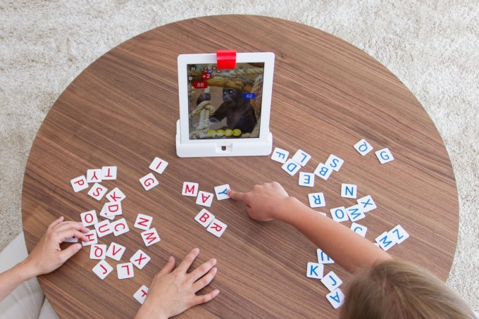
While the best way to experience Osmo is to try it for yourself, the general gist of the experience involves playing a game in front of the iPad, following software prompts along the way which guide the gameplay.
In the case of “Words,” children try to quickly guess the word by sliding letter tiles in front of the tablet, while in “Tangram” kids use colorful wooden pieces to try to reproduce the image on the screen by placing shapes together. A third title, “Newton,” lets you engage in more creative play by placing any object in front the iPad – glasses, a pen, your hands, etc. – to turn them into structures inside a game involving bouncing balls and targets.
Though my daughter is only four, and below the target age range for these apps, with some guidance we were able to play some of the Osmo games together. It was easy to see how these games could make the iPad a more social activity - something that’s more like the modern-day equivalent to what was once the family board game night at home.
That being said, the test versions I was able to try (admittedly a few weeks behind the versions of the apps launching today) did have some kinks. I found, for example, that the shapes game “Tangram” would sometimes not see the pieces correctly, lighting up to show a match, then dimming again for no apparent reason, then lighting up again, which was confusing.
The sounds effects and music also need work, as they didn’t seem quite as kid-friendly and engaging as they could be. (They actually sound better in the video above, than in person). But overall, the games work as advertised, provided you have good lighting and a flat surface to play them upon. And Sharma says that now the goal is to make Osmo work on any surface, including floors and tables alike.
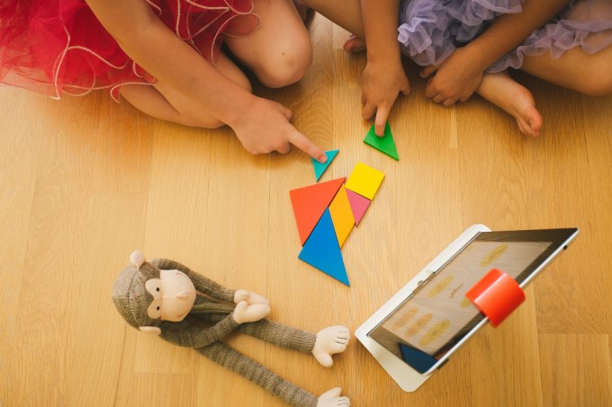
The company has been piloting the games in over one hundred schools, many near their home base of Palo Alto. From these early tests, the founders came to better understand the potential for Osmo from an educator’s perspective, explaining that their group play nature could help with a child’s social and emotional learning, while other games taught different concepts, like spatial intelligence and creative thinking.
Crowdfunding Launch
Today, Tangible Play is launching its crowdfunding campaign which will allow it to assemble a core group of early adopters who the team hopes will help to evangelize the product and help Osmo gain traction. Though the gaming kit will eventually retail for $99, crowdfunding backers will be able to get it for a discount at $49, with some limited availability. The goal is to raise $50,000 to help with start-up and manufacturing costs.
However, the company doesn’t really need the crowdfunding in order to get the device to manufacturing, as they’ve previously raised an undisclosed round of seed funding from K-9 Ventures last year.
You can join the new crowdfunding campaign or learn more here: www.playosmo.com.
Source: http://techcrunch.com/2014/05/22/former-googlers-launch-osmo-a-gaming-device-that-combines-real-world-play-with-the-ipad/