Innovation

Leica's new camera is a stunning work of aluminum art by Gavin Lau

Screen-Shot-2014-04-29-at-1.30.44-am.png

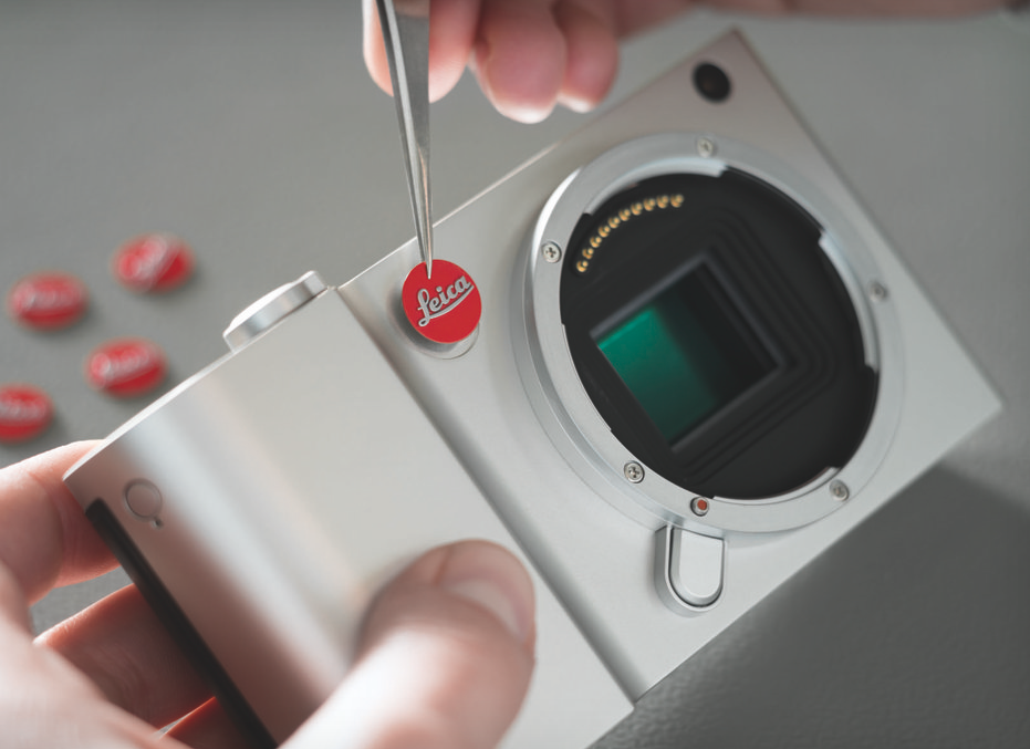
Earlier today, Leica unveiled its new Leica T camera system. It's an all-new mirrorless camera platform with a distinctly different design than anything Leica has produced before. Leica had a little help along the way: the company called upon Audi's design team to work on the project, and the final result looks very similar to an iPhone or other modern, unibody metal smartphone.

We'll be reviewing the new Leica T in the coming weeks, but until then, peruse the images below for looks at the camera, its lenses, accessories, and the manufacturing process that goes into making the Leica T.


Source: http://vrge.co/1gUhUdw

iOS 7, six months later by Gavin Lau

ios-7-logo.png

Since we are roughly six months into the general release of iOS 7, and about two months from learning about iOS 8, I thought I’d share my thoughts on iOS 7 as well as my iOS 8 wish list. Overall, I’ve been pretty happy with iOS 7 and haven’t wanted to go back to iOS 6. However, I still think there is room for improvement.

What I like

The new look-and-feel introduced in iOS 7 was controversial, to say the least. For me, I liked the new interface from the beginning. I’m in the developer program and installed the beta the day it was released. I took me a few days to get used to it, but after that there was no going back. I recently had my iPad replaced under warranty. When I got the new one, it had iOS6 installed. It was a jarring moment as I realized then how much I liked the new look and feel.

Being able to flip up (as opposed to flip off, I guess) Control Center and turn Wi-Fi, Bluetooth and the flashlight off and on, as well as have quick access to a calculator, is a nice addition and has also eliminated the need for a separate flashlight app. My one complaint is the touch target for the swipe seems a little narrow.

The Notification Today Screen is a great addition. I’d be lying if I said I used it as much as I should. It’s nice seeing what my day looks like first thing in the morning. Granted, it seems the times I use it the most are the days I’m thinking of calling in when I’m sick and want to see if I have any important meetings. When I swipe down to see the Today Screen, and it tells me “There are 2 events scheduled…” for the next day, I’d like to be able to tap on that sentence and bring up the calendar.

What I also like to see is for them to borrow from Google Now and let me add in sports scores and the like. This week, I fell asleep before the Red Sox won a game in 14 innings. It would have been great if the Today Screen showed the score the next morning. However, I’ve never really used the Missed Notification tab, because I’ve really limited the amount of apps that hit the Notification Center.

I really like the new Multitasking screens. It took a little getting used to it taking up the whole screen, however, the live update is great. Sometimes, I’ll use that to take a quick peek at an app and then scoot back over to the current app.

While I still use 1Password, I’ve become a big fan of iCloud Keychain. What I’d like to see is the ability to have other apps have access to it, too. I still need to keep a copy of my passwords in 1Password because Mail, WordPress, and any other app with a login can’t read the Keychain.

crump-ios72

What I’m not sold on

The grouping of photos by Moments in the Photos app is a bit of a hit or miss for me. I’d like the grouping to be a little bit smarter. Over the period of a week, I took photos at a show in Connecticut, near work, and near home. On one view level in Photos, they were grouped all together, When I tapped on a photo it did bring me to the grouping of just the Connecticut show. The reason I’m sold on it is because of that mid-level grouping. I’d prefer it didn’t group the different locations that way. That said, I don’t like it when there’s only a few photos in a collection, so I’m guess I’m just never happy.

iTunes Radio is something I keep forgetting is there. I like the idea of it, and as a iTunes Match subscriber I should be using it more. I usually come close to my data limits each month (my plan is split between three phones) so I have cellular data turned off for Music. Since I do most of my music listening on the ride home from work, listening to iTunes Radio is pretty much out. I should use it at work, though, where I can get on the guest Wi-Fi.

crump-ios71

What I don’t like

The fact that Airdrop only works between iOS devices (or two OS X devices) is a let down. Sometimes, I’d like to be able to drop a file from my Mac to my iPad without going through the the iTunes File Share route.

While Siri has gotten better, it’s still a let-down for me. I still seem to be having, “I’m sorry Dave, I can’t do that right now” moments more than I’d like. Either she has a hard time with my Boston accent, or she’s just hard of hearing, because it seems like most text messages have her end up mangling at least one of the words. I use Siri on almost a daily basis and at least twice a day I end up swearing at it. I would also like the Siri APIs opened up for all developers to use.

The folder view on the iPad feels like it should display at least another row of icons. I also don’t like that tapping the home button still leaves me in the folder; I want it to bring me back to Home screen.

GameCenter is still pretty useless for me. I have friends on GameCenter, but I never really interact with them. The Notifications seem wonky, too. My girlfriend plays Scrabble on her iPad a lot, but according to GameCenter, she last played it a year ago. I would also like to be able to tap on the Scrabble icon in GameCenter and challenge her directly.

My iOS 8 wish list

I’d like to see more app parity between OSX and iOS. iOS really needs a Preview app. I can store PDFs in my iCloud, but can’t see them on my iPad. I’m also not sure why there isn’t a calculator or compass on the iPad, either. It’s unlikely we will see this, but I’d love to be able to set default apps for mail and browsing. On the iPad, I’d like to see the landscape view have the same six columns I can have in the springboard. If there’s room there, why isn’t there room on the main display. It also throws my OCD off when the rows don’t line up.

Apple also needs to increase iCloud storage and bring their prices in line with Google’s service ($9.99/mo gives me 1TB of data vs. a max of 50GB of iCloud storage for $100/year. Also, you cannot fully back up 64 or 128GB iOS devices. Granted, some of this data can be redownloaded from iTunes Match, iBookstore and other repositories. I’d like to use iCloud to hold a lot more data than I currently can. I have roughly 30g of guitar magazines I’ve scanned in and I’d like them to sit on iCloud; right now they are on my Google Drive. I would also like to truly start severing the iTunes connection my iOS devices have, and improve how iOS apps sync back to their OS X counterparts. If I add a book on my iPad’s iBooks app from Project Gutenberg, it’s not synced back to iBooks on OS X (to be fair, I don’t think if I open a book on the Kindle app it’s auto-added to my Kindle Personal Documents, either). I would also like to create an album on Photos on my iPad and have it appear in iPhoto on my Mac.

I would also like to be able to write to Reading List from apps not called Safari. I’ve been using as a replacement to Pocket since, and I don’t like that I can’t set my Read Later in Twitter to Reading List. Actually, a share sheet like Android would be great, On my Nexus 7, once I have the Evernote app installed, I can share just about everything with that app.

We will find out June 2nd what Apple’s roadmap for iOS 8 is. Most likely, we will see a few bits of people’s wish lists and then a slew of features we hadn’t though of. What I hope is now that Apple is done (hopefully) with the redesign, iOS 8 will focus on features.

Source: http://gigaom.com/2014/04/27/my-thoughts-on-ios-7-six-months-later

Photo-Sharing App Frontback Comes To Android by Gavin Lau

frontback-android.png

Frontback just released the Android version of its popular photo-sharing app. Previously, the app was only available on iOS. But even with just the iPhone app, the app was downloaded one million times over the past eight months. With the new Android release, the company can certainly expect many new users. Frontback started as a photo-taking app to capture fleeting moments. A Frontback post is a digital collage of what’s in front of you, and your face as it happens.

I’ve been playing with the Android app for the last few weeks, and it’s everything you would expect. It looks and acts exactly like the iOS app, but on Android.

At the same time, it was re-skinned to look more like an Android app. Buttons and menus follow the general Android guidelines. This way, Frontback makes you think it has always been an Android app.

There is one additional feature compared to the iOS app — offline mode. You can now take a Frontback without connectivity and send it. The app will keep the photo and push it to Frontback’s server the next time you’re online. This feature will come in the next iOS update.

“In our case, due to full screen images, memory’s issues are indeed amplified, especially considering that Frontback provides on top of that a camera functionality,” Frontback lead Android developer Giovanni Vatieri wrote in an email. “The biggest challenge for the camera part is to reach the highest photo quality possible considering the different devices’ capabilities and the memory available at the moment the user access the camera.”

Moreover, Frontback’s user interface is very different from other photo-sharing apps. When you open the app, you just see two square-ish photos on top of each other (a Frontback post), filling up the entire screen of your phone. Yet, some Android phones have different aspect ratios, screen resolutions and more. The company had to work around these constraints.

The company also worked a lot on the iOS app before releasing the Android app. When your app is available on multiple platforms, you have to develop every single feature multiple times to reach feature parity. That’s why the company wanted to improve the iPhone app before releasing the Android app.

Co-founder and CEO Frédéric della Faille also shared some numbers. While the app recently reached one million downloads, its user base has doubled in the past two months. Compared to January 2014, the number of uploaded photos has tripled. In other words, active users are becoming more active, or the ratio between active users and total users is increasing.

These are not hard numbers, so it’s hard to claim for sure that the company is doing well. But there is one thing for sure, the Android app is a much-needed addition in order to boost the company’s growth.

Frontback Meetup


Source: http://techcrunch.com/2014/04/16/photo-sharing-app-frontback-comes-to-android

Interactive eBook Apps: The Reinvention of Reading and Interactivity by Gavin Lau

image00-691x220.jpg

The invention of the tablet PC has created a new medium for book publishing. Interactive books are everywhere, and have revolutionized the way people consume the printed word. With the recent software available to allow easy creation of interactive books and with the race to bring these products to market, there seems to be a more and more dilution of quality and a loss for the meaning of interactivity. When publishers create new eBook titles or convert a traditional printed book to a digital interactive eBook, they often miss the added value this new medium can provide.

It’s important to understand the distinction between apps and eBooks, as it's something that often confuses both publishers and consumers. It basically comes down to formats; apps are mostly native iOS orAndroid software, whereas eBooks are documents of a particular format, such as the open standards EPUB and Mobipocket (.mobi). And eBooks can be further distinguished from “enhanced eBooks,” which use formats such as ePUB3 for iBooks (Apple) and Kindle Format 8 (KF8) for Kindle Fire (Amazon).

eBooks were the first to appear on devices such as the Kindle, and have very limited interactivity. You are mainly able to flip the pages, search for content, or highlight words to see a dictionary definition. These devices also allowed font size to be increased to enable visually impaired readers enjoy books more easily. This gave publishers the unforeseen benefit of regaining a large population of users who couldn’t read printed books.

Enhanced eBooks (ePUB3) are a new digital publication standard that allows easy integration of video, audio, and interactivity. I expect this format to advance the future of textbooks and other educational material. Future textbooks might be able to "read themselves" with audio narration, perhaps preventing students from actually reading. But the benefits outweigh the downsides; for example, the new text books might also offer the ability to make and share annotations without destroying the book, interactive self-tests throughout the chapters, and generally a much more enjoyable learning experience.

Apple has recently released iBooks Author, a free eBook creation software that lets anyone with a Mac to create iBooks textbooks, cookbooks, history books, picture books, etc. iBooks Author generates a proprietary format for books that will only be available for sale on Apple devices. Adobe has also made available a Digital Publishing Suite via InDesign for the iPad, Android, and Blackberry platforms. Mag+ and Moglue are two other independent publishing platforms that are worth mentioning.

http://youtu.be/pr076C_ty_M

Interactive eBooks is a category for apps designed specifically to utilize the powers of tablets to enable users to interact with the storyline in sight, sound, and touch. I like to think of interactive eBooks as an evolution of the printed book with added interactivity in order to create an experience beyond the printed format. Examples of interactive eBooks include pop-up book apps for kids, interactive travel guides that utilize the device GPS capabilities, cookbooks with built-in timers and video recipes, or any traditional book that now uses the tablet to enhance the experience with interactivity.

Grimm's Rapunzel 3D Pop-up Book

Grimm's Rapunzel ~ 3D Interactive Pop-up Book

On a touch device, interactivity is the ability to engage with the user interface, including the ways you move your fingers on the screen, the way you to select an app, or how you browse the Web. Interactive eBooks are, by definition, an enhanced book-like experience that have a different core premise than other types of apps (with the exception of games perhaps). Whereas in most applications, interactivity focuses on menu navigation and interaction with the user interface as means to achieve a goal (view an image, find an address, read an email), interactive eBooks provide interaction with the content and storyline, and therefore offer a unique experience each time. A good example of is Richard Dawkins’ The Magic of Reality, where you interact with the storyline through interactive demonstrations and games that allow you to get hands-on with the science discussed in the book by, for example, letting you simulate the effects of heat, pressure, and gravity on different states of matter.

http://youtu.be/eBrP3-Ep3ww

The experience of interactive eBooks should not be confined to animations based on touch-and-response interaction, or merely flipping the page; when designing these Books one must ask what is the enhancedexperience—why to move from print to digital, and how to create value and fun.

Interactivity for the Sake of Interactivity

If a book app does not use interactivity in order to enhance the reading experience, it does not belong in the interactive eBook category. In the race to bring interactive books to market, some of the books have only featured very superficial interactivity—what I call “interactivity for the sake of interactivity”—where, for example, touching an image activates a simple animation such as making a butterfly fly, or a tree drop leaves to the ground. These interactive experiences do not add value to the story, and are therefore somewhat meaningless.

There are a few exceptions where this type of interactivity is actually a success. For example. one of the first books published as an interactive app for the iPad was Alice in Wonderland. This book was a phenomenal success though offered nothing but eye-candy interactivity. When the app was first published, the reviews called it "a reinvention of reading” that made clever use of the accelerometer to make Alice grow as big as a house or to throw tarts at the Queen of Hearts and watch them bounce. Although these activities through the 52 pages of the book are fun, I think they distract from the actual story. The reason this book was such a success is due its having been published when the iPad was fairly new, and touch interactivity was still an exciting experience.

http://youtu.be/gew68Qj5kxw

Another book that was fairly successful at the time was The Pedlar Lady of Gushing Cross, which offers narrated animation with very basic interactivity, but was considered revolutionary when it came out because reading the story while seeing the animation unfold was definitely an enhanced experience to the young reader. However, this book did not offer any real value through interactivity, and might as well be classified as a short animated movie. The limited interactivity of seeing letters animate while you tilt the device was merely a gimmick, as you can see in the video below

http://youtu.be/1mfm9dwLzdU

Cozmo's Day Off is an interactive eBook that was on the top-seller list for many months, and is packed with interactive elements that made it a great success. It contains over 100 unique audio and animated interactions. However, this app would be better characterized as a game for young kids and not as an interactive storybook because the story seems secondary to all the bells and whistles, and it’s written in style not intended for young audiences. But perhaps this is a case where interaction simply for the sake of interaction can be the whole point of a book.

The image below shows all of the hotspots that trigger an animation sequence for one page of the book:

Hotspots for Cozmo's Day Off

http://youtu.be/s59IzYDhz8E


Interaction for Value

It is possible for interactivity to go beyond the superficial, to add value to the book and create an experience that would be impossible in print. Here are a few examples of such cases.

Al Gore's Our Choice is a great example of how meaningful interactivity creates an engaging and fun learning experience. With clever use of interactive infographics, animations, documentary videos, and images, this book is a great example of what the future has in store for digital publishing.

http://youtu.be/U-edAGLokak

The Martha Stewart Cookies iPad app is a wonderful example of an interactive recipe book. Besides just offering great recipes, it also allows you to search recipes based on ingredients and cookie type to find the perfect cookie for your needs. For example, you might use the app’s search wheel (below) to look for bars and biscotti-type cookies with oatmeal as the main flavor component. This is a great added value because this type of interaction is unmatched in print.

Martha Stewart Cookies AppParis: DK Eyewitness is probably the most complete travel guide you can find for the iPad. It features beautiful cutaways of buildings that can be explored by tapping and zooming, complete offline maps for all the central districts of the city, interactive city and park walks with “hotspots,” and extensive listings of the best sights relative to your current location. No more searching aimlessly for your location on a map or looking through index pages; the interactive app shows what's around you within walking distance, making the iPad a must-carry on in your travel bag for an experience unparalleled in a traditional travel guides.

http://youtu.be/c3JHGVSSW9w

Bobo Explores Light is an educational experience for young adults. It puts a fully functional science museum in the palm of your hand, teaching you about lasers, telescopes, lightning, reflection, bioluminescence, and sunlight. This is great example of using simple interactivity to explain relatively complex topics through science experiments that you can actually perform on your iPad. Bobo, a friendly robot, serves as a guide, taking the young reader through space, land, and sea, to learn all about the science of light.

http://youtu.be/GBckJD0tfAo

In my book, Timor the Alligator, kids participate in the story by picking toothpaste and helping Timor brush his teeth. This story could not have been told in a printed book because, without the use of interactivity, young kids would not be able to visually understand that brushing actually helps keep a clean mouth. The simple process of choosing a toothbrush, adding toothpaste, and brushing Timor’s teeth until they turn white serves as an educational experience for preschoolers and toddlers reading the book.

http://youtu.be/H7ASZOZNd1U

With the Numberlys app, kids (and adults) learn about the alphabet through a series of fun interactive games. This book probably has the most spectacular visuals I’ve seen to date. Its aesthetic is inspired by Fritz Lang’s silent film, Metropolis, so the app offers a unique cinematic experience and gameplay to engage users to learn about the (fictitious) "origin of the alphabet."

http://youtu.be/D8soG0XgzzA

As you can see from these examples, interactive eBooks are no longer just about a touch-to-animate type of interactivity, nor simply the touch interface controls. Rather, they are about adding value through interactivity by using the full capabilities of a touch device to engage the user and enhance the learning and reading experience. These engaging experiences are what I call a true reinvention of reading.


source: http://uxmag.com/articles/interactive-ebook-apps-the-reinvention-of-reading-and-interactivity

Colorbay is a new way of looking at photo-sharing platforms by Gavin Lau

colorbay-main.jpg

Colorbay is a beautiful iOS app that lets you browse images from popular photo-sharing sites like Instagram, 500px, and Flickr. If you are a longtime user of these services, Colorbay is also a time capsule that lets you rediscover old favorites. For example, Instagram only shows the last 300 photos you’ve liked because the service wants to make sure it “runs smoothly as the app becomes available to a growing number of people.”

That might seem like a lot, but over the past three years, I’ve liked way more than 300 photos on Instagram, including pics of my friends’ children as they grow up and images from design-related accounts that I save for inspiration.

I have even more old favorites on Flickr because I joined in 2004 and was an avid user. Back before Facebook became widespread, Flickr was my favorite site because there tons of very active groups for things ranging from Japanese Rement miniatures to vintage clothing.

But I’ve stopped visiting Flickr as often as I used to, partly because most of the people I met on the site have migrated to other social networks. I also disliked last year’s major redesign and Flickr’s Favorites page was never easy to navigate in the first place.

end on Pinterest or Evernote to catalog most of my favorite images, but Colorbay’s “My Likes” stream is a welcome trip down memory lane. I found photos I haven’t looked at in almost five years, but still enjoy. It’s also a fun way to browse my own old snapshots.

Colorbay, which is also available for iPads, displays photos in a mosaic-style stream that automatically plays unless you pause it. It currently allows you to browse your timelines and popular photos from 500px, Flickr, Instagram, Pixter, and App.net. Colorbay’s cool “Throwback” feature automatically delivers a random mix of photos from all services, while “Lomography” delivers film (or film-like) photos with that tag. You can also search your own tags.

Even if you don’t like to wallow in nostalgia as much as I do, Colorbay is also a fantastic photo discovery tool and a great piece of eye candy.


Source: http://techcrunch.com/2014/04/07/colorbay-is-a-new-way-of-looking-at-instagram-flickr-and-other-photo-sharing-platforms

Android and iOS users spend 32%... by Gavin Lau

flurry_time_spent_android_ios.jpg

Android and iOS users in the US spend an average of 2 hours and 42 minutes every day using apps on smartphones and tablets (up just four minutes compared to last year). Of that, 86 percent (or 2 hours and 19 minutes) is spent inside apps, while the remaining 14 percent (or 22 minutes, down 6 percentage points compared to last year) is spent on the mobile Web using a browser. These latest figures come from mobile firm Flurry, which provides analytics and ad tools that developers integrate into their apps. The company collected data between January 2014 and March 2014 and concluded that “apps, which were considered a mere fad a few years ago, are completely dominating mobile” while the browser “has become a single application swimming in a sea of apps.”

Here are the results in graph form:

Just like last year, games took first place with 32 percent of time spent. Social and messaging applications increased their share from 24 percent to 28 percent, entertainment and utility applications maintained their positions at 8 percent each, while productivity apps saw their share double from 2 percent to 4 percent.

It’s worth underlining that Facebook’s share dipped a bit from 18 percent to 17 percent. Nevertheless, Facebook still has the lion’s share of time spent in the US, and was able to maintain its position with the help of Instagram. Flurry argues that position will become even more cemented, if not increased, once the acquisition of WhatsApp closes.

This year, Flurry broke out YouTube separately, which shows us it owns a whopping 50 percent of the entertainment category. We’ll be watching closely to see if it manages to grow its 4 percent share of time spent.

“It is still too early to predict the trajectory apps will take in 2014,” Flurry admits. “But one thing is clear – apps have won and the mobile browser is taking a back seat.” Unless this trend reverses, we can expect many more acquisitions from tech companies the size of Facebook and Google.


Source: http://tnw.to/q3Jet

Adoption of Experience Strategy, Citrix - Customer Experience by Gavin Lau

Screen-Shot-2014-03-25-at-16.16.52.png

A cloud company known for products that enable mobile workstyles, Citrix has a Customer Experience organization lead by Senior Vice President Catherine Courage. Her team is focused on empowering all divisions of the company, from executives to individual contributors, to make innovation and customer experience central to their thinking. Judges were inpressed by a robust program that spreads design thinking throughout a large organization using a multi-layered organizational approach, and felt like the documentation provided with the application could be useful to the experience design community. http://youtu.be/01Y7qlPFpqw

Adobe Bets on an iPad Pen and Ruler by Gavin Lau

BN-BX281_ADOBE_G_20140313173939.jpg

“When people hear that Adobe is getting into hardware, for many the first reaction is ‘why?’,” explained Michael Gough, Adobe’s vice president of experience design, at the South by Southwest conference in Austin, Texas. “But, this really is within our wheelhouse. We’ve always built creative tools and these products are really just another example of that. This isn’t just another stylus.”

Adobe’s pen currently wears the codename Mighty, while the ruler is going by the name Napoleon—because “it’s a short ruler,” Gough said.

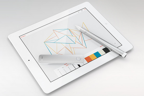
The two products, which Gough demoed at SXSW, as you can see in the video above, are built with clean lines and shod in aluminum and white plastic. They look not mistakenly like something Apple would design.

The two devices work in tandem with an iPad drawing app that Adobe is also developing, one that enables the hardware to mimic an architects ruler and wide array of drafting templates—the greenish, flat pieces of plastic you’ve seen if you’ve been down the art aisle in any office supply store.

With a click of the lone button on the ruler, circles, squares, triangles, arcs and other shapes found in drafting templates appear onscreen for the pen to trace—just as architects, designers and engineers have done repeatedly for decades with a paper and pencil in the analog world. The ruler and pen, which features a pressure sensitive tip, also make drawing a straight line easy—something that can be difficult with a tablet stylus.

And while Mighty and Napoleon are built with the needs of architects and designers in mind, Gough said that Adobe’s first hardware wouldn’t have a steep learning curve—something Adobe software is known for.

“This is an opportunity for Adobe to make creativity accessible to everyone, because anyone who can use a pen and a ruler will be able to use this as soon as they pick it up,” he said. “That’s a sweeping, beautiful mission, but it’s also good business sense. We want everyone to be a potential Adobe customer—not just creative professionals.”


Source: http://on.wsj.com/Pyaq9q

Apple CarPlay hands-on by Gavin Lau

Screen-Shot-2014-03-10-at-23.13.40.png

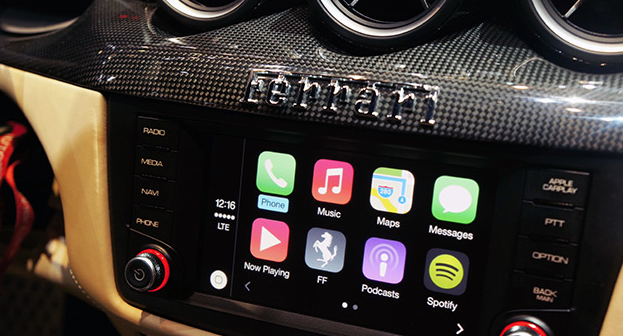
Apple's in-car infotainment system has been a long time coming. After it was announced at the company's annual WWDC conference in June last year, "iOS in the Car" flew under the radar, only to undergo a rebrand and launch publicly yesterday under a new moniker: CarPlay. Sharing part of its name with the company's AirPlay media-streaming protocol, CarPlay combines all of the iPhone's most important features and mirrors them inside the car, allowing car owners to call, text, navigate and listen to music (and more) using touch- or Siri-based voice inputs. The new in-car interface is compatible with new Ferrari, Mercedes and Volvo models unveiled at the Geneva Auto Show, and it's there that we got the chance to test Apple's automotive assistant inside a suitably equipped Ferrari FF coupe. Will CarPlay force you to buy an iPhone to go with your car (or vice versa)? Not really -- the Ferrari we tried actually deployed Apple's dash system alongside its own, while Mercedes-Benz and Volvo (two of Apple's other partners) have said they'll continue todevelop Android and MirrorLink solutions for their new models. Compatible with the iPhone 5 and up, CarPlay is "loaded" into the Ferrari's built-in navigation system by way of a Lightning adapter located underneath the armrest. Wireless connections are coming, at least from Volvo, but our test was limited to traditional cables. Once it's connected, Ferrari will continue to utilize its own infotainment system, but users can load CarPlay by hitting a dedicated dashboard button, allowing all touch and voice inputs to be diverted to your iPhone. This loads the CarPlay dashboard, which features a familiar array of icons and services you'll recognize from your iPhone. From here, it's a case of using the touchscreen or calling upon Siri to load each of the services -- the latter of which can be summoned with the Siri Eyes Free button located on the reverse of the steering wheel.

The first thing we noticed is how speedy everything is. Apps load quickly, and Siri's contextual algorithms hastily recognized our voice commands and responded appropriately. Apple has also implemented safety features to ensure services do not draw your attention away from the road and push forward its "hands-free" theme. For example, when we sent or received a message from a contact, Siri would only read the message back to us and we never once got the chance to see its contents. An Apple representative was able to talk us through each CarPlay feature, so do make sure you check out our in-depth hands-on video above to get a better idea of what Apple and its car maker buddies are aiming for.


Source: http://engt.co/1gOId5x

Smartwatch Apple or Google needs to make by Gavin Lau

Screen-Shot-2014-03-08-at-0.45.50.png

Why can't great smartwatches look like normal watches? Smartwatches, for the most part, can be divided into two categories: vague approximations of the future like the Pebble, Gear, and Gear Fit, or conventionally styled watches from companies like Citizen and Cookoo that offer far less functionality. While it's true the Pebble Steel is making inroads in the aesthetic department, its blocky construction and oversized buttons aren't likely to appeal to the masses.

Gábor Balogh is a freelance designer from Hungary who, like many of us, wants an attractive, watch-like watch that just happens to be smart. The difference between Balogh and the rest of us is he went ahead and designed an interface he believes could enable regular watch designs to include a full bevy of smart features.

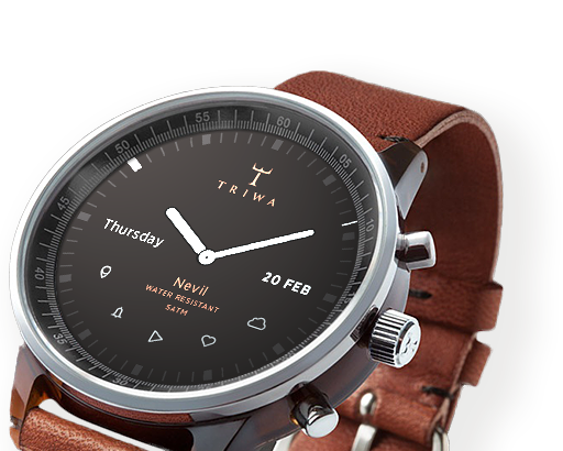
After posting his concept for a smartwatch on Behance, Balogh took some time to talk through his interface ideas withThe Verge. The actual watch pictured in the mockups is almost incidental, as the concept simply takes the Swedish watchmaker Triwa's Havana timepiece (with the company's permission) and replaces its face with a circular display. This proposal is about interface paradigms, not product design. "In this concept the UI does not have a predefined style," says Balogh, "but it would match the housing. Only the navigational patterns have to be taken into consideration."

Although the interface itself will be down to watch and phone companies to decide, Balogh offers up some simple but polished ideas that go very well with Triwa's design. Pairing your smartphone to its watch will make the appropriate app icons appear on the display, with notifications, maps, and music information streamed from the device itself. When you don't want it to be a smartwatch, it mostly looks and behaves like a regular watch.

"I LIKE PRODUCTS WITH DISCREET TECHNOLOGY."

02

"I like products with discreet technology," explains Balogh, "when they serve me, my real needs, and make my life easier rather than simply changing my days." He calls out the Nest thermostat and Apple's Airport Express as prime examples of technology being applied discretely without obscuring functionality. "They're just ticking away in the background, making your life easier."

In an attempt to avoid obfuscation, Balogh's concept doesn't utilize a touchscreen or voice control. Instead, the interface uses the buttons and bezel found on most watches. The bezel is key to this interface. It can rotate to, for example, scroll through a long message or switch functions in an app, or be clicked to make a selection. The rotation element doesn't necessarily need to be physical — Balogh says he could imagine a more classical watch going with a physical dial, or a sporty design opting for an iPod-esque click wheel.

Using the bezel for controlling apps and other smartphone-related tasks frees up the three side-mounted buttons to control "native" functions like time, date, and alarms, as well as switching between modes. This clear separation of native and app functions should make the interface easily accessible to users familiar with how a regular watch works, while the lack of a touchscreen will stop the display from picking up smudges and grime from your fingers, and also stop your fingers from obscuring the display. "The size of the watch is a very limiting factor, so we don't have to make it very smart. I see the watch as a piece of jewelry, and wanted to add an interface that would be familiar on a classic watch."

Of course, Balogh is a designer, not an engineer, and there are technological issues that will need to be overcome before we can hope to wear something like his concept on our wrists. Circular screens, although not impossible, are a rarity, and squeezing a battery and the necessary circuitry into the tiny space that usually contains mechanical watchworks would be difficult. That said, the guts of a Pebble are actually fairly small, and larger watches may be able to contain them.

As a busy freelance designer, it's unlikely Balogh will be able to muster the time or funds to assemble a team and make his concept a reality. But as technology advances it's easy to see a future where tech giants like Samsung rein in their "futuristic" designs and attempt to take on the Breitlings and Tag Hauers of the world with something like Balogh's idea.

Source: http://vrge.co/1lENsu8

Apple CarPlay by Gavin Lau

Screen-Shot-2014-03-04-at-0.50.45.png

Apple CarPlay Apple’s CarPlay is close to being available in the wild via partnerships with a handful of car manufacturers, and Volvo is already showing off what that will look like in practice. The car maker just posted a video to their YouTube account that provides a glimpse at how the system works.

CarPlay will work with a variety of different kinds of infotainment systems, including those with touchscreens, as displayed in the video, and those that use physical controls. Volvo’s integration also allows them to control features and services using steering wheel-mounted controls, and the first vehicle to sport the interface will be the XC90 SCUV, which is coming to market later this year.

Volvo offers up some interesting technical tidbits about how CarPlay works, too. The connection works via H.264 video streaming, that then gathers touch input from the console screen and relays it back to the connected device. The name ‘CarPlay’ is evocative of Apple’s AirPlay, and it sounds like the tech is similar in some ways between the two.

One final detail shared by Volvo in its press release: while currently CarPlay requires a physical Lightning cable connection, Volvo says Wi-Fi connectivity is coming in the “near future.” That could potentially open up access to devices like the iPhone 4S, which is still on sale but which uses a 30-pin connector, but Apple’s CarPlay site clearly states iPhone 5 and newer required for use, so it’s more likely this will just provide another connectivity option for owners of those devices.


Source: http://techcrunch.com/2014/03/03/volvo-shows-apple-carplay-in-new-video-says-wi-fi-connectivity-is-coming-soon

by Gavin Lau

screen-shot-2014-02-27-at-9-46-37-am.png

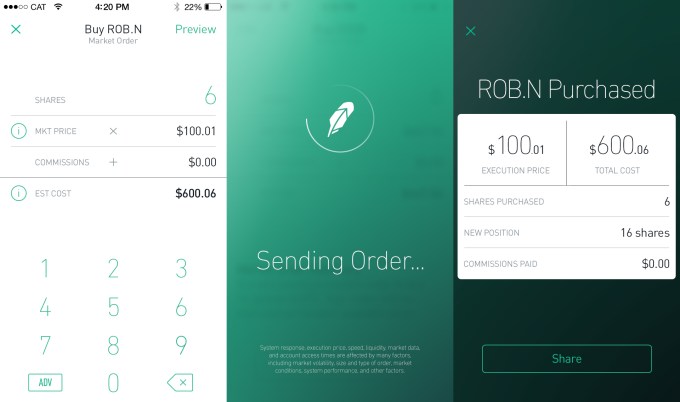
RobinHood is about to let anyone buy and sell stocks for free instead of having to pay E*Trade or Scottrade $7 per transaction. Today RobinHood begins inviting the 160,000 people who’ve signed up to download its glossy new app where you can efficiently track and trade stocks. “It’s by far the most beautiful brokerage app, though that’s not saying much” co-founder Vlad Tenev jokes. But while RobinHood makes Wall Street look stylish in your pocket, what’s special is what it does, and does for free. That’s letting you trade stocks with zero commission. You might assume it would cost RobinHood money to execute trades, but in fact it can make money by moving yours around. We’ve just been conditioned to assume its something you have to pay for after decades of investors handing Scottrade, E*Trade and other brokerages $7 to $10 for each buy or sell.

screenshot-2013-12-18-at-6-36-44-am

Those who want their trading for free can sign up for RobinHood and expect an invitation email over the next few weeks to months. Since you’re trusting it with your savings, RobinHood wants to onboard people with extreme care rather than as fast as possible. But soon it expects to be holding hundreds of millions of dollars for its users so they can make instant trades from their phones.

RobinHood gave TechCrunch the first look at its new app, and its investor Google Ventures‘ attention to design is readily apparent. The whole app is themed white or black depending on if the stock market is open or closed. Meanwhile, the app’s chrome goes green or red depending on if the currently viewed stock is up or down that day. This trick tells you at a glance whether you can officially trade or not and how well you’re are doing.

Robinhood_nightAndDay

Most finance apps only let you monitor stocks like Yahoo Finance or the first version of RobinHood, or charge you to trade them like those from the big retail brokerages. RobinHood co-founder Baiju Bhatt stresses that if you want to do deep financial research, you probably want to sit down at a desktop. But if you want to check your stocks whenever you have free moment and make some trades when the courage strikes you or whenever something shocks the market, RobinHood lets you do it in a few swipes. [Disclosure: I was friends with Vlad and Baiju in college.]

You can set alerts in case your stocks move a certain percentage, or place limit orders that are executed if the price hits a certain point. When you’re ready to make a live trade, just select how many shares of a stock you want to buy or sell. RobinHood previews how much that will cost or earn you, and you swipe to confirm the trade (which triggers some delightful animations and buzzes). And because security may be the biggest threat to RobinHood, it even lets you set up a special pin code that’s required to open the app.

Robinhood_ThreeScreens

RobinHood says it will never charge for trading. Right now, it’s supported by over $3 million in funding from Google Ventures, Index Ventures, Andreessen Horowitz, Rothenberg Ventures and some angels. But it plans to quickly become self-sustained by charging other developers for API access, letting users trade on margin (money they’re owed but don’t own yet) for a fee, and through payment for order flow where stock exchanges pay the startup to bring its trading volume to their marketplaces.

For now, though, RobinHood could democratize stock trading. If you were a fat cat trading in the hundreds of thousands or millions, those little $10 fees didn’t mean much. But if you’re not rich and still want to invest, those commissions could add up to eat away at what you earn through smart trading. By replacing brick-and-mortar store fronts and legions of salespeople with an app and a lean engineering team, RobinHood can pass the savings on to its users.


Source:  http://techcrunch.com/2014/02/27/trade-stocks-free-robinhood

'Details Matter, It's Worth Waiting to Get It Right' by Gavin Lau

SteveJobsFront2.jpg

Today marks what would have been Steve Jobs' 59th birthday, and Apple fans around the world are once again remembering the Apple co-founder and CEO more than two years after his death. Apple CEO Tim Cook is unsurprisingly one of those remembering Jobs today, and Cook has acknowledged the day in a pair of Tweets honoring Jobs and vowing to continue "the work he loved so much".

While remembering Jobs' legacy, Cook may also be indirectly addressing Apple's lack of significant announcements so far in 2014, reminding his followers of Jobs' philosophy on making sure all details are taken care of.

Cook has promised that Apple is working on "some really great stuff" in new product categories, with a smart watch and new television-related products topping the list of rumors. With Apple rarely being a company to rush to market, Cook may be quietly asking for patience as the company continues work on its upcoming products and services.

Coincidentally, today also marks the 14th birthday of MacRumors. Founded in February 2000 before the introduction of the iPad, iPhone, and even the iPod and OS X, the site has grown enormously and fostered the creation of our sister sites TouchArcade andAppShopper. As always, we are grateful to our readers, contributors, sponsors, and all those for whom MacRumors is an online home or a regular stop.


Source: http://www.macrumors.com/2014/02/24/cook-honors-jobs-59th-birthday/

Fitness Tracking Comes To Your Ankle by Gavin Lau

Screen-Shot-2014-02-21-at-11.58.25-PM.png

Fitness Tracking on Your Ankle Flyfit isn't all that different from other pedometer-based fitness trackers –– except you put it on your ankle instead of your wrist.

That's useful for swimmers and cyclists, who didn't get any joy out of the Fitbit, Nike Fuel Band or Jawbone Up. But Flyfit can measure pedal and leg stroke movements.

Flyfit, a Kickstarter project, has been in development since 2012. Like most fitness trackers, it will still record other aspects of your daily activity — your steps, your sleep cycle. It will also connect with your phone via Bluetooth, allowing the device to track pace, speed and your GPS position, all in real time.

The device includes a waterproof, USB-chargeable battery and five different band colors. The battery can last a week in low-power mode. The app, still in development, will be available for both iOS and Android.


Source: http://mashable.com/2014/02/20/flyfit-fitness-tracker/

Mobile payments are finally everywhere you want to be... by Gavin Lau

Screen-Shot-2014-02-20-at-1.03.24-AM.png

NFC was supposed to be the future.

My next phone was going to include the technology, which would let me pay at any cash register by waving my phone instead of swiping my credit card. NFC would also let me touch phones with a friend to share a picture, tap my phone to a speaker to play music, and even unlock my phone with a ring or clip. NFC would someday even replace bar codes,according to Osama Bedier, the one-time head of Google Wallet and unofficial torchbearer of the NFC movement. Google’s contactless payments system was bound to take over the world. Until Google gave up on it.

Carriers blocked the company from deploying Wallet on phones, and retailers outside Mountain View didn’t feel much urgency to upgrade their cash registers with NFC capability. Eventually, Google transformed Wallet into a straightforward PayPal competitor. The best hopes for NFC payment adoption in the US lie with several programs created by carriers (Isis) and credit card companies (MasterCard MasterPass), which only work with a few banks and at select retailers. An NFC payments solution — in the US, at least — is effectively stuck in a stalemate. But a new startup called Loop thinks it has the answer: a wireless payments technology that does what NFC promised to do, all without forcing carriers or retailers to change anything.

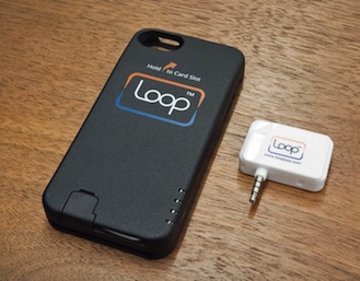
Loop comes in two flavors, for now: a $39 key fob and a $99 Mophie-esque ChargeCase. Both devices hold virtual versions of your credit and debit cards, and work at over 90 percent of the country’s credit card machines without retailers having to change anything, according to Loop. The Fob and ChargeCase work only with the iPhone, for now, but they will be compatible with Android in April. In 2015, Loop expects its technology to be built into a variety of phones from its OEM partners.

It’s the NFC dream all over again, except this time it might actually come true.

Magnetic attraction

Loop co-founder George Wallner founded Hypercom in the late ‘70s. You probably haven’t heard of it, but Hypercom built the technology behind many of the credit card readers still used in grocery stores, coffee shops, and other retailers today. After making his millions and eventually selling to Verifone, the biggest player in the space, Wallner retired to his yacht. "I was not paying much attention to the payments industry," he says, at least until about a year and a half ago. A friend mentioned that NFC was being pushed as a new medium to transmit credit card information.

Loopscreenshots2_300

"I was surprised that NFC, which is a good technology, was being used in such a simple way," Wallner says. "The best way to do it is to work with the equipment [retailers] have today — not just something in between." Wallner, an engineer by trade, prototyped a new technology that would transmit magnetic-stripe credit card data, but do it wirelessly. It would effectively have the same impact and feature set as NFC payments, but would work at over 90 percent of credit card machines in the US. Wallner was about to come out of retirement.

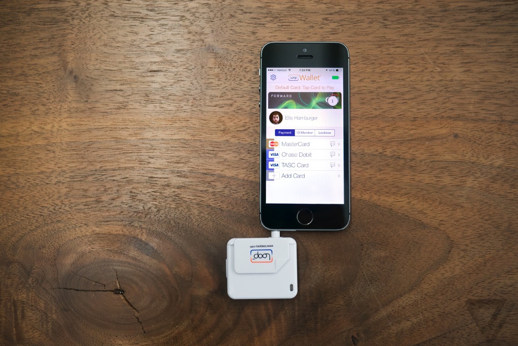
He founded Loop with Will Graylin, an entrepreneur whosold a mobile payments company of his own to Verifone, and Damien Balsan, the former head of NFC business development at Nokia. Loop’s first products are the Loop Fob and the Loop ChargeCase. The Fob is essentially a Square-esque credit card reader, and the ChargeCase is a battery pack / case combination with small credit card reader dongle. The Fob connects to your phone via headphone jack, while the ChargeCase connects via Bluetooth. Both devices interface with the PIN-protectedLoopWallet app, which lets you scan in your cards; Loop stores your card data in an encrypted form on your phone, and inside a secure element on the Fob and ChargeCase.

You’ll need to be within a few inches of the actual reader head inside a credit card terminal for it to work, but Loop’s range is good enough that you don’t need to hit it on the nose. From there, pressing a button on the side transmits the magnetic signal for your most recently used card just as if you’d swiped it. If you’re using the ChargeCase, you can tap a card’s icon inside the LoopWallet app to transmit its signal. I tried both the Fob and ChargeCase at coffee shops, taxis, restaurants, and grocery stores, and every time, cashiers were skeptical and wanted to call their manager. Only when I was persistent ("Look, just press the button, trust me") would they do so. And to their surprise, Loop almost always worked on the first try.

Loop_fob_and_keys

The point of sale

I’m happy with Loop’s reliability, but less so with its initial product designs. The Loop Fob is a bit chunky, and only holds one card at a time. (Coin solved this problem with an onboard screen and card-switching button, but it remains to be seen how well it actually works in practice.) I ended up carrying around both the Fob and my wallet just in case, which defeats the purpose of the Fob. Perhaps if it were much smaller, like a Mobil Speedpass, I’d bring it with me everywhere.

TAPPING ON MY PHONE TO PAY FOR SOMETHING FEELS TRULY FUTURISTICLoop_chargecase_and_reader

The Loop ChargeCase is a more logical form factor that provides both backup power and payment capabilities. The ChargeCase is essentially a cheaper-feeling Mophie: it can be activated either with a quick button press on its side, or using the Loop Wallet app. Inside the app, you can flip through all the cards you’ve scanned in, then tap one to transmit its magnetic signal to a credit card reader. Tapping on my phone to pay for something feels truly futuristic, like the Google Wallet promotional videos of yore. This was the promise of Google Wallet, but it’s Loop that delivers. And Loop says it’s already working on a new version of the ChargeCase with a removable Loop card you can hand to waiters and bartenders.

Loop worked at most credit card machines I tried aside from subway-ticketing machines, gas pumps, and ATMs that require you to fully stick in a card for a scan to take place. Loop has hacked its own way to working at these kinds of terminals — it involves sticking another card into the reader slot, and then pressing a Loop device against it — but it’s not worth the trouble. Loop also didn’t work at Duane Reade, a popular chain of drugstores in New York, but Loop says this is only because Duane Reade hasn’t upgraded the software in its credit card readers. At Walgreen’s and Staples, the credit card readers accepted debit card transmissions via Loop, but not credit card transmissions. They require a software upgrade too, it seems. But despite the hiccups, Loop worked in far more places than any mobile payments app or hardware I’ve ever tried. The company solved a big piece of the payments puzzle — but in doing so, revealed another enormous obstacle blocking the path of any mobile payments startup.

Loop_fob_and_phone

In your pocket

Loop’s biggest problem is that it’s a waste of time. It feels magical to use, but isn’t worth the additional 10 or 15 seconds it takes to explain to each and every cashier. At a bar or restaurant, handing over my phone or Fob while yelling instructions over the chatter of other patrons was both awkward and impractical. And even if a friendly cashier doesn’t ask any questions before trying out Loop, they almost always ask questions afterwards. I felt like I was not only wasting my time, but the time of the people in line behind me, like the main character in that one VISA commercial.

Hardware ubiquity, as it turns out, is only half of NFC’s problem. The other half is that it requires cashiers to trust you aren’t trying to hack them by touching your gadget to their credit card reader. Even if Loop works at every register, it doesn’t compute for every cashier. Acceptance may come in time as more cashiers learn about Loop, but I have a feeling that true ubiquity would only come from corporate executives formally deploying new systems asStarbucks and Whole Foods have done with Square readers. Or perhaps even from Isis.

EVEN IF LOOP WORKS AT EVERY REGISTER, IT DOESN’T COMPUTE FOR EVERY CASHIER

Loop and others say they add value by offering retailers digital rewards and custom payment app experiences, but these perks are separate pieces of the payments puzzle that should come once mobile wallets are ubiquitous. Loop also offers the ability to take pictures of your ID and loyalty cards for storage inside the Loop Wallet app, but until I start sprouting gray hairs, no bouncer is going to accept a photo of a photo ID. So I’m stuck with two or three cards in my wallet, which is really no less convenient than carrying five or six cards.

Wallner does say that Loop’s hardware is more secure than a credit card since it can’t be skimmed, providing one more reason to use it. I haven’t been able to personally verify the truthfulness of this statement, but in a world where credit card companies are liable for all fraudulent purchases, Loop’s security isn’t a killer feature.


Source: http://vrge.co/1nNBPOr

Dear Car Makers: Please Hire People Like This by Gavin Lau

car-inter.png

How touch screen controls in cars should work The interfaces in modern cars are, with rare exception, awful.

It’s almost absurd, really. The car is one of the most expensive things that people buy for themselves. It’s massive. It’s got a power supply that lasts for days… and yet, it’s one of the least “smart” devices in our lives. A three-year old tablet headed for the recycling bin puts the stock interface in most cars to shame.

The operating systems are slow, and often bug-riddled. If there’s a touchscreen, it’s almost certainly a crappy, low-res screen using yesteryear’s touch technology.

Worst of all, they’re dangerous. Over the last few years, touchscreens have become fairly standard in many new, mid-range lines. Which is great! The problem? Manufacturers didn’t really go about it right. Rather than seizing the opportunity to design something entirely new around touch, they just took all of the physical, oh-so-pressable buttons they once splayed across the dash and crammed them onto a touchscreen. Haptics? Sensible, spatial design? Whatever, we’ve got a touchscreen! Shiny!

As a result, actions that once required but a pinch of muscle memory (like, say, changing the station) now require you to take your eyes off the road entirely, lest you blindly jam your finger into the wrong button in that flat sea of glass.

Voice control is a strong contender here — perhaps more so than in any other space, really. But that’s yet another place where cars are lagging. As Google’s voice recognition approaches an almost terrifyingly accurate level, I’m still finding myself angrily shouting at my 2014 model car while it fails to figure out which of six possible commands I’m saying.

Thankfully, both Apple and Google have realized the massive space to be won here, and are actively working to take the manufacturers and their terrible design work out of the mix. It won’t happen overnight — but in just a few years, interacting with our cars should be a whole lot less awful.

In the meantime, let us all drool over this just-posted concept video by Matthaeus Krenn, whose LinkedIn profile lists his last job as being a product designer at Cue — the team behind the titular Cue personal assistant app that was acquired by Apple back in October.

Is it perfect? No. Amongst other things, it requires users to learn and memorize how to control an interface, rather than working in a way that they can discover naturally. Is three fingers A/C control or audio source control?

But we need more of this. We need more smart people thinking about how we interact with our cars, especially as touchscreens become more and more common. When we’re steering what is essentially a 2-ton metal missile down the street, skipping to the next song shouldn’t be a dangerous decision.


Source: http://techcrunch.com/2014/02/18/dear-car-makers-please-hire-people-like-this

Will Our Computers Ever Be Real Friends? by Gavin Lau

her3.jpg

Technology has grown increasingly personal over the years, but can it ever be a "friend" in the way we think about human friends? The movie Her, directed by Spike Jonze, envisions a future in which operating systems have evolved to learn from our behaviors and proactively look out for our best interests every day. They're our personal assistants, but they've become nuanced to the point that we have no problem calling them our friends. And when a person says they're in love with their operating system, it's not particularly weird.

The star of Her is OS1, a new operating system that, when you first launch it, creates a unique persona to best accommodate its user's personality and communication needs. For the film's lonely protagonist, OS1 takes on the name "Samantha" and acts as a personal assistant to control connected technologies like computers, smartphones and TVs. Voiced by Scarlett Johansson, she is also the most human-sounding non-human ever built.

Samantha talks and responds naturally like a human, but she can also "like" things like colors, faces and stories. She can "see" her surroundings via webcam, laugh at jokes, make her own jokes, and even exhibit feelings of joy and sadness. She can also recognize and analyze patterns in its owner's recreational habits, relationships and career, and offer beneficial advice without the user needing to ask for it—just like a friend would.

If AI's goal is to emulate human behavior, OS1 might be the ultimate realization.

The closest modern approximation to the fantasy depicted in Her is the virtual personal assistant, which can be found in desktop clients like Nuance’s Dragon Assistant and smartphone apps like Apple's Siri or Google Now. While it's highly unlikely that any of these products will turn into anything like OS1, many natural language developers believe it won't be long before our AI assistants get much more personal than they are now.

More Than Human

Nuance CMO Peter Mahoney says his company’s been spending more time building out virtual assistant capabilities due to the “groundswell of interest in making more intelligent systems that can communicate with humans more fluidly.”

Since computing technology has reached the point where it can now access huge amounts of data in the cloud, sift through that data and make real-time decisions about it in just seconds, Nuance has worked hard to transition its solutions from solely transcribing audio to actually extracting meaning from the text.

“Dialogue is really important,” Mahoney told me. “In the original systems that came out, it operated like a search engine. You say something and something comes back, but it may or may not be the right thing. But that’s not how humans work. Humans disambiguate. We clarify.”

Creating “natural-sounding” systems that can dissect speech and read between the lines, though, is just as difficult as it sounds.

Martijn van der Spek is the co-founder of Sparkling Apps, a startup that owns nine different speech recognition services including Voice Answer, which the company calls its "next-generation personal assistant." According to van der Spek, virtual personal assistants require massive amounts of server power, and smaller startups with AI solutions—like Sparkling Apps’s Voice Answer and its virtual "assistant" Eve, who does the talking—simply can't afford to power a truly smart assistant with expertise across a broad number of domains, as opposed to just a few.

“The amount of data stored results in performance issues for our servers,” van der Spek told me. “This together with the concern of privacy has made us clear Eve’s database every 24 hours. So she suffers from acute amnesia and any long-term relationship is doomed to fail.”

Luke Muehlhauser, CEO of the Singularity Institute for Artificial Intelligence, also noted that AI is advancing more slowly than it might because many researchers aren't sharing their information. Large private companies like Google and Facebook are keeping their AI-related research under wraps, whereas academic researchers constantly publish their progress in journals.

Getting To Know You

Digital assistants may never evolve to love us like OS1 does in Her, but maybe they'll at least eventually remember what we've told them in previous conversations.

Today’s personal assistants are helpful with solving problems that are happening right now (“play a song,” “text Joe,” “launch Skype,” “find a Chinese restaurant nearby,” etc.). But if AI ever wants to approximate human behavior, its systems will need to be a little more thoughtful. And that means pushing intelligent systems to store more data and consider more contextual information when making decisions.

“A human who is thoughtful understands your needs, wants and desires—he or she understands you and can contextualize that,” Mahoney told me. “One of the things you talk about is having all the information. The more online information and the more great services out there that exist, the more we’ll be able to connect our intelligent systems that can understand everything that’s going on.”

What drives a recommendation engine isn't just information, but learned combinations of relationships, classifications and genres. “Structured content will happen first versus things that are less structured—those will be more complicated to figure out,” Mahoney said. In other words, today's personal assistants know a lot about what's playing in theatres, but those less-structured concepts—like remembering previous conversations about favorite movies to proactively recommend a new movie the user may like—are going to take more time to develop.

Ray Kurzweil, the noted inventor and futurist currently working with Google on its X Lab projects, believes that Google will build a computer that can understand natural language and human emotion by 2029. But as he told tech blogger Jimi Disu in December, an amped up digital assistant could be in our pockets in as little as four years:

Right now, search is based mostly on looking for key words. What I’m working on is creating a search engine that understands the meaning of these billions of documents. It will be more like a human assistant that you can talk things over with, that you can express complicated, even personal concerns to. If you’re wearing something like Google Glass, it could annotate reality; it could even listen in to a conversation, giving helpful hints. It might suggest an anecdote that would fit into your conversation in real-time.

Making Friends In iPlaces

Over time, the intelligence of personal assistants will expand as the online catalogue of information grows deeper and better-connected. And lots of big companies are investing heavily to make the best use of those vast information stores.

Last October, Apple purchased a unique “personal cloud” company that can search deep into social networking accounts. And Google recently purchased AI firm DeepMind Technologies, which “uses general-purpose learning algorithms for applications such as simulations, e-commerce and games,” according to its website.

See also: Google's Game Of Moneyball In The Age Of Artificial Intelligence

But collecting massive libraries of information isn't enough to power a true personal assistant. Companies like Apple and Google also need to perfect the "dialogue" factor, since there is all too often a noticeable lapse in time between the user's question and the personal assistant's answer.

The key might be to disconnect from the cloud entirely—or at least to minimize the number of times the system must connect to the cloud. But even though personal assistants would benefit from as much local processing as possible, the ideal personal assistant—think "best friend that knows everything about you"—needs access to the deep catalogues of online information. Companies are working on anticipating users' needs to have the most relevant information ready to deliver, but there's a lot of information to consider and many moving parts.

Google is experimenting with a few solutions to make personal assistants work faster, namely with offline voice recognition in Android, while Intel's new Edison computer might make it possible for voice recognition over mobile devices or even wearables to work near-instantaneously. The key, according to most companies, is to minimize the number of round trips over cellular-data signals to make processing—and in turn, conversations—more snappy.

See also: If AI Means The End Of Us, Maybe It's Okay

Intelligent personal assistants will become more valuable as they get better at understanding the subtleties in communication, but researchers and developers will eventually be forced to grapple with the issue of ethics. If we can program a computer to function like a brain in order to like or even love us, there’s nothing stopping developers from fine-tuning those powerful systems to personal or corporate interests as opposed to a true moral compass.

In other words, we want AI to drive our cars, manage traffic congestion, save energy in our homes, and better organize our daily lives—not to constantly nag us to visit Wal-Mart.

Movies like Her make us fantasize about personal assistants that can be true friends, but the state of today's AI technologies leads one to believe this won't be happening anytime soon. Personal assistants are nifty features, but they need to improve their listening skills, knowledge bases and memory banks before they can be our trusty sidekicks.

In time, AI assistants may grow smart enough to learn our habits and advocate for our best interests, but the odds are against personal assistants ever leaving the friend zone to become something "more." And there's nothing wrong with that.


Source: http://readwr.it/s19n

giant 3D selfies at Sochi Games by Gavin Lau

asif_khan_megaphon_sochi_8719huftoncrow_022__0.jpg

Visitors to the Sochi Winter Olympic Games are being given the opportunity to create giant self-portraits in a pavilion created by designer and architect Asif Khan and commissioned by Russian telecoms company MegaFon. The pavilion is situated at the entrance to the Olympic Park and judging by these photos and the video shown below, is pretty darn cool. The 2,000 metre-squared cube features a kinetic facade that can recreate the faces of visitors from 3D scans that are made in photo booths installed within the building.

The finished portraits appear three at a time, with each one displayed eight metres tall. Created by Khan in collaboration with Basel-based engineers iart, the portraits are formed by the use of 11,000 actuators.

"Each of the 11,000 actuators carries at its tip a translucent sphere that contains an RGB LED light," says Valentin Spiess, CEO at iart. "The actuators are connected in a bidirectional system which makes it possible to control each one individually, and at the same time also report back its exact position to the system. Each actuator acts as one pixel within the entire façade and can be extended by up to two metres as part of a three-dimensional shape or change colour as part of an image or video that is simultaneously displayed on the facade."

According to Spiess, the process of creating a selfie at the pavilion is as "fast and simple as using a commercial photo booth".

Khan has form with Olympic pavilions, having created the Coca-Cola Beatbox pavilion for the London 2012 Games. That piece featured a series of interlocking ETFE cushions with sound embedded within them, meaning that visitors could 'play' the pavilion like a musical instrument. Both the London and Sochi pavilions reflect Khan's general interest in creating transformative structures.

"For thousands of years people have used portraiture to record their history on the landscape, buildings and through public art," says Khan of the Sochi work. "I’m inspired by the way the world is changing around us and how architecture can respond to it. Selfies, emoticons, Facebook and FaceTime have become universal shorthand for communicating in the digital age. My instinct was to try and harness that immediacy in the form of sculpture; to turn the everyday moment into something epic. I’ve been thinking of this as a kind of digital platform to express emotion, at the scale of architecture."

Source: http://shar.es/QK706

DevArt: Google's ambitious project to program a new generation of artists by Gavin Lau

DevArt - Art Made with Code[metaslider id="156"]The exhibition is called Digital Revolution, and from July 3rd to September 14th it will explore the impact of technology on art over the past 40 years. It will feature artists, designers, musicians, architects, and developers to reveal the artistry that's all around us, from the films that we watch to the games that we play. DevArt, its final act, will showcase three large-scale, “magical” works of art from established artists, and one that's yet to be announced. That’s where you come in.

At the core of DevArt is a new website and competition from Google that hopes to inspire coders to get creative, and offers them the platform on which to do so. The winner of the eight-week competition will have the opportunity to exhibit their artwork in the DevArt area at the Barbican. In addition to the main prize, one project will be highlighted on the site’s front page each week — it’s a massive opportunity for some serious exposure.

"ART ISN'T JUST THE OUTPUT BUT THE ENTIRE DEVELOPMENT PROCESS."

The winning piece will be exhibited alongside artworks from three of the biggest names in digital art, and all of them will be developing their work in public through the DevArt site. “What we're trying to show,” explains Google Creative Lab’s Emma Turpin, “is that art isn't just the output, but the entire development process.” Anyone visiting DevArt will be able to follow the projects, look through each artist's code, and see that code slowly refined and developed into the final exhibit.

Zach Lieberman is one of the artists that will be developing his idea for DevArt. He’s been working in the field for over a decade, regularly creating new artworks, and he also co-authored openFrameworks, an open-source tool kit that helps others to code creatively. His work uses technology to create unexpected experiences, often incorporating gesture, sound, and more than a little showmanship.

Lieberman’s piece for DevArt is tentatively titled Play the world. It will allow visitors to play on a keyboard that samples sounds, in real-time, from hundreds of radio stations around the world. Play a "middle C" on the keyboard, for example, and it may pick up a matching note from a sports radio show in Nigeria, or a bossa nova station in Brazil. The keyboard is surrounded by a circle of speakers, and the sounds will be "geographically oriented" depending on where in the world they've come from. Like most of Lieberman's art, what's going on behind the scenes is highly complex — scanning hundreds of the world's radio stations while simultaneously analyzing pitch is no easy feat — but to the person playing that keyboard, it should feel effortless.

Taking a different approach are Varvara Guljajeva and Mar Carnet, better known as Vavara + Mar. They’ve covered a vast range of topics with their work, but the results are always clever, playful, and leave a lasting impression. In 2012 they turned a São Paulo skyscraper into a giant metronome that beat to the "rhythm of the city" based on social media activity. Their DevArt piece takes the now-everyday occurrence of speech recognition and injects a healthy dose of whimsy.

Titled Wishing Wall, it attempts to reimagine how we share our wishes with the world. Visitors will be invited to tell their wish to the wall, where the words will transform before them into a butterfly. These butterflies will be generated by analyzing speech and determining the sentiments behind the words used, and the result will be a giant wall of wishes represented by butterflies that visitors can then interact with.

The final commissioned piece will come from Karsten Schmidt, whose name will be familiar to many Londoners. His malleable, open source digital identity for the Decode exhibition at the city’s V&A museum captured the public imagination, and his new work will expand on the co-authorship ideas he first introduced years ago.

Co(de)factory (another tentative title) will play out like a performance, and, much like the DevArt competition itself, it gives the public a starring role. Schmidt has created a set of 3D-modeling tools and will invite the public to contribute a small section to a larger work either online or using computers in the DevArt area. When completed, these works will be printed live at the exhibition using a UV 3D printer, an almost theatrical machine that appears to "grow" objects from a photosensitive liquid using UV light. At least one of these collaborative artworks will be printed every day and exhibited in the space, and over 70 will be printed over the duration of the exhibition.

Taken at face value, the three projects couldn’t be more different, but all will be created much in the same way any piece of software is. The message is simple: all you need is an idea, and the ability to code it, and you can create amazing things. Anyone can sign up for the DevArt competition and start coding, regardless of experience; it even connects up with the popular software development site GitHub, so would-be art superstars just need to link up a GitHub project and updates will be pulled into their DevArt page automatically. Through the competition and exhibition, Google and the Barbican hope to encourage creative coding, but more importantly, they’re looking to show that code can be, and often is, art.

TECHNOLOGY IS EVERYWHERE, AND THE PEOPLE THAT CREATE IT AND CREATE WITH IT ARE, AND ALWAYS HAVE BEEN, ARTISTS

The Barbican has successfully showcased digital and interactive art for years, notably with2012's massively popular Rain Room, but Digital Revolution is more than that. It’s a dizzyingly ambitious show that will feature historic pieces like vintage arcade cabinets alongside contemporary work from the special effects teams behind Gravity and Inception; video games from small indies and larger developers like Harmonix, the team behind Rock Band and Dance Central; a multitude of audio exhibits from artists like Philip Glass; and what sounds like a rather special collaboration between Will.i.am and audio artist Yuri Suzuki, who’s currently crowdfunding a synthesizer that can turn anything into a musical instrument.

Through Digital Revolution, and perhaps no more so than with DevArt, the Barbican wants to tell the world that technology is everywhere, and the people that create it and create with it are, and always have been, artists. Digital art is art.

So what’s in it for Google? DevArt is the brainchild of Google Creative Lab, a free-thinking arm of the company that showcases why, before the data collection, and before the privacy scares, so many of us fell in love with the company. It’s an in-house design agency, a brand consultancy dedicated to just one company. It employs top-tier designers, developers, and technologists who are encouraged to create, innovate, and experiment for the good of Google. It was instrumental in the redesign of most of Google’s services that saw aesthetics and usability as equally important qualities, and it’s also quite unique in its willingness to work with other companies to show what’s possible with Google services. As you’d expect, DevArt showcases more than a few of these services, with all of the exhibits tapping into a couple of Google properties like its Cloud Platform or Maps API.

"DEVELOPERS AND CODERS ARE THE NEW CREATIVES."

Discussing DevArt with Conrad Bodman, guest curator at the Barbican, and Steve Vranakis, executive creative director at Creative Lab London, it’s clear that they’re far more enthusiastic about the exhibition than the opportunity to promote Google services. Both firmly believe in the idea developers and coders are "the new creatives," and technology is the canvas for that creativity. "What we really wanted to show," says Vranakis, "is that if you give the platform and the opportunity for coders to express themselves creatively they could make something incredible."

As Bodman talks through his plans for Digital Revolution, Vranakis’ face lights up in excitement over the who’s who of artists being name-dropped. Usman Haque, whose company Umbrellium creates massive, interactive urban installations is also involved, and he’s apparently working on a giant interactive exhibit involving lasers that everyone is looking forward to. They’re looking to transfer that excitement to a new generation that has yet to discover digital art, and coding in general.

The timing, in the UK at least, couldn’t be better. As the exhibition ends and begins to move its way across the world, computer programming will, for the first time, be taught to all children in England from elementary school through to high school. The children that come flocking to Digital Revolution this summer might be wowed by the lights and interactive elements, but what they take away to their new programming classes could be far more important. "If a 10-year-old girl [visits DevArt]" says Turpin, "we want her to understand that coding can make butterflies fly and land on her hand, and show her the magic behind what they see. And that magic’s code."


Source: http://vrge.co/1lApPnD

Pacemaker and Spotify cue up the iPad's simplest DJ app by Gavin Lau

Screen-Shot-2014-02-05-at-12.00.07-am.png

Jonas Norberg built two great products that nobody used. The first was the award-winning Pacemaker, a wonderfully nerdy beatmaking gadget that cost $850. The second was a tablet app for DJing, but Norberg chose the wrong partner to launch with — the BlackBerry Playbook. After being booted out of his own company and then buying it back, Norberg is trying once again to make a dent in the world — but this time, he picked a better partner: Spotify. Pacemaker for iPad, a new DJ app, launches today with exclusive access to Spotify's massive streaming music library, and the ability to play two Spotify songs simultaneously for the first time.

Pacemaker is a free app entering a crowded market of premium DJ apps like Djay and Traktor. Most of these apps use clever touch interfaces and a laundry list of features to appease both pros and amateurs, but Pacemaker takes a different approach. "We want to do for music what FiftyThree did for drawing on the iPad," Norberg says. What he means is that anyone can pick up Pacemaker and use it, without having any prior DJ skills, and without needing to own a giant library of hot tracks to mix. If you plug in your Spotify credentials (or sign up for a free trial inside the app), you're instantly granted access to Spotify's 20 million-track library of songs.

I was nervous when Norberg handed over his iPad and asked me to play it, having no prior experience, but after a few minutes of tapping around I felt pretty comfortable scratching, adding loops, and setting cues in my mix. Pacemaker’s unique radial interface finds an excellent balance between simplicity and feature bloat, offering up to eight effects like Bass and Treble, as well as a few beat pads for looping and beat-skipping. Each of these effects and adjustments are operated the exact same way — using the spin of your finger on a circle, just like with the original Pacemaker gadget. Its color palette is friendly and inviting, while its Sync button made sure my tracks never stuttered when I switched between them. The app even manages a few power-user features of its own, like a memory that records cue points you’ve set up in your most-used tracks.

As I played around with the app, I quickly realized that it wasn’t really competing with the likes of Traktor and Djay, the two industry leaders for tablet DJ software. Pacemaker was instead offering up a new kind of DJing experience that most people could have fun with without getting tripped up in settings menus and synthesizers. Traktor and Djay offer an outstanding array of features, but to an amateur like myself, they can be stifling and sometimes overwhelming. Half the battle is also amassing a big library of great tracks — another problem that Pacemaker solves with its Spotify partnership.


PACEMAKER FOR IPAD SCREENSHOTS

Pacemaker worked directly with Spotify on its integration, which includes a number of tweaks to make playback and streaming as smooth as possible. Perhaps most importantly, Spotify allows Pacemaker to stream two tracks simultaneously — a first for Spotify. In my tests, songs loaded from Spotify as quickly as they did from local storage, and were just as responsive. You can’t, however, record mixes that include Spotify tracks for licensing reasons. This is pretty much what I would expect, but it’s a shame that Pacemaker didn’t work out some way to save your Spotify mixes — perhaps by requiring an internet connection for you to play them.

"DEMOCRATIZING DJING WAS SOMETHING WE’VE ALWAYS BEEN STRIVING FOR."

The app is reminiscent of iPhone mixer Figure in its approachability, and with the addition of Spotify integration and no price tag, Pacemaker is an easy recommendation to anyone interested in DJing. Pacemaker, like FiftyThree’s Paper, offers a set of effects to start you off, but also offers an array of upgrades in a "try before you buy" store that’s a near carbon copy of FiftyThree’s. But as with Paper, you can do a whole lot without buying any of the extra effects the app offers for $1.99 each, like Reverb, Roll, Echo, Loop, and Hi-Lo, and Beatskip. I wasn’t entirely sure what all of these effects did to my music, but they were all fun to play with — and thanks to the app’s consistent interface, it was easy to mess around with any of them and feel cool doing it. "Democratizing DJing was something we’ve always been striving for," says Norberg. "We have a free app that’s really easy to get into — and now the final barrier is removed by having Spotify integration."


Source: http://vrge.co/1fJ3vSS