UX of microinteractions for user delight by Gavin Lau

0*z0PFec0Od85oqnrS..png

Imagine you liked a medium post, you want to appreciate the work. What will you do?

You will click or tap on the clap icon.

Now, if you are reading this post on a desktop, then gently hover your mouse on the clap icon on the left side of your screen.

What happens? The circle bursts a little.

Now click on the clap icon. There is another little explosion and you get a number on the top of the icon.

0*yGsZbLV3Mjk7tK3c..png

The little burts. The tiny explosions. The movement of icons. The popping of numbers. All of these are microinteractions.

Microinteractions have become an essential part of our digital life. From the time you wake up to your mobile alarm, to checking emails, liking your friends post on Facebook to playing songs on your iPhone- we live with microinteractions all day.

“Good design is actually a lot harder to notice than poor design, in part because good designs fit our needs so well that the design is invisible, serving us without drawing attention to itself.” — Don Norman


Why microinteractions matter?

We are living in the age of user experience. Be it on mobile or desktop, your user wants to accomplish their goals with fun and an humanized experience. But microinteractions do more than that like-

  • Help your user navigate the website
  • Give feedback on completed actions
  • Help users in their next action
  • Motivate users to take action
  • Boost engagement with software

Dan Saffer in his book ‘Microinteractions- Designing with details’ identifies four parts of a microinteraction.

0*S2D9O-ycvT_UEoYi..png
  • Triggers initiate a microinteraction. Triggers can be user-initiated and system initiated. In a user-initiated trigger the user has to initiate an action, say in the medium’s clap icon. In system initiated trigger, the software detects certain rules are being met and initiates an action, say the locking of phone when it is idle for sometime.
  • Rules determine what happens once a microinteraction is triggered. In the medium’s clap icon it initiates a little burst or explosion.
  • Feedback lets people know what’s happening. Anything a user sees, hears, or feels while microinteraction is happening is feedback. It means that your action has been acknowledged. Remember the vibration on your phone when it is silenced or when it is switched on/off.
  • Loops and Modes determine the meta-rules of the microinteraction. What happens to microinteraction when conditions change or when they expire? Will the feedback be repeated?

Now that we know microinteractions play a big role in boosting your user experience and helps in making him engage with your website/app, let’s discuss how we can maximize their impact.


Here’s few tips to boost UX of microinteractions

Identify right opportunities: Microinteractions are tiny elements that can be used anywhere. However, it is important to tie the microinteraction with some value. The value can be to-

  • Attract your user’s attention
  • Communicate with the user
  • Provide feedback to the user
  • Help him complete an action
  • Motivate him take an action
0*cJ2XI_db1Ggnqfp5..png

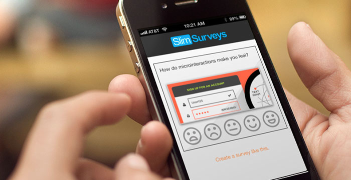
Keep it simple: One thing users hate is cognitive load. And this comes from complexity. Your users want to accomplish their tasks fast. Super fast. Don’t make your microinteractions a stumbling block in their path. Keep it simple and easy to understand.

Source: Opera

Source: Opera

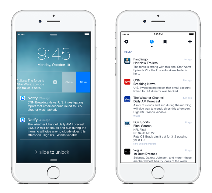
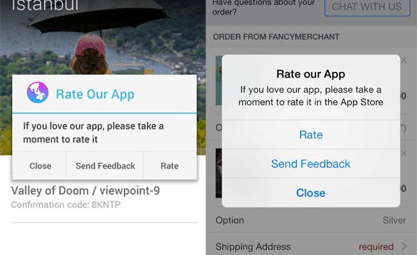
Keep it short: Micro in ‘micro interactions’ is an operative word. Keep your microinteractions tiny and short. Keep it fast. It shouldn’t take more than a second to happen. More and you are not helping the user.

Source:Technousa

Source:Technousa

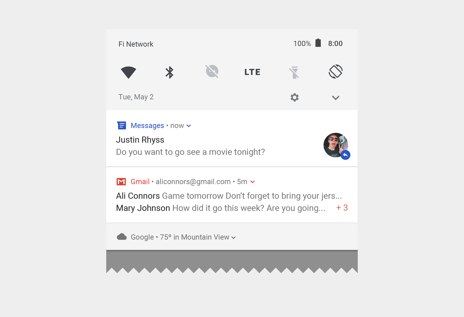
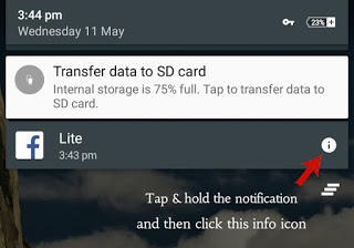
Be predictable: Your users are tuned into a set of behavioral patterns. Like the color ‘green’ means go ahead while ‘red’ means stop. An ‘upside thum’ means like and ‘downside thumb’ means it’s not good. Changing them will take time. And microinteraction is not the place. So it’s important that you follow standard conventions while designing your microinteraction.

Source: Adobe

Source: Adobe

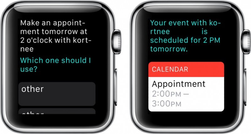
Make it fun: The idea behind creating microinteractions is to humanize the experience. And humans love having fun. Use animations and icons to good effect.

Source: UX Planet

Source: UX Planet

Make it a part of your overall design: Align the design of your microinteractions with your overall theme design. Use complimentary colors, typography and styles to create a visual harmony with your overall design.

0*C1MXJxx6sTGZGSdK..png

Test to perfect it: As with any design element, you must try out different microinteractions and test it. While testing it’s important that you also consider user fatigue with the microinteraction. Many a times, an interaction looks fun first time but gets boring thereafter. So make sure that your microinteraction is able to keep the user interest after repeated use.


Final Thoughts

User experience is important for the success of the software you are designing for. And microinteractions have the potential to take the user experience to next level. So think about the end-to-end experience, identify gaps and then use microinteractions to delight your users.


Designing Facebook for Mobile VR by Gavin Lau

1*FuCHZktdV4VIOuVc3WjoLw.png

The mission of the Facebook Immersive Design team is to enable people to experience moments as if they were there. We believe the ability to tell and experience stories unbounded by a rectangular ‘frame’ allows people to connect more deeply with those moments and ultimately each other.

We’ve built support for 360 photos and videos on all platforms and have seen more than 25 million 360 photos and more than 1 million 360 videos posted on Facebook to date. Although Facebook hosts a lot of great 360 content, it can be easy to miss in your News Feed and hard to find when you have a headset ready.


Introducing Facebook 360

For the past few months, I’ve been working on designing the next step in making 360 photos and videos even more immersive and easier to discover: the Facebook 360 app for Samsung Gear VR, powered by OculusIt is the first dedicated Facebook media app for the Gear VR platform, a destination to view 360 photos and videos from Facebook in VR.

1*klof4wvN8Hir7_xWSEz8Pg.png

Facebook 360 is a one-stop shop for catching up on what you may have missed from your friends and pages you follow, immersing yourself in the 360 photos and videos you’ve saved while finding something new to enjoy.


The app features four sections:
 
Explore: The most popular 360 content on Facebook from media companies, organizations, and individual creators.
 
Following: 360 content from friends and Pages you follow on Facebook.
 
Saved: 360 content you save from News Feed on mobile and desktop right in the app, ready for you to enjoy at a more convenient time.
 
Timeline: Your memories ready to be relived in a new way through the 360 photos and videos you’ve shared.

We focused on providing people with a coherent experience in Gear VR that mirrors people’s traditional Facebook usage. We ran weekly research sessions with participants of different backgrounds to validate our assumptions along the way.


Facebook as a Destination

When designing the app, it became clear that the context of use for 360 photos and videos from Facebook is very different in VR. People are likely to visit Facebook on their phones or desktop many times a day, but VR sessions are typically longer and more deliberate; users typically set time aside for more immersive experiences.

1*PJPbtDq-8MJtCDsr6ocWLQ.png

Furthermore, we heard that even though people enjoy viewing 360 content, it can be inconvenient to move your phone around to interact with it, especially in a public setting. To address this, we added the ability to access your Saved content from within the Facebook 360 app for Gear VR. This allows people to save 360 content for later as they encounter it on News Feed, then access it within Facebook 360 when it’s most convenient for them. By doing this, folks can set aside time throughout their week to catch up on what they’ve saved to watch later.

This symbiotic relationship between 2D and VR environments aims to meet people where they are and guide them along a more immersive experience at their own pace.

Once inside Facebook 360, our goal was to help people discover some of the great 360 content on Facebook that they might not have encountered. We set out to address this by creating an Explore feed, which highlights popular 360 photos and videos across Facebook. People can visit this feed in Facebook 360 to discover great VR content creators and follow them to build up their Following feed over time.

The following are five design considerations that informed the making of the Facebook 360 app:

  1. Passive Immersive UX
  2. Support redundant interactions
  3. Use depth to reinforce hierarchy
  4. Optimize for sloppiness
  5. Always try it on headset


1. Passive Immersive UX

Through user testing, we learned that most Gear VR owners don’t use VR standing up, instead, they use it while sitting on a couch or in bed and find constant interaction with the headset’s touchpad to be tiring. This informed a lot of our design decisions for navigation and interactions in Facebook 360.

1*DnSDLBXZPvQJq1E8TS4Xfg.png

For example, many apps require people to constantly jump between a grid and a piece of content. This seemed like a big friction point. To address this, we made the decision to automatically transition you to the next photo or video after viewing the current one without having to go back to the grid. The result is a seamless, story-like slideshow of content that allows people to lean back and immerse themselves in the content without having to constantly jump back to a grid to make another selection.

From the grid, people can tap any story to dive into a slideshow of one of the four sections in the feed — Discover, Following, Saved, or Timeline. If they see something they like, they simply tap and hold anywhere to leave a reaction or tap to bring up more information about that story.


2. Support Redundant Interactions

When possible, we designed more than one way to accomplish something. This redundant interaction approach aimed to give people the option to use what is most comfortable for them to accomplish the most common tasks.

For example, browsing content can be done simply by looking left or right in the grid. People can also tap a visual affordance or swipe with the touchpad to advance.


3. Use Depth to Reinforce Hierarchy

Traditionally, we’ve been trained to design information hierarchy from top to bottom, left to right. However, in VR, the center point takes precedence over anything else and objects placed closer to you will take priority over objects that are farther away. This informed our decision to use depth as an element to disclose hierarchy within the app.

1*mRActAC_oSEc2OUE9QLlFA.png

For example, we found that showing depth when looking through the story previews in the grid gave the effect of looking through a window into another world. This made sense for people’s mental models and added an element that feels welcome in VR.

1*pSuhZEHhcojlxnCCxZzBtA.png

We designed the story cards in the app to move forward as the person showed intent to interact. A story card sits at 6 meters away from the person but animates closer when they look at it. After tapping it, the card animates even closer to drive focus on the metadata and show a smooth transition between states.

We found this helpful to give people a sense of where they were and help them easily navigate between different surfaces in Facebook 360.


4. Optimize for Sloppiness

We put a lot of effort into designing gaze-based interactions that were comfortable to use and required interacting with the touchpad only when necessary.

1-XaSZQKEZvuOwxcf93HH7jA.gif

In this example, the reticle snaps to UI elements as you approach them, allowing people to be less precise with their head movements. This seemingly small detail presented an opportunity to make gaze-based interactions easier and required minimum effort to complete a task.


5. Always Try It In Headset

We were fortunate enough to validate our assumptions along the way by involving folks from all levels of expertise to participate in user research as we made progress in the app. We invited participants every Friday to test mental models, comfort zones, information architecture, and other interactions with people who’d never used VR before, as well as VR experts.

We learned that prototyping is an integral part of developing a product in VR: what often seems obvious in 2D is far more complex when experienced in headset. Through the development of this app, we ramped up our ability to quickly prototype rough ideas and test them out in headset. Finally, we built an end-to-end prototype that used sample data to convey the intended look and feel and interactions for the final app. This was instrumental for engineers to have a ‘North Star’ as they implemented the production app.


Usable Usability. Are you impacting product design cycle in a good way? by Gavin Lau

1*xZgGhvMXGlvoImn2Dk7VfA.jpg

Recruit the right user

Believe it or not recruiting the right user for your usability test is even more important than the test itself. If you are a small UX agency or a multinational enterprise, you have challenges when looking for right people to recruit.

Let’s assume you have a participant pool or use an agency to recruit, you should ask yourself Do they represent your target audience?! And I’m not talking just about few screener questions that tell you some basic information about each participant. If users you recruit are not representative of the major users your team is designing for, then your test will not bring any valuable insight into the product team!

If your team has already created a persona, then try to recruit users as close as to the persona. If your team does not have any persona created and there is no time for it, simply chat with your key stakeholders in product team and find few key possible characteristics which can help you to identify who you are targeting [and don’t be surprised if they didn’t know!].

Also, Avoid professional participants. Believe it or not, some people are making living out of this. They sign up for every agency and any user study they see. This might dramatically cause your research to be biased, as often I learned these types try to please you and say what you like to hear, instead of a genuine response which is what you need to influence smarter decisions.

Recruiting is tricky and what I just said was probably 2 out of 234 recruiting tips from The Don Norman group.


Be Aware!

People behave differently when they are observed. It is a FACT! The goal here is to make users as comfortable as possible so they perform the tasks as close as possible to a regular situation where they are not in a usability lab. That’s all I know! Make them feel comfortable and build RAPPORT.


Be a politician!

Be friend with stakeholders!

Tomer Sharon in his book, IT’S OUR RESEARCH says:

“50% of my time is devoted to research planning, execution or analysis, and the other 50% involves politics”.

Being a good listener is not just for the usability room and with users. Listen carefully to your stakeholders for two reasons.First to understand what exact insight they need from the test. This will inform your usability study design. Second, try to understand what is their side and what do they believe to death about the product you are testing. This will help you to massage your report and make it consumable, rather than destroying all they have done.

Bring key stakeholders to the usability table! This is MAGIC! Not only it helps you to get buy-in, also the first-hand experience of watching a user struggling to figure out how to make sense of a feature generates empathy and injects User-Centred juice into stakeholders brain.

Often design team, developers and project managers are so immersed in their work, which they forget at the end if intended users can’t make sense of the products, the mission is failed!

Make sure to tell stakeholders not to interrupt the session and not to talk to the participant unless you say so. Ask them to keep their questions for the end if you plan to have any.


Don’t party the night before

Get a good night sleep before the test day

If you already scheduled an intense day of testing with users, and if sessions are long, chances are that you get sick of what users are saying repeatedly and that will cause losing focus and interest which participants can easily tell if you are not interested and that might affect their responses. This is critically important if YOU are the MODERATOR!


Shut up! Listen and nudge

Do not ask YES/NO questions!

Aim for open-ended questions, and avoid those that end up with a simple answer of yes or no. Not only these questions will not have any qualitative insights, but they might also force users to give you false data as they want to please you and not look dumb. Instead, focus on questions that give you insights about WHY a certain thing happens or HOW it affects the user.

Encourage talk but do not lead the conversation

In another word, Shut up and listen! It is the most important skill a UX researcher MUST have especially when it comes to interviewing and moderating usability studies. Be an active listener, make eye contact appropriately.


This is not a lecture

Practice lean notetaking

Do not try to take notes from everything. This won’t help you for a quick analysis at the end. Being a good note taker ain’t easy. I suck at it big times! Anyway, make sure to be absolutely focused. Here is how I try to take notes:

  • From the things that surprises me [unexpected behaviours].
  • When the user gets confused and struggles [Make sure to note WHY they struggle, not just the fact that they struggle!].
  • When I see or hear something from a user that might answer a stakeholder question.

If you can, try to have someone else to take notes and focus on being a good moderator. Make eye contact if it helps to build rapport but do not distract the user.


One test stand

Do not recruit the same users for the future iteration of the same product!

The nature of design iterative process indicates that you make something, you test it and make it better and AGAIN! This means you will need to test the same feature over and over and over again as it improves. Users who already tested a product will have prior knowledge, therefore having them to test another iteration of the same feature they are already familiar might not give you the insight you look for. That being said, cases are different. Sometimes you want to know if a certain product pleases the current users, and in that case you may actually recruit users who have prior knowledge.


How to apply design thinking in Healthcare by Gavin Lau

1*rquYS-mAQWdsKLAOkcQspw.png

Design Thinking, at its core, is a creative process to solve everyday problems with a human-centered approach. While the word ‘creative’ may sound like something do only with designers/artists, good news is- it’s not. Anyone can implement design thinking. Only thing that you really need is- listen to your customers as people who need your help. Once you understand their needs, their hopes, their fears and the friction they face while dealing with a particular problem- Bang! You are halfway through it.

Let’s hear a story. The story is about a woman named Elisa (yeah! I made that pseudonym). Elisa is an eighty-one year old woman suffering from age-related macular degeneration (AMD). When she was told she needs to take an injection in the eye for treatment, she was petrified. And why wouldn’t she? It’s not just any injection on the skin, it’s a needle in the eye. At the age when you are struggling with survival, it’s terrifying to think of ways in which you can go blind.

Apart from this particular case, it’s a fact that many of us dread getting an injection. Diabetic patients go through this painful experience, everyday. Sometimes they have to administer these injections themselves, and sometimes they have to deal with a less skilled, less empathetic nurse.

Don’t you think we need a better solution to this? Can’t we develop something which makes this experience less scary? Can we go that extra mile and feel the pain of these patients? Can we somehow make them suffer less than they are already suffering?

An organization called Portal Instruments has now challenged this 160 year old needle & syringe technology with design thinking. They have created a needle-free computerized injection system which fires a jet of liquid into the human skin. The handheld, low-cost unit is highly precise and accurate. The device is easy to use and its digital health features empower the patients to holistically manage their chronic condition interactively.

Design, particularly in healthcare, is about efficiency, usability, and a better user experience for patients as well as medical practitioners. And Design Thinking is a very powerful approach to solve customer’s problems. So where can you apply design thinking in healthcare?


Design Thinking in Patient Care

Patient care is not just about exchanging pleasantries and moving ahead with the treatment. When you apply Design thinking to this process, you will uncover ways in which care goes beyond the treatment.
 A customer empathy map will help you understand your patient’s pain, concerns, fears and go beyond the clinical treatment. For instance, simply by listening to the concerns of expectant mothers, you can help them ease their anxiety. After quality research & brainstorming viable solutions, you can arrive at a proposed solution to help them be better informed about the labor process.


Design Thinking in Clinical Experience

Memorize the last time you were sitting in the emergency-room and recollect your waiting experience. Wait times are difficult to pass. You are in a troubled state of mind. Patients and their families spend a considerable amount of time in waiting rooms, sometimes waiting to be treated and other times waiting to see the doctor.

Design thinking may bring forth innovative ways of helping patients feel comfortable and making their experience bearable. You can start by asking questions and understanding their mindset. Must the patient be left alone while they wait for care? Is there a better way in which family wait time can be utilized? If you can not reduce the wait time, think of ways to utilize it.Once you answer these questions, you’ll be able to elevate the user experience of your users.


Design Thinking in Websites

If you are building a healthcare app/website, then you have to take care of the reliability and accuracy of the information that you provide. A person’s medical records can be critical information while monitoring health patterns, or detecting disease symptoms. Prioritize the most important information & fields for your users. Boil down to basics. Take all age groups into account and design keeping in mind their ailments.

They (might) want more information with less number of clicks, they (might) wish for larger and readable fonts. And while you may get away with frequent ‘small’ updates on social media apps, here it (might) frustrate them.


How to design a great Healthcare Experience

You know why every superhero is veiled behind a mask? Because creators of comic heroes want you to believe that even superheroes are like any other human. Their only superpower is endurance and resilience. They understand people; they want to solve their problems. They put people before anything else.
Much like Spidey! Or Batman.

Design thinking is same. It’s about organizing those mindful scattered ideas that everybody forgot to care about. Design thinking is about subtle differences which make you outshine from the ordinary. Yet it’s not so easy put yourself into some else’s shoes. It takes a lot of efforts in brainstorming and generating ideas. Then, you should quickly pivot on a prototype and gather use feedback for continuous improvements.

Design thinking has already made it to healthcare. But, as we all are aware of the sad state of product design and innovation in Healthcare, there are still areas where it remains underused, such as patient transportation, communication gap between doctors and patients, to name just a few. Here’s one approach that might be useful to you-


Research and define the problem statement

If you are dealing in food business, wouldn’t you start talking to the farmers? So, start with conversations. Talk to patients/families about their problems.
Build customer personas. A persona is an imaginary character that embodies your real customer. Learn about your user’s lifestyle, their goals, their values, the challenges they face. Empathize for your users & their problems.
If you are designing an online appointment experience, you need to involve every single person associated. Right from the doctor to the patient. Even the receptionist. You need to understand their roles and most importantly, where they fit in together. Once you understand their pain points, then you’ll be able create the experience for patients who need care.


Ideate

Enough talking! Time for some action. Gather all that you have talked and use the outcome of Research phase to generate interesting ideas. Not all ideas will be usable; so try and stay close to ‘potential solutions’. Use techniques like high-level drawings, user-mapping and plot a user’s experience map to arrive at innovative solutions.
For instance, while building a SaaS-based mobile engagement platform for one of our client, our design team took conscious efforts to understand the whole journey- health plan benefits, treatment requirements, appointment details, communication medium, medication instructions etc.

Putting down our ideas on paper helped us a lot in working on user work flows. We were able to visualize a smarter workflow which connects with patients through mobile messaging for more effective communication.


Prototype and iterate

Giving your ideas a shape is crucial to the design thinking process. Otherwise it will just be castles in the air. Prototyping is something that pushes you into making things tangible so that you keep moving forward.
Prototypes will be a proof of concept of your ‘ideation exercises’. They will help you in demonstrating and validating your concepts and understanding. Moreover, they are important because you would want to test your functionalities in a real environment with real users.

Prototypes need not be beautiful. It can be a black and white template of your colorful understanding. It must answer simple question- as simple as “How would you like to reach out to your members?”

Depending on your application (web/mobile), prototypes can be interactive or static. What really matters is that they must convey the user experience flow.

The advantage of building a prototype is that it’s something substantial and not just some thought process going on in our mind. Once you have pushed that into real environment, you can take feedback from users and iterate to simplify functionalities.

Designing for healthcare won’t be a joyride. Unlike social media apps like Snapchat, your healthcare platform will grow slowly. And that’s not your mistake. The user base that you are catering to, is not looking for socializing or entertainment. So the only solution lies in applying design thinking to approach problems.

Before aiming for success, first, offer a service that’s valuable. Offer a service that solves a real problem. Offer a service which makes them forget that they are interacting with a machine.
Let’s build a better healthcare experience. Let’s be more human.


Designing Voice Experience by Gavin Lau

As a voice user experience designer, I’ve worked with Fortune 500 companies to help improve their speech applications. In this article, I want to share my experience on what are some of the things you should think about when designing for voice.

(Google Images)

(Google Images)

The rise of voice interfaces are pretty obvious as every single major company rolls out their idea of a virtual physical assistant. With voice interfaces, all of a sudden we can search, send messages, even control our connected devices seamlessly — all by our natural voice. But there’s a catch — according to VoiceLabs, 69 percent of the 7,000-plus Alexa “Skills” — voice apps, if you will — have zero or one customer review, signaling low usage. Now that’s really not good statistics. So why is that? I believe VentureBeat has said it best:

“ We are not creating conversations, we are building old-school commands hidden behind voice requests.”

With these voice interfaces becoming more and more common, the need to make them more conversational and user-centered is significant. In this article, I’ll explain my process for voice design based on my experience of working with clients from variety of industries from telecommunications to retails.


What is a Voice User Interface?

Let’s visit the concept of what exactly a voice user interface is. A Voice User Interface, or VUI (pronounced “voo-e”), is simply an application that the user interacts with by communicating vocally. Most of us are familiar with voice interfaces by interacting with automated phone systems. Sadly, a lot of phone systems have a very badly designed interface. There’s a reason behind this, and it’s because the developers who design these systems don’t understand how to design for voice experience.

Some of the reasons why you have such bad experience with voice devices:

  • They lack context in speech and not truly conversational in nature.
  • They’re designed to act as, “information collector.”
  • The dialogues are spoken the way we write and not speak.

It’s important to realize that it’s usually not the technology that’s causing a bad experience but rather the design interfaces you’re interacting with. Let’s look at some ways we can get started on designing a great experience for your voice devices.


Understanding Persona

(Source: pexels.com)

(Source: pexels.com)

Everything has a personality, even your bots and voice devices. I remember a friend who once told me that he prefers Amazon Alexa over Google Home since he can wake Alexa up by using a name rather than OK Google. He was referring to its persona and it is relevant as technology tries its best to connect with its users.

Clifford Nass, who was a professor of Communications at Stanford University, and a renowned authority on human-computer interaction claimed in his book, The Media Equation:

People tend to treat computers and other media as if they were either real people or real places. (The Media Equation)

We’re emotional beings and tend to bring that association to everything. Don Norman, a giant in the field of Human-Computer- Interaction, even wrote a book on this called Emotional Design. Norman states:

People can more easily relate to a product, a service, a system, or an
experience when they are able to connect with it at a personal level. (Emotional Design)

As you can tell, a great user experience is not about just making usable or functional apps but also about creating an emotion. Likewise, a great persona in voice is not about just having a pretty voice. It’s also about connecting with the user on the other end. When we hear a voice, we unconsciously make a lot of assumptions about that person. These assumptions include how intelligent that person might be or which region or country they’re from.

A persona or personality can be thought as a character in the voice user interface world, just the same way in a film or book. It’s one way a company can brand itself, for it’s an extension of the brand itself. Therefore, it’s very important to pick the persona very carefully. I remember running a usability study with a major healthcare brand and hearing comments from participants stating, “That voice sounds too happy. I’m calling to refill a prescription. Why does she sound too happy?” We eventually had to coach the voice talent to adjust the prompts to match the proper tone. One common misunderstanding is you can hire a voice actor with a pleasant voice and that’d be the end of persona creation.

Creating a well-crafted persona takes time and research. According to the book, Voice User Interface Design, here are some of the things one should think about when designing a persona for your voice interface.

  • The Role: What’s the role of the application to the user? In other words, is it an assistant that the user is familiar with that gives advice on stock options? Is it a bank clerk?
  • Company Brand / Image: The persona that you pick for the system or application should be at least compatible with the brand or company’s image.
  • Familiarity & Target Audience: Your persona should be familiar to your users. Therefore, for a compelling persona, we need to consider demographics, attitudes, the frequency of usage and the lifestyle of the user. A persona that works well in one culture might not work in other.


Designing the Blueprint

(Source: pexels.com)

(Source: pexels.com)

While it’s very tempting to design your voice experience using a flow-chart, it’s not the best way to achieve a great experience. Although it’s important to have a flow-chart explaining the workflow or information architecture, the conversational design prompts shouldn’t be focused on that. Remember that speech happens in a context and is not strictly based on logic.

How many automated systems have you heard with prompts such as, ‘If you want to return to the main menu, press 1’. This is not recommended since we tend to move conversations forward and not backward. For example, if I ask you to repeat something, you don’t go back and retrieve it. Instead, you simply state differently — i.e., “Sure, here’s it again”. The more I ask you to repeat, the more differently you explain. The ingredient to make a design naturally conversational is understanding linguistics. In a conversational design interface, the focus is on building an interaction based on the way people speak, not how they write. A lot of voice interfaces are written in the way we write rather than the way we speak.


Designing a VUI dialog

(Source: allexpress.com)

(Source: allexpress.com)

In voice interfaces, we don’t have wireframes; we have sample dialogues. But before we get to that, let’s start with user stories. Start by describing scenarios in which your users will find useful. Identify major scenarios to describe the purpose of your interface and ways your users can interact with them.

Next, start crafting a few sample dialogs for your scenarios. A sample dialog is a script that shows a conversational flow between the system and the user. You can think of this as the VUI version of a wireframing process. A sample dialog can be something you show your client to get feedback before you start prototyping.


A Sample Dialog

Here’s an example of what a sample dialogue might look like:

Caller using the phone to make a payment; payment info stored.

System: Thanks for calling BankOMatic. I looked up your number and found an account. I see you have a payment that’s due today. Are you calling about that?

Caller: Yes.

System: OK. For security, tell me the last four digits of your Social Security number.

Caller: 4321.

System: Thanks, let me look it up. 
Found it. You have a payment of $40.98 that’s due today. 
Would you like to make a payment now?

Caller: Yep

System: All right, I see you have a VISA card ending in 789 on file; would you like me to use that?

Caller: Yes, please.

System: Just a second… All done! I’ve put that through. Just so you know, it might take up to 48 hours to show up on your account. Now, if that’s all you needed, feel free to hang up, and thanks for using BankOMatic.

While the dialog above is a happy journey, you should also write for not-so happy scenarios such as, what happens if the user says something out-of-context, error progression, etc. We’ll talk more about errors later on. You probably notice the use of contraction in the dialogue above. In a conversation, we tend to use contractions (i.e. ‘You’re,’ ‘I’m’). And it’s not because we’re lazy. There are some things that would sound really odd if we don’t use contraction. For example, how would you say the following without the use of contraction?

  • “Wasn’t John’s presentation great?” → “Was not John’s presentation great?”

The question above makes you want to say, “Yes, your honor. It was indeed a great one!”

Whilst we do this unconsciously, it’s important to realize once again — the way we speak is different from the way we write, so please do keep that in mind when designing your VUIs.

Another idea to keep in mind is what’s called a discourse marker. A discourse marker is a word or phrase that you can use to connect and arrange what you say or write (i.e. ‘anyway,’ ‘now’, etc.). In the dialogue above, I have used the word ‘Now’ to make an obvious transition from one idea to another.

You see a lot of speech systems these days using technical jargon or words that are often only familiar to engineers and developers. Let’s take this example:

System: Your request has been processed.

How would you rewrite in everyday language? Here’s one way:

System: Done! You’re all set!


Error Strategies

In early 2017, Google published In Conversation, There Are No Errors , and according to the article, one should think of errors as opportunities to create meaningful conversations. I’ll let you read the article on principles behind handling errors on your own time. For now, I’ll just jump into some examples.

Rapid re-prompts

The rapid re-prompt approach doesn’t provide detailed information right away. This is similar to the kinds of statements people might use in a typical conversation to show that they didn’t really understand the speaker:

  • “What was that?”
  • “Say it again?”
  • “I’m sorry?”

Escalating Errors

From my personal experience of running usability studies with clients from variety of industries, I’ve found that escalating errors can save time and task completion; especially for power users.

System: What’s your date of birth?
Caller: Uh…
System: Just tell me your date of birth using 2 digits for the month, 2 digits for the day, and 4 for the year.

As you can see, the error strategy started escalating from general to specific rather than just giving all of the information right away. It’s also great for power users who are used to hearing the prompts so many times.

Be Cooperative

When writing prompts and error strategies, consider being cooperative by applying Grice’s Maxims. Not only this will help the user experience, but would also create confidence and trust in your users when interacting with the device.

  • The maxim of quantity — try to be as informative as one possibly can, and give as much information as is needed, and no more.
  • The maxim of quality — try to be truthful, and don’t give information that’s false or not supported by evidence.
  • The maxim of relation — try to be relevant, and say things that are pertinent to the discussion.
  • The maxim of manner — try to be as clear; avoid obscurity and ambiguity.


Final Thoughts

While there are many ways you can design a great experience for voice, remember that the end focus is on users like you and I. So, it’s important to understand not only the target users but also the context in which the dialogues will appear.

In other words, study the way we speak and write. Study user-centered design processes and learn how to approach the challenge humanly. It’s usually not the limitation of speech technology that’s responsible for a horrible voice experience. It’s usually the designers not knowing how to apply these processes that result in a less-than-desirable voice interface. Hopefully, this article will help you design for mere mortals.

Design in the Age of Anxiety by Gavin Lau

1*-ZVjt-oTPg_8F7I-vS0u0Q.jpg

To create a better future, understand the now


Last weekend I gave a research workshop on a rainy Sunday in Prague. Following a tram ride across a bridge over the Vltava under grey skies, I walked up a cobblestoned alley to the shiny new Merck IT Innovation Center, with a view of at least 2 castles from its rooftop garden. Prague is like that.

During the discussion, one of the participants asked, “But how do you design for situations other than the one you are in? How do you design for wartime during peace?” Someone else handily pointed out that there is never really peace, so that shouldn’t be a problem. Czechs go deep fast.

That is a big question — the question rattling around at the bottom of all objections to evidence-based design. Why bother thinking about what exists when you want to create something new?

Design is exciting because it is the practice of shaping the future. Research requires the discipline of taking an honest look at the past and present. The present is a mess. It always is. But the present is the soil in which we grow our potential futures. Those who strive for innovation without inquiry will have trouble getting their ideas to thrive in the real world. This world includes every pesky human occupying the corporate kitchens and Slack teams inside, and every lagging technology still in use out there. Habits die hard.

The future spreads like cold butter

I think about this every single day as I reach for the out-the-door trinity: keys, wallet, phone. For most of the 20th century, it would have been keys, wallet, watch. Now my iPhone, having devoured dozens of other devices, is hungrily eying my wallet. The keys, an incremental update from ancient Mesopotamia, are losing ground, but still hanging on. I ride a bicycle dressed per Alexa’s weather advice, and most days I do wear an analog watch. The future spreads like cold butter.

My workshop — like all of my research preaching — is a bit of a bait and switch. I don’t want designers to do research for its own sake. In fact, I want the opposite of that. I want to help them get better design out in the world faster. I want meaningful products and services with a longer shelf life. Real change requires asking the right questions before rushing to come up with an answer. Innovation takes hold when a new idea fits into existing habits like a key into a lock.

Innovation without inquiry leads to trouble in the real world

As Jared Spool says so economically “Design is the rendering of intent.” Poor design often results from the distortion of good intentions. Few organizations set out to create, on purpose, products that harm or fail, information that confuses or distresses, or teams consumed by status concerns. These things happen because something happens along the way, often something as habitual as it is unintentional.

Nothing distorts intent like anxiety. Anxiety pulls focus from the goal and lets energy flow towards distractions and perceived threats. Anxiety flourishes in the absence of information.

Most of my time, I’m working directly with clients. My role as a designer is not only to inform and articulate their intent, but also to help our clients stay the course and defend the process in order to meet the goals. This is the advantage of coming in from the outside. We can ask the questions that get to the heart of the concerns and redirect requests with evidence. And this doesn’t mean just laying out the data. It means explaining how our work will meet the specific needs and goals of the people we’re talking to.

With the right information, delivered with care, anxiety dissipates

The most well-known area of design research is ethnographic user research — understanding the behaviors and mindset of the intended users of a product, service, or system. While that is necessary, the most critical research we do often centers on the organization itself. Only by understanding the behaviors and mindset of the people with whom we’re collaborating can we define a process that leads to a successful outcome. This can take a anywhere from a couple of days of conversations to three months of intensive interviews. Whatever the investment, it always pays dividends.

We don’t use what we’ve learned to dismiss the inevitable anxieties that crop up, but we can counter them effectively by knowing where they originate, and minimize their pull. The capacity to innovate is fragile in the face of entrenched habits and unspoken fears. So, we get them all out on the table and consider them in our solutions.

Toxic politics? Legacy technology expertise? Resource constraints? Seemingly infinite stakeholders? Inexperienced team? Demanding executives? No amount of customer-centered design thinking can defeat these. Because we work in the real world, every project has something, and we embrace it. This mundane chafing of humans working together will persist long after we’ve donned our spandex jumpsuits and gone into space.

Leadership throughout a design project is a matter of maintaining clarity, rewarding trust, and encouraging the most effective participation from every stakeholder at every point. It is up to us to create the conditions that allow our clients to make the decisions that lead to the future they envision. While we’ve seen patterns over the years, every client has their own habits and concerns.

Removing anxiety from the design process can decrease the potential for anxiety in the world. A reactive process leads to me-too products, solutions for non-problems, feature-creep, and tone-deaf communication. Internal issues that pervert the intent of good design threaten to become the vexing material of daily experience for millions.

If we do our job right, our work together also gives our clients the tools they need in order to protect that intent from future anxieties, and to adapt the system to those changing scenarios. We can’t predict the future, but we can use information to give our part of it a nudge in the right direction.


Gamification Mechanics in UX: Smart User Journey by Gavin Lau

From the very childhood people start playing games and they never really stop. Game spirit follows us in every sphere of our life revealing its facets such as challenges, achievements, or rewards from time to time. Trying to transfer game features into everyday life is a habit helping people to deal with complicated situations. Such a tendency could possibly cause the appearance of the gamification concept.

The word “gamification” stands for the technique of exerting game mechanics into the non-game environment. Designers often use gamification to create effective digital products and secure high level of user engagement. In one of our previous articles, we’ve mentioned common game mechanics such as challenges, points, badges, leaderboards, and journey. Each gamification element serves for certain goals and has a different influence on users. Today’s article is devoted to one of the most commonly used game mechanics called user journey. We’ll define its essence and find out how it works for UX improvements.


What’s user journey?

To make pleasing UX design, it’s vital to think out all the stages of user interactions. The thing is that one person may use a product for accomplishing different goals each day, even more, they apprehend the product differently every time. Designers and researchers noticed that experience and user interactions gradually evolve as people gain more skills in using the product. Such characteristics make it similar to a journey which players go through in games.

Considering this fact, designers come up with the idea of applying a game mechanic called user (player) journey in digital products. User journey can be defined as user’s progression stages over the time of product usage. Designers create UX that way so that people could go step-by-step through the various features and interactions which gradually change depending on users needs.

Let’s look at the example. A standard video game always has different levels from the easiest to the most complicated one. This way a player can adapt and easily comprehend how the game works on the easy levels and then constantly learn and make a progress. By the end of the game, a player is usually a skilled competitor who can deal with more complex tasks. If people receive difficult tasks at the beginning, they aren’t able to handle them. Or in case a game only consists of easy challenges, players will soon be bored.

The same works with digital goods. A product which has a simple system of interactions often attracts users with its convenience. However, if people use it for a long time and there are no changes at all, they may get bored. In case a product has an enormous amount of features at the start, they may just get lost within it. To avoid such problems, designers need to think of UX as a user journey, guiding them step-by-step to the point of achievement.


Stages of a user journey

User journey is a game mechanic which aims at making the process of interaction with a product easier and more understandable. A user feels as a real player starting the personal journey of the product usage. Designers plan different stages which a player (user) will gradually go through. Let’s look at the common steps which a user journey includes.


Onboarding stage

People who only start their journey within a product need to be actually onboarded. It means that users should be offered an introduction to the features so that they wouldn’t be afraid to make a mistake. Also, it is good to present a navigation system if it has some peculiarities.

Designers use onboarding tutorials in various digital products. Tutorials appear to users who launch an app or a web product for the first time helping them get oriented within unfamiliar features and controls. One more task designers need to accomplish at the stage of onboarding is user motivation. The product should be presented that way so that people had a motivation to use it more than once. That’s why onboarding tutorials need to contain short but clear info describing the possibilities of a product helping users to understand if a product can be useful for them.


Scaffolding stage

When users continue their journey, they go to the next stage of interactions called scaffolding. The step includes disclosing features progressively as the people become more experienced in using the product. Unlike the onboarding stage, users don’t get long instruction. Scaffolding is more like practical part. Users are trained to use a product proficiently, and the more they learn, the more tools (features) they receive. This stage allows people gradually learn more about a product and receive more features as far as they need to use them. Users don’t get a great number of features at once, so the interactions system won’t seem too overloaded or complicated.


Progress stage

No matter what tasks people do, they always want to know about their progress. Providing the feedback on the results of a user journey, we can inspire them to continue. It’s a core step since people lose the enthusiasm of a beginner pretty soon and they need to be motivated to stay.

Some may ask what progress can be in non-game digital products? For example, a social app can notify users when they gained a certain number of new followers or friends. Meanwhile, educational applications can inform users on how much they’ve learned from time to time. All small details matter. Just tell people they achieved something and they get a dose of enthusiasm to continue.


Endgame stage

Designers usually stop at the stage of scaffolding and progress uniting them in the endless loop, where users constantly learn and receive feedback. However, sooner or later people get bored of such patterns and may quit the product. Here is why the endpoint of a journey is also important to be thought out.

Endgame stage doesn’t mean that users will receive the message “Thank you for being with us! Bye-bye.” At this stage, proficient users are recognized as experts or veterans and they are usually given some privileges for loyalty. People like to be valued and they often give it right back. It’s not a secret that loyal customers are the best marketing managers for a product. New users willingly follow satisfied users’ testimonials.


Why a user journey?

User journey is a complex game mechanic which requires deep attention to details. Each stage should be carefully planned and connected to the others. Moreover, it requires long-term plans for future updates, so the process of user journey development may take a long time. Of course, some may ask if it is worth the effort to bring it into a product. Let’s see what user journey can give you back.

Clear interaction system. Users receive features gradually at the stage of scaffolding and learn to utilize a product step-by-step. An approach helps to avoid problems with incomprehensible interactions and functions.

Increased user engagement. One of gamification principles is to make people always motivated and involved in “game”. User journey is usually full of different tasks and achievements which people can gain, so users can’t resist game spirit.

Customer loyalty. If a product is constantly improved for its users, people really appreciate it. Moreover, if a product has some privileges for loyal customers, people trust it more.

Product recognizability. As we said above, satisfied customers are effective marketers for a product. Users willingly share their pleasant experience and it won’t stay unnoticed.

The element of fun. As any other game element, user journey is a good way to bring an emotional aspect to a product. People always need some kind of recreational activity so that they could escape from everyday routine for a bit. By adding the fun element into a casual product, you help people reduce some stress and relax for a moment.

All in all, we can say that user journey is an effective method for UX improvement. However, a designer and a client should consider the fact that gamification works well not for every product. It depends on a type of an interface, its target audience, and business goals. For more detailed information, check our previous article where we’ve defined the tasks which gamification helps to accomplish and don’t miss the updates on gamification in UI coming soon.


How To Design Notifications For Better UX by Gavin Lau

Notifications evoke mixed reactions from users. Many a times they find it useful. Many a times they are annoyed by it. But notifications serve a purpose. They are powerful tools to inform users of app crashes, introduce them to new features & updates, and inform them about new messages and mails from friends. From marketing perspective, they help connect with users who have abandoned apps and promote engagement.

Notifications are anti UX. They are a distraction. So how to design your notification so that it becomes purposeful and useful?

But before that let’s understand notifications in detail.

Typical interface for notifications

Typical interface for notifications


What are notifications?

We go by the simple definition. Notification is an act of bringing something to the notice of the user. Notification is a way for an app to notify you or send you a message that you can read without having to open the app.

A very simple example of a notification is an email alert. You get a flash message on your smartphone screen when you receive an email. You wish to open the app directly from the main screen itself. You can also dismiss the notification by sliding it across. However, the main purpose of the notification is to announce the arrival of the email. Under normal circumstances, you have to open the email to check out your mails. The notification enables you to get a gist of the matter without having to open the mailing application.


Types of notifications:

  • User generated notifications:
0*6YIy8q9IC5qmJqMp..png

This is the most common and engaging types of notification. Mobile messaging is the simplest example of this type of notification. It is directed specifically at a particular user. Other simple examples of these notifications are the posts, likes, and comments you pass on social media.

  • Context generated notifications:

This is also a fast growing type of notification where the application generated a notification based on permission of its users. The location based notifications are the best examples. Sports and meeting updates are also very common in this category.

Source: Macrumors

Source: Macrumors

System generated notifications:

Source: aboveandroid.com

Source: aboveandroid.com

These are notifications generated by the app based on the needs of the app. An example of such a notification is a security alert requesting for resetting of password.

  • Push notifications:

In fact, all kinds of notifications can come under the classification of push notifications for the simple reason that they are pushed through by the system.Push notifications are of two types. One that requires you to take immediate action and the second one is passive notification.

  • Notifications requiring action from the user

The very purpose of the notification is to induce the user to take immediate action. It can be an email alert, a notification to change the password, a notification offering a sale discount asking you to use a discount code, etc.

Source: material.io

Source: material.io

Passive notification:

These notifications provide information to the user. There is no need for the user to take any immediate action on it. A weather update could be one simple example of this type of notification.

Source:Androidcentral

Source:Androidcentral

Smart notifications:

Source:Beebom

Source:Beebom

The smart notifications have the unique ability to be delivered to each app. You can set up triggers to sensitize the app when to release the notification. We have already stated earlier in the article that the timing of the notification is very important. The objective of pushing a notification is to ensure the user to take immediate action. This makes the timing very important. The system can sense when the interaction level can be at the maximum. This will deliver a positive experience to the user.

Secondly, you can track the smart notifications and analyze the results. This enables the system to improvise on the quality of the notifications. This can determine the success rate of the notification campaign.


What makes a good notification?

  • Non-interfering: A notification is a timely alert. However, it can distract the user. Hence, the main characteristic of a notification is that it should be non-interfering. It should achieve the purpose of letting the user know that something important is on the way.
  • Small in size: A good notification should be as small as possible but effective at the same time. An example of a simple unobtrusive notification is the calendar notification that usually slides at the top of your mobile screen. They are small in size but they serve the purpose well.
  • Contextual: A location based push notification is contextual. They can alert you in case you are in the vicinity of the particular retail store. This feature works depending on the shopping and wish lists you create on the online shopping websites.
  • Serve warnings: A good notification should act as a confirmation message, especially when you delete apps or important messages. It can serve a timely warning to the user that you are about to delete something permanently from your mobile phone.


When not to use a notification?

Source: kissmetrics

Source: kissmetrics

Notifications should not be used at every instance, as frequent interruptions may cause annoyance. Its best not to use notification when:

  • A user has never opened your app
  • There is no value to bring to a user, such as “Haven’t seen you in a while”
  • Requests to review or rate an app
  • Operations that don’t require user involvement, like syncing information
  • Error states from which the app may recover without user interaction


How to design a notification?

The good news is that you can design meaningful notifications without compromising the user experience. Here are a few tips on designing notifications-

  • Design considering the importance of your message: Choose different designs for different types of massive. For passive notifications, choose a lighter design while an action-required notification, design to attract user’s notification. Pick right colors, say a red for immediate action. Use relevant icons.
Source: Designdeck

Source: Designdeck

Provide enough information: The purpose behind a notification is to inform about an event and encourage him to take action. But, for that, he need enough information. So make sure that your notification has enough information to help him understand the purpose of notification and what needs to be done.

Source: easycodeway.com

Source: easycodeway.com

Give user the control: UX accentuates when users feel that they are in control. They has the choice of switching off notifications. Go beyond that and give them choices in- types of notification they want to receive, when they want to receive and the frequency of notification.

Source: Gadgetguideonline.com

Source: Gadgetguideonline.com

Handle multiple notifications smartly: To handle multiple notifications of the same type, create one notification that summarizes them all. For example, a messaging app might have a summary notification that says “3 new messages.” Upon expansion, it could show a snippet for each message. This lets the user know about the time it would take to deal with the notification.

Source:material.io

Source:material.io

Embrace A/B testing: The best way to get your design right is to put it to rigorous testing. Try out different designs and test them. See which design is making the user take the desired action. And what’s not working.

0*favEgcGEH9ylDLrP..png

Final Thoughts:

Notifications are double-edged swords. They can promote engagement but can also result in user annoyance. So getting it right is important for your overall experience?


Why Do So Many Hardware Startups Fail? by Gavin Lau

In July 2017, device maker Jawbone became one of the most spectacular failures in the history of startups.

The company’s announcement that it was selling off its assets was long coming: Despite grabbing $930M in funding during its 10-year lifespan, Jawbone failed to hold on to significant market share for its line of headsets, fitness trackers, and wireless speakers.

Jawbone became the second-costliest VC-backed startup failure of all time.

0*DJIoEpbOswibaKWs.png

This was just months after well-funded consumer hardware startups Electric ObjectsHello, and Lily Robotics also kicked the bucket.

Why did they fail? Many reasons typically come together to lead to a startup’s death.

But it is possible to tease apart some common drivers if you look closely. We sifted through nearly 400 failed consumer hardware startups from our database and identified the reasons for failure among a subset of them, and found some of the main reasons include:

1. Lack of consumer demand

2. High burn rate

3. Lack of interest after initial crowdfund

4. Product strategy mistakes

The list of well-funded flameouts we looked at includes companies like NJOY, Pearl Automation, Coin, Plastc, and Jawbone, as well as lesser-funded startups like Inq Mobile, Bia Sport, Electroloom, and others.

(For a full list of the top 9 reasons for consumer hardware failures and the relative frequency of each in causing startups’ demise, download the complete whitepaper.)

It’s notable though, that while failure may be common among hardware startups, there always seems to be a second act.

After the asset sale in July 2017, Jawbone co-founder/CEO Hosain Rahman found investors to keep the company’s pulse alive in a related venture: According to reports, former Jawbone financier BlackRock has a stake in Rahman’s new effort, Jawbone Health Hub, which will sell health-related software and hardware.

So it seems to go in consumer hardware: Despite the huge challenges of building a successful business in this space (even with massive funding), investors and entrepreneurs never stop chasing the dream of creating the next mass-market product.

Ignoring the tired-but-true cliche that “hardware is hard,” they look past the graveyard of once-praised failed startups, including Jawbone, Juicero, Flip, Pebble, and others.

And they try again … and again.


Investors continue to pile into consumer hardware

Part of the reason they do so is that investors and crowdfunding sites keep putting cash in their pockets. Entrepreneurs continue to raise funds through Kickstarter or the early-stage markets based on their aspirations to build a future consumer hardware empire.

The second quarter of 2017 saw nearly 140 deals and $1.2B in funding to consumer hardware startups. And last year was a record year for deals and dollars. Some $4.4B went into consumer hardware across 624 separate deals. Half of the activity went to early-stage opportunities, including nascent companies in emerging areas like robotics, smart-home solutions, and AR/VR. Three early-stage upstarts to raise last year included robotics startup ROOBO, “intelligent oven” maker June, and VR-headset developer Fove.

0*dr95r4-MAQotUJ0E.png

Consumer hardware startups continue emerging at a fast clip.

When we look at data on how many companies in this category receive their first round of outside funding in each year, the number keeps going up.

That means entrepreneurs and investors continue to believe in consumer hardware innovation, despite the odds being stacked against them.

The number of new consumer hardware startups hit an all-time high last year with 450+ first-time financings, including rounds to connected-home company Latch (maker of a smart door lock) and Rythm (maker of the Dreem, a wearable device designed to improve sleep quality).

0*0N1q6R9rrrv2iNv_.png

“Investors have a deep-seated bias against hardware,” Paul Graham wrote in 2012, citing the conventional wisdom that software businesses can scale up faster and more cheaply than hardware businesses.

However, the data stretching back to that year tells a different story — as long as crowdfunding sites are included in a stretched definition of “investors.”

Crowdfunding actually plays a big role in the consumer hardware ecosystem and the proliferation of problematic startups: Sites like Kickstarter and IndieGogo make it possible for hardware entrepreneurs to raise money (or even take pre-orders) for concept designs or poorly functioning prototypes that would never pass VC muster.

Entrepreneurs often believe the exposure will help them land the VC funding that will bring their wares to life, but as our funnel data shows, that doesn’t happen often.

Another notable trend emerges from the funding data: There’s been a significant run-up in the size of late-stage rounds.

The median late-stage round size peaked at $45.5M in 2016, after three consecutive years of deal size increases.

0*XwnzkrxiEBE566ib.png


Chasing the big exit

Is investor’s confidence in consumer hardware warranted? IPOs in the consumer hardware space are rare, and for every multibillion dollar acquisition achieved by makers of Beats headphones, Nest thermostat, or Oculus Rift headset, there’s a trail of postmortems by the creators of the Pebble smartwatch, Narrative Clip camera, Angel Sensor wristband, and so many others.

Only 17 consumer hardware startups have gone public since the start of 2012, and the category has averaged less than 50 total exits per year over the last five years. However, there have been over 55 exits per year in each of the last 3 years.

0*q7JrBqAyV8BJQn9l.png


The brutal statistics on consumer hardware failure

For any startup, the path toward success is brutally difficult.

We’ve tracked a tech startup’s chances of success after raising an initial seed round, including both hardware and software companies. Only 46% of them will succeed in raising even just one additional round of funding.

We also found that 70% of them will die or become “zombies,” i.e. self-sustaining.

These are the walking dead of the venture ecosystem which may be earning revenue but aren’t successful enough to IPO or be the next billion-dollar M&A.

As hard as it is for all tech startups, it’s even more difficult for consumer hardware companies. See the data below.

0*1UuKQtgrNogGY6xm.png


As the graphic shows, they have a very small chance of survival.

Only 24% raised a second round compared to 46% for tech companies generally. A full 97% of the consumer hardware companies we tracked died or became zombie companies. Although we did include business plan competitions and crowdfunding in our hardware funnel, the stark difference cannot be explained away fully.

In all, 56% of the 382 consumer hardware startups analyzed raised their first funds on a site like Kickstarter or IndieGogo.

The median size of those crowdfunding raises was just $210,000 — providing very little runway to support hardware manufacturing, marketing, or sales costs.

Intuitively, it makes sense that many hardware startups fail after one round of financing.

For hardware startups — which face the added need to build consumer-ready physical items before going to market — a small seed round, incubator/accelerator deal, or crowdfunding raise can rarely take a startup’s product beyond the prototyping phase.

Startups are likely raising money to get to a limited release stage, and then finding that there is not a large enough market for their product to justify a larger raise and production at scale. Indeed, as we saw above, lack of consumer demand was the №1 reason for product failure.

We also dug into consumer hardware zombie companies to see roughly how many of them were likely to be active at all.

Since startups don’t typically publicize their failure, and maintain their websites and even social media accounts even after operations have ceased, we used web traffic data as a gauge to get a rough idea of how many of the zombie companies are likely dead outright.

We found that among the consumer hardware startups in the CBI database that haven’t raised funding since 2014, 57% see negligible levels of website traffic, almost certainly indicating a defunct operation.

0*-XVmJWO50zyoX6En.png

As we mentioned the other side of the coin is the occasional big exit for hardware startups, including Facebook’s acquisition of Oculus VR for $2B in March 2014.

Despite the long odds, not all hardware startups are lost. Get the full reportfor profiles of startups still in contention for a significant exit, followed by an analysis of two of the most prominent and well-funded hardware startup failures of recent times: Juicero and Jawbone.

If you’d like even more data on the most (and least) successful startups out there, be sure to check out the CB Insights platform or subscribe to our daily newsletter to follow the biggest news — and biggest blowouts — in the tech world as they happen.


Empathy and product design by Gavin Lau

1*Ww5iQVH0YehsbaldS3ePEg.jpeg

Product design is one of the most commonly discussed topics. There have been many discussions going around regarding user experience design, psychology and emotion when coming to product design. Product design is a norm which is modified from the original word user experience design. The word product design looks into both user experience as well as looking into the business aspects of the product as well.

Over the years product design has evolved into a significant factor for product development companies, and many types of researchers have been done to improve the quality of the products. There are new techniques and process introduced to enhance the understandability and discoverability of the products which customers are using at the moment and in the future.

The problem with most of the product today is that product designers have a lack of interest in understanding how users feel about the product. The product designers have to think in a way they should feel that they are “in the user’s shoes” which is called empathy.

Empathy is one of the keywords that has been going around in the word User experience but never thought of using correctly. Most of the time designers use the power of empathy to acquire insights only.


What is Empathy?

1*AwpH8AxRGcVJkzS_QbjI-Q.jpeg

Empathy is to see the real world through another’s eyes. In design terms, it means that to understand and discover needs of people so the designers can design solutions for them. In order to do that the designers should feel, give and receive unity with the users of the application.

In my study, I came across a video that beautifully explains the empathy and how empathy empowers the creative process.

How Empathy Fuels the Creative Process: Rethinking the Meaning of Connection When we hear the word "connection," we often envision a line being drawn between two separate circles. In this talk, Seung Chan Lim (Slim) shares stories and theories that arose from his recent research into the intersection between empathy and the creative process of "making."


The designers should look in to empathy. Why?

Designing a product is not just to create a good looking design. As designers, we should give a proper meaning to the product and make the product understandable and discoverable. More than that the product should give good user experience and should match the business goals of the relevant user groups. In order to do that the designers have to have an understanding about the life of the users.

Three state of empathy — resource : UX Magazine

Three state of empathy — resource : UX Magazine

The states I have mentioned above are the states that designers always misinterpret. We will look at them one by one.

Not empathizing : It is the status where the designer is not feeling unity with the “other”.

Empathizing :Empathizing is when the designers feel unity with the “other”

Over empathizing : When the designer confuse him-self with the “other”

The designers have to have a proper understanding of how to work with empathy. In order to do it properly, the designers should have the understanding of the process of the empathy.

The Empathy Process

The Empathy Process

By using this process the designers are will be able to create better engagement towards to the user and understand “others”.

What is the role of empathy in design?

  1. Empathy should not be limited to “Users” : We always consider that we can use empathy for our users. We tend to forget that we can use empathy can be used in many ways. We can use empathy to understand fellow team members, the devices we are going to use the applications on, business values of the clients.
  2. Empathy can be used more than just a tool :We talk about improving the quality of the product all the time. In product design, we do observations, interviews, and other means to create the best product that can solve their problems. We can use empathy as a gateway to communicate with clients, core-workers and the users for the product.
  3. Empathy empowers ideas : When designers engage with people using empathy may help them to come up with new ideas for the product since they become capable of looking at a problem on a different set of angles. This can be achieved by having a good relationship for a longer time with the user groups as well as your fellow team members.


How can we create empathy driven designs?

photo credit — www.theartofed.com

photo credit — www.theartofed.com

Create and maintain humanity for the people who you are designing for

1*ikWKAVWJuAci_JsQ1y22-g.gif

We tend to forget our products are being used by actual human and not by some advanced AI. When we create persona’s it’s better to create visual personals so that when your team looks the visual persona they will get a feeling of what the user’s feelings and thoughts.


Validating your ideas constantly

1*pkqQV2HBIQMKvhy8Fa5BqQ.png

When you design, your design ideas are mostly based on hypothesis. By having empathy you should be able to go to your clients and users and get their feedback with an open mind. The designer will be able to get the best designs by validating the ideas.


Use story-boarding

1*nlCuLVQfC3F6S0An2wr7zg.jpg

Storyboarding is a tool that visually helps the designers to understand and predict how the users are going to interact with the product. It helps the designers to understand how people go though the application flow and how they are interacting with it. This will support the designers to understand and create strong narratives.


Learn and observe the user groups

1*OWQnC213W67lvTRdhyMWaQ.jpg

When your clients come to you with a problem they tell a story that is incomplete. Most of the time they do that because they do not understand what they want most of the time. It is up to the designer to understand what the real problems are and design a solution for it. The designers can fill in the gaps for the product by observing the users. Using empathy the designers are able to understand what they like, what makes them use that application, what are the pain points, their frustrations.


Create Empathy maps

credits — davidleeedtech.wordpress.com

credits — davidleeedtech.wordpress.com

A empathy map shows and discuss about what a user needs. Empathy mapshelps the designers to understand the users. Empathy maps helps designers to have a broad understanding on users rather than focusing on factors such as behaviors. An empathy map is divided in to four main groups.

  1. Quotes & Identifying words : The quotes and defining words that has been spoken by the user who’s being interviewed. The designer should look in to unusual words as “stuck” which has a deeper meaning when come to product use.
  2. Actions and behaviors : See and capture the things that users do in using the product. The designer can write down or draw the process of the user when interacting with the product so the details can be referred later.
  3. Thoughts and beliefs : There can be quotes that can be said by the user beginning “I believe”, “I hope” and “I think”. The users might say things such as “I hope that the process is not too long to finish” must be noted.
  4. Feelings and emotions : Understand the emotions and feelings that the user has displayed while using the product.

Creating empathy in product design is one of the key things that product designs can come up with to create meaningful products with better user experience and better quality.


The Future of Voice Design by Gavin Lau

voice-recognition-990x711.jpg

Speech interfaces are on the rise. Consumers are excited, taking note, and playing with tools like Google Home and Amazon Alexato see what voice can do and how it can fit into their daily lives. Don’t be fooled, this moment isn’t a fleeting one—the adoption of voice as a mainstream medium has been a long time coming. When I submitted my session for IA Summit ‘17, the reviewing team of designers were excited to learn more about voice, and others said (almost reluctantly) “now is the time to get on board with this stuff.”

Designing for voice involves writing prompts and responses to help users get acquainted with the possible actions they can take and make it easy for them to accomplish the task at hand—my work as an Interactive Communication Designer involves a lot of writing! Designing conversations is like designing an information architecture: ultimately we want to help people achieve an end task and find what they’re looking for, but there are lots of unique things we have to account for to help them accomplish these tasks with no visual interface. 

As it happens, UX designers already possess the skills they need to design effectively for voice—this isn’t a revolution, but rather a natural extension of the skills many of us have been utilizing in designing for other digital mediums. Knowing how to design well for this growing medium will be an integral part of the growth of products and applications that will shape the ways we communicate with our devices. 


Principles of VUI Design

Designing conversations is ultimately the goal of voice design. In the same way that UX designers create visual interfaces that are easy to navigate, drive users to take action, and reduce constraints in their way, voice interfaces lead users to accomplish tasks with as little confusion and barriers as possible. In the case of voice though, it happens through a seamless conversation.


Error Handling

I’ll cover several principles of Voice User Interface design during my talk at IAS ‘17 this year, but I couldn’t help talking about my favorite principle early—error handling. Handling errors through voice is one aspect of designing for voice that makes it unique, and directly parallels to the ways we think about designing thoughtful and clear visual interfaces. 

Error handling is an essential component of designing thoughtful voice interactions. How can users understand the limits and possibilities of a system without any visual cues? The answer is through thoughtful handling of errors. When designing for a voice interface, designers have to expect what users will say. I’ll use my work in designing interactive phone calls for healthcare as an example. 

In a situation where I’m designing an interactive phone call for patients that need to get a colonoscopy, I can expect that when I ask if patients would like to schedule a colonoscopy now, they might respond in several ways: yes, no, stop calling me, I don’t need this, etc. For each of these expected answers, I can design thoughtful responses and can even capture variations on each of these types of responses, like: “yeah, sure, okay, no way, no thank you,” or even “never call me again.” But in some cases, patients either get confused, lost, or curious about our systems and sometimes speak “out of grammar” or out of the possibility of the responses I’ve expected. 

For example, a user might say something like… “pickles.” 

My system obviously doesn’t know what to respond to the word “pickles”, since I as a designer didn’t expect a patient would respond to my question about colonoscopies in this way. While I can’t be helpful in this scenario, I can thoughtfully redirect the user, or “error handle” to better get them where they want to go. 

When a user reaches a limit, a poorly designed system might say nothing at all, or ask the user to repeat their question until the user asked something the system could take action on. Like a visual interface, designers must be thoughtful about these potential error paths, and help users get back to completing their desired action sooner. In this case, I might say something like, “I’m really sorry, I didn’t quite hear what you said. Would you like to schedule a colonoscopy now? Just say yes, no, or I don’t need one.” In this situation, I’m designing a response that shows a user has reached a limit in the system, but have also provided suggestions for moving forward and getting where they want to go. 


Designing Grammars

Another important principle of VUI design is anticipating how users will respond—also called designing grammars. In the context of designing interactive phone calls for Emmi, I’m typically asking patients lots of questions over the phone—things like, “Have you gotten a flu vaccine yet this year?” or “Would you like to transfer to schedule a screening now?” In both of these examples, I can expect the responses to be fairly straightforward. People will typically respond with a “yes,” “no,” or “I don’t know.” By anticipating these responses, I can train my voice interface to expect these answers, and can also frame my questions to make it clear to patients how to answer these questions. 

In some cases though, identifying how users will respond gets tricky, and the users may break our expectations. In many cases, as users begin to trust their VUIs, they start using more complex responses and phrases that they expect the system should understand. 

For example, I might ask more complicated questions to patients with specific conditions like heart failure. In one case, I wanted to ask patients, “When you cough, are you experiencing any mucus?” in order to determine whether they were having any serious complications their doctors should know about. In a simple scenario, I would expect users to just say “yes” or “no,” but in reality users respond like they would in a polite conversation to a person. They’ll add in extra words like, “yes I am” or “no I’m not” or sometimes even “yes, mucus” or “no mucus.” By anticipating these normal variances in conversation, I can design a system that is smarter, more closely mimics real conversation, and builds the trust of users. 

In other words, by listening to recordings of patients interacting with my VUIs and doing lots of research, I can better anticipate what these variances will be and prepare for them to prevent confusion and frustrating user errors.


Creating a first Product Design System in Sketch by Gavin Lau

The first days

I remember the first day I joined Agorize, I asked the PM if there is a styleguide I can use in Sketch. He told me we don’t have any styleguide and only have some screens designed in Photoshop.

The problem is that we have a product with a consumer-facing side and a client-facing side, and that they were based on 2 two different front frameworks. He told me that my main mission will be to find a way to visually merge the 2 parts of the product.

I understood I will have to make a styleguide, to have one source of truth and make our product consistent, while working on new features planned in the roadmap.

Two weeks later, another designer joined the team, so we decided to quickly make a first styleguide. It looked like this:

Our first design styleguide

Our first design styleguide

We used this sketch file as a template starter file, but we didn’t use symbols at this time. After some weeks working together, we started to face some problems. We had to design many features and faced many inconsistency issues as the product was becoming more complex. It was also often difficult to stay synced together, and with developers.

So we decided to take some time to find a solution to those problems and improve our workflow. We were loosing to much time doing always the same small tasks. At this time, I had heard about design systems but hadn’t worked on one.


The day we started to build the system

It was time for us to start making things. Here’s the process we followed:


Step 1: UI Inventory 🔍

We started with an UI Inventory. I searched and listed all the missing components in our style template.

Form Components To Do list sample

Form Components To Do list sample


Step 2: Create Spreadsheet to see progress 👍🏻

I then created a Google Spreadsheet to track progress of the different steps (design, documentation, code snippets…) for each item. Obviously, this spreadsheet has to be shared and updated.

Google Spreadsheet to keep track of the progress

Google Spreadsheet to keep track of the progress


Step 3: Design missing simple components ✍🏻

After that, we started to design the missing simple components. We only design atoms & molecules at this time, so we can use them once they are converted into symbols to build organisms later.

It was a long process but we finally designed almost all the components.


Step 4: Convert atoms and molecules into symbols 👌🏻

We convert only atoms, molecules and some organisms into symbols and nested symbols.

We use the plugin Auto-Layout to managed the spacing and flexibility. We now try to replace it with the new resizing feature in Sketch.


Step 5: Build organisms and page templates with symbols created 💪🏻

Trying to get that card resizable 😏

Trying to get that card resizable 😏


We try to make my components responsive with Auto-Layout and Sketch resizing feature, so we can reuse those components when designing for others devices or layouts.

Overrides for a symbolized card

Overrides for a symbolized card


Admin

A page template. Only for recurrent pages

A page template. Only for recurrent pages


Step 6: Create a shared Design Library to collaborate with other designers 👬

To share all the symbols with the other designer and create a living styleguide I can share with others teams, I first used the plugin Zeroheight.

This plugin is fantastic, it automatically generates an online styleguide with our Sketch components.

But now Sketch Libraries is out, I don’t know if we’ll keep using Zeroheight (sorry guys).


Step 7: Write documentation and best practices ✍🏻

Write documentation (specifications, guidelines, best practices…) with other designers and engineers to make sure everyone is on the same page and agreen on them.

We are currently writing our doc so I’ll edit this part in the near future.


Step 8: REPEAT 🔥

Keep building and maintaining your Design System together.


The outcome (so far)

This is how the design system looks like for now.

Preview of Agorize Design System

Preview of Agorize Design System

All artboards are organized with Atomic Design principles in mind, and by categories like Colors, Icons, Illustrations, Form components, Navigation etc…

Agorize Design System in Sketch

Agorize Design System in Sketch


Form Atoms in Agorize Design System

Agorize Design System in Sketch

Agorize Design System in Sketch

Icons in our auto-generated styleguide on Zeroheight.com

Icons in our auto-generated styleguide on Zeroheight.com


We still have many thing to do so keep in mind it’s a work in progress 😉

Here are the main lessons I’ve learned working on this design system:

  • Don’t try to convert everything as symbols. You should only convert atoms, molecules, and some organisms.
  • It’s ok to not have a perfect design system. It’s a product that is always in movement, you will always have to improve it, update it and maintain it.
  • Communicate on it and involve others early in the process.
  • Documentation is key. When something is written down, you can’t discuss it, you can’t make mistakes.

I’ve also learned a lot about creating products that scale, mastering Sketch tricky features and Sketch Plugins, and collaborating with engineers.


How to Get A Job in Product Design or UX Without a Portfolio by Gavin Lau

1*njVDeRp6avZBlFAcH64czg.png

You’ve just gotten out of University, you’re still in University, you’re changing careers, you’re just curious and you want to give Product Design or UX a go. There’s one problem though… you don’t have a portfolio, or you have one but it’s mostly side projects or fake projects, nothing that would excite anyone hiring for a design role. The other problem is, you don’t have a lot of connections, you don’t know how this whole tech and design world works, it’s dark, confusing and a bit intimidating.

1*38_nkDEG8ILd3Vh3TAFoaA.png

Well, good news! I’m here to help. I’ve been a Product/UX guy for over 8 years, have had the pleasure to work with some of the biggest and best brands in the world, I’m buddies with design super-stars like Jake Knapp (he’s like the Brad Pitt of Silicon Valley), and now I run my own agency that hires Designers! Why do I want to help you? Because I want internet attention of course! Just kidding (please like, share, clap, subscribe, tweet, insta) — really I just want to help those willing to listen to find some of the shortcuts I wish I had known about.

Ok, enough blabbing! Here are my best tips on getting a job in Product Design! (If you don’t feel like reading, just watch this cheeky video myself and my lovely colleague, Brittni, made:)

"How can I get a job in product design if I don't have a portfolio?!" We get asked this all the time. So we thought we'd give a little advice to anyone looking to start their career in (or make a change to) Product Design! If you liked this, you should follow us on INSTAGRAM!
1*-iMdsgc5-WJpIRq51a5Oww.png


1. Volunteer at Events (and be useful AF)

Goddamn it! This one is so obvious, but so few people get it. Getting a job is so much just about “being there” and building relationships with certain people. When you volunteer at events, for example a UX Meetup run by a company you want to work at, you’re basically giving yourself a foot in the door without having to be interviewed or going through the painful process of showing off your portfolio, which is likely not going to have any real projects in it anyway!

Everything in work-life is about relationships. Sure, skills are important, but they’re absolutely trumped by relationships. Volunteer at relevant events, meet and get to know relevant people and slowly you’ll start to find some great shortcuts into the places you’ve always wanted to work.

Now there is one caveat to this strategy: if you volunteer at an event, you need to completely overdo it in terms of being proactive and useful. You also need to be patient and build trust with employees at the companies you want to work at so it doesn’t come across that you’re desperate for a job. You want to seem curious (and you should be) about how the company works, what the culture is like, what their processes are.

The current AJ&Smart product team is full of people who I first met at our events!

The current AJ&Smart product team is full of people who I first met at our events!

At AJ&Smart, we’ve met some of our best employees and allies through volunteering, but it was always the people who went the extra mile, gave us insights we hadn’t thought of and in the end showed us that they have a great work ethic. I’ve seen too many volunteers who get the opportunity and then waste it by simply doing the basic tasks at hand and making no effort to take it a step further or even ask questions.


1*RfOsjyR8zCbcRnZPVnxbAQ.png

2. Canvas Strategy (a.k.a Make Other People Look Good)

This one is so simple and so obvious, yet so many people are so busy thinking about themselves when they look for a job that they forget that the people hiring them are also only thinking about themselves!

Making other people look good, removing obstacles for them, helping them make connections to people that they might find invaluable is the ultimate job hack. It doesn’t matter if you’re looking for something new or just looking to be promoted, the Canvas Strategy (which I first heard about from Ryan Holiday here) is a tried and true formula for accelerated success.

So, how about an example?

Let’s say you want to work at my agency. Now, we, like many product studios, get a lot of applications daily and it can be quite hard just to keep up with which candidates are interesting, which ones we should meet. Now let’s say I get an email from a candidate (who, maybe volunteered at a recent event ;) ) and let’s say this email is an introduction to someone at a company they know I want to work with, or maybe they figured out i’m trying to grow our Youtube channel and connect me with an influencer who wants to help. They’re not asking for a job yet, but they’re already creating value before I’m ever exposed to their design skills. They’re already building a relationship by making my life easier.

This is so much more likely to turn into a coffee or a beer with me than the emails I receive asking if someone can “pick my brain”. Before you ask for something make sure you’re delivering some form of unconditional value.

Ryan Holiday outlined 3 great ways to get started with the Canvas Strategy here:

3 Keys:
1) Find new trains of thought to hand over for them to explore. Track down angles and contradictions and analogies that they can use. Ex: I was reading the biography of ______, I think you should look at it because there may be something you can do with the imagery.
2) Find outlets, people, associations, and connections. Cross wires to create new sparks. Ex: I know _________, and I think you two should talk. Have you thought about meeting ____?
3) Find inefficiencies and waste and redundancies. Identify leaks and patches to free up resources for new areas. Ex: You don’t need to do ___________ anymore, I have an idea for improving the process, let me try it so you can worry about something else.


1*4y0VRkD4Uqx7fpPVZZHc4w.png

3. Use the Least Crowded Channel

Even if you have a fantastic portfolio, even if you have some experience, standing out against the crowd when you email your resume is extremely difficult. Especially if you’re interested in working in a smaller to medium sized product studio who may not even have a well-oiled hiring system in place (ehem… we’re very guilty of this at AJS). What’s very likely to happen is that your submission will be either looked at and forgotten, or never even opened.

So, how do you get a companies’ attention in the over-saturated, messy world of hiring? Well, you look for the companies’ Least Crowded Channel.

This is simply a way of contacting a company or gaining attention from a company by taking a route that not many people are taking.

Want to work at Really Cool Startup? Well, maybe you should see what happens when you contact them on instagram DM! How about Famous Design Agency? Are they putting on events in your city? How many people go to them? How many people volunteer at them? How about Big But Still Cool Company? Check out their Snapchat, they’re just starting out and not a lot of people are getting in touch.

I’ve made some of my most valuable connections using the Least Crowded Channel approach, especially in the last few months using Instagram DM’s (thanks for the advice Gary Vaynerchuk!).

Yesterday a girl walked straight into our office asking about a job posting we had online. No email, no warning. It was bold and could have gone wrong (in fact she tried the day before but nobody was there), but she ended up landing an interview before anybody else even had the chance. Our new intern (who we now want to hire full-time) contacted me directly through Instagram before I even got around to reading the email requests for internships. This works people! Give it a go.


1*yeGlRuF9KMsjiFMIABJcJQ.png

4. Be Eager and Humble

It doesn’t matter how well you do the other 3 things in this list if you do it half-assed or arrogantly. We’ve had volunteers who have landed full-time jobs and have been with us for years, we’ve also had volunteers who were more work than help. Nobody wants to work with somebody who’s not eager to work.

When you’re eager to work, eager to learn and honest about what you don’t know, you start to build an honest relationship with employees of companies you might want to work at. It’s simple: People like people who are eager to help, there’s something about the energy of someone who’s excited about the work they’re doing, even if it’s setting up a workshop table. There’s a tendency with some people to “overcompensate” for their lack of experience by acting uninterested, or even arrogant. This is a major mistake.

When I see somebody doing a half-assed job of a simple task, I don’t think “Oh well, that’s probably just how they deal with boring tasks like this”, I think “Well, that’s how this person is and I don’t want them to infect my teams with this sloppy attitude”.


Conclusion

Ok, I gotta finish this up because it’s getting sloppier the more I write, there are a few more tips I missed in the video above if you’re looking for more. I know I wrote this article with Product Design as the focus, but realistically these tips can be used for any industry.

Do you have any tips? Do you like any of mine? Let me know in the comments! I’m going to leave you now with another job-related vid that I made recently. You may notice a haircut.

Join us for our two-day Design Sprint Bootcamp:- https://www.eventbrite.com/e/ajsmart-design-sprint-bootcamp-with-jake-knapp-tickets-36186624167 For Jonathan's full article & all of the other resources mentioned just click here:- https://uxplanet.org/the-golden-age-of-ux-is-over-ac318099c5b9 The Golden Age of UX is Over Here's how to stay relevant in the new, mature era of digital product design When I started AJ&Smart in 2011, UX Design was still so misunderstood that I spent the next 3 years just explaining to my clients (while also defining it to myself) what it actually was and why it was valuable.

Maintaining A Work-Life Balance When You’re The Boss: UX Designer Shane Mielke’s Top Tips by Gavin Lau

Being an in-demand UX designer can be a double-edged sword; while you can make great money and stay engaged working on interesting projects, it’s easy to throw yourself into your work and lose track of your personal life. UX designer and author Shane Mielke is at the top of his game, but it hasn’t always been easy for him to find balance. Years ago, just as his professional life was really ramping up, his family started to grow. With his first daughter on the way, a wife embarking on a new career, and a move to a different city, life got busy.

Shane Mielke responded by pushing himself to “provide,” grinding 24/7 to generate as much business as possible. It wasn’t long before his work-life balance tanked. Years later, just when it looked like his work may cost him his family, he did a full pivot and rethought his approach to life and work. We asked Shane to share some practical tips he discovered for making sure your professional life doesn’t destroy your personal one.


When did you know you had to make a big change?

When I got the magical shoulder tap. My wife said ‘honey we need to talk.’ It had been six or seven years of non-stop hustling at that point.

It was hard, because I felt like it was almost like a slap in the face. You feel like you’re doing the right thing by taking on all this work to provide for your family, and now you’re being asked to pull back on it. But really this was a catalyst and growing point.


How did you make the transition in your life?

There’s always something that’s going to need to be done at work. The way you combat this is having something better to do outside of work. You have to have a wife or husband who’s like, it’s 5 o’clock, we have to go. Maybe it’s kids who need to get to tutoring or sports. Schedule a vacation months in advance that you’re financially committed to and can’t get out of. Or maybe you just need to schedule something for yourself (like setting an hour aside everyday to go work out).

Instead of planning your day around the work you have to do, you plan your day around the things you want to be doing outside of work. I now worry more about disappointing my wife or my kids than I do about disappointing a client.

What this means is I really need to hustle to get my work done so I’m not in trouble in my personal life.


So it’s about eliminating the little distractions?

That’s a huge part of it. Take a mason jar, and fill it half way with sand (the little distractions and unimportant tasks). Now take some rocks (the really important things in life) and try to fit them in. You won’t be able to.

You need to switch things up and put the rocks in first, then the sand goes on top. You have to focus on the big things first, then see how much room is left for the distractions.


What’s your advice for ‘setting hours’ when you do project-based work?

As an employee, you already know you’re getting paid, you have the insurance of an employer. As a freelancer, you don’t have that guarantee. You have to be aware that you are a business and your time is valuable. If you go over and above the scope of work, too often, you end up making less money, being more tired, and your personal life will suffer.

If you keep that in your mind, you will develop a detector in your head on whether a project might be a bad fit for you. Every project is an amazing microcosm of time spent working, deadlines, and budgets. There are times when you have to look at a project and say ‘it’s not going to be quite as creative as I wanted because time’s running out, and I’m not willing to put in the crazy extra hours.’

Then there are other projects when you say, this one’s special, and you can tell it will be worth the extra time and energy. Factor all of these variables in, and use them to help you determine when you’re going to tap out and when to say no.


How else can you be efficient as a UX designer, for the sake of your personal life?

Have a good understanding of your own style. Sure you need some diversity of skills to avoid always doing the same type of project, but once you understand the things you like to do, it eliminates some of the doubt in problem-solving and design and you can work faster.

There comes a certain point as a designer when you have to trust that people are coming to you for your solution and not waste time second guessing.


What’s at stake if you don’t consciously prioritize your personal life?

The thought process for many UX designers, especially younger ones, is ‘we’re doing something that’s pretty fun, it can be done at all hours of the day, so why not work around the clock?’ Those designers need to know what the possible consequences are. You could end up divorced, you could end up with your family hating you, you could end up with health problems because of your poor diet and caffeine consumption.

The more people know about these pitfalls early in their careers, the easier it is for them to make decisions about how long they work at a certain pace, what they agree to do, or the kinds of work they do in the first place.

In today’s day and age, you can and should really craft your own career and pathway. You can do high level work, and do the things you want to do within the hours of the day. In a way, it’s like having your cake and eating it too.


No Digital Tools needed: Creating Digital Products by Gavin Lau

I am sure, every UI and UX Designer knows that kind of problem: You have received a briefing for a new project. Everybody is on fire and is going to do some fancy stuff for it. But how to start? How to create innovative ideas? How to set your mind free and let your creative-you come out?

It is easy: Turn your computer off. Get out of your digital comfort zone. Tools like SketchInvisionBalsamiqAxureAdobe XD and stuff like this are great to produce wireframes, click-dummys, prototypes and design languages, but they hamper you from getting really creative in the first step.

Here are my three favorite methods to push your output to the next level


MindMaps

Grab a piece of paper and just write and scribble down all your ideas based on your briefing. It is so helpful to see your thoughts and notions on paper, written by hand. The whole process of ideation is fixed visually. The whole process of a ideation will be fixed visually. Another advantage of a mindmap is that you can easily show your teammates your ideas and how you got there.

Photo by: Steffi Kieffer

Photo by: Steffi Kieffer


Crazy Eights

It is not just the name of the method which is pretty nice. The kinds of ideas you get out of it are also unexpected. And the best: It is time boxed.

How to do Crazy Eights?

It is a simple thing. Grab a big piece of paper. Fold it to get 8 squares out of it. That is your playground. From now on you will have 60 seconds per square to sketch down your idea. It is possible to sketch 8 variations of one idea into the squares or to draft 8 different ideas into the boxes. It is about creating various ideas in a visual way within a time boxed frame. Pressure of time is your booster to draw your ideas quick & dirty. — The essential thing of this technique is the strict time limit. And it does not matter if your sketches are beautiful or ugly as f**k.

Photo by: Sarah Regli

Photo by: Sarah Regli


Use physical Objects

A few days ago at COBE we received a brief from a client asking to manage and sort several content items simultaneously through using a maximum of 3 physical buttons.

So we turned off our laptops and rebuilt the existing interface using pens, yes pens. Every pen represented a content item. We tried to move the objects from point a to point b through using 3 kinds of taken actions, like up or down. We found that a cup became a good representation of a container. So we added a cup to our interface rebuild.

Our solution was the following:
Select pens in order to move them into the cup
Moving the cup up or down to define the new positions of the pens
Taking pens out of the cup and into the new position

The best thing of this method is, that you can easily explain your idea to all of your team mates and discuss your idea by having a visual and haptic prototype of your thoughts.

Photo by Bench Accounting on Unsplash


Gestalt Theory for Efficient UX: Principle of Similarity. by Gavin Lau

1*85j0wqnptMW8oUJJGQCFJw.png

Many designers can boast of having creative intuition and a sharp eye: they add as much passion and feeling into the layout of the future website or app as rational thinking and measurement. In lots of cases, that’s not bragging but the real skill to see all the details together, to feel the possible pitfalls of the user flow, to find the original solutions not ruining usability. Yet, there’s no magic on this way: this skill is based on not only talent but also practical experience and persistence in studying theory, standards, and guidelines which quickly change together with technology and devices. Even creative experiments are based on the knowledge of interaction mechanisms and factors influencing them: to break the rules, you have to know them well.

Visual hierarchy in web and mobile interfaces belongs to the domain knowing which designers strengthen their creative potential. Exploring the ways how people perceive information and using them for building good navigation, digestible copy, and effective color choice has a great impact on the usability of the product — and scannability as its important part. So, today we are going back to basics: let’s start revising how Gestalt grouping principles can affect user interfaces positively.


What is Gestalt theory?

Basically, Gestalt is the term that comes from the German word Gestalt [ɡəˈʃtalt] meaning «shape, form». It is used primarily in cognitive psychology for the field exploring the laws of meaningful perception of the data which people constantly get from the world that seems primarily chaotic. The basic idea behind this movement can be caught through the well-known phrase by Gestalt psychologist Kurt Koffka: «The whole is other than the sum of the parts». When people perceive the complex objects consisting of many elements, they apply conscious or subconscious methods of arranging the parts into a whole organized system instead of just the set of simple objects. It works on different levels of perception, but the visual part seems to be the most interesting for designers creating interfaces.

Why could designers get interested in this issue? Because it helps understand psychology of the app or website users better. When you know the factors influencing visual perception, it makes the process of UX design much more proficient giving higher rates of successful interactions and lowering the level of misunderstandings users could get on this way. Among the various levels of this approach, principles (or laws) of grouping are probably the most essential for designers to consider. These principles are based on the idea that people arrange what they see along with some patterns organized into five global categories: Proximity, Similarity, Continuity, Closure, and Connectedness. Here’s one of the infographics offered by Vertical Measures blog and visualizing the core description for some principles.

0*kJPPQcf0DT8gjEqZ.jpg


In user interfaces, principles of grouping applied thoughtfully make the perception of layout elements quicker and easier as well as establish the priorities in different levels of interaction. Today we are going to consider the similarity principle of grouping widely used in design practice.


Similarity principle

The principle of similarity is grounded on the idea that things which share visual characteristics such as shape, size, color, texture, value or orientation will be seen as belonging together. It means that if a person perceives the set of elements, he or she tends to group the ones which have one or several features alike as the related items. Therefore, giving different layout elements identic or similar visual features, designers stimulate users to set the appropriate connections and understand the whole scheme faster.

Similarity can be based on various visual parameters such as color, shape, size, and orientation. Let’s check some practical examples on interfaces designed by Tubik team.


Color

Here’s the common example of applying color similarity in a simple calendar app. The letters marking the days of the week on the calendar screen are visually grouped with one color which is different from the colors used for the numbers in the calendar grid. Therefore, the quick glance is enough to separate these types of symbols — color simplifies the process of the first scanning. The next level of color similarity takes place in the field of numbers: the dates on the week which the user has chosen look brighter while the other dates of the month look more faded. The key interactive zones are colored brightly and present the visual accent which is instantly noticeable and cannot be missed. So, color enables the designer to make the easy path of navigation for a user with effective visual hierarchy via the principle of grouping.

One more example here shows how grouping by color can be applied effectively for the copy in graphical interfaces. You can see the screen of a to-do app where the position which is already marked as done is featured in different color compared to the tasks that are in progress. It enables the user to scan the list quickly and group the kinds of tasks in split seconds.

More complex application of grouping principle by color is marking categories and blocks of content. It works very well in the interfaces full of various content organized on several levels such as, let’s say, blogs, e-commerce or educational resources etc. Color markers simplify navigation and keep the consistency of design enabling users to remember the color prompts and find the content they want easily. The example above shows the blog app applying this principle: various posts are organized around global categories and marked with colors which you can see on icons, colored tabs on the posts and correspondent quick stats of posts in the user profile. The same principle is applied in the Moneywise App shown below.

This is the educational app devoted to economics: the content is organized into four global categories. The color used to mark the category is also used as the background color for all the cards belonging to it. So, in the process of interaction, it helps users to quickly get oriented where they are.

Surely, this way of color grouping goes further as it organizes not just the elements on one screen but different screens or pages within all the digital product. However, it also corresponds to the Gestalt principles: such an approach allows designers to create interfaces which look and feel consistent and support the general integrity of visual perception from screen to screen, from one interaction to the other.


Size

The principle of similarity grouping the elements by size is another cornerstone in creating intuitive and user-friendly interfaces as it establishes the basis for strong visual hierarchy supporting users. This approach helps to set the priorities and make the most important content visible. Grouping the similar content elements by this principle arranges the connection between them, often faster than a user can read the copy or see all the details.

The good way to present this principle in action is checking the organization of copy content.

The example features the corporate website of an architecture company. The copy blocks presenting the benefits and approaches of the firm are supported with the keywords applying two grouping principles simultaneously: they use different size and different text orientation. In the process of interaction, they are obviously perceived as the related elements. Also, the extended menu page shows the typographic hierarchy grouping copy elements by size: keywords, categories, and subcategories.

Here’s another example of grouping by size and color. We can see the concept of a tab bar in which interactive elements of equal importance are given in the same size and faded shade while the core interactive element — plus button — is made prominent via bright color and bigger size. Moreover, trying to add the content via this button, the user is offered three options for different types of content. And again, grouping the appearing three buttons which use the same color as the parent button but smaller size, the interface enables the user to set the connections and hierarchy of navigation elements easily based on typical operations of cognitive perception.


Shape

One more way to group the elements on the web page or screen is marking them by shape.

The example shows the app which uses cards of the same shape to simulate the interaction with the physical objects — the base of data cards. This approach allows the user to perceive the set of content blocks as related.

The interface for Homey app shown above also presents the example of grouping by shape consistently from one screen to another: the buttons marking the rooms use the rounded-square shape while the buttons of various indicators within a particular room screen use the round shape. It sets the clear connections between the related layout elements as well as global navigation in the app.

Although we have just started revising Gestalt theory usage in design, it’s already obvious that knowing these simple yet effective principles can save much effort for users and support user-friendly interfaces with mechanisms that work according to human cognitive abilities and psychological patterns. Follow the updates to check the explanations and examples for other grouping principles: proximity, symmetry, continuation and others.


Designer’s Self-Checklist: what kind of designer are you or want to become? by Gavin Lau

1*xpe9VdFYN3PeWPkrUgw0og.png

Master of craftsmanship

  • Able to come up with designs of products or ideas with strong (high quality) visual and interaction design in any form the people go “wow!”
  • Always stay up-to-date with the current design trends, guidelines and tools to execute desired, trendy and pretty-looking designs
  • Leads the design industry with new design trends and creative solutions
  • Has plenty of knowledge in the various kinds of design tools that helps to shorten time throughout the design process (plug-ins, frameworks etc)
  • Has a solid understanding of the design system and can contribute to the company-wide design guidelines and tools that help other designers shorten their time
  • Confidently expresses the possibility/feasibility of the suggested design solutions and takes initiative in leading the team
  • Able to create high fidelity prototypes with attractive visual design
  • Regularly uploads and showcase work on places like Dribbble or Behance to look for feedback and actively involve in inspiring other designers


Detail-oriented perfectionist

  • Pay close attention to minor details that other people can’t catch (alignment, colors, layout etc)
  • Regularly follows up with the engineer to improve the product quality or when implementing the new design
  • Always prepared to answer any questions about the design decisions made about the product (organizes ideas and documents well)
  • Tries to catch micro-expressions or any kind of feedback from the users during research sessions
  • Does thorough research when beginning the project and during the project (looks at competitor’s products, analyze findings etc)
  • Sometimes, being comfortable to act as a devil inside the room, giving honest and straightforward feedback rather than just nice ones


Well-organized

  • Documents the design process well (photos, iterations, research outcomes, needs, pain points etc)
  • Knows what to do next at each of the steps (raises important questions, categorize needs of the users, analyze pain points etc)
  • Efficiently presents the current work in an organized fashion to other team members or during the design crit to get some feedback about the design
  • Keeps the working space organized and tidy (naming the design iterations well, keeping related files in a folder together, Artboards are aligned and named accordingly etc)
  • Everyday at work, there is always lists of things to accomplish


User-centered

  • Knows who to design for and why solving the problem will help them
  • Understands the specific types of users (country, culture etc) and their behaviors, emotions and situations when using the product
  • Takes feedback about the product well and looks for opportunities to improve
  • More passionate about helping the users, not oneself’s deadlines and performance (although meeting those are also important)


Part-time coder

  • Knows how to write and understand some code (i.e HTML/CSS/JS)
  • At a level where ideas/concepts can actually be expressed in real-life (i.e tangible, visual, audible etc)
  • Communicates well with engineers about what’s feasible and what’s not in a given time frame
  • Comfortable tackling on small tasks that engineers don’t have time for
  • Expresses design skills further by doing side projects
  • Takes part in hack-a-thons to invent new things as a multi-skilled designer (who can do some front-end development)


Passionate writer

  • Able to clearly articulate the problem trying to solve, document ideas and findings well as well as making all of these easy to read by other people
  • Regularly writes on Medium or other publications about UI/UX/IxD (anything related to design) with interesting topics and unique experiences that people can relate to and empathize
  • Actively searches and thinks about a topic to write (could be inspired by other people too)
  • Not shy about sharing thoughts and experiences to other people
  • Takes in advice and comments with opportunities to grow
  • Effectively organizes the content with clear justifications and reasons which are good practices to have for a designer


Active learner

  • Always looks out for new tech/design/industry trends and stay up-to-date
  • Spends time reading news, journals, magazines, articles (i.e Tech Crunch) during commute or free time
  • Watches tutorials/tips videos from Youtube, Udemy, Udacity or other places to learn and develop technical and soft skill sets
  • Rather than thinking that certain skill sets are unnecessary, at least have the courage to get a chance to learn about them (i.e how to design for AR/VR, sound design, IoT etc)
  • Willing to take in feedback from others graciously, always looking to grow instead of being pissed off at reading unfriendly comments
  • Talented at being able to catch and adopt some of the characteristics/skills that other people have to own advantage
  • Always hungry to learn new things instead of being satisfied of the current position/role


Curious innovator

  • Actively searches for opportunities to enhance the current product’s user experience, income revenue, conversions, feature upgrades etc
  • Doesn’t shy away from asking questions to teammates and even to people higher up the corporate ladder (with preparation of course)
  • More of a self-searcher and do-er rather than someone who needs consistent hand-holding or guidance
  • Looks at more than one option (or design solution) with willingness/curiousness to investigate other possible ideas
  • Never satisfied about the product because there’s always problems to solve
  • Always eager to meet new people and find out ways to efficiently work together in teams


Communication genius

  • Able to easily grasp the attention of everyone in the meeting room
  • Nails down successfully of what the current problem is, why it’s worth solving, who the current users are etc (being able to clearly define the problem statement and move on throughout the project)
  • Keeps the meeting times concise, efficient and fun while bringing every talented people in the room together to work out a solution
  • A person that others can trust and rely on when the task is handed over knowing that they will get updates on the progress regularly
  • Updates the current progress to other co-workers who are involved in the project every once in a while to make them feel engaged and motivated
  • Utilizes the talent of other designers or any other co-workers to find out what is needed, answer questions and share them with the team
  • Becomes a primary point of contact for certain projects


Smart leader

  • A designer that can successfully lead the project and shape the overall parts of the product
  • Can clearly articulate the why’s in the feedback given to other people
  • Efficiently utilizes other people’s time to meet the goal (deadline) while not leaving anyone behind or less motivated
  • Able to motivate other junior designers on each of their parts
  • Figure out a way for the team to work and communicate more efficiently
  • Organizes events and fun activities to bring the team together


Painter of a bigger picture

  • When designing for a solution, thinks about the company-wide mission, future plans on the current product and how to work side-by-side with other teams that are related
  • Always be ready to talk about other suggestions/ideas that will be made by other teammates and convince them about the current design
  • Strategically, with good intentions, find out ways to talk about the impact made during the quarter/half/year and convince the co-workers or managers about the hard work
  • Constantly designs life’s journey — desired team/company to work for in the future, actively interview at other companies, update portfolio/resume or even plan out personal life


Reliable co-worker

  • A person that people can confidently suggest being a candidate for the new proposed project
  • A designer with high-end skills and thoughtful ideas that engineers, PMs, researchers or any other co-workers can feel motivated to solve problems together
  • Without a doubt, is able to convince teammates with clear reasons
  • Has a good reputation within the team and the company
  • Has more friends than enemies inside the company
  • Someone that people from another team or company would die to hire


Community organizer

  • Willing to give back to the design community by being a mentor to students or talk about personal experiences or provide tips by being a panel, speaker or lecturer
  • Constantly makes efforts on improving the design culture at the company
  • Loves to help out new designers being on-boarded successfully with happiness
  • Runs design meet-ups, conferences or teach & learn sessions inside or outside of the company
  • Manages other designers at the company to help them on their work and most importantly, enjoy working


True mentor

  • Inspires other aspiring, junior designers who are always seeking guidance, tips and information with regards to skill sets, job interviews etc
  • Spares time talking to other designers who reach out with interesting questions without turning them away or ignoring their emails and messages
  • Doesn’t give out false/misleading information just to save face
  • Doesn’t look down on other designers in any circumstances
  • Always tries to tell the truth, share honest thoughts and learn
  • Helps out other designers inside/outside the company or other teammates who are struggling with either technical skills or personal problems


The 7 Absolutely Stunning Tools for Product Managers by Gavin Lau

0*JomG70RUJGEo75JJ.jpg

Product management is not like taking the product from point A to point B, it’s more like a do-it-all job and it requires you to take the product from point A to point Z. A product manager thus has to be present everywhere from sketching the prototype to the sales of the end product.

“One reason product management is such an appealing career is you get to sit at the intersection of technology, business, and design.”― Gayle Laakmann McDowell, Cracking the PM Interview: How to Land a Product Manager Job in Technology

And because you sit there, you need to use tools that can help improve the design of your product, analyze your business goals, communicate with your team and much more.

There was a time when product managers had to use more general product management tools to do this all. Excel spreadsheets and PowerPoint decks were the mainstream. However, we now have plenty of tools to choose from in our daily working routine. And more importantly, they are created with the product managers in mind.

So, let’s take a look at a few of those tools.
 

Trello

1*ozdRc1DfqukqJKKEVUPzbw.jpg

Trello is like a virtual whiteboard since it helps see multiple project elements in one place. If you are looking for a high-level project visualization tool, then this is the best option for you.

Within Trello, you can create drag-and-drop cards, assign tasks, put labels and deadlines, add comments, tag people, invite people to collaborate, upload files and much more. Trello is good for both full-time and freelance teams and it allows managing anything quickly and seamlessly. One more thing: it’s free of charge!
 

Slack

1*A7vtUyzcu-n-H7jia9-voQ.png

Team communication is a must, so you need a business chat. What to use if not Slack? It is a team communication tool and its features are more tailored to fit the needs of teams no matter small or big. Slack allows creating channels where you can discuss large-scale company-wide issues and make announcements. It also allows creating private channels to help you share confidential information with a few team members. And there is direct messaging that is just like email. Like other messaging apps, Slack allows sharing links and uploading files but it also allows integrating other apps so that you do not have to switch back and forth to get things done.
 

Hotjar

1*giCyPvOS5zzEJ-RBFKWwdw.jpg

Hotjar is an all-in-one analytics and feedback tool that helps hear more from your website visitors. It allows seeing the heatmaps and understanding what users care about and interact with on your website. It also provides you with recordings of clicks, taps, and cursor movements. The tool also provides in-depth analysis on conversation rates. However, the most interesting part about Hotjar is that apart from analyzing visitor behavior, it asks them to provide feedback on their experience with your website. For example, your visitors can fill in survey templates or leave instant visual feedback right on your website.
 

Inapptics

1*LvHOLAeSUoCYeUPvd6JWEA.png

Hotjar is an analytics tool for websites. Inapptics is a similar tool for mobile apps. Mobile app product managers are going to love this! Inapptics allows you visualize user experience in your app and see how people navigate through it. It also answers the question whether your users really take the flows that were designed for them or not.

Like Hotjar, Inapptics provides heatmaps that show where users are tapping on each screen. This can help you visualize and analyze users’ browsing habits and make your app more appealing to them.

With Inapptics you can replay any crash with just one click and see the exact steps that led to it. But that’s not the end: Inapptics also allows browsing through all the sessions performed by a particular user and seeing what they have been doing in your app since day one. Cool, isn’t it?

1*grS6-Fs5VVtTH_bwLtZ07A.png

It’s free for apps with less than 1000 monthly active users. So if you are a product manager or have a mobile app and want to analyze user behavior in your app, go ahead and create your free account.
 

Aha!

1*NVLKfRrzTyyPOIG7190s8Q.png

Aha! is a product roadmap tool that focuses on the “why,” the “when,” and the “what” of the product planning process. This is a brilliant platform to help you create a visual product roadmap where you can outline your strategy, ideas, and features. Note that Aha! allows employees and customers alike to come up with ideas. In addition, the integration of development tools allows making those ideas visible for the engineering team.
 

Typeform

1*l5EHZYBw8yWWZhNYfZGd7w.png

Product research is what product managers need to do regularly. Typeform helps to create forms and survey templates on all kinds of devices. With Typeform, you can ask for anything: information, insight, event registration, payment, opinions, etc. Use a survey or a form in order to improve the product. The best part about Typeform is that unlike usual forms, it’s fun and creative.
 

Instabug

1*tkAJeK_hkzWSLpcPc9rN5A.png

No one likes bugs especially software engineers. And it is sometimes really hard to notice them. Instabug helps find and fix bugs quickly and effectively. You need to add only one line of code to integrate Instabug SDK to your app. Then your users and beta testers can shake their phones to report a bug. Along with their feedback, they can attach a voice note or a screenshot of what happened. You then get detailed bug reports that include information regarding OS, device, connectivity type and much more.


Bonus Tool

This is just a small list of product management tools out there. If you go deeper and do your own research, you will find more interesting tools to help you get your stuff done.

But before you hit Google in search of other cool product management tools, let me tell you about Unsplash, a platform for free stock photos. It’s not a surprise that product managers need high-resolution images from time to time. Instead of buying them, you can search for them on Unsplash. It delivers 10 new photos to download every 10 days. And if you subscribe to their email list, you will receive that batch of 10 photos every time they appear on the website.


Designing experiences for startups by Gavin Lau

1*DBuzbS4nSLzZcDNGxAwbzQ.jpeg

Partnering with startups represent a shift in how designers think, feel and operate throughout the design process. Are your collaboration muscles flexible enough for that change?


Over the last few years, R/GA Ventures has partnered with more than 80 early- and growth-stage startups from different verticals and industries. From defining their go-to-market strategy, to creating brand and design systems, to redesigning product experiences — we have been using our creative capital (our talent) to help accelerate and augment the reach of startups that are already disrupting their field.

We are talking about a wide range of products and services here.

Connected devices, artificial intelligence technology, logistics, analytics tools, retail systems, wearables, chatbots, physical installations, sensors, educational platforms, CRM tools, and more.

Personally, as a designer who has always worked with huge brands (Google is one of our main clients at R/GA San Francisco), moving into these Ventures programs represented a big shift in terms of how I think, feel and operate throughout the design process.

What are the differences when it comes to collaboration, design process and solutions?


The product is often still being defined

For some of the startups working with R/GA in our Ventures programs, the product is still at its early stages of concepting and testing. It’s not uncommon to find startups that have focused their efforts in developing a powerful technology, but haven’t fully defined their product’s value proposition and how its functionalities map to their users’ needs.

In early interviews with the startup founders, we often times hear that “all we need is a few usability improvements to our existing interface” — but as they start to collaborate with R/GA’s strategists and designers, they realize the different parts of their ecosystem is more connected than they thought. A simple change in one of the pieces will have a huge impact in other parts of the system. So the best solution might be to step back and think about the user experience more holistically, as a broader ecosystem, and instead of usability fixes, come up with a new design system that will avoid usability problems from happening in the first place.


1*ZGCFF1aOK06XiuWGEvnS7g.jpg

UX improvements have higher value

We are working with new products that are still trying to expand their user base and reach new audiences.

For that reason, the onboarding experience plays a really important role in the overall success of the company. It’s the moment of truth: the initial steps of the interaction between users and product that will make them decide whether that will be a relationship of love or hate.

As a designer, it is important to help the startups understand the impact design can have in those initial moments. The more traction the company gets, the more people will be accessing the website, signing up for the service, downloading the app and spreading the word about the service. Even the smallest improvements to the user experience can have a huge impact on conversion rates and satisfaction scores.


You have to be ready for change

These companies are usually trying to disrupt a certain market, which also means a lot more uncertainty when it comes to the company’s position in the market and how the fluctuations happening externally might affect the company.

For designers, working with startups means the design process has to be flexible enough to quickly adapt to change. It’s not uncommon to see foundational changes in the product direction halfway through the engagement with the startup.

Be ready for change. Knowing how to work with an agile mindset, having alternative versions of the product ready to implement, and learning to think beyond the current product functionalities are some of the good practices for designers who are looking to add value to the startups.


You’ll be white-boarding with the CEO

When you are working with startups, you have much more access to the company’s founders and partners on a daily basis. A quick walk around one of our Ventures Studios will let you see R/GA’s designers white-boarding UI ideas with the startup CEOs in a room.

Don’t be alarmed if these CEOs don’t match your expectations of what a CEO looks like; these are hands-on entrepreneurs that are trying to disrupt an industry, make a change, and who have been trained in a much more collaborative mindset than more traditional founders and leaders.

All this access to the C-suite is extremely powerful for the partnership between agency and startup. It speeds up the decision-making process and enables ideas to go from paper to product in a matter of weeks.

No bureaucracy. Everyone wins.


1*-34PH6vcUwNIJ-h46M0JAA.png

Ideas have to be validated as quickly as possible

As in any other client engagement, the role of Experience Designers in the process is to represent the user’s voice as the team makes design decisions about how the product is going to function, behave or look.

When working with startups, user research is more important than ever — exactly for the other reasons aforementioned. But we often take a more nimble and recurrent approach to user research, instead of treating it as a project in itself; every decision goes through some sort of validation, whether that means in-house user-testing sessions or a quick focus group exercise. Startups in earlier stages usually have great relationships with their beta users, which makes it fairly simple to get on the phone and invite some of those users over for a quick conversation.


Brand and product are being shaped together

When working with big companies, our role as designers is to understand the organization’s values and beliefs and to translate them into product interface moments that will shape one’s experience with that brand.

In a lot of startups, the brand is being defined at the same time as the product — and often times these two things mix up more than one would expect. Design works hand-in-hand with branding, and the process becomes much more bi-directional and collaborative: product definitions help shape the brand, and brand definitions influence product decisions.

Airbnb First Date Concept - Explore your host’s favorite… with your host by Gavin Lau

Jacob is a full-time Accountant from Guam. He has always been interested in Japanese culture and is planning a trip to Tokyo, Japan. He wanted to learn about Japanese culture and what Japanese people do in their everyday lives. He went on Airbnb to look for places to stay, where he can also hang out with his host. He searched through the listings, picked his favorite one, got super excited to be spending time there. However, when he got there, he found that the host was rarely at home and he felt uncomfortable asking if he could show him around because he wasn’t sure how much the host was willing to share.

Not only Jacob who faces this problem, several Airbnb users I met during my trip to Japan have experienced similar situations. “Spending time with hosts” is like a hidden decision metric when selecting a listing on Airbnb. People often realize after they arrived at the place.

“You see, a house is just a space, but a home is where you belong.”
— Brian Chesky, Co-founder of Airbnb.
Photo Courtesy of Airbnb

Photo Courtesy of Airbnb

The core idea behind Airbnb is Belonging. And the core idea behind belonging are meaningful relationships.

IKEA’s survey found that 48% of respondents defined home as “where I have my most important relationships”

Also, what differentiates Airbnb from other travel accommodations is actually being able to actually live like a local. Is the host not the local expert here?

So, how might we build a relationship between hosts and guests?


Ideation

Figuring Out What Features to Develop

I brainstormed with my friend, Sahil Khoja, to explore possible ideas. After that we made a graph including the ideas to identify valuable ones.

1*ASVIHL1uP8VcR17rTJGzbw.jpg
1*RmSUaPYbLmT_974-dSKKhA.png

I then focused on the ideas in awesome-difficult are because those are the riskiest, but are potentially most “awesome” and valuable.

1*D6YpmR-9GaRgeBTUJUHQeA.png

I also found that the ideas we came up with tackle different touch points in the ideal end-to-end traveling experience. I decided to tackle the “before” phase because that determines the development of the relationship between a host and a guest during the stay.

At the end, I narrowed down to three potential ideas:

1*BMXNzE1B8cIoThpjI32rvw.png


Which Idea Actually Solves The Problem?

After determining the ideas to explore, I hand-sketched them to visualize the concepts and conducted user interviews to find out whether they solve the problems and which idea is worth pursuing most.


Idea 1: Bingo: Breaking the Ice Before They Meet

Bingo Concept Low-Fidelity Sketch

Bingo Concept Low-Fidelity Sketch

The goal of the game is not to get a Bingo, but for them to start a conversation so they don’t find it awkward to build a relationship. Here is how it works:

  • Once the booking is confirmed, the pre-filled Bingo Interest Board of both the guest and the host will be shared on their profiles and “Play Bingo” button will appear on their inbox.
  • After both click “Play Bingo”, the game will start. Each has 5 minutes to answer each other questions about their interests. (Ice breaker!)


Idea 2: First Date: Get It Right Since The First Time

Current Format of Directions From Hosts

Current Format of Directions From Hosts

First Date Concept Low-Fidelity Sketch

First Date Concept Low-Fidelity Sketch

The core idea behind this concept is to make sure that the host gets everything right since the first day, so things don’t go wrong before they build a relationship. The First Date page will include:

  • Hosts’ directions will be presented as a “checklist” instead of a chunk of paragraphs so guests don’t miss it.
  • Activities that the hosts are willing to offer e.g. local supermarket tour.


Idea 3: Digital Gift

Digital Gift Exchange Concept Low-Fidelity Sketch

Digital Gift Exchange Concept Low-Fidelity Sketch

The core idea behind this concept was inspired by how Japanese people have to bring gifts to the hosts upon their visit. Also, in order to give someone a gift, you have to know about that person to a certain extent, so it indirectly encourages them to start a conversation. Here is how it works:

  • Once the booking is confirmed, a countdown to the “Gift Exchanging” day will appear in their inbox.
  • They are then expected to talk to each others and exchange their interests.
  • On the “Gift Exchanging”, they can choose a digital gift from the system e.g. in a form of gif/illustrations and can customize a message.

Key findings:

1*-t66iDegLcv8zCTjPFmjEQ.png


Iterations

After synthesizing the insights, I re-iterated on the concepts to alleviate the weaknesses and further highlight the strengths.

Idea 1: Bingo x Digital Gift

Combining Bingo and Digital Gift Exchange Concepts

Combining Bingo and Digital Gift Exchange Concepts

Medium Fidelity Wireframes of Situations Where Their Interests Matched and Don’t

Medium Fidelity Wireframes of Situations Where Their Interests Matched and Don’t

After testing, I decided to remove the gamified portion of the concept and replaced it with an automatic matching process by the system. I tackled the weakness of this idea, which is the awkwardness if they don’t share a common interest, by diverting their focus from “not sharing common interests” to “they can share amazing stories because they are different” (above right).


Idea 2: First Date (Highlighting What The Host Offers)

Medium Fidelity Wireframes of Developed First Date Concept

Medium Fidelity Wireframes of Developed First Date Concept

The main weakness of this idea is that it can be too much of a hassle for the hosts, so this feature will be optional for both the host and guest. I also found later that guests are often very tired from traveling on the first day and the common check-in time is relatively late (4pm), meaning that there won’t be much time and energy for them to spend time together. I decided to redirect the core idea to it being the “First Date” — to focus on them spending quality “living like a local” time together, rather than guests following the hosts’ house directions on the first day.

Building relationship face-to-face rather than through screens

I settled on the First Date idea for two main reasons:

  • This idea focuses on building relationship face-to-face rather than through screens
  • Nice gestures and cues about how much time the host is willing to spend time with them. It’s clear that a host is willing to show the guests the “living like a local experience” if a host offers this and it’s not too pushy.


Develop

Where in the “before” process will First Date fit into?

I found that some hosts indicate their level of commitment to spend time with their guests under About section on their listing. But most of the times, the information is lost in chunks of paragraphs. Also, because the guests are often not aware of their expectations to interact with hosts until they arrive at the place. Therefore, one of the main challenges I tackled while developing the flow was to make sure the feature is prominent to users during the reviewing and booking process.

The guests are often not aware of their expectations to interact with hosts until they arrive at the place
Task flow of how guests are informed about the First Date offers

Task flow of how guests are informed about the First Date offers

As shown in the diagram above, users can review the First Date plan before they start booking (as a part of the decision metrics) as well as during the booking process, as one of the steps.


Final Interaction for Reviewing and Accepting (/Declining) First Date offer During the Booking Process

1*RShndVUH2T0CPEl2wYeQbw.png


What can go wrong?

After developing the flow, I brainstormed around this question: “What can go wrong?”. I decided to go with the most potential common case: a guest has some kind of restrictions e.g. food and want (/need) to request changes to the plan. Just like when you are meeting a new friend for the first time, you don’t want to end up taking a friend who can’t eat beef due to religious restrictions to a local restaurant that’s known for steak.

After interviewing, I found that some guests don’t review their trip plans until the day before or even the day of traveling. This means that if they want to make changes, the host might not have enough time to prepare. Therefore, it is important that the guests are aware of the plans and inform any changes ahead of time.


Scheduling a Friendly Reminder, Keep it Conversational

I quickly brainstormed ideas and decided to settle on the idea of host scheduling a friendly reminder (shown on the right) through their inbox. This is because inbox is already used as the main contact medium (and the message also goes to the guest’s email inbox). This increases the chances of guests seeing the message and reacting upon it.

1*F-QkGqfZ5NCe-zRa4Qtlbw.png


Conclusion

This design sprint has become one of my favorite projects of all time because it is the first design case study I developed from insights I discovered from traveling. Inspired by my solo trip to Tokyo, this project started from observations, conversations then problem-solving.

I learned that finding the right people to test the ideas with is very important for valuable insights. I didn’t have access to the group of people I met in Japan to test the idea throughout, so I ended up spending a large amount of time searching for the “right” people on campus to test with. During the searching process, I came across some Airbnb users who are not the target audience for this feature, learned about reasons why they use Airbnb (e.g. lower prices, nicer interiors) and understood the product positioning of Airbnb more.


Looking Forward

After developing this case study, I realized that there are many opportunities spaces where Airbnb could work on to become an end-to-end “live like a local” experience provider. Host-guest relationships development would differentiate Airbnb from other travel services even more.