The role of a product owner is quite demanding. It requires applying and adapting a wide range of skills spanning across a broad view of subject knowledge, excellent communications, and multi-tasking capabilities.
Read MoreBiggest design trends for 2020 /
Design trends 2020 are an ideal mixture of the visual side of graphic design and the high-tech side of evolving technology.
Read MoreHow to design lean personas for your UX strategy /
Designer’s guide to creating a lean persona template — you’re just a few steps away from a speedier, lighter design process!
Read More4 steps to finding a true human insight about your audience /
By observing a sample audience, finding a source of tension, and testing your hypotheses, you can land on a true human insight.
Read MoreDesign Thinking: an enabler for social innovation? /
The creative problem solving approach of Design Thinking attracts more and more companies who see in it the means to help them break out of the old moulds they have become stuck in, to create alternative ways of looking at a problem
Read MoreWhy Designers Need to Start Thinking About Blockchain /
Blockchain. You’ve heard the word. Perhaps you’ve invested in a digital currency or two. But do you really know what the technology is and why it matters?
Read MoreWhy your Blockchain Startup Needs UX Design /
Technology needs design — more than ever
Well-designed products that meet the standards of today’s discerning consumers and create an atmosphere of trust will be the most likely to succeed in bringing this new technology to fruition
10 Do’s and Don’ts of Mobile UX Design /
Mobile design can be a tricky subject, with many things to consider when creating a mobile app. To simplify the task, I’ve prepared some highly practical tips on what you should and what you shouldn’t do when designing a mobile app. Keep them in mind as you’re designing your app’s experience.
Read More10 Laws Of UX, Illustrated /
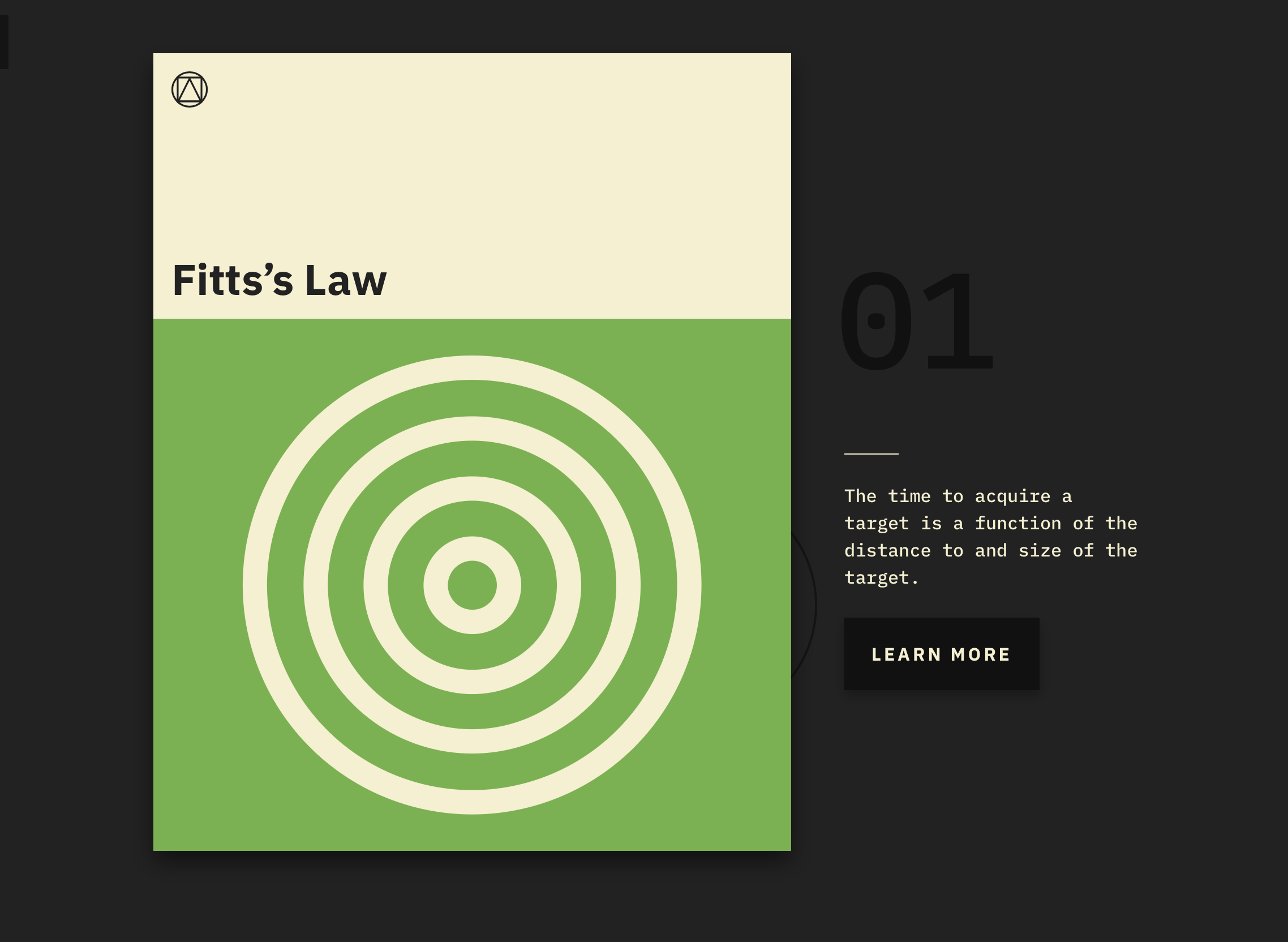
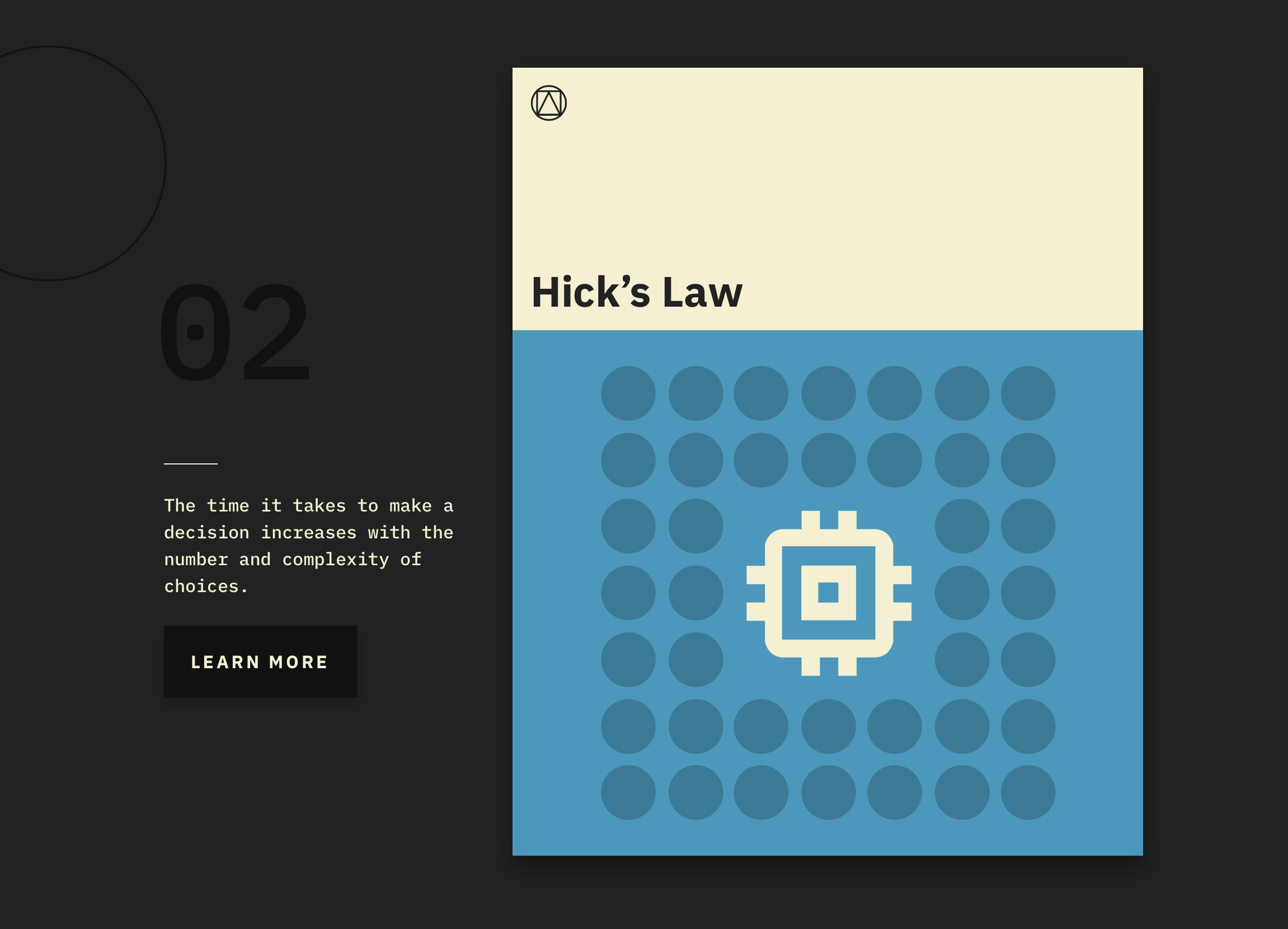
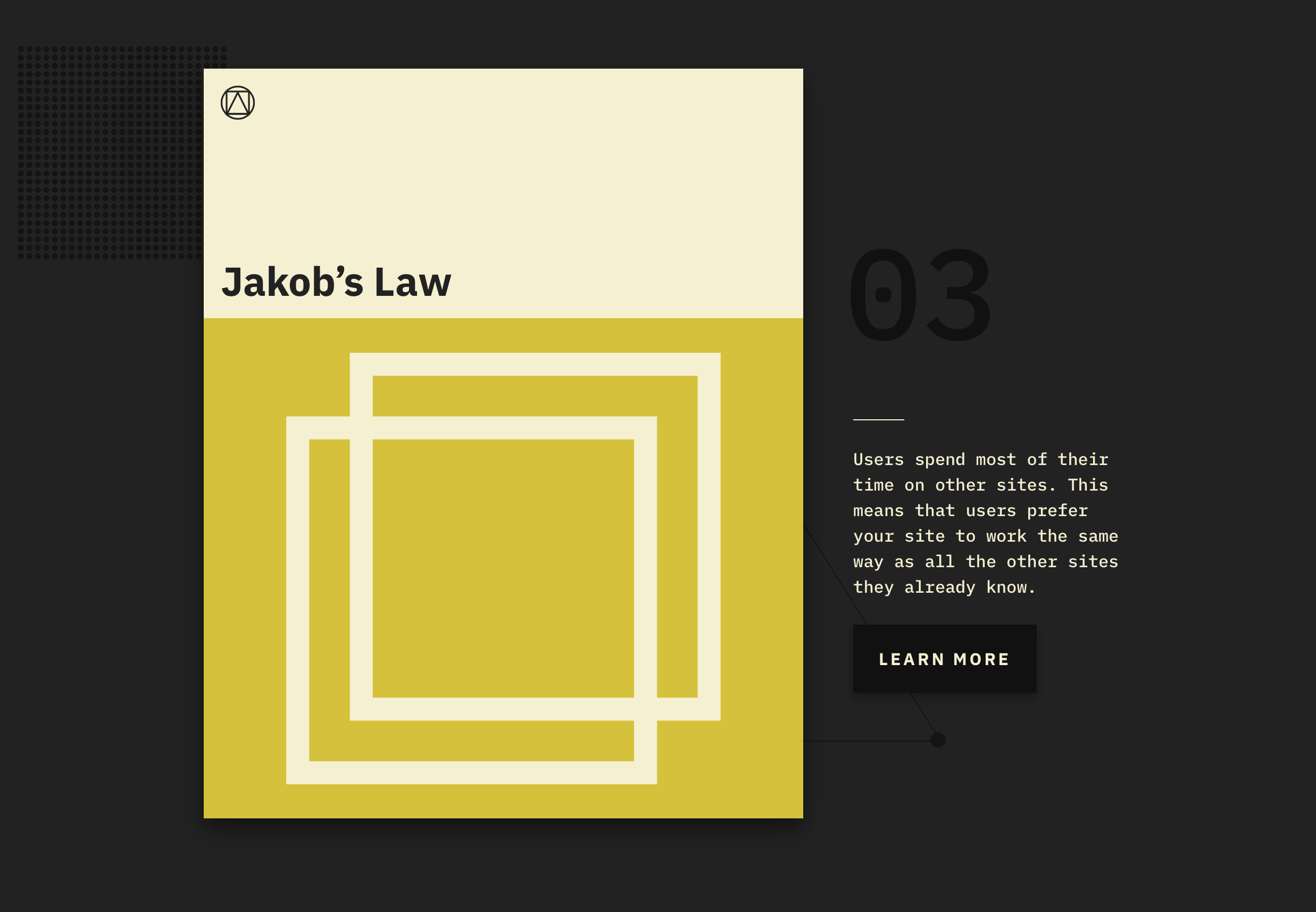
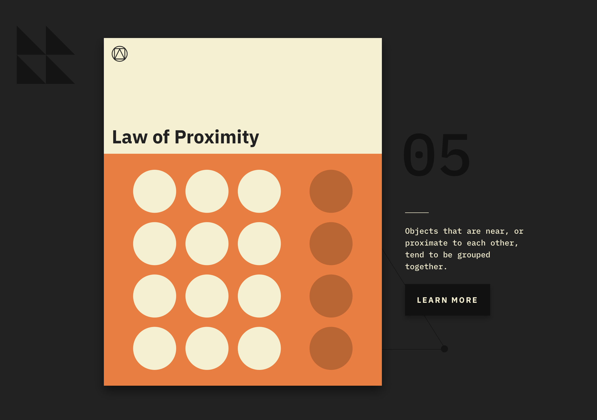
Good design tends to follow general principles that give designers overarching guidelines to work within. But for user experience and interface designers, there are also laws that govern the nitty-gritty. For instance, it’s helpful to know that the time it takes for a user to make a decision increases when there are more complex choices–known as Hick’s Law–or that because users spend most of their time on other websites, they want yours to work similarly to what they know–the premise of Jakob’s Law.

Jakob’s Law:
Users spend most of their time on other sites. This means that users prefer your site to work the same way as all the other sites they already know. [Image: Jon Yablonski]
A new site lays out 10 of these laws using simple language and graphic design to explain each one. Created by the front-end designer Jon Yablonski as a way of codifying the maxims he relies on his day-to-day work, Laws of UX draws on well-established ideas from psychology, as applied to UX design. Yablonski’s contribution is to collect several in one place and create visual representations for each.
“I decided to build the site as a resource for those who find themselves referencing the same information time and time again, or perhaps might be aware of some of these, but not all,” Yablonski tells Co.Design in an email. “I believe that these maxims and principles are invaluable for guiding design decisions.”
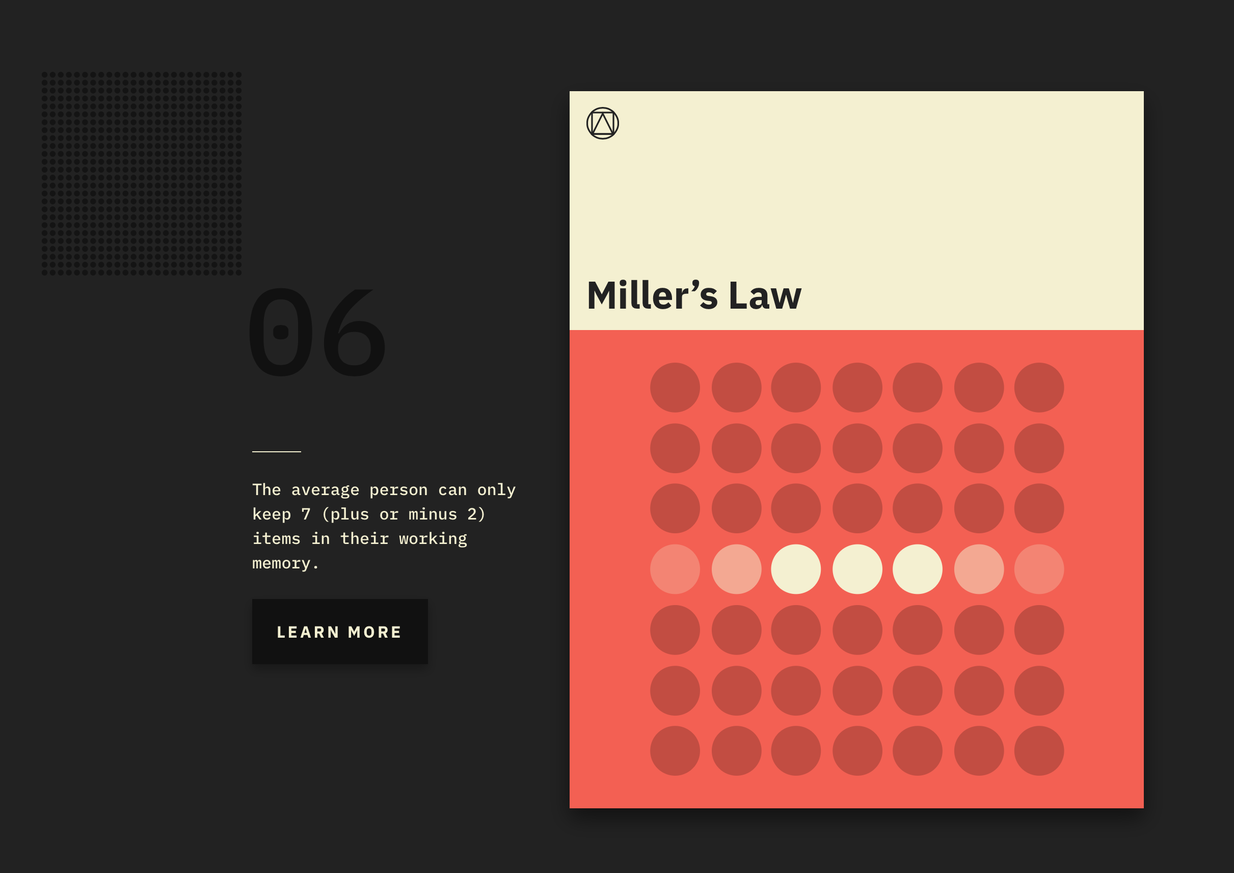
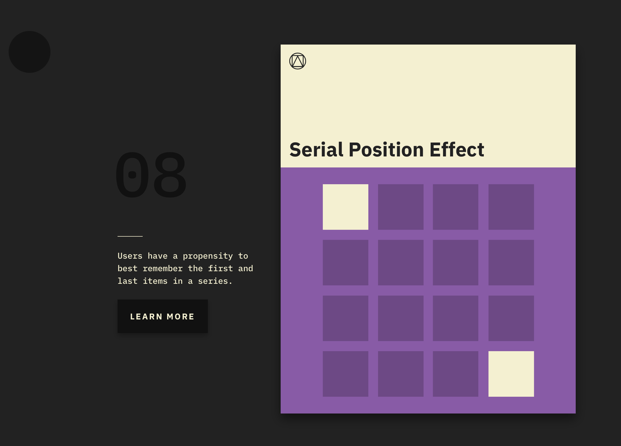
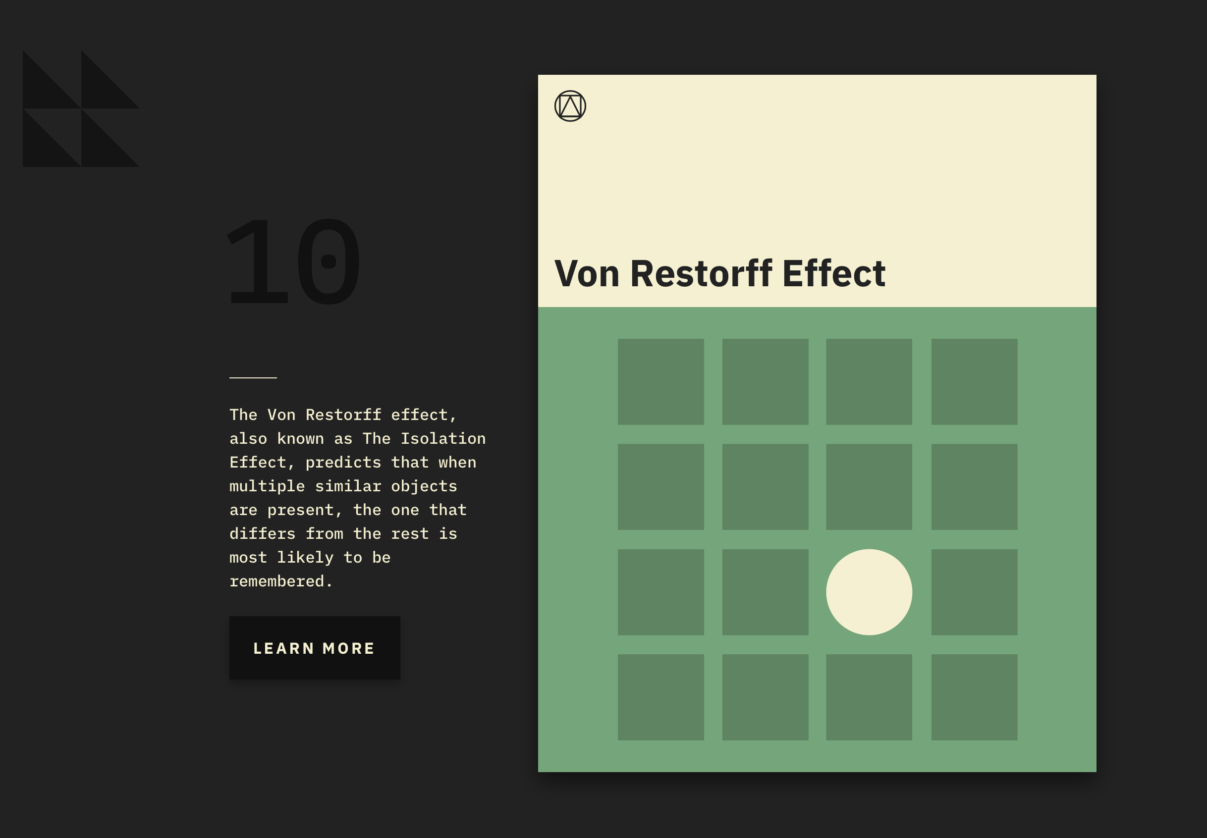
The Serial Position Effect–which posits that users tend to remember the first and last item in a series–comes straight from psychology, as does Miller’s Law, which theorizes that people can hold up to seven objects in their working memory. Their prevalence in UX points to the importance of psychology in design–to truly serve the user, you have to understand how they think and behave, both consciously and subconsciously.
![Serial Position Effect: Users have a propensity to best remember the first and last items in a series. [Image: Jon Yablonski]](https://images.squarespace-cdn.com/content/v1/546aeb13e4b06c7939161700/1516852370023-LSVZWEDUF7WMD2Q7OKJQ/i-1-10-laws-of-ux-illustrated.jpg.png)
Serial Position Effect: Users have a propensity to best remember the first and last items in a series. [Image: Jon Yablonski]
On the site, each law gets its own graphic representation inspired by classic Penguin book covers. “Instead of simply collecting these as a list, I really wanted to create visual representations of each in order to aid in memorization,” Yablonski says.
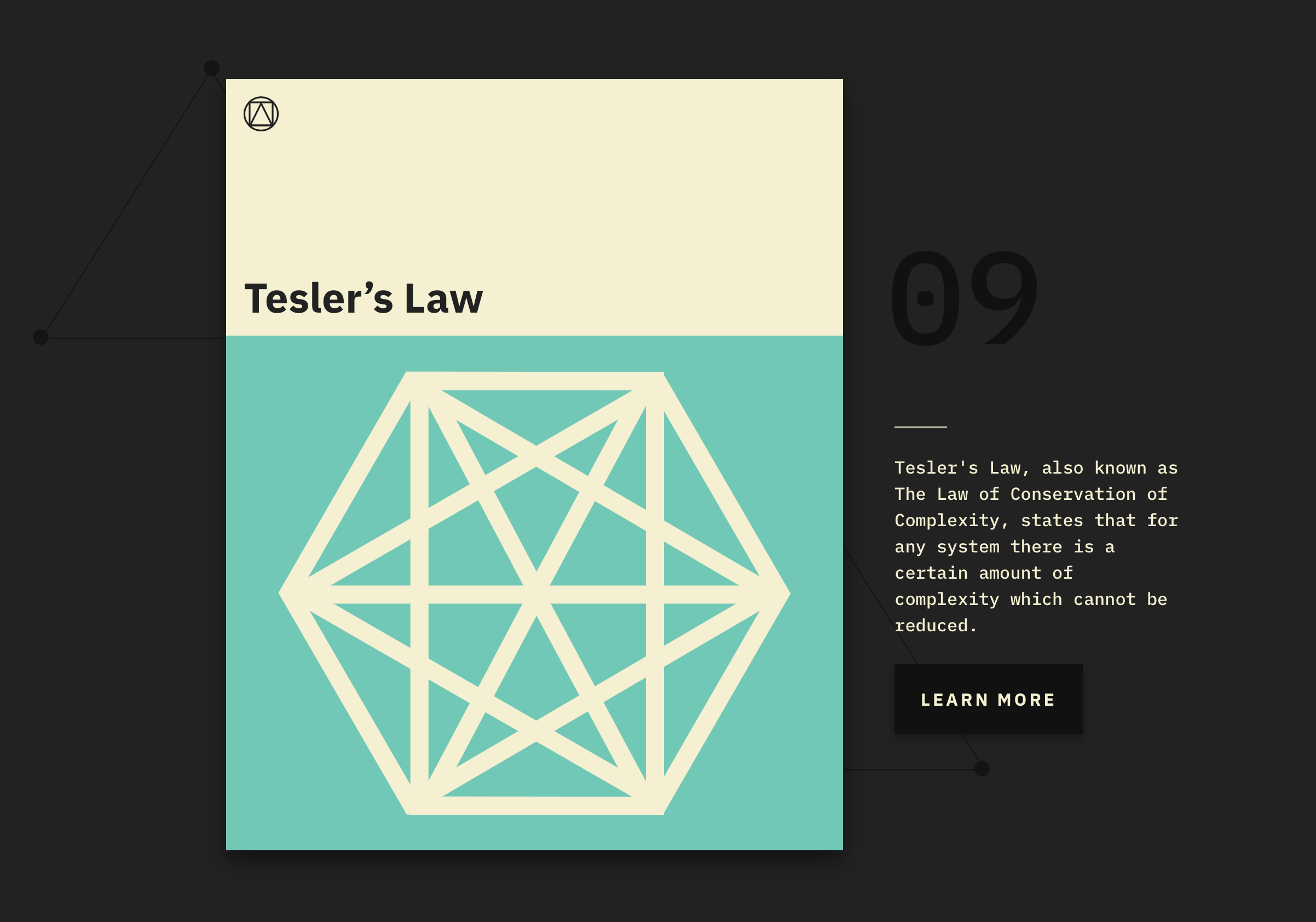
Tesler’s Law, for example, posits that any system has a certain amount of complexity that can’t be reduced further–and it’s represented by a hexagon drawn through with lines connecting each point. The law of proximity, which describes how objects that are close to each other tend to be grouped together, illustrates the idea quite literally. Clicking on any of the laws from Laws of UX’s home page takes you to a longer description each law’s history, along with Yablonski’s sources and a link to download his design for that law as a poster.
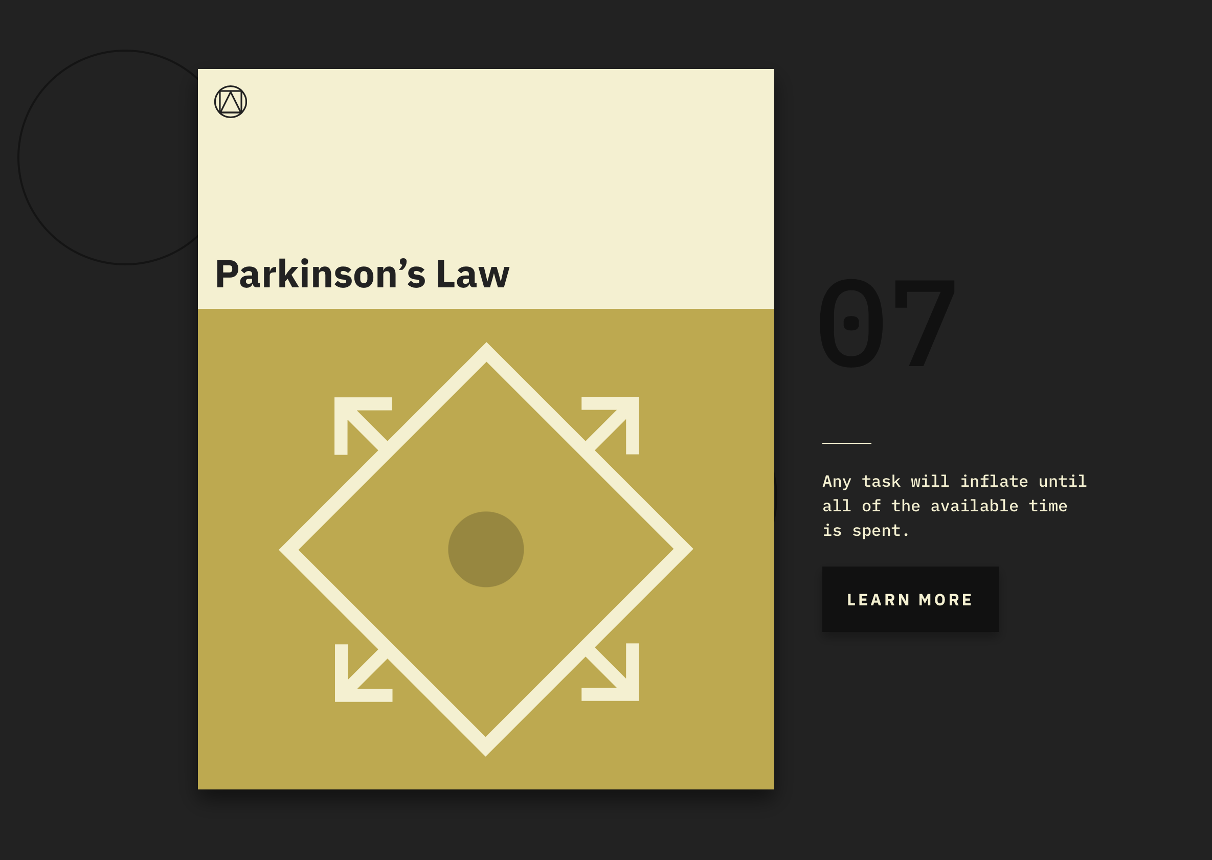
So far, the site has only 10 laws, but Yablonski plans to add more, including Murphy’s Law, Sturgeon’s Law, and Parkinson’s Law of Triviality. What laws do you design by?
Progress Trackers in UX Design /
When designing a large ecommerce site or complex online service, most probably you will be asked to design a system for ordering or configuration online. Guiding users through this process by making it easy and intuitive is key to helping increase conversion rates. Any frustration along the way may cause them to leave and pursue other options.
An easy-to-use stepped process helps users avoid frustration and successfully complete a primary task. In this article we will overview various uses of progress trackers and see how they can be implemented.
What Are Progress Trackers?
Progress trackers (or progress indicators) display progress through a sequence by breaking it up into multiple logical and numbered steps. They guide the user through a number of steps in order to complete a specified task. Good progress tracker should inform users about following aspects:
- What steps (or tasks) they have completed (preferably with a proper visual response)
- Current step they are on (user’s current location within the process).
- Which and how many steps still remain (preferably with clear designation).

Progress Trackers convey progress through numbered steps.
There are three primary reasons to use a stepped process:
- Logically group input data
- Set clear expectations for the user
- Track progress within a complex process
Why Do They Work?
Progress trackers create a clear path to completion. Studies show that offering users a clear idea of how many steps it takes to get to the final target can significantly reduce abandonment. From the psychological point of view, this makes a lot of sense. If you know how many steps you must complete in the process, you’re more likely to complete the process.

Create account as a multi-step action.
Also presenting content in chunks makes scanning easier for users and can improve their ability to comprehend. In practice, chunking is about creating meaningful, visually distinct content units that make sense in the context of the larger whole.
Uses of Progress Trackers
Progress trackers can be used in a variety of contexts. The following three areas are the most common.
Online Ordering
By far the most common use-case of progress trackers is in conjunction with online purchasing, since this task can be naturally split up into multiple steps.

Multi-Step Forms
If a form requires a lot of user input, it may be good to split the form into multiple steps.

Onboarding
Progress trackers are also used to guide users through the features of apps and services. You can use dots when the number of steps isn’t large (like in Dropbox example below).

Dropbox onboarding
Best Practices in Progress Tracker Design
There are no universal solution for creating excellent progress trackers. But one thing for sure — you should always think of how your users interact with the system. Generally speaking, you should design process steps as simple and clear as possible in order not to confuse users.
Setting Users Expectations
When a user is going to take on a complicated process, it is important to manage their expectations up front and tell them how much time and effort it will take. If the user thinks the task will take two minutes, but in reality it takes ten, the user won’t have a positive experience.
Providing a description of the process will help users prepare for a more complicated task. Its also a good idea to give an estimate of how long the task takes to complete, especially when the steps don’t map one to one (e.g. some steps are longer than others).
Establishing a Logical Flow
- Show the direction of movement. It’s better to use arrows in order to emphasize the direction, because the lines alone don’t provide much of a “flow.”

- Use icons in conjunction with words to describe the steps in the process. It should be clear for users what step sequence.

- Don’t make the process too long. 3–5 steps will be enough.
- Use numbers to describe the steps and indicate where in the process the user is (e.g., Step 3 of 5)
Keeping Users Informed of Their Location
“Where am I?” is one of the fundamental questions users need to answer to successfully navigate. That’s why a key aspect of good progress tracker design is keeping the user informed of where the user is within the process. This improves the logical progression because the users will know where they are in relation to where they have been, and what sections are to follow next.
You should offer a good visual representation of progress. Users rely on visual cues from navigation elements to answer this critical question.

Image credits: Dribbble
Use a clear change of state, not just a change of color to indicate which step the user is on. Proper icons and text labels that help users understand the menu options can aid comprehension.

Alternate label placement error state
Avoid Multiple Progress Trackers
Avoid using steppers multiple times on one page or embed progress trackers within progress trackers. They can create a mess in your UI.
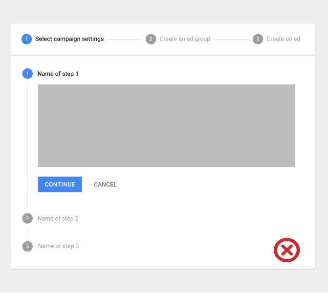
Image credits: Material Design
Showing Progress Feedback
Progress trackers may display a transient feedback message after a step is saved. This feedback should only be used if there is a long latency between steps.

This progress indicator displays a transient feedback message after a step is saved.
Progress Trackers for Mobile Apps
Since horizontal space is usually limited, a vertical progress tracker might be good solution for mobile apps and sites. Simply ensure the contents for each step are responsive.

Vertical steppers are designed for narrow screen sizes.
Conclusion
Design progress trackers to be easy, understandable and unobtrusive and don’t forget about their visual appearance that also should attract and guide users visually. Think “users first.” Remember that we aren’t designing for designers. We are designing for our users. Ultimately, good progress trackers can make users stick around to finish the task and generally have a more positive impression of your site or application.
UX & Psychology go hand in hand — Introduction to human attention /

A handy article about human attention from a psychologist’s and a UX Designer’s view.
As a UX designer, we design digital products that people interact with. When we are designing these products, we spend a lot of time on different research methods to understand the behavior, habits, and needs of our users. However, there is a couple of general patterns that characteristic of all people. To be consciously used, we need to understand the process of human cognition.
The purpose of this article is to understand the concept, function and types of visual attention and to use this knowledge in everyday product design.
What does psychology say?
In this section one of my friend, Anikó Tőzsér helps us to clarify the basic principles of human attention.
What determines what we pay attention for?
Attention is an ability that helps to select the information between different stimuli and process. Our attention can decide that we want to deal with the stimuli or ignore it. Sometimes this process is automatic and sometimes we focus our attention on a problem which we have to solve.
Psychology of attention deals with mechanisms of perception that form the behavior, and how consistent behavior is created. Psychological researchers of attention concentrate on audition and sight.
Spatial attention vs. feature-based attention
There are two ways of visual attention: spatial attention and feature-based attention. Spatial attention means that we direct our attention to a particular region. Feature-based attention means that we direct our attention to a particular feature, for example colour.
Human Information Processing
For the sake of design products, which grab people’s attention, we need to understand the processing of information.

However this is a debated issue.
- When one period is finished, the next one starts, and the periods contain more and more complicated features of the stimuli.
- Others argue that it’s continuous, which means that every stimulus is transmitted immediately.
Types of attention
There are different types of attention, which are determined by the situation and the intensity of the stimuli.
Selective Attention: it is an automatic process, that chooses between important and less important stimuli depending on the situation. As we can attend to only one thing at the same time, this kind of process helps to select the most important stimuli in the given situation.
As a UX designer we need to be aware of the fact of intensive changes: intensive changes of the environment draw the user attention. With this fact under our belt, we can consciously design user experiences that truly fit the users.
Divided attention: if a process is automatic, more processes can happen simultaneously. A great every day example is driving and talking at the same time. We can pay attention only to one action at the same time, that’s why if something happens on the road in front of the driver, the driver will stop talking and concentrate on the driving. In this moment the attention becomes Focused, meaning that the attention is limited to one object, action or stimuli.
Focused attention is the brain’s ability to concentrate its attention on a target stimulus for any period of time.(cognitivefit)
Sustained Attention: Sustained attention is when we keep our focus on one subject for a long time, even if we need to repeat the given action or activity.
As a UX Designer, we need to know that during the learning and working activities (listening to a teacher or reading an online lesson) the users need to use their sustained attention. It means that everything on the user interface should serve this goal.
Attention is a limited cognitive resource
As a UX designer we need to reduce cognitive overload.
Each sense modality has some separate attentional resources. An auditory task interferes less with a secondary visual task would.
”It is much easier to monitor the road ahead while talking on a cell phone than when looking at the navigation system.” (Visualexpert)
In one moment 5–9 (7+-2 The magical number) objects can be detected, which means that the area of spatial attention is not constant, it can be broader or smaller.
Cocktail Party Effect:
Cocktail party effect is the ability to tune into a single voice and tune out all others during a crowded party. This also could happen in the digital environment. Web party effect is the cocktail party effect in the web environment.
As Dr. Susan Weinschenk explained in her article, you can use the senses to grab attention. Colours, contrast, fonts, white space, beeps, and tones are helping to capture attention.

Too Many Options (Hick’s Law)
More choices need more cognitive load. “It describes the time it takes for a person to make a decision as a result of the possible choices he or she has: increasing the number of choices will increase the decision time logarithmically.”

Change Blindness
Depending on our focus, our brains can be fully blind to changes going on around us. We need to design our products according to the main user goals and tasks. UX is a treasure box full of useful methods and techniques. Creating user journey map or conducting task analysis could help us to avoid the ‘change blindness’ effect.
What most people don’t understand about AI and the the state of machine learning /
AI is more than a buzzword, but right now, it’s closer to sea slug than an all-knowing machine.

Photo by Andy Kelly
Though the term was officially coined in the 1950s, Artificial Intelligence (AI) is a concept that dates back to ancient Egyptian automatons and early myths of Greek robots. Notable attempts to define AI include the 1956 Dartmouth conference and the Turing test, and passionate AI advocates persist to explain the concept to the world in a way that is distinguishable and digestible.
AI is a topic of mystery, wonder, and seemingly endless possibilities. However, it remains elusive to the general public, and is often portrayed negatively in predictions of its future. To combat the cycle of fear induced by Hollywood’s versions of AI, we need to understand, clearly, what artificial intelligence is.
How to know if it’s AI
In its most complete and general form, an AI might have all the cognitive capabilities of humans, including the ability to learn. However, a machine is only required have a minute fraction of these skills to qualify as an AI.
Artificial Intelligence
Artificial Intelligence is the trait of a machine, usually a computer program, to exhibit intelligent behavior. Intelligence, in this context, means the ability to achieve a goal under the varying circumstances or conditions that occur in the world. Correspondingly, within computer science, the domain of AI is the study of designing such intelligent systems.
Based on this technical definition, an AI doesn’t require the ability to learn. In the most extreme case, all intelligent behavior in the machine could be directly hard-coded into it by a programmer. The machine can still conform to the definition of AI as long as the preset algorithm allows it to achieve its objective. Many current-day AI systems are actually of this rule-based systems type, where engineers supply all the intelligence to the system.
Machine Learning
Machine learning is the science of making machines exhibit intelligent behavior without explicitly being programmed to do so. Specifically, it provides systems with the ability to autonomously learn from data and improve without an engineer having to change its program code.
On a less technical level, you could say that AI is the goal and machine learning is one of the paths to get there — have the machine figure it out itself. In many cases, machine learning is concerned with learning and improving models using previously collected data. Using the data, the machine can make experience-driven predictions or decisions. By keeping its models up-to-date, the machine will autonomously learn to adapt to changing environments.

Photo by Redd Angelo
AI is not autonomously superior to humans
To clarify what AI isn’t capable of, we need to explain what it can do. While engineers can handcraft AI and supply all the intelligence, machine learning is increasingly important when creating AI systems. This is because machine learning promises to reduce manual engineering time while finding unknown solutions, even to domain experts. However, in many cases, engineering time simply shifts from directly designing an AI to designing a machine learning algorithm that learns the solution itself. Human engineering is still very much needed.
At first glance, the above is the perfect solution. We create an AI capable of learning, show it how to learn the solution to a task, and subsequently, it will simply figure out a solution to any related problem, right? It would appear that big companies like Google, Microsoft, and Apple think so: they’re capitalizing on this intuitive expectation to persuade people that their AI systems will solve many of their customers’ problems. They’re investing heavily in AI and making big promises.
Over the last decade, learning systems have glamorously solved object recognition, speech recognition, speech synthesis, language translation, image creation, and gameplay. The algorithms’ abilities are advertised as groundbreaking, which they are. People without deep technical background in machine learning often perceive machines’ improvements in performing specialized tasks like these as an AI’s rapidly increasing set of combined abilities. This is not entirely true.
Every day, an algorithm is learning to solve new tasks and getting better at others. Google DeepMind’s AlphaGo AI defeated Lee Sedol, one of the world’s best Go players. Upon learning this, a client with a background in engineering stated,
“We now have a general AI which has learned to outperform humans in Go — it could surely optimize the design of a car’s exhaust system.”
However, this reasoning is based on the assumption that once a machine learning algorithm has been developed to solve one problem, that same algorithm can be easily applied to solve a different problem. That’s not the case.
In reality, each of the above-mentioned breakthroughs are achieved by highly-specialized machine learning algorithms that have taken some of the smartest people on the planet years to develop. They were designed and fine-tuned with the specific goal of solving their specific task — and only that task.
There are some underlying methodologies, such as deep learning, that can be repeatedly applied across various application domains. However, for most applications, combining various machine learning methodologies is required. The resulting machine learning system needs to be tailored to fit to the data from the specific application, and the training algorithms need to be tuned to find a high-performing solution. Each of those steps requires a machine learning expert (often more than one) supplemented by software engineers and domain experts.
It takes an army
AlphaGo was the result of a multiple-year project with at least 17 people contributing to it, of whom several are leading experts in their respective fields of machine learning. According to third-party sources, AlphaGo is reported to have used 1920 CPUs and 280 GPUs during its game with Sedol.
Big AI companies have several teams of world-renowned machine learning experts paired with software engineers. In many cases, each team is dedicated to one specific application domain with the goal to research incremental methods to improve the current best machine learning approach in that domain.
Modern AI is more like a sea slug than an omnipotent machine
Biology offers a good intuition of today’s AI capabilities. Biologists research ‘the mechanisms that cause an animal to change the way it responds to a particular circumstance after an experience alters the meaning of that circumstance’. Put in one word: learning.
A common research subject is the sea hare (i.e. a mollusc or sea slug): specifically, scientists study the genes that define how its neurons fire. Depending on their genetic structure, two species of sea hares condition their behavior differently based on the same experience (i.e. data). Right now, machine learning operates at roughly this level; experts modify the program code of the learning algorithm (similar to the gene code of the sea hare), changing its abilities and predispositions to adapt to various experiences. The developmental state of machine learning is probably closer to invertebrates, like the sea hare, than to the advanced cognitive abilities of mammals or humans.

Photo by Johan Desaeyere
During the past two years, researchers started developing machine learning techniques that adapt autonomously to new tasks. However, methodologies are only in their infancy. To put it in the words of a DeepMind scientist,
“recent work on memory, exploration, compositional representation, and processing architectures provides grounds for optimism.”
In other words, we have reason to believe that reaching the goal of a more general AI might be feasible.
Introducing the new Dashboard /
How we designed a more consistent and intuitive experience for 40.000+ users.
Mollie has a clear focus on fixing the online payment space through better tech and intuitive design. If you’ve ever used our API, I hope you’ve found the experience agreeable. We’ve tried hard to make it as efficient as possible. Now, we’re releasing an entirely redesigned Dashboard, to deliver that same experience. In this story, I’d like to introduce you to the new design and I’ll talk about how we’ve tried to add value for our customers through design that inspires a logical workflow while maintaining scalability. Come take a tour around the design highlights of the new Dashboard.

The new Dashboard.
The Situation
We firmly believe that providing our users with a calm, intuitive, and efficient working environment is essential. By building a product that is neatly arranged and makes sense, we can help our users be more productive. The less thought that goes into how you’re achieving something, the more focus, there is on what you’re doing. And since there’s so much data in Dashboard, it’s important that we present that in a clear way, to help our users navigate it all easily.
We felt, however, that over the years, Dashboard had lost some of that clarity. For years, we’ve been adding features and tweaking its design to make it all fit. By now, we got as much out of the old design as we were going to get. That’s why we decided it was high time we took a step back and looked at how it all fits together.
Of course, before starting out, we decided on our needs and demands: the new Dashboard had to fit in with the new identity we established in 2017 and form a consistent whole with our other touch points, like the marketing website. We also needed a design that doesn’t just hold our current features and functionalities, but one that will also hold any future features we might come up with. This scalability is extra important now because we’ll be releasing new features and updates at a higher pace than before. The design also had to be familiar enough to be usable by users who’ve grown accustomed to the old design, without too much guidance. Another thing we had to keep in mind: our users range from single-person webshops to Fortune 500 enterprises, and they all use the same Dashboard. You can probably guess that finding a way to encapsulate all of this, was quite a challenge. But as I look at the final product, I think we rose to that challenge.

Sidebar, content, and optional inspector in the new and much calmer Payment Detail screen.
The Design
There it is. As you can see, we’ve made it fit in nicely with our other touch points. To achieve this, we used recognizable colors, typefaces, and icons. We used the same solid color backgrounds and loads and loads of white space that we also use on the website. This also gives the whole a clean look and feel. And the layout mirrors our website as well.
Next, to make it recognizable, we had to make it scalable. We realized this by dividing the screen into two distinct parts: the sidebar and the content. Let’s dive into those a little deeper.

Designing the new navigation.
Sidebar
The introduction of the sidebar is the biggest change we’ve made. This sidebar is always visible on larger screens and turns into a hamburger menu on small screens. It holds the main navigation, the organisation switcher, and the account options. All these elements used to be at the top of the screen, but this positioning had some serious flaws. For one, it really wasn’t scalable. We ran out of space and had to find some creative ways to fit things in, which in some cases resulted in some counter-intuitive manoeuvring to achieve something simple. Changing organisations, for instance, you’d have to go to the dropdown menu below your personal account to get an overview of the organisations you work for and then be able to switch around. It works, but it’s not great. By giving this a dedicated place, we hope to improve the way you navigate around the different organisations. In the same way, navigating around the different parts of Dashboard has been made more efficient.
Having set up Dashboard with a sidebar, we’ll also be ready for future features. For instance, we’re working on implementing more extensive team management and role dividing settings, at some point in the future. We’ll be able to easily integrate that into the design of Dashboard now.
Something else we think will help: because the sidebar is always visible, it’ll be easier to block out when you’re working within the content screen. This creates a calmer working environment. On to the content.
Content
The content portion of the screen is obviously the biggest, and because we’ve moved the navigational options away from this portion, we’ve freed up quite a bit of screen space. We love white space because we think it makes for a peaceful and calm experience and we made sure to keep a lot of it. We cut all this free space up into three distinct parts. The first two parts are the header and the content, these are always visible. The third part is optional: an added inspector within the content part. We think working becomes easier because these parts are used consistently. The header always holds the page title on the left and page actions on the right. The content always has enough room. If the content requires anything in particular, like filters or detailed information, the added inspector is there to provide it.
Throughout Dashboard, the actions in the header control the entirety of the content. They refresh the data, show a different data set, export the data, etc. The actions in the inspector always manipulate the shown data, they filter it, search through it, or provide extra information. By making this distinction between page actions and data actions consistent throughout Dashboard, we believe using them becomes a more intuitive experience.

Dashboard for mobile.
Mobile optimisation
While we were at it, we also took the opportunity to optimise Dashboard for mobile screens. As much as 20% of our customers use Dashboard from a mobile device and we wanted to give them an equally great experience. I already mentioned how we change the sidebar into a hamburger’d menu when your screen gets narrow. In addition to that, at this point the header, the content, and the optional inspector get restructured. The title and page actions are stacked vertically. Below them, whenever visible, comes the optional inspector. Finally, the tables are structured differently to better fit the dimensions of a smaller screen. We think these changes give our users an optimal mobile experience while maintaining clarity and usability.
Wrapping it up
That, in a nutshell, is how we redesigned Dashboard and how we used a sidebar, consistently recurring elements, and a lot of whitespace to create a clearer, a more consistent, and more intuitive UI. I hope you got something out of this write-up.
How AI is being leveraged to design better UX /

Image — @skippuku (twitter)
If you’re in the tech industry at this point of time, my hunch is that you have heard something about Artificial Intelligence (AI) or User Experience (UX). As AI continues to become more understood, its becoming less confined to the domain of developers and data scientists. As Designers/ Tech enthusiasts/ Entrepreneurs/ World Changers its important we start or continue to think beyond the devices and interfaces we currently use. To continue improving the world, we shouldn’t become limited to what currently exists. We should be looking for inspiration in everything, and be thinking of the world as an interface.
Jake, awesome intro, but what is AI? Is that flying cars and stuff? Good question, lets find out with this video by Peter Diamandis.
In conclusion to this video, as I write this in 2017 AI is controlled, limited, evidence based and a form of code. AI is not alive, conscious, Skynet, creative, ambitious or empathetic. Lets have a look at some case studies of companies that are using various forms of AI to improve their UX.
Airbnb
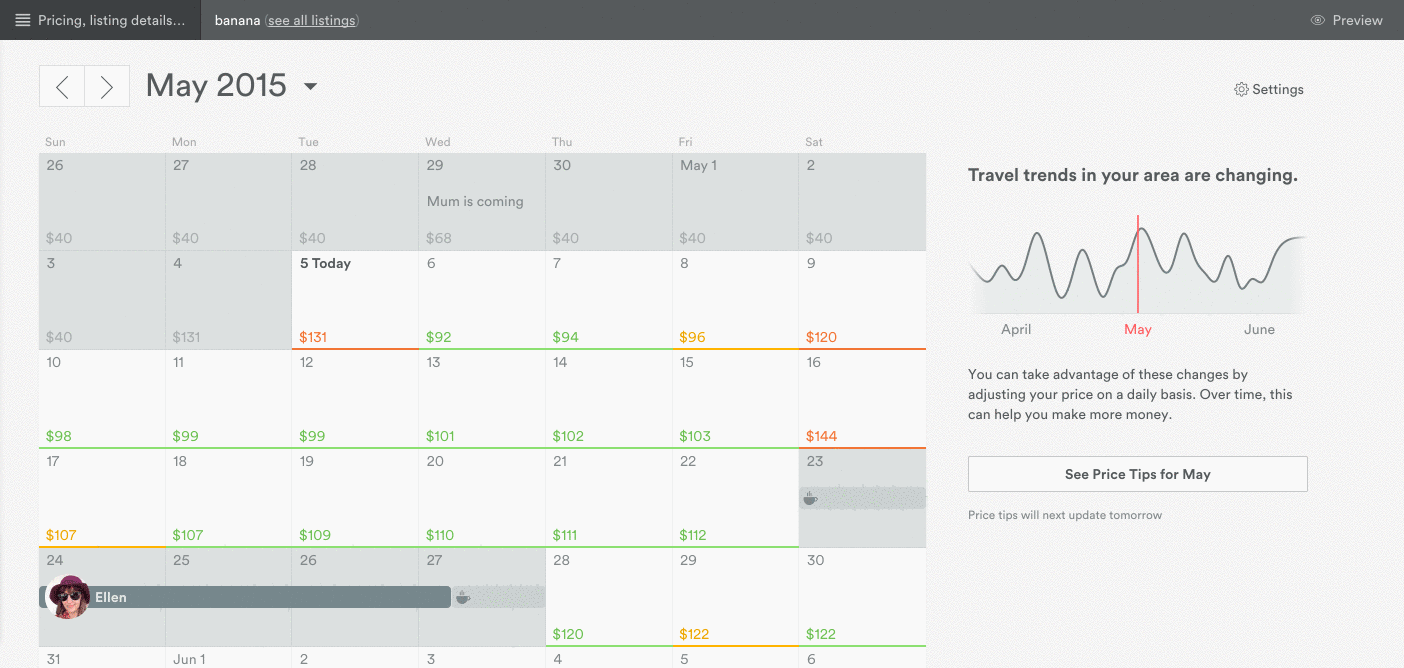
Image — Airbnb https://www.airbnb.com
When you think of Artificial Intelligence, your first thought isn’t exactly renting out rooms or flats. With AI and a data-driven culture, Airbnb have revolutionalised not only the hospitality but also the way the industry engages with AI. When you go on holiday, regardless of location or type of accommodation — your likely to be paying a price that’s based on a demand vs supply model.
Airbnbs ‘Price Tips’, is an AI tool that “lets Airbnb hosts see exactly where they should set the price of their property on a day-by-day basis to make it most likely to be rented” — Airbnb. With this tech, property hosts are able to see a calendar that displays the price they have set for their asset every day. If hosts have priced their asset right, the dates appear green — if the price is too high, price tips displays the price red. With this information hosts can use a slider adjust the price and find the ‘sweet spot’ — a price low enough that it’s likely to be rented, but high enough that you’re not leaving money on the table.
Price Tips AI algorithm is based on the massive amount of data Airbnb receives and processes using the company’s open AI tools. There’s a host of different factors that go into the price tip model, including listing type, location, price, availability, and how far away each date is from the current time. With all this data, Price tips can automate calculation and thinking processes for Airbnb users and in turn make the experience more intuitive and transparent.
Online / Inproduct Support Chat Bots

Chatbots and other modern interfaces are becoming more human every day (Well atleast the way they feel) — This is due to the ‘Hollywood Formula’. The Hollywood formula is a formula to help create meaningful stories by Martin Stellinga . Think about how Disney characters create relationships with their users. They manage to establish these large scale relationships with diverse demographics. Each of Disneys characters have unique personalities that are displayed across various mediums (apps, books, films ect). Imagine if we could become experts in creating these human narratives across our interfaces and constitute similar connection for our users. If AI is the new UI, then personality could be the new UX.
Many websites/products offer their customers the opportunity to chat with a support representative while browsing. *Plot twist* Although they may feel human, not every company actually has a live person on the other end. Often you are communicating with primitive AI. What’s interesting about this is that these chat bots need to be skilled in interpreting natural language — a rather difficult hypothesis.
Netflix

Example of face and full-body features to determine the focal point of the image — Image : Netflix https://www.netflix.com
In a multi-device world, designers of all kinds have to come up with a large amount of variations in content/graphics to cater for many mediums. This process takes time… lots of it — Well, not for Netlfix. Netflix and many other companies have handed over this ideation phase to AI.
Netflix discovered early how much its visuals influence user groups and their decisions to watch particular content. To take advantage of this conclusion, Netflix developed an AI algorithm to crop characters from images and apply stylized movie titles to create a poster unique to a users interests, languages and location — cool hey? Alongside this, the algorithm also A/B tests the effectiveness of each design on Netflix’s users to self train and optimize its content. When AI handles such tasks, the design team can focus more on understanding the user journey and refining these rules.
AI is not only limited to the big players, smaller companies like RealEyes are also taking advantage of such advances in technology.
Its not reason that drives human decision — its emotion. We know that humans are motivated by their emotions, with emotion stimulating the mind “3,000 times faster than cognitive thought” — Tier 360. To help organizations objectively and accurately measure human emotion RealEyes offer forms of technology that read human expression through facial recognition algorithms.
RealEyes software records human emotion through a webcam and makes sense of it with an underlying AI algorithm. This tech is great for things like usability testing — when testing a product you may find that users are able to use and understand it (good), but are experiencing some form of anger emotion in response to a certain form of messaging (not so good). Without having measured users emotional responses, the product could have been deployed and have resulted in customer upset. Other benefits of this tech could include the automation of work flows by efficiently analyzing and coding video / image data and more.

Image — RealEyes https://www.realeyesit.com/Media/Default/Videos/Video_Poster.jpg
So you have read through some case studies about how AI is being used to improve UX, but id love to add a final example that’s a bit different. This example is about the way AI can and will change the way we build our products, but potentially also work to improve relationships.
Pix2code
AI could be your new front end developer — yes front end developer, awesome hey? Pix2code is a form of intelligence that can generate code from screen shots of your interface. A tool like this could help bridge the gap between UI/UX designers and front-end developers, but not replace either. Check it out in action.
While the code isn't that great right now, its important to understand that this is a proof of concept. As the AI gets more training its only going to become smarter and more efficient. From this moment on, it will only become better.
Lets Talk Data. Data = Intelligence, No Data = No Intellegence.

Image —Fabien Girardin : A feedback loop that will feed the algorithm with learning material (data).Its quite easy to get carried away with AI and the adequacy of this system in UX. Yet, its important to remember that the results it provides users is only as proficient as the data its learnt from. The quality of the data matters to AI. The more sophisticated the information gets, the better informed the AI is, and thus the better the resulting decisions.
Its quite easy to get carried away with AI and the adequacy of this system in improving experiences. Yet, its important to remember that the results it provides users is only as proficient as the data its learnt from. The quality of the data matters to AI. The more sophisticated the information gets, the better informed the AI is, and thus the better the resulting decisions. Supplying the AI with undeveloped information could prove to be disastrous — large holistic data sets are a must.
Although a scary thought, we may need to design experiences that incentivise the engagement that can help improve/train our AI. We may need to prioritise AI over our users by taking one step back with our UX, to take two steps forward with our AI. The more unpredictable the experience, the smarter the AI can become, and therefore; we need to be okay with launching premature experiences to our users to collect data. As designers we need to solve the friction between getting the info the AI needs to know and the info our users are willing to provide.
The flow diagram below helps illustrate a feedback loop between AI and a humans.
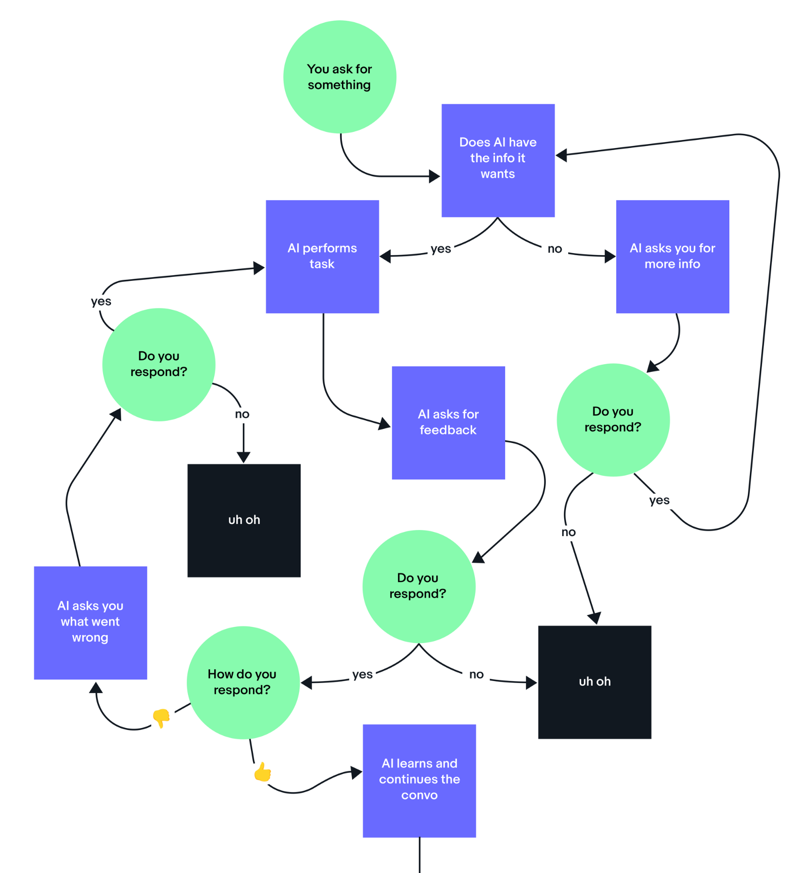
Image — Elaine Lee (AI Designer at Ebay)
Conclusion
The world is rapidly moving towards AI. As designers we have the opportunity to define how our relationship with AI will play out. Its an opportunity for us all to collaborate with data scientists (and other stakeholders) to innovate, and create exciting meaningful experiences that will benefit our users and the future of UX. Remember, data is the staple of experiences with systems that learn. The combination of data, learning algorithms and UXD can trigger an evolution of memorable experiences for our users.
A Guide to the Art of Guerrilla UX Testing /

Research and testing are great things — they give design teams the ability to inform their designs with reality. Nowadays, research and testing are pretty much a requirement for web and mobile projects. There are plenty of methods for conducting UX testing, but many of these methods are resource-intensive and time-consuming, and this often stops teams from testing in the first place.
Luckily, an easy technique for refining the user experience exists. It helps product team validate (and invalidate) critical assumptions at cheap cost and with rapid speed. It’s called guerrilla testing.
In this article, I’ll show you how to conduct guerrilla usability testing to get the most out of it. You’ll learn how to avoid or minimize the technique’s weaknesses, and improve planning for all research and testing. But before we dive into details, let’s first define what guerrilla testing is all about.
What is guerrilla testing?
Perhaps the best definition of guerrilla testing was coined by Martin Belam. He defined guerilla testing as “the art of pouncing on lone people in cafes and public spaces, and quickly filming them whilst they use a website for a couple of minutes.”
Basically, guerrilla testing means going into a coffee shop or another public place to ask people about your prototype. It’s low cost and relatively simple testing that enables real user feedback.
This type of testing has following characteristics:
- Participants are not recruited but are approached by persons conducting testing sessions.
- The sessions themselves are short (typically 10–15 minutes) and are structured around particular key research objectives.
- The output is typically qualitative rather than quantitative. Testing helps to quickly validate how efficient design is on its intended audience or whether specific functionality works in the way it is supposed to.
Each testing session can be represented as a following number of steps:
- Approach a person
- Introduce yourself and ask if they would like to participate in product testing
- If they agree, get basic information about them
- Give them a few scenarios to do
- Observe their interaction
- Ask about their experience
- Thank and reward them for participation
The beauty of guerilla testing:
- Guerrilla testing is a fast method that provides sufficient enough insights to make informed strategic design decisions. Guerrilla research can be squeezed into nearly every timetable or deadline.
- Since it doesn’t require a lot of money, most product teams can afford to do guerrilla testing on a regular basis.
- Doesn’t require specific research skills. Anyone on the product team can conduct guerrilla testing.
- Can be used as a demonstration the value of user testing/research for stakeholders, especially for those who struggle to acknowledge the value of usability testing.
Guerrilla testing is great for:
- Identifying critical usability issues early in a product design lifecycle.
- Testing hypotheses/assumptions during design sprints. Guerrilla testing can be an easy way to validate those hypotheses and create validation checkpoints.
- Validating tasks that don’t require specific knowledge (e.g., completing a signup form, ordering a product in e-commerce store).
- Getting quick baseline measures of an existing product experience (your key competitors).
Guerrilla testing isn’t so great when:
- Domain-specific knowledge is required to use a product (e.g., completing specific use-cases in financial or medical apps). You can’t expect all the people you talk to will have all required skills.
- A specific environment is required to conduct testing (e.g., testing can be done only in a certain location).
Now when you know what guerrilla testing is, let’s walk through how to conduct it.
Step 1: Prepare for testing
Many UX professionals consider guerrilla testing as bad practice. They say it often doesn’t reflect the real picture. This opinion comes from a flawed approach to testing.
The danger of guerrilla testing comes from poorly planned and executed test sessions. Such test sessions don’t provide any reliable insights. While guerrilla testing is a definitely less formal way of testing (in comparison with lab usability testing), that doesn’t mean that it can be successfully done in a planned fashion.
Know your objective
The number one rule of research/testing is that before collecting data, you must know why you’re collecting data. No matter what testing technique you employ, it’s always worth being certain of your objectives before conducting testing sessions.
If you don’t know what you expect to get from your research, you won’t gain sufficient insights after the test session. Having an objective doesn’t mean having a big-detailed plan (which would probably be overkill for this flexible, “on the fly” technique) but it does mean having a clear definition of what you’re looking for when you start.
For example, if you’re testing an app for ordering food you might want to know answers to questions like:
- Can users easily search a particular type of food they would like to order?
- Can users submit the order without too much effort?
Have an interactive prototype
Some UX experts suggest guerrilla testing can be done with almost anything, including concepts drawn on paper. As a result, many researchers print out designs and ask test participant to test paper sheets. This isn’t right way to do guerrilla testing because that’s not how someone experiences a product in real life. You can’t expect people to understand how your product works by flipping through paper pages.
While you don’t need to have a finished product to conduct guerrilla testing, you still need a prototype testers can experience. The more it resembles a real product, the more valuable feedback you’ll receive.
Tip: If you’re at the early stage of your design process and don’t have a prototype yet (even a semi-functioning one), you can test your competitor’s solution. This way you’ll be able to understand how real users interact with a product from the category and what areas of UI/UX you should focus your attention during development.

A prototype of mobile app created in Adobe XD
Pick the right location
A lot of UX professionals think guerrilla testing can be conducted in the nearest public place (cafe, sports venue, shop, etc). But that’s not always true. You need to pick a location where your target audience spends their time. For instance, if you’re testing a new mobile app for a retail chain, you might go to one of the stores and test there.
Tips:
- Ensure the environment is relaxed. You won’t be able to conduct a proper guerrilla testing if all your test participants are rush or stressed.
- Always ensure staff at the venue are OK with you doing some user testing.
- If your prototype requires internet connection, make sure to pick a location with a stable Wi-Fi.

Image credit: johnferrigan
Create smart scenarios
The tasks you select for your testing session play a critical role in whether findings will be useful or not. Since it’s impossible to test everything at once (not in regular usability testing, and not in guerrilla testing), you need to select carefully.
Tips:
- Think about all the important things people need to be able to do using your product and write down a short list of tasks. For example, if your product is a mobile app to order food, you probably want to test how people find a product, compare products, order a product, add a product to a wishlist, etc. Write these tasks down.
- Now that you have a list of tasks, it’s time to prioritize them and decide what to test. Give each task points from 1 to 3 based on how frequently the tasks are performed. 3 points are for tasks a majority of users will do most of the time, 2 points if they do it occasionally, 1 point if they only perform this task rarely (like complaining about an order).
- Choose the top 3 tasks. You’ll use them to create scenarios users can understand and grasp easily.
- Create a scenario based on each task. A good scenario has following characteristics: it describes a problem for participants to solve; it’s easy for them to relate to (by providing context and a realistic level of detail); and it doesn’t hint to the participant how to achieve the goal. An example of a scenario:
“Imagine that you’re looking for ordering a pizza for your office party. You found this app and you want to try it. Go ahead and give it a try.”
- Before testing your scenarios with test participants, pre-test them with friends and colleagues. Make sure that scenarios are easy to understand and people can follow them without any confusion. Not doing a proper run through of the test in advance is a common guerrilla testing mistake.
Take someone else with you
While you definitely can conduct guerilla testing alone, it is worth taking someone with you for two reasons:
- You won’t be worried about your stuff — your colleague can look after your things while you approach potential subjects.
- It will be easier to discuss the results of test sessions.
At the same time, it’s not recommended to have more than two people in research group because it will make test participant feel uncomfortable. Two is the perfect number.
Conduct five test sessions
Jakob Nielsen did an extensive research and found that testing with five users will help you find up to 85% of the core usability problems in your product. You learn a lot from the first person you talk to, a little less from the next, and so forth. After the fifth user, you’ll observe the same findings repeatedly, but won’t necessarily learn anything new.

You only need to talk to five users to find 85% of the core usability problems.
Be ready to adapt to context
The lack of a controlled environment is one of the most significant differences between guerilla testing and regular user testing. Guerrilla testing is about adapting to the situation. Even when you carefully picked out time, location, there’s always a possibility that things may not go according to plan. Consider all potential risks and have a plan of action for it.
Tips:
- Have a backup internet connection in case the Wi-Fi connection isn’t fast enough. Also, don’t forget your charging cables or additional power packs.
- Be ready to trim the number of questions if a person decides to leave a testing session earlier.
- If the environment around you is too loud, focus on tasks that require less verbal clarification.
Step 2: Approaching people
Proper introduction is essential
Think in advance about how you are going to introduce yourself. You’ll only have a couple of minutes to get across what you’re there to do and what you want from the participant, so you better get your intro right!
For my initial approach I use a 5-step formula:
- Question: Do they have a time? (1)
- Describe: Who are you and why are you there? (2)
- Describe: What do you want from them? (3)
- Questions: Can they stop for 10 minutes? (4)
- Describe: How you reward them. (5)
Hello, do you have a minute? (1) My name is Amy and I work for company ‘Awesome.’ (2) I’m here asking people to take a look at our product (3) and let me know what they think of it. If you have 10 minutes for me (4), I’ll ask you a few questions and record the answers. In return, I’ll buy you a coffee or a muffin to say thank you. (5)
Before starting a test session, it’s important to learn some basic facts about your test participant. Spend a minute or two to find out if they are the type of person who may use your product. If you have specific criteria for people who you want to talk to, a few simple questions will help clarify. For example, if you’re testing mobile app for ordering food, you can focus on finding the following information:
- Do they order food online?
- What is their level of technology proficiency (whether it’s a tech-savvy or regular user)?
Step 3: Running the testing session
Explain the purpose of testing, and mention you’re testing the app, not them
Before you start testing, make sure your participants have a good idea of what you’re doing and why you’re doing it. Since most people don’t know what guerrilla testing is all about, provide some context. This helps develop trust between the researcher and test participant, and leads to more honest responses.
Another important moment that should be taken into account is that people in testing situations often can feel as though they are being tested (as opposed to the product itself), and sometimes start to apologize or shut down. To prevent that, say something like:
“I’m testing the product, not you. No need to worry about making any mistakes. And please don’t worry about our feelings. We want to improve our product and need to hear your honest reactions.”
Follow ”Think Aloud Protocol”
The think aloud method is critical for getting inside the user’s head. It means asking the user to speak out loud everything they are thinking, so you can gain insight into the thought process behind the user’s actions.
As the participant uses the product, you should encourage them to think out loud and share their thoughts and ideas with you. Since talking while doing isn’t typical for people, you should ask them to do it:
“While you’re using the product, I would like you to think out loud. Just say what you’re thinking, what you’re trying to accomplish, what you expect to happen after an interaction, and so on.”
For example, if you’re testing a mobile app for ordering food, you should expect people to say things like, “Hm, this looks like an app for ordering food. I wonder how to find a product category. Maybe if I tap here, I’ll see it.” Give them an example like that one to help them understand what you’re looking for.
Tips:
- Don’t hesitate to ask test participants questions like, “What are you currently thinking?” “What do you think will happen next?” or “Is that what you expected to happen?” during the testing session to stimulate them to verbalize their thoughts and feelings.
- Even when people are thinking aloud, sometimes they experience problems with verbalizing their thoughts. That’s why you should ask clarifying questions if something seems unclear or you think there’s more information a test participant can share.
Keep testing consistent
A common problem with guerrilla testing is the temptation to go with the flow when querying the user. Often a particular question can trigger interesting insights, and a person who conducts the testing wants to get the bottom of it. This can cause the test to go in an entirely different direction and, as a result, it’ll be impossible to compare results.
It’s always better to focus on your primary questions while conducting sessions. If you found something unexpected during a test session, note it and circle back to a particular topic to dig deeper at the end of the session.
Encourage creativity in user feedback
Making testing consistent doesn’t mean you can’t foster creativity. Help test participants get creative by asking them to sketch their ideas or feelings. For example, if they think there’s something wrong with UI, you can ask them to draw a simple schematic solution for the problem. These ideas might help you to improve things in the next iteration.
Speak less, observe more
As soon as you give test participant your scenario, you should stop talking, lean back and watch how they use your prototype. Don’t provide any extra explanation. Why? Because you want the testing session to be as real as possible, and you want to see how test participants figure out things for themselves — and the best way to see the natural behavior is to remain silent during testing sessions.

Just give test participants your scenario, lean back and observe how they use your website, app or prototype.
Your participants will undoubtedly have questions, and since you’re sitting next to them, they will ask you. To avoid any misunderstanding or bad feelings whenever they ask you something, just say something like this:
“That’s a good question, but I can’t tell you the answer right now because we’re interested in natural user behavior — how people use the product without any hints. I’ll give you the answer after the testing session, but for now I would like to hear what would you do if you were using this product on your own.”
Be a timecop
Remember, guerrilla testing isn’t a usability lab with paid users. You’re asking people to take a break from their busy lives and spend a couple of minutes with you and your research. Be mindful of how much time you spend with test subjects. If you ask someone for 10 minutes, make it 10 minutes—not 30. If you don’t respect their time, they’re not going to very happy, and that will impact their feedback.
Minimize note-taking
During the test, make sure you don’t continuously keep taking notes. When you’re sitting next to test participant and spend most of your time writing, it’ll definitely make test participant stressed and wonder what’s going on. There’s absolutely no need to write down everything you find — write down only the most critical things and observations, your key findings.
Tip: Record the session. Video or audio recording a session can be a good way to collect all important information. Obviously, recording should only be done with the interviewee’s permission. Be prepared to abandon recording if your interviewee is uncomfortable or reluctant. In the context of guerrilla testing, you can utilize specific software for this purpose: apps like Silverback or UX Recorder collect screen activity along with a test subject’s facial reaction.

Image credits: Sean Melchionda
Step 4: After testing
Conducting the tests is only half the journey to perfect UX. The feedback from testing sessions should be converted into improvements or (and) requirements for your product.
Analyse task completion ratio
Completion ratio is perhaps the most obvious finding from guerilla testing. You should capture the task completion for each of your participants and each of the critical tasks you identified earlier. The number of users who face problems on certain screens (calculated as the drop-off rate) will help you decide which parts of your app should be reworked.
Fix the biggest problems first
After guerilla testing, you’ll probably have a list of usability issues faced by test participants. How to know which problem to start first? You should focus on fixing the most important problems that affect a majority of your users.
Tips:
- Don’t try to fix the problem in code — instead, create a prototype. Fixing problems can be expensive, especially if the issues affect an already-released app. To prevent any potential reworks, it’s better to create a prototype and test it again to be sure the fix works for your users.
- Good is better than perfect. Find easy-to-implement solutions. Remember that time is money — don’t seek a perfect solution. When fixing usability issues, it’s essential to find solutions that can be implemented quickly.
- Fix only the problems you find. When working on a fix, it’s tempting to make changes that go beyond the problems you actually observed. Avoid that temptation. Remember that you have a lot of work to do, and it’s better to move according to the plan.
Combine guerrilla research findings with other research data
It’s important to understand that guerrilla testing can’t be a replacement for other types of UX testing. Thus, you can’t focus entirely on guerrilla testing to understand how people perceive/interact with your product. Nearly all projects would benefit from multiple research methods such as:
- User interviews. User interviews can deliver a lot of insights about a target audience, such as their behavior, expectations, etc.
- Moderated in-person usability testing. Moderated testing is a great way to understand how users complete certain user flows. In most cases, it’s possible to record interaction on a video and use it as a reference in a future.
- Remote usability testing. Remote testing removes many of the challenges related to session setup. This inexpensive way of testing allows you to quickly verify a design with an unbiased audience.
- A/B testing. A/B testing, also known as a split test, is a perfect type of testing when you want to compare two versions of the design and select the one that performs better.
When you combine results of guerrilla testing with other research techniques, you can get valuable results more quickly. To achieve really great results, make testing a habit.
How different companies conduct guerrilla testing
Here are a few case studies for your inspiration:
Guerilla Usability Test: Yelp
Improving Yelp’s web experiencemedium.com
Wrapping up
Whether you’re exploring a particular research problem or testing a design solution that you already have, guerrilla testing can be a huge time-saver. Now when you know a lot more about this great testing tool, it’s time to try it in the real world!
When AI gets in the way of UX /

Don’t let your fascination for AI get in the way of your fascination for solving real problems from real people.
Artificial Intelligence is the big buzzword of today. If you are a digital designer, there are good chances that a quick scroll through your RSS reader, Twitter feed or Slack channels will show you more instances of the term “AI” than you would see just a year ago. New products being launched, journalists speculating how many years it will take for robots to take over the world, experts giving their opinion about how to design for AI.
Our entire industry is rushing to launch the world’s first AI-powered _______ (insert a product category here), without a proper use case or business case for it.
It doesn’t matter how it is going to be used, or by whom. What matters is to be the world’s first. Whatever it is. As long as there’s AI powering it.
In the next few months, every vertical of every industry will start to attach the AI-powered label to all its products — as well as its variations “AI-enabled”, “AI-driven”, “AI-controlled”. It’s a process that has been happening in the last 1–2 years and will only intensify moving forward.
On the other hand, products that are proudly created by humans (not robots), will start to attach labels that sit at the extreme opposite of the spectrum: “hand-made”, “hand-crafted”, “curated by humans”, “human-made”.

But what does that mean for UX Designers?
To create anything that will be powered by AI, technologists inherently have to start with the data that will be used to train the AI and ultimately create these amazing AI-powered tools and services. This process is usually driven by engineers — the experts that actually know how to model the intelligence and enable it to take action based on data.
The problem with that is that teams usually pick the first problem that technology can be applied to, without validating it with real users. Is that technology solving a real user need?
Just because something is possible doesn’t mean it should exist in the world.
It’s the same story when the concept of mobile apps came up in the late 2000s. Hundreds of apps were being launched every week, solving problems no one ever had. The vast majority died; the ones that were relevant for people persisted.
As UX Designers, our biggest challenge will be to participate as early as possible in these types of projects. To be designing along with developers, as soon as data is available to be looked at. And to bring the good old design methods of user validation and user research to the moment decisions are made — so companies don’t spend millions of dollars solving problems that don’t exist.
Stop Annoying Your App Users: 4 Push Notification Best Practices /

Image credits: Pexels.com
Push notifications are sometimes more important than the rest of your UX. So, it’s a big deal to know what the push notification best practices are these days.
As mobile app users, we all have seen some great push notifications and some that just suck. If the push annoys the user, then they might simply end up uninstalling your app. That’s sad. But that’s the truth.
Imagine your app users are your beloved people. Yes, they are eager to spend time and money on you. But they will not stand it if you spam them, trick them into doing something they don’t want to, or simply keep annoying them with asking for favors. I am not saying that push notifications are something spammy. I am just trying to say that they might look spammy if you are not doing it right. Don’t do like this.
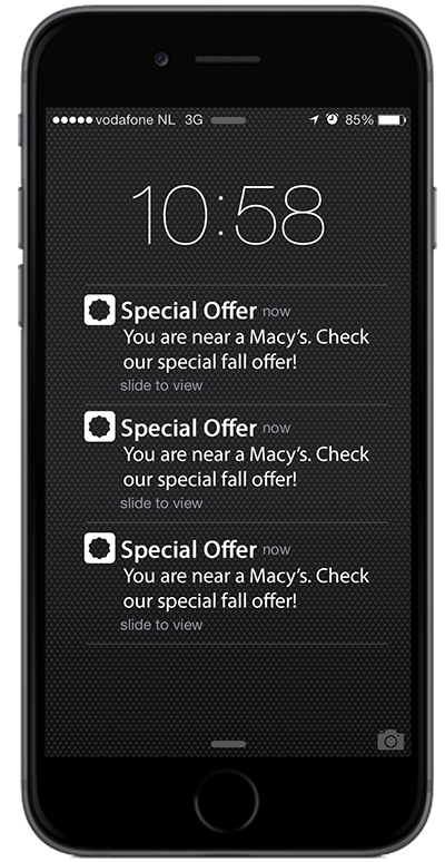
We often speak of app users as if about some strange creatures. And we sometimes forget that they are all people just like you and me, just like your mom or wife or husband or girlfriend. So, when we are creating apps, we need to hold this tightly in our minds that products are for people, not users. A push notification is a product too. Accordingly, it should be designed in a way as to be attractive and exciting and engaging. It should be for people.
Some app makers are really good at this. They are able to re-engage app users and boost retention rates with the help of push notifications. These are the rockstars. So, in this article, I have gathered some really cool push notification best practices for you to try. Here we go!
1. Get the opt-in
They say “The good thing about push is it reminds the user that your app is installed. The bad thing about it is it reminds users that the app is installed.” In fact, the push can either make or break your plans regarding re-engaging app users. So, you need to be extremely careful before even starting to design the push notification content. The first thing to do is getting a permission to send push notifications to your users. Make them opt-in.

You can even create your own splash screen to speak to your users personally. On that screen, try to create an attractive message about the importance of opting in to push. Include the best arguments you can think of. From there, if they answer positively, you can show the official opt-in prompt which they can confirm.
2. Make the push relevant
Personalization matters! Never ever send content for anyone. Each and every user should say, “Oh, this is a message for me.” So, you know your task: no more generic messages. Use segmentation and send tailored, unique, exciting push notifications instead of faceless junk.

Now you might ask: “Based on what should I segment my users?” The answer is — you can segment them based on several parameters. Let’s look at examples. You can personalize based on the user journey. For example, if it’s a gaming app, you can send pushes based on the level of the game the user is on. If it’s an e-commerce app, you can send push notifications based on the list of items the user has in their cart.
There are a bunch of marketing and UX tools that can help you segment your users based on various factors and send push notifications. At Inapptics, we are now creating an AI-powered engine that is going to find usage patterns in our customers’ apps and let them know whenever something interesting is happening.
For example, we will be able to predict which app users are more likely to churn. With this information in hand, our clients can send push notifications to those users and re-engage them and not let them abandon the app. You can subscribe for an early access on our Product Hunt Upcoming page.
3. Choose the right words
Push notification content comes next. The rule is simple here: content should be interesting. Choose the right tone and be careful with your wording. Generally speaking, you have around 10 words to make a positive impact. Here are a few quick tips:
- Be precise and obvious about what you want
- Add a clear-cut call-to-action
- Use your 10 words wisely

If you are offering a discount, use phrasal verbs. Pushes that include words like “off,” “today,” “now” provide a feeling of urgency and seem to be working quite well.
P.S. never use the word “click” when sending mobile push notifications. We don’t click on mobile, we tap.
4. Let your users know you have missed them
This one seems to be one of the most overlooked push notification best practices. But the thing is sometimes even the most loyal customers drastically stop using their once favorite apps. Yes, that’s the saddest thing for app makers. Another sad thing is that churn is so hard to predict.

That’s why you need to cuddle your app users with love, affection, care and sweet push notifications of course. Let the dormant users know about your redesign, about a new feature or just simply about how much you have been missing them lately.
Summing up
Using push notifications strategically can be a great way of reminding your users about your app. Just make sure to use them at the right dose: too many irrelevant pushes can make your users leave and never come back again. Not enough messages can result in a decrease in engagement.
In both cases, there is a risk of your app being uninstalled. So, brace yourself and get ready to not let your people go.
To Get More Creative, Become Less Judgemental /
The need to do more great work drives many creators. More quality and (or) quantity. Or both. Creativity is a central source of meaning in our lives.
We have come this far because a few bold innovators and creators chose to create, build, make, do, or start something. In “Body of Work: Finding the Thread that Ties Your Career Together” author Pamela Slim says:
“We are made to create. We feel useful when we create. We release our ‘stuckness’ when we create. We reinvent our lives, tell new stories, and rebuild communities when we create. We reclaim our esteem, our muse, and our hope when we create.”
Prof. Dean Simonton, a psychologist who’s spent many years studying creative productivity, discovered two things about highly creative people.
- They’re woefully bad at knowing when their own work is going to be a hit or a miss
- Their capacity for productivity that makes them original, not their innate talent.
Simonton writes: “On average, creative geniuses aren’t qualitatively better in their fields than their peers, they simply produce a greater volume of work which gives them more variation and a higher chance of originality.”
Quantity lead you to quality.
But sometimes maximizing your creative output can be a struggle.
Decide what you want to create and why
Purpose is a great motivator. Your “why” can move you to do the impossible.
What do you want to accomplish right now?
You need enough clarity to give yourself a direction.
Clarifying not only your purpose but your direction reinforces your ultimate life purpose. You should have a clear understanding of what you want next month, next quarter or next year.
Napoleon Hill once said “There is one quality that one must possess to win, help and that is definiteness of purpose, the knowledge of what one wants, and a burning desire to possess it.
Successful people have a definite sense of direction. They have a clear understanding of what success means to them. Everything they do is consistent with their goals. They look forward and decide where they want to be. Their day to day actions helps them move closer to their vision.
Once you find your why, you will be more careful and selective about your daily actions. Knowing your why is an important first step in figuring out how to achieve the goals that excite you.
The titans of creativity pursued the one thing that brought out the best in them. They defined their direction in early in life.
Thomas Edison held over a thousand patents in his name.
Picasso made 50,000 works of art in his life.
Mozart composed over 600 pieces in his lifetime.
Charles Schulz drew his iconic Peanuts comic strips for 50 years. He made 17,897 Charlie Brown strips before he died.
Create first, judge later
If you are striving to be prolific, forget judgement. Forget perfection.
Stop judging your work. Nothing kills creativity faster than comparing your work to someone else’s. Your job is not to judge your work. Your job is to put it out there. To see what will become of it. Give your creativity every chance of survival.
Don’t fuss over details as you move forward. What matters is that you get something done. Every day if you have to.
The real world doesn’t reward perfectionists. It rewards people who get things done. Give yourself time in your life to wonder what’s possible and to make even the slightest moves in that direction.
You will screw up in the process but it’s okay. Don’t beat yourself up for making a mistake or making a wrong choice. It will only lead to self destructive behavior.
Ed Catmull says, don’t wait for things to be perfect before you share ideas with others. He recommends you show early and show often. In his book, Creativity, Inc.: Overcoming the Unseen Forces That Stand in the Way of True Inspiration, he writes:
“Don’t wait for things to be perfect before you share them with others. Show early and show often. It’ll be pretty when we get there, but it won’t be pretty along the way.”
It’s okay to screw up as long as you are willing to try again. Non- comformists and originals screw up a lot. But they move on, knowing that at some point, the breakthrough will happen.
Creativity flourishes when you don’t seek perfection but focus on getting stuff done. Creating is the result of thinking like walking. Left foot, problem. Right foot, solution. Repeat until you arrive.
Find your flow
Have you ever completely lost yourself in a task, so that the world around you disappears? You lose track of time and are completely caught up in what you’re doing.
That’s the popular concept of Flow, and it’s an important ingredient to doing work and loving what you do. It’s in this state that we do our best, most efficient work effortlessly.
In positive psychology, flow, also known as the zone, is the mental state of operation in which a person performing an activity is fully immersed in a feeling of energized focus, full involvement, and enjoyment in the process of the activity.
During flow, people typically experience deep enjoyment, creativity, and a total involvement with life.
Achieving flow is often referred to as being in the zone!
Mihaly Csikszentmihalyi, a psychologist who has studied the relationship between attention and work, has written extensively about Flow. Mihaly enourages us to muster enough energy to do what we know we should do. In his book, Flow: The Psychology of Optimal Experience, Csikszentmihalyi writes:
“Contrary to what we usually believe, moments like these, the best moments in our lives, are not the passive, receptive, relaxing times — although such experiences can also be enjoyable, if we have worked hard to attain them. The best moments usually occur when a person’s body or mind is stretched to its limits in a voluntary effort to accomplish something difficult and worthwhile. Optimal experience is thus something that we make happen.
Uninterrupted creative process is the key to great work. Many creatives resist the idea of systems and structure. But you need to commit to a process, routine or system that works for you. Do more of what works for you.
Start and maintain a creative routine
Chances are you already know whether you’re a morning person or a night person. Morning larks and night owls have very different opinions on the best time of day to do important tasks.
If you pay attention to your body’s response to work for a period of time, you will be able to find out what works best for you and when you are more likely to be creative.
You are most active in the morning, hence your ability to concentrate, focus and get challenging tasks done. Your body is at a perfect physiological state (being well rested and recovered from previous day’s work) for optimum performance. Many people believe that morning is the best time to create.
Mason Currey writes, in Daily Rituals: How Artists Work:
“A solid routine fosters a well-worn groove for one’s mental energies and helps stave off the tyranny of moods.”
“But one’s daily routine is also a choice, or a whole series of choices. In the right hands, it can be a finely calibrated mechanism for taking advantage of a range of limited resources: time (the most limited resource of all) as well as willpower, self-discipline, optimism. A solid routine fosters a well-worn groove for one’s mental energies and helps stave off the tyranny of moods.”
Benjamin Franklin, once advocated for a lark lifestyle in a famous saying: “early to bed and early to rise makes a man healthy, wealthy, and wise.”
Charles Dickens was a morning person. He finished his writing by 2:00pm each day.
Barack Obama, on the other hand chooses to stay up reading past midnight despite his incredibly long days.
Experiment and find out what works best for you and stick to it. And when you find the best system for your creative work, do everything in your power to protect it from interruptions and distractions.
Consistency trumps everything
To succeed in anything you put your mind to, build a system that makes it easy to stay consistent.
Jim Rohn said “Success is neither magical nor mysterious. Success is the natural consequence of consistently applying basic fundamentals.”
Defining your direction as early as possible is the most important decision in sport, and everybody knows it. But, curiously enough, this is also the most important decision in life in general, but much fewer people realize it.
In order to get what you want, you have to choose one direction and move towards it, constantly improving over a prolonged period of time.
As Anders Ericsson, author of “Peak: Secrets from the New Science of Expertise” notes, “Elite performers in many diverse domains have been found to practice, on the average, roughly the same amount every day, including weekends.”
More deliberate practice equals better performance. Tons of it equals great performance.
John Maxwell said: “Small disciplines repeated with consistency every day lead to great achievements gained slowly over time.”
In order to reach big goals you need time, during which you must continue moving in your chosen direction.
Commit to doing a little, often. When you do, you’ll never be daunted by the size or scale of a creative project again.
Be deliberate. Be consistent.
You can’t be consistent accidentally. It has to be a deliberate choice you make, every day. Deliberate consistency doesn’t feel good because it’s hard work and requires discipline.
It’s about knowing where you want to be, and creating habits, behaviours and actions that will support you in getting there. Then doing or being them as often as you can, intentionally and deliberately. Over time your deliberate and intentional consistency will become natural consistency.
The shift from deliberate to natural is powerful and transformational.
Consistency and a series of purposeful actions will transform the way you work and hone in your chosen craft.
When you find your flow, you will be so prolific, they can’t ignore you.
How to Be More Productive in the Digital Age /
Experts from Evernote, General Assembly, and more share tips and tools for staying on top of your work and life.
Staying on top of everything in our busy, digitally-driven lives is a huge challenge for most of us. How do we balance fielding work demands, being attached to our smartphones, and staying on top of wellness, all while trying to excel in our careers?
Last week, I had the pleasure of discussing productivity in the digital age on a panel hosted in partnership with Evernote and General Assembly at GA’s London campus. The aim was to understand how to become more productive in our work and life, and a crowd of 230 self-starters in business came out to learn more.
The panel of experts consisted of:
- Graham Allcott, author of the global bestseller How to Be a Productivity Ninja, founder of Think Productive, and host of the Beyond Busy podcast
- Josh Zerkel, director of global customer education and community at Evernote and Certified Professional Organizer®
- Richie Barter, founder & CEO of machine learning and AI software analytics company AltViz
- And me! Lora Schellenberg, marketing lead at global tech education company General Assembly, and co-founder of Circle, a community advancing women’s careers in our new world of work
During the discussion, we explored the productivity challenges faced by our panelists representing various backgrounds including marketing and community teams for global brands, running a consultancy, and managing a rapidly scaling startup.
4 Tips for Personal Productivity
Being productive on a personal level comes naturally to some, but for many it must — and can — be learned. Chances are, you’ll notice a difference after incorporating even one of the following tips into your routine.
1. Think about what “mode” you’re in at each point of the day.
Not all hours of the day are created equal. How can we optimise each part of our day to make sure we’re doing the type of work that’s most impactful at that time?
I’m not a morning person, so getting simple emails out of the way is an ideal way for me to spend the beginning of my day. I’m generally in a hyperfocused mode at midday, which is when I’ll find a quieter spot in the office to zone out with no distractions.
You may feel hyperfocused, collaborative, or tired and unmotivated at different points in your day, so think about what type of work that makes the most sense to do during those times.
Zerkel recommended being deliberate with how you’re spending your time. “It’s fine to occasionally enjoy some mindless television, but know that you’ve chosen to do it — it didn’t choose you,” he said.
(For more ways to stay focused, read these tips from one of GA’s product team leaders.)

2. Stop being a slave to your digital devices.
How do we control our ever-increasing dependence on our smartphones, which tend to cause constant disruption? Josh Zerkel suggested not constantly being at the mercy of your mobile. “Turn off notifications for everything and be more deliberate about how you spend your time,” he said. “Ninety-nine percent of the time it’s not an emergency,” especially when it comes to social media.
To reduce the interruption of our phones during times of critical focus, Graham Allcott suggested the app Quality Time to block unnecessary apps on your phone at a predetermined time that you decide. It breaks down the amount of time you spend on certain apps per day, giving you more visibility into which apps you want to spend less time on, like Facebook or Instagram.
Another more straightforward suggestion is to put your phone on airplane mode or turn it off entirely when you’re focusing on a particular task.
3. Break down projects into manageable tasks.
The word “project” is overwhelming, so it’s important to divide your work into smaller tasks, which helps to avoid procrastination. Allcott said, “A project is anything more than two to three tasks. I use a tool called Nozbe to get things done.” It’s a simple task management platform that helps individuals and teams prioritize tasks and get them done quickly and effectively.
I suggested a time-management method called the Pomodoro Technique(which I practice through the TomatoTimer web app), which allows you to focus on an activity for 25 minutes without distractions and makes tasks less overwhelming. Once you complete the first round, you’ll feel a sense of satisfaction and achievement. These emotions trigger endorphins, which, in turn, propel you forward. The technique works best when you plan your small tasks beforehand, allowing you to feel less overwhelmed by the idea that you’ll only need to focus for 25 minutes at a time before getting a short break. You can then feel accomplished after each 25-minute interval is finished and you can check the task off your to-do list.
Zerkel also encouraged attendees to “be careful of the projects you’re committing to, and learn to say ‘no’ early and often.” He went on to share that, “Yes is good for learning, no is good for productivity.” In an age with an astronomical amount of notifications, information, tasks, and so much more competing for our attention, we need to be judicious about our decisions when it comes to which projects we’re choosing.
4. Nurture your business network.
You never know when you might need to call on your network, whether you’re looking for a new job or in need of an introduction. (Need tips for building a community and connecting with executives? We’ve got you covered.) Nurturing and maintaining your network — even when you don’t feel it’s a priority — will take you far in business. One way to do this is to occasionally give without expecting anything back, like introducing a friend from university who’s launching a startup to an investor you know. Having a reputation as a “connector” will get you seen as someone who’s trustworthy and solid to work with.
Allcott pushed the point that “you shouldn’t beat yourself up about needing to ‘work the room’ during events. It’s way more valuable to have two meaningful conversations than 10 empty chats.”

I went on to suggest that because you may forget many of the specific conversations you have at an industry event, you can use the typical business-card exchange as an opportunity to jot down what you chatted about, and whether you said you’d follow up — directly on the business card, if there’s room. And don’t give in to pressure or a sense of obligation to make connections you’re not actually interested in: You represent your personal brand and your company, so always follow up when you say you’re going to, and if you don’t plan on following up, don’t say you will.
Zerkel took this opportunity to jump into a demo showing Evernote’s feature that allows you to snap a picture of a business card and import it into the app. It automatically digitises the person’s information, creates a profile, and even pulls details from their LinkedIn page. “This makes it incredibly easy to stay in touch,” he said. “You can also create a quick note about what you discussed and how to follow up.”
You can also consider utilising a customer relationship management (CRM) tool, like Trello, to keep track of your contacts, especially one with the capability to auto-remind you to follow up after a certain period without contact. This helps foster your business relationships and keeps you on top of your key contacts. Zerkel suggested that if you’re the person who follows up, “you win, because not many people will do this.”

3 Tips for Productivity at Work
Being productive at work benefits your career — and your company — in a huge way. You get tasks done faster, work smarter, and ultimately prove you’re a valuable asset to your team. Here are our panelists’ best tips for workplace productivity.
1. Prioritise great communication.
Solid communication within your team at work is vital to creating a culture of openness and understanding, and I suggested that it’s a good idea to over-communicate. It can be tough to make this a priority when you’re heads down in your work, but it pays off in the long run in terms of productivity.
This doesn’t mean constantly being touch with your team on Slack, for example, as this can be a distraction or cross the line into annoying. But if you’re collaborating on a project, making sure you take even five minutes to sit down with the individuals involved to make sure they understand the brief and are able to ask any questions will pay off in the long run. After all, certain team members may consider asking questions to be a weakness, so it’s best to get ahead of this and build a culture in which it’s encouraged.
On the culture piece, Allcott mentioned the importance of developing a culture in which your team bonds outside of the office as well. Of course, not everyone is able to make time for a weekly happy hour, but what about a monthly Friday-afternoon team activity? At GA London, we get together for team breakfast at a nice restaurant once a quarter to celebrate our wins. After all, well-developed relationships make communication smoother and ultimately prove beneficial for the business.
2. Be data-driven about performance.
Do you use Objectives and Key Results (OKRs) within your role? I suggested utilising them for productivity because they help keep teams stay on track and be aware of where everyone stands. At GA, we set them for ourselves (once a quarter) and agree on them with our manager to make sure we’re on the same page. At the end of the quarter, we review them together to see what we hit and what we missed, and re-evaluate the OKRs for the next quarter. For example, as the marketing lead, one of my OKRs is to get a lead conversion of 13% by the end of the quarter. Being data-driven in my marketing role helps stay on track every day.

Also, collect data in all areas of your business to help you understand which activities produce the best output for the company and iterate on those further. I suggest investing in business intelligence software, such as Tableauor Looker, from the very beginning of launching your company. This helps your various teams, like sales and marketing, have a better idea of where they stand. For example, you can track how many new leads are coming in based on various marketing activities (like driving users from social media to your website) and determine which of them converted into sales. These programs also allow you to visualize the data in graphs, to more powerfully see business trends. Allcott said, “Don’t just chase what looks interesting or promising for the company — make decisions based on the data.”
3. Self-manage yourself as a leader.
As a founder, Richie Barter used to always attend his team’s daily standup meeting. However, he’s become aware of the importance of stepping away from this — though it was challenging to do so — because he found his employees would shape what they said around what they wanted him to hear instead of being honest.
Barter goes on to suggest that from his experience managing teams, he finds it important to be somewhat hands-off and give his team autonomy to innovate and even fail occasionally, with the ability to call on you in times of need. After all, it only helps you be more productive not to be involved in everyone’s business at all times!
Needless to say, I learned so much being part of this panel, especially the various ways to look at productivity whether you’re the founder of a business, a team leader, or an individual employee. The most important point? Productivity is not only accomplished by the “gurus” — it can be achieved by any individual, including you. It’s a matter of simply tweaking certain habits in your daily life, like committing different times of the day to different types of work. Figure out what’s most important to you and what works within your lifestyle — there’s no one-size-fits-all solution.
Make relationships, not things /

Brands think of content as another product to create, but content isn’t a thing. Content is a relationship.
This statement has the whiff of woo woo, but allow me a moment to convince you of its simple truth. Because once you’re convinced, you’ll be free to stop deliberating about what to make, or how to make it, or whether it will go viral, and instead realize this one, simple truth:
All storytelling decisions begin with deciding what kind of relationship you want to have with your audience.
Relationships are based on trust
All relationships are based on trust.
You trust someone when you have confidence in their reasoning, or their feelings, or their abilities. You have that confidence because that someone has exhibited that reasoning or those feelings or those abilities over time.
In other words, you trust someone because their behavior is consistent across weeks, or months, or years.
Trust, you could say, is simply another word for time.
This is, of course, why people get attached to even-handed managers, and companies that meet or exceed analyst expectations, and monthly magazines that always have good articles, etc.
It’s not just that the manager is fair, or that the company is profitable, or the magazine is good. It’s that the manager is fair in every situation, and the company operates efficiently no matter the market, and the magazine always arrives on the first of the month.
It’s the consistency of a thing’s actions over time that builds trust, not the simple fact that the thing exists.
This should tell you something about telling stories: you have to keep telling them if you want anybody to care.
This should also tell you something about relationships: they take a lot of work.
There is no trust without honesty
Trust, of course, requires honesty.
You can’t trust someone if that someone isn’t honest about their reasoning, or their ability, or their intent. Their dishonesty takes away your ability to make good decisions.
This is, of course, why people try to avoid managers who dissemble — because the manager’s lie compels the employee to make poor career choices.
And this is why people try to avoid companies that provide falsified guidance — because the company’s lies compel investors to invest poorly.
And this is why people try to avoid magazines, or branded content, or TV anchors who aren’t forthcoming about why they publish certain articles or promote certain beliefs — because lies, whether by omission or commission, compel the audience to make unwise decisions.
In each case, the liar is lying because they fear a negative response to the truth. They’re afraid that if they tell somebody the truth, that somebody will no longer like them, or love them, or trust them, or whatever it is the liar fears most. They care about themselves, not their audience.
Another way of saying this is that the liar is optimizing for an output by falsifying an input. This can never end well. By lying to his audience, the liar makes himself unable to trust that audience. He can’t trust the audience because the audience believes in what the liar knows to be untrue. That means that the audience becomes a thing to be manipulated — which incentivizes further poor decision-making on both sides.
Anyway, this is the reason to reject all kinds of stupid perfidy, from the deplorable (“eco-conscious” gasoline companies), to the inane (unlabeled-but-paid-for lifestyle porn on Instagram), to the wildly unhealthy (stop posting for the likes, friend — you’re killing yourself).
This should tell you another something about telling stories: you have to begin with how the world really is, not how you wish it to be.
If you’re only optimizing the output, you’re optimizing a lie.
And so this is why a publication’s most valuable asset is their relationship with their readers
A publication isn’t content. A publication is the exploration of an idea.
The Economist, for example, explores classical and economical liberalism. Ben Thompson’s Stratechery explores the business strategy of technology companies. Kottke.org explores the liberal arts of the internet.
Each of these publications explores their ideas through the lens of current events; they are dependable voices that provide context for what’s happening, in their purview, in the world.
These publications have material assets (offices, computers, web sites, whatever), but those assets are simply commodities. The one truly valuable and non-fungible thing that they own is their audience’s trust, which was earned over time.
Their audiences trust that the authors will honestly examine the idea territory they’ve set out to explore. The author gives honest effort (input), the audience gives attention and trust (output).
This is a relationship.
This is two parties (publisher and audience) agreeing that a thing that exists between them (the content) is true.
As it happens, this relationship functions just the same for independent publications as it does for successful content created by brands — from a16z’s podcast, to Y Combinator’s Macro, to Autodesk’s Redshift.
In each case, the storyteller knows that they, the storyteller, aren’t the point of the discourse; the point of the discourse is the idea — which is larger than the storyteller and which never ends.
Make relationships, not things
The decision to create a relationship instead of a thing has real consequences for what you make, who you ask to make it, and how it gets done.
If you want to create a conversation because what you value most about your audience is their insight, then there are appropriate platforms and tools and people to help you do that.
If you’d rather create a teacher-student relationship because your audience needs tutelage, then there are appropriate platforms and tools and people to help you do that, too.
Regardless, the strategy flows from deciding what kind and quality of relationship you want to have.
Which is why it’s disappointing when a brand says “we need three pieces of content!” Yes, but why? You might as well ask me to make you three one-night stands.
Here’s your three one-night stands.
Was it as good for you as it was for me?
Everything works this way
Relationships are based on trust. Trust takes time and honesty. You can’t just create a pile of content and be done with it. You can’t “thing” your way to people trusting you.
Which is to say: the question isn’t what content to create.
The question isn’t how to create that content.
The question is why do you care about the people you’re creating the content for? What makes them special? What kind of relationship do you want to have?
How do you want them to feel?