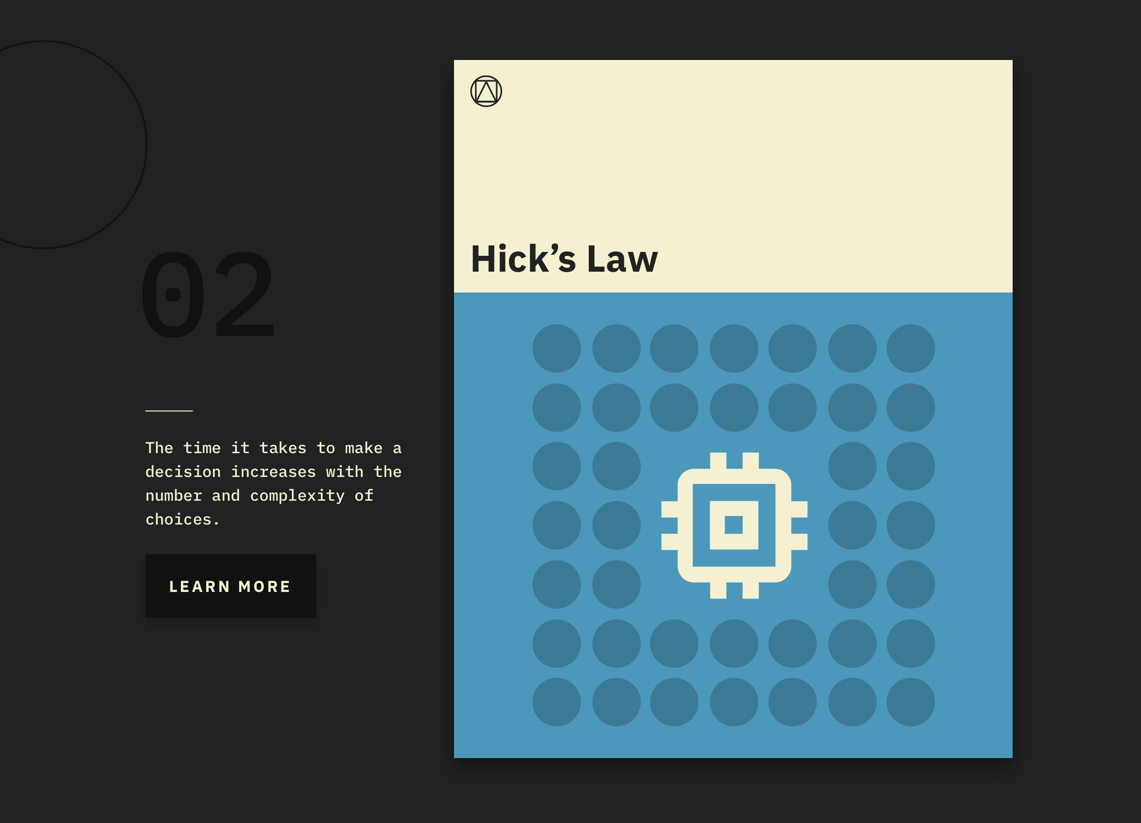
Good design tends to follow general principles that give designers overarching guidelines to work within. But for user experience and interface designers, there are also laws that govern the nitty-gritty. For instance, it’s helpful to know that the time it takes for a user to make a decision increases when there are more complex choices–known as Hick’s Law–or that because users spend most of their time on other websites, they want yours to work similarly to what they know–the premise of Jakob’s Law.

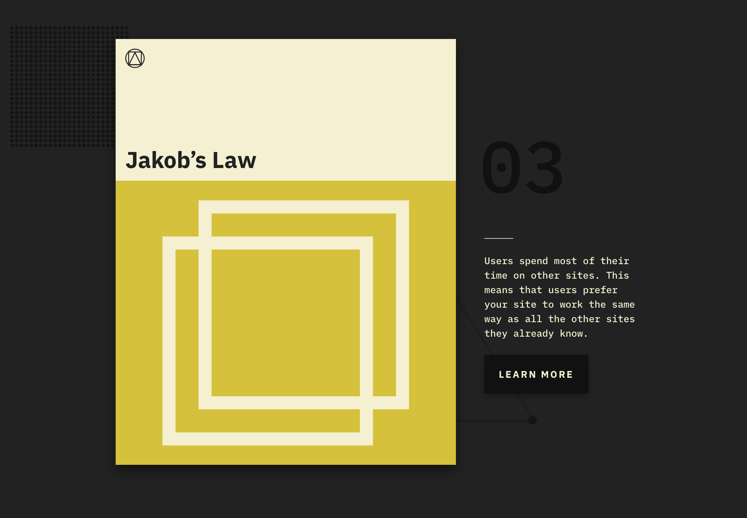
Jakob’s Law:
Users spend most of their time on other sites. This means that users prefer your site to work the same way as all the other sites they already know. [Image: Jon Yablonski]
A new site lays out 10 of these laws using simple language and graphic design to explain each one. Created by the front-end designer Jon Yablonski as a way of codifying the maxims he relies on his day-to-day work, Laws of UX draws on well-established ideas from psychology, as applied to UX design. Yablonski’s contribution is to collect several in one place and create visual representations for each.
“I decided to build the site as a resource for those who find themselves referencing the same information time and time again, or perhaps might be aware of some of these, but not all,” Yablonski tells Co.Design in an email. “I believe that these maxims and principles are invaluable for guiding design decisions.”
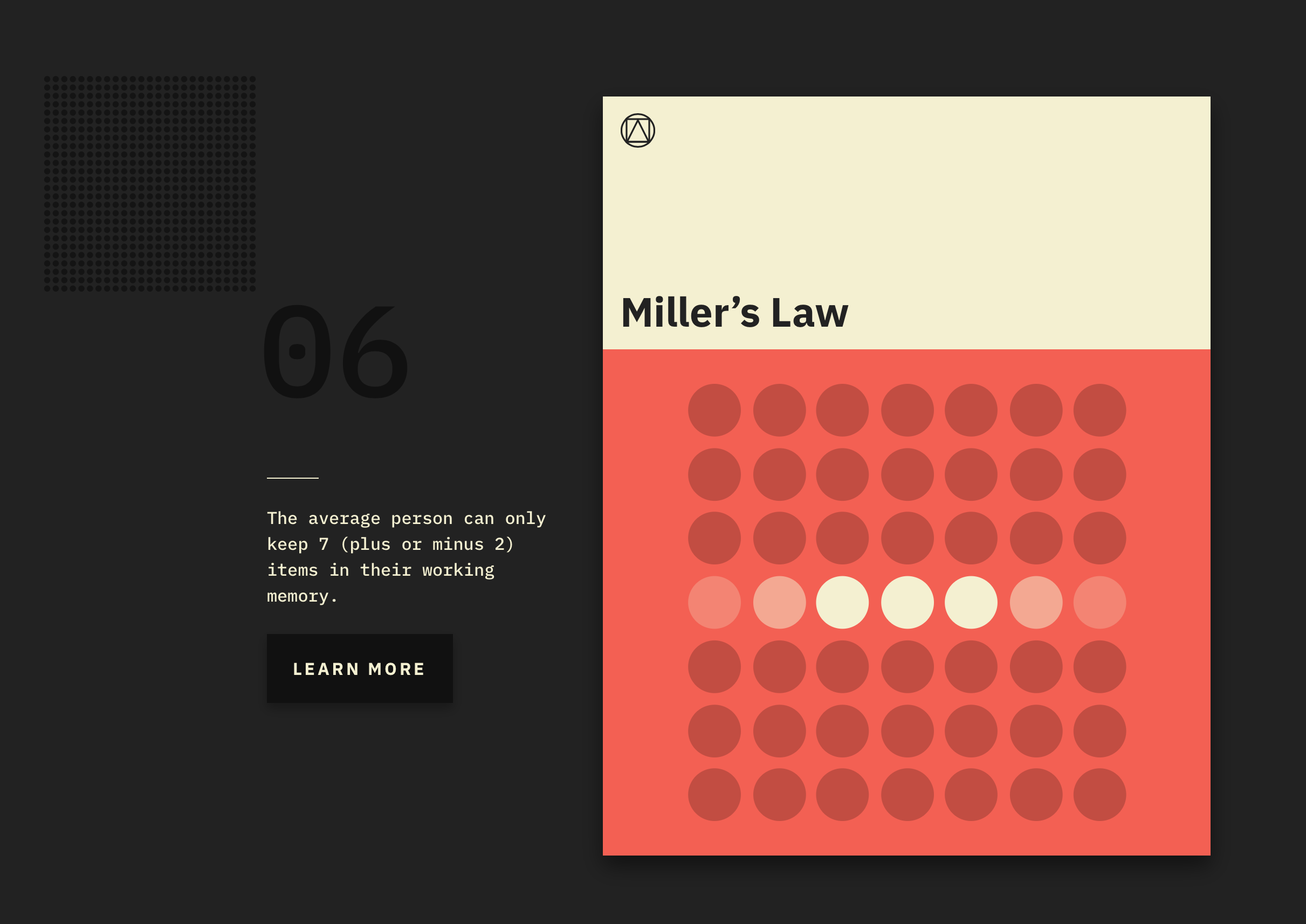
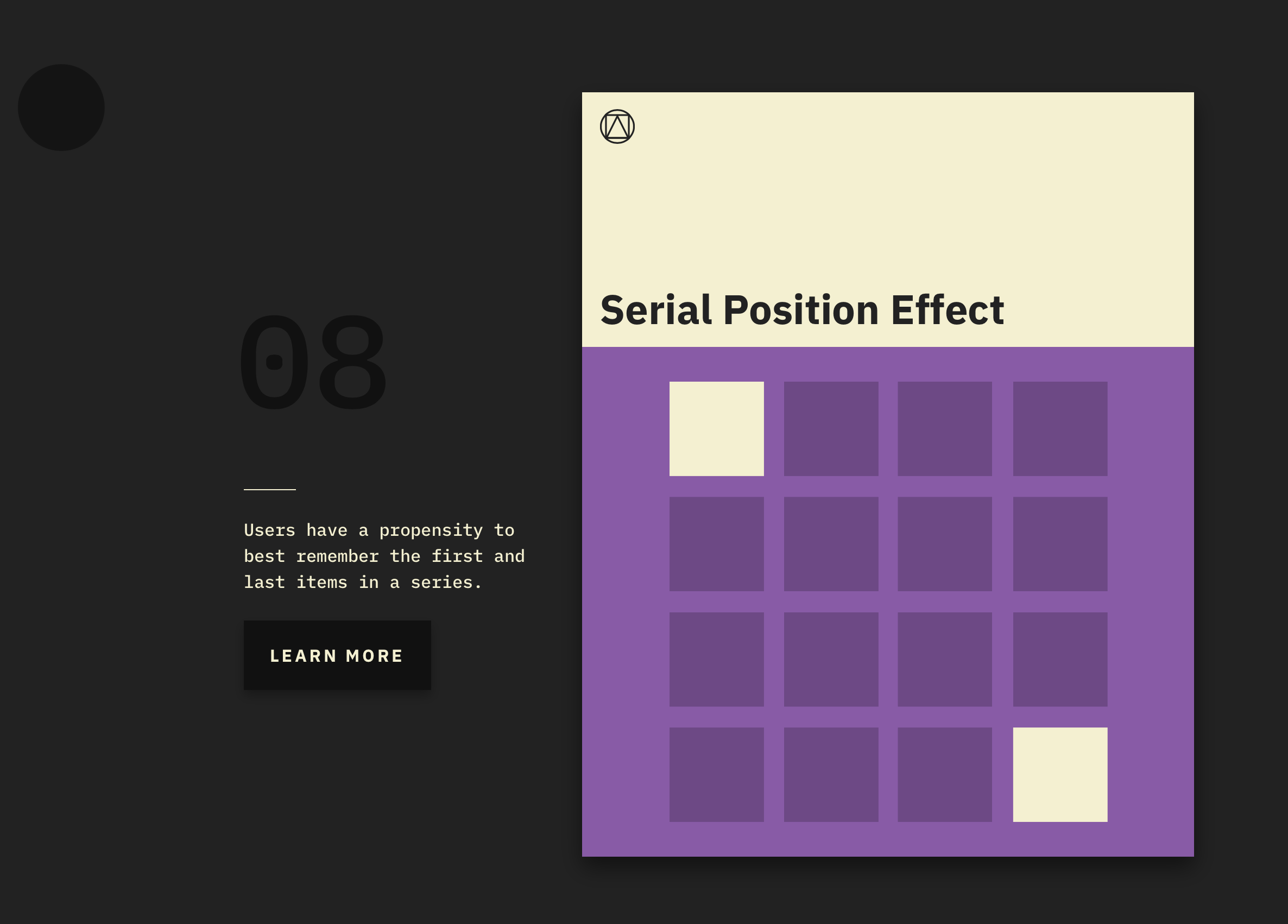
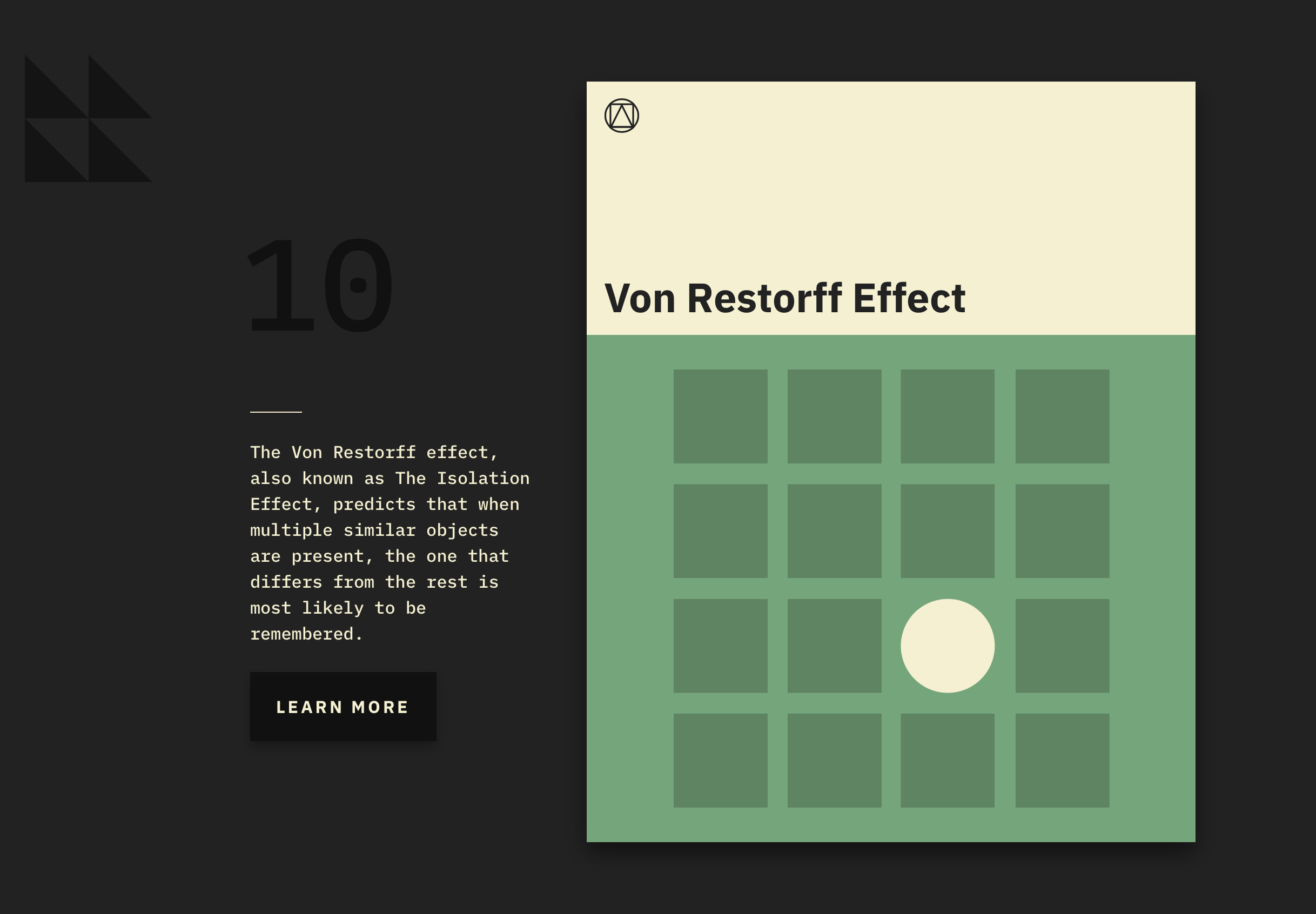
The Serial Position Effect–which posits that users tend to remember the first and last item in a series–comes straight from psychology, as does Miller’s Law, which theorizes that people can hold up to seven objects in their working memory. Their prevalence in UX points to the importance of psychology in design–to truly serve the user, you have to understand how they think and behave, both consciously and subconsciously.
![Serial Position Effect: Users have a propensity to best remember the first and last items in a series. [Image: Jon Yablonski]](https://images.squarespace-cdn.com/content/v1/546aeb13e4b06c7939161700/1516852370023-LSVZWEDUF7WMD2Q7OKJQ/i-1-10-laws-of-ux-illustrated.jpg.png)
Serial Position Effect: Users have a propensity to best remember the first and last items in a series. [Image: Jon Yablonski]
On the site, each law gets its own graphic representation inspired by classic Penguin book covers. “Instead of simply collecting these as a list, I really wanted to create visual representations of each in order to aid in memorization,” Yablonski says.
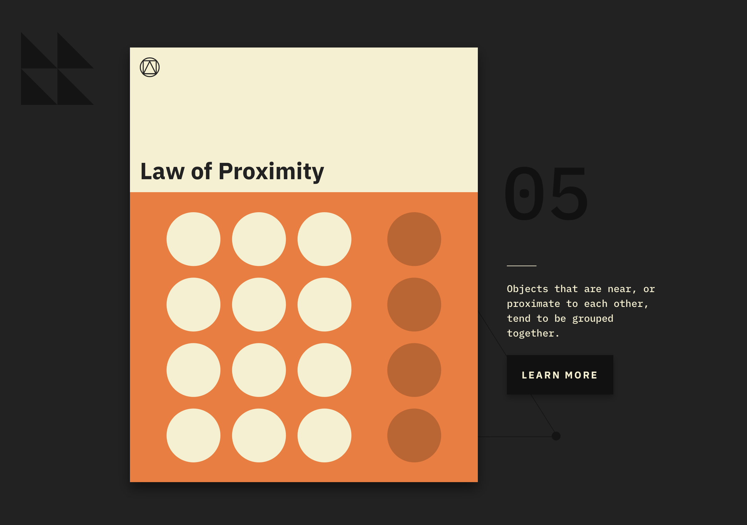
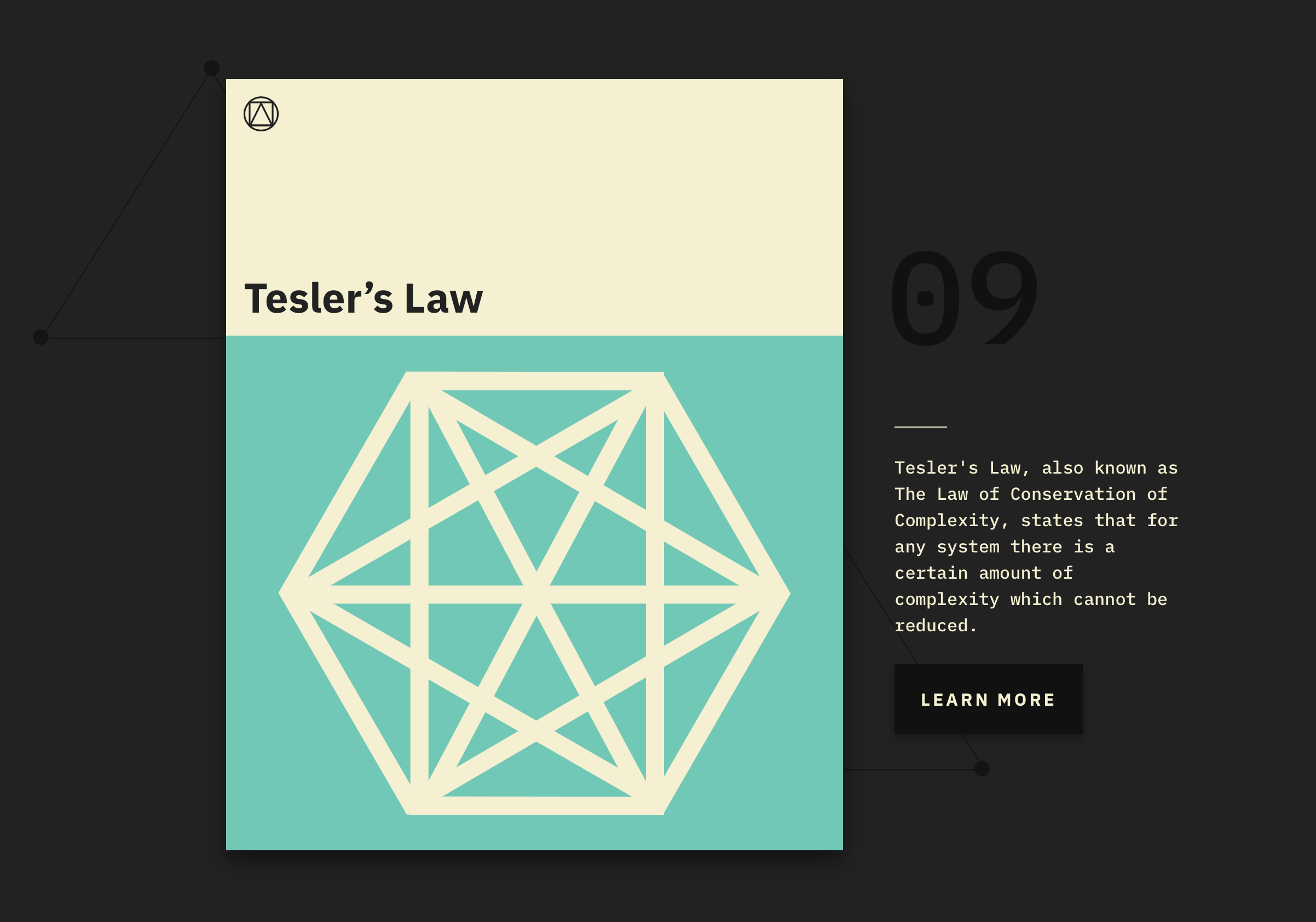
Tesler’s Law, for example, posits that any system has a certain amount of complexity that can’t be reduced further–and it’s represented by a hexagon drawn through with lines connecting each point. The law of proximity, which describes how objects that are close to each other tend to be grouped together, illustrates the idea quite literally. Clicking on any of the laws from Laws of UX’s home page takes you to a longer description each law’s history, along with Yablonski’s sources and a link to download his design for that law as a poster.
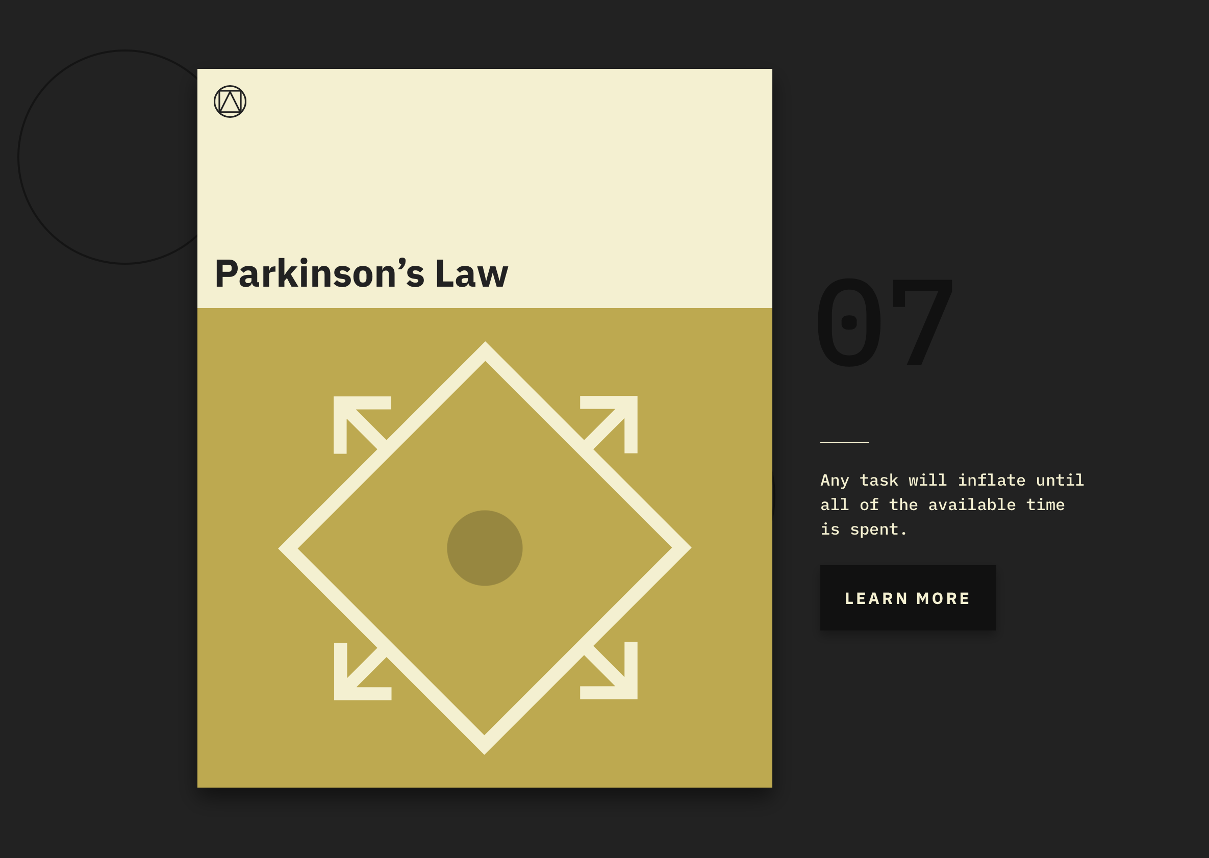
So far, the site has only 10 laws, but Yablonski plans to add more, including Murphy’s Law, Sturgeon’s Law, and Parkinson’s Law of Triviality. What laws do you design by?