
A new type of interface
One of the biggest challenges for our design team was to design the user interface of Spaces. Unlike with traditional web, desktop or mobile design where we can rely on existing UI elements and interaction patterns that people have learned over the years, most of those patterns have yet to be invented for VR.
An important goal of our interface design was to make sure the UI was here to serve the conversation, not get in its way. While we could have had interfaces that take full advantage of the space and isolate people while they focus on performing an action, we instead looked for interfaces and interactions that empower people to reach their goals while still being in the space with their friends and continuing their conversation. We wanted the UI to feel transient and useful, not interruptive.
To help people distinguish “real” objects and people from the user interface, we adopted early on a holographic visual language for our UI. This not only allowed us to visually separate interactive elements from the rest of the environment, it also allowed us to be more flexible with physics and temporality for our UIs, as people already have a preconception of holograms being lightweight and ephemeral.
Throughout our progress building Facebook Spaces, we came up with a few interfaces and interactions that are worth mentioning. Some of them didn’t turn out successful and had to be thrown away, while some worked out better. In the next few paragraphs, I’ll share some of the concepts we explored to solve some of our problems and the learnings we made.
Virtual Table
During our early days, we built prototypes in which people could freely roam around a space. We tried different solutions to the locomotionproblem and tried different types of space. We quickly realized one of the biggest problem with that approach: it was hard to actually have a conversation with someone. When able to freely move around, people tended to get lost and weren’t really interacting with each other.
In another experiment, we built a tool in which people could create music together. In its first iteration, people would be side by side, looking at a giant keyboard-style instrument. While really fun and playful, people were never really looking at each other and talking.
A quick observation of how we tend to operate in the real world when spending time with people having conversations pointed us at the essential element we were missing: a virtual table, to anchor the conversation and create a social construct.
At F8 2016, our first pass at a table was a rectangular tray people would stand around and on which they could pick up/drop objects. We also played with different sizes and configurations (square, rectangle, large, small, solid, transparent, etc). The solution that felt best for us was a circular holographic table that can sit 4 people comfortably.

Main Navigation
VR Watch
One of the first interfaces we worked on was our main navigation UI. Our first prototype was a virtual watch that would be attached to your virtual hand and contain the top level menus of our app. While very discoverable and cool, we learned how hard it was to aim at buttons attached to a moving hand. It was also quite tiring for the arm, as it required people to raise their elbow quite significantly to put make the interfaces readable and reachable. This indicated to us that the watch could be a great place to surface short-length temporal information with limited interaction (for example, notifications) but wouldn’t feel as good for complex interfaces like a main navigation system.

VR Tool-belt
Attached to your body, the tool-belt felt very personal. Appearing the moment you’d look down at it, it would allow you to make selections or grab objects with one hand, which felt pretty nice. But after a few days of using it, we realized how uncomfortable it was on the neck to repeatedly have to look down at the tool-belt. It was also challenging for people using the app seated who would keep hitting their legs when using it.

VR Buddy
The idea behind VR Buddy was to provide a single object you could move around and place wherever you wanted it in the space. Hitting that object would open a radial menu around it, giving you access to its submenus.
The benefits of this approach were multiple:
- You could manipulate the UI with one hand and it was anchored to the world, allowing you to be precise and take your time.
- You were also able to choose its position in space, allowing you to bring it with you when you were drawing on the side, etc.
- Moving it was quite fun and delightful, especially when the submenus were open as they were placed on a spring and were lagging behind the core in a fun and bouncy way.
But the drawbacks were also multiple:
- The radial menu approach meant having to wave your hand in the air multiple times to hit the different submenus and get to what you wanted. This created fatigue in your arm and was quite inefficient.
- Opening up a 2D interface meant either having you turn around to face it, or opening it in a weird position in which we couldn’t ensure your comfort.
- The fact that you could move it around also meant you could easily misplace it and have to look for it.
- It was hard to build a spatial model/muscle memory of how to use the UI as you were regularly changing its position and orientation.

VR Dock
With the learnings from those past explorations and a few others, we designed the first version of what we called the VR Dock: a 3-dimensional interface anchored to the table in front of you that lets you access your content easily and quickly without having to move around too much.
This solution had the same benefits as the tool-belt without the main inconvenient of forcing you to look down too much. The main concerns with this were scalability and the amount of space this was occupying on the table. The floating orbs were also getting in the way of you interacting with the objects on the table.

VR Plate
The idea with VR Plate was to incorporate an interactive surface on the table with an outer ring and an inner ring as a way to structure the information. The inner ring could also serve as a region for delivering 3-dimensional objects like a selected tool or media.
Similarly to the first VR Dock, the main drawback of this exploration was the amount of space used on the table, which we considered solving by adding a open/close button near the edge of the table. Another problem was to communicate the origin of any UI that would come out of a selection you’d make in that interface, which wasn’t easy with this concept.

VR Dock 2.0
The solution we shipped with was very much a marriage of the first Dock and the Plate: a 3-dimensional Dock with a 2D interface on it, that can project a UI or objects in front of you, and can be closed down into the table when you don’t need it.
This solution worked out for a few reasons:
- People seemed to immediately know how to interact with it. The resemblance with a tablet was a signal for people that they could touch it with their fingers to make a selection.
- The projector metaphor worked really well to communicate the origin of the UIs, how to turn them on/off or how to switch between them.
- The minimal amount of real estate occupied in front of you gave you a feeling of control and it didn’t feel in your way.

Display Center
Another problem that we had to figure out was how to allow people to show media content to the other people in the room. From our first prototypes, we knew that turning a selected media into a 3-dimensional object felt right. Holding a photo or a 360 orb in your hand feels real, and passing it to a friend feels natural and delightful.
But we also needed a way for people to display media big, where everyone in the room can comfortably see it. Our early interaction was to let you stick a 360 orb to your face to activate. While pretty delightful, it wasn’t very discoverable and we saw some people hitting their headset with their controller the first few times they’d try. We also felt the need to be able to display a 2D photo or video big where everyone can comfortably watch it.
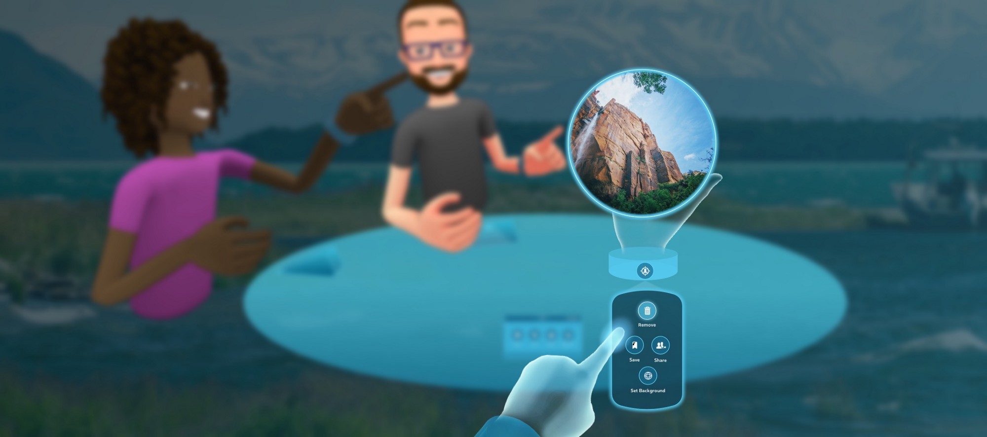
We called the solution we came up with the Display Center: a circular zone at the center of the table, which activates when you drop a piece of media inside of it and automatically starts displaying that media. A 360 photo or video suddenly becomes the environment, while a 2D media starts projecting on a large screen.
Once projecting, people can control their media from a distance using their dock. They can also end the projection, either from the dock or by taking the media out of the Display Center.

Wrist UI
Another challenge was to figure out a way to interact with a particular object in the space. After a few concepts, we created the Wrist UI, a contextual interface that appears on the inside of your wrist when holding an object and displays the action buttons you can use for that particular object. It’s the equivalent of a right-click on a desktop computer.
This interface worked out pretty well, as it was very discoverable and easy to understand and use. The biggest challenge with it was to make it feel visually okay to have a UI floating off your arm. The hologram metaphor turned out very useful in this case, as seeing a hologram projected on your forearm feels much better than a solid object attached to your invisible forearm.
VR Watch 2.0
With our first prototype of the VR Watch as a main navigation system, we learned that the concept of a virtual watch should probably be kept for fast, easy interactions, to prevent you from keeping your arm in mid-air for a long period of time. We also learned that flipping your wrist to access information felt fast and magical.
With those learnings in mind, we rethought our watch interface to serve as a notification center. When a friend sends the person a message on Messenger, tries to call them or sends them an invite to join their space, their controller vibrates and a sound comes out of their watch, catching their attention. By a flip of the wrist, the person can read the notification and take a quick action.

An evolving system
Together, those different interfaces allow people to find their friends, access their content and tools, display their media to the people in the space, and stay connected with the outside world. They’re just our first attempt at solving some of those problems and it’s likely that most, if not all of them will eventually be replaced by more robust solutions in the future.

The journey ahead
Building this first version of Facebook Spaces has been the most challenging, fun and rewarding time of my career. I’ve gotten a chance to tackle something both crazy ambitious and very fun with a team full of talented and passionate people. Designing for VR is both frightening and exciting, as you can’t rely on the skills you’ve been perfecting over the years and have to get out of your comfort zone to go acquire new ones. And designing social VR experiences turned out to be extra challenging, as the feeling of presence and immersion is very strong and the opportunities and challenges are numerous.
But as with everything, both for Facebook Spaces and for VR as a whole, this is just the first step of a long journey ahead and I’m grateful to be a part of it.
