Figuring out your content layout is a tricky task on a mobile device. Desktop devices give you all the screen space to work with. But on mobile, you have limited screen space. Users can only view a small amount of content at a time before they need to scroll to view more.
You end up wondering what the most efficient layout for viewing is. Should you use a list view or grid view? Your decision could affect how quick and easy it is for users to find what they’re looking for.
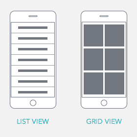
List vs. Grid View
List view displays your content in a single column list. It’s text heavy and there are no images. At most, you can display small icons or thumbnails next to the text. Users rely on reading the text to make their selection.
Grid view displays your content in two or more columns with images. The images dominate most of the space, and text is shortened to prevent too much textwrapping. Users rely on the images to make their selection.
List View Prevents Overscrolling
Many designers use grid view because its more appealing to the eye. But the problem is that grid view forces users to scroll more.
Grid view includes images which make the page much longer. It’ll take users many scrolls to view all the available options. This is too much scrolling for their fingers.
List view prevents overscrolling by making pages shorter. The exclusion of images allows you to fit more options per screen. It also allows you to use accordions to add layers of suboptions on the same screen. Users find what they’re looking for by scanning text labels.

List View Prevents Hasty Selections
Not only does grid view force users to scroll more, but it causes them to make hasty selections. Users get so stimulated by images that they’ll select the first option that appeals to them.
This can often lead them in a section that doesn’t have what they’re looking for. The user then has to go back and scroll further. With so many stimulating images, it’s easy for users to get distracted and misled.
List view prevents users from making hasty selections. The text provides precise enough information to help them find the content they want. They’re able to make the best selection after reading through all the options.

Grid View Works Best for Examining Specifics
Aside from aesthetic appeal, grid view also helps users when they’re examining specifics. For example, if a user is shopping for a shirt, they’ll have a specific type in mind. It’s only after the user has narrowed down the content to a category that grid view is most effective.
A grid view display of clothes will distract more than help because only a few of those images will be of shirts. The user has to scroll to filter out a lot of irrelevant images when scanning.
But once the user is in the category of shirts they want, the images will have more relevancy. The user can scan the shirts and spot certain details they’re looking for with ease.

Final Thoughts
Most users are on the go and don’t have a lot of time when they’re on a mobile site. They need to be able to find the content they want fast. The layout you choose is key in making this happen.
There’s more flexibility with layouts on desktop, but on mobile, your choice matters. The view that allows users to see more content while doing less work is the winner.