
Uber’s splash screen launch animation.
Bringing Apps to life through beautifully simple motion
Using animation allows App designers to entice users with a more engaging medium. The goal isn’t to entertain the user with over the top transitions, but rather to simplify the way the user interacts with the App by creating a visual approach to the interaction. Thanks partially to a rise in popularity of video games, today’s modern App’s take design cues from their animated menus. They no longer simply design static screens, Apps now design the entire flow of the users interactions with the software.
These animations can be used for a wide range of interaction patterns and in many different contexts to unite beauty and functionality within the App. They can be used to guide the users attention, explain functionality or features, influence behaviour, communicate a status change or help the users see immediate results to their actions.
Here are a few examples that illustrate where you can add beauty to you App to improve the user experience:
Onboard Users with Visually Engaging Content
Using animation to create visual stimulation by creating short stories for each of the features within your App, during the onboard process, gives users a clear understanding of what the App does. It also reduces the need for long explanations of these features making the onboard process visually appealing.

Konvene Tutorial by www.sfcd.com
Create Delight when Changing Between Different Views
Using simple animations to communicate the change between the different graph views when the user toggles between the ‘Line’ and ‘Column’ option creates a sense of immediacy from their action by bringing the result to life through movement.
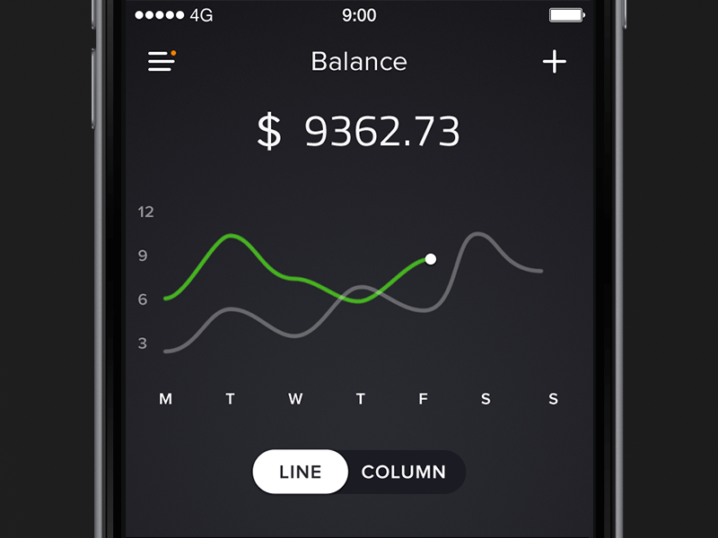
Balance Graph by www.ramotion.com
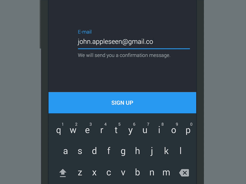
Make the Log in Experience Visually Enjoyable

Opening Screen for a Banking App by Jakub Reis
When Apps create visually stimulating opening animations it brings an level of excitement to the user, every time they open it. While these animations need to be fully functional above all else, we as human beings are not only rational, we’re emotional.
We’d like to believe we make decisions rationally or even logically, but in reality, we tend to make them emotionally first. Then we choose to defend those decisions with logic. By creating animations that are emotionally stimulating Apps will begin to create relationships with their users, as long as it also delivers to their needs users will be loyal.
Allow Changes to happen Fluidly without Hard Cuts

Cards Menu Concept by www.galshir.com
Using animation to make transitions obvious so it is clear what happened between where the user started and where they ended up. A beautifully fluid transition allows the user to clearly understand where their attention should be focused following their interaction. Take this card based menu concept for instance, the animation that occurs following the interaction clearly outlines the next option for the user.
Visual Feedback to Highlight User’s Accomplishments

Replace by Zee Young
Animation is also a fantastic way to help users visualise the result of their actions. By following the design pattern ‘show users, don’t tell them’, we can use animated feedback to highlight the accomplishment of the action.
In Zee’s example, when the user clicks the send icon, the little paper plan component gets shot across the skye to symbolise the message has been sent.
Highlighting the Visual Relationship Between Elements

Animation enhances the sense of direct manipulation. For example, like this example where transition to adding a new goal comes directly from the results of the goal itself, and back again. This effect both informs the user of the screens functionality while adding an element of wonder to the interaction. Transforming the display graph into the setting functionality also signifies the interconnected relationship between these two actions, and that one doesn’t exist while the other is present.
Immediate and Clear Feedback to Indicate the Error State
Action button by Google Material
Animation should also be used to reinforce the actions the user is performing. Like this example from Google Material, the error state is enhanced with the animated action button. If the correct information had been entered the sign in completion animation would played instead the user is presented with the error animation and message and is required to retry their entry. When the user notices animation that are clear like this they instantly understand the action.
In Summary
Animation can be quite powerful when used in the right context. To ensure this happens it’s important to make sure you consider when animation is and isn’t appropriate. As digital product designers it’s our job to deliver delightful experiences to the user, to do this we need to embrace motion from the very beginning as natural part of the design. Design has become more than just visual presentation, it’s now about creating an emotional connection.