As a web designer, you probably find yourself in one of two camps:
- You’re either loving it that cards are becoming more and more significant as a design style,
- or you’re totally hating it … feeling that being creative in this landscape is becoming more difficult by the hour.
So what’s the deal with cards in web design exactly? Are they the future? Do we have no other choice than to follow the trends and design our websites to be entirely card-based? Or maybe this isn’t bad at all, maybe every website starting to look quite similar isn’t a problem … maybe it’s a good thing? Let’s find out.
First of all, let’s face the reality. Cards are here. They are heavily in use all across the web, and there’s nothing you or me can do to stop them.
We don’t need to go far for examples. One of the most successful use of cards comes from Facebook. And it’s nothing new there either. Facebook has been using cards ever since I can remember. (Or course, not all Facebook is card-based, but there are visible cards used in the News Feed, for example.)
What about Pinterest? Cards from day one.
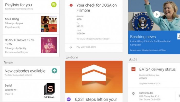
And have you seen Google Now? Same thing:
Twitter uses cards as well, to present individual tweets, especially if you want to embed them on another site. There’s a thin card border visible:
And let’s not forget thousands of portfolio websites, blogs, and other niche projects. Not to mention the Behance.net website itself:
All of this seems to add up to one thing … all modern websites – well, okay, most of them – do appear to look quite the same. They’re blocky, the branding isn’t as strong as it used to be a couple of years ago, and the focus is much more on the content rather than the individual graphical elements overall.
Who’s to blame?
It’s hard to pinpoint the exact place where card design has originated from, but we can all agree that what truly put it on the map was Pinterest going mainstream.
Ever since the design choices of Pinterest have been noticed by the community and recognized by the public, many templates, themes, and design frameworks followed suit, and have given us an easy way to build our own card-based websites.
After all, Pinterest was the hottest new thing, so everybody wanted to have a website just like it.
But flat design is to blame too.
When we look at the principles of flat design, they are very restrictive, and not allowing you to introduce much flare. Basically, even using slightly too-stylized borders does seem like pushing it.
In a landscape like that, separating the individual elements on the page has become a challenge. You could no longer use fancy shadows, 3D-like elements, and etc.
Enter cards … cards can still fit within the boundaries of flat design, yet allow us to visually separate the individual blocks of content on the page.
So, the main question is this: Can all those clever developers and designers be wrong? Is Pinterest wrong? Is Google Now wrong? Well, let’s look into the pros and cons of joining the card design bandwagon.
Cards work well for mobile design
One of the biggest challenges of mobile design is making sure that your creation looks great on any – and I do mean any – screen size and resolution.
Quite frankly, if you get this part right, your mobile design is successful.
That’s where cards come into the picture and make our job easier. By their nature, cards are basically tailor-made for mobile.
Cards are responsive by definition, so they will always fit the space given, no matter how small. And even when dealing with very wide desktop screens, you can still fit a couple of cards next to each other, so neither one looks too wide for viewing comfort.
Example from Trello (desktop vs. mobile):
Cards are great for cross-device user familiarity
Sorry, I just came up with the term “cross-device user familiarity,” but it is quite accurate.
What I mean is this:
Setting the technical mobile-friendly nature of card design aside, let’s look into a different issue – one that’s more general. Basically, being able to make your design render well on all devices is one thing, but making the experience consistent regardless of the device is something entirely else.
In other words, for good cross-device design, you need to make sure that once the user becomes familiar with the site, they can feel just as familiar with it on any device.
Here’s an example. This is a website that’s mobile-optimized from a technical point of view:
However, the problem is that even though everything looks okay on any device, the experience isn’t consistent, and the structure of the site won’t be familiar to someone used to just one version of the design (desktop or mobile).
Now a good example. Please look at the Trello screenshot from the previous section. No matter if you visit it via desktop or mobile, the experience is consistent. The things you’ve learnt about the design on desktop, you can apply to mobile. As a user, you’re familiar with it.
Cards indeed are one of the most flexible formats for creating consistent experiences for your users regardless of the device they’re on.
Cards are easy to make look right and optimize
Cards are simple, individual blocks of content. Each one usually serves a single purpose and doesn’t hold that much info. This self-containment makes them much easier to work with in comparison to grids or other styles of design.
It also makes it easier for you to optimize cards for achieving their specific goals. In the manner: one card = one goal.
Cards are good for organizing large amounts of content
When you look at Pinterest, there’s a lot going on. In fact, what you see is an endless stream of user posts, pictures, and interactions (comments, likes). But somehow all of this looks natural. It looks like it fits.
It’s hard to not give Pinterest’s card design some credit for the effect. Quite frankly, this design can handle any amount of content, provided that each individual piece of that content is self-contained within its individual card.
You can take advantage of similar principles when designing your next content-heavy project. Looking for a framework that can handle the volume? Card design it is.
Individual actions are clear with cards
When you have an interface that lets users take certain actions on individual pieces of content (or elements of an app) then it’s sometimes hard to distinguish between all those actions, and make it clear which action is assigned to which element.
Cards make this a lot easier. Simply, if you want to enable specific – sometimes different – actions for individual content elements then just place the buttons/links triggering them on the card itself. It sounds like a simple and obvious thing, and it is, but only for card design. Finding a good placement for action triggers on, say, a grid can be tougher.
For example, Twitter uses this principle for individual tweets. As I’m sure you know, there’s a load of actions that a user can take on a tweet that’s embedded on some site. Example:
Yet somehow all of those actions are clear and showcased well. There’s no confusion, and no user will ever click the wrong icon even if there are multiple tweets embedded next to each other.
Cards are perfect for dashboard interfaces
Dashboard interfaces have a tendency to be complicated. After all, they need to deliver a big number of options, customizations and adjustments for whatever they’re meant to help administer.
This makes them yet another place where card design can make things easier. There are two contributing factors here – we talked about them a couple of paragraphs above:
- Cards are great for organizing large amounts of content (or a large number of elements).
- Cards make individual actions easier to grasp.

For example, WebAppMeister.com does a great job using cards inside their dashboard-like website interface (GIF below). The site compares various e-commerce platforms, and there’s a set of sliders describing different parameters of each platform. Depending on how the user interacts with the sliders, a different platform pops up to the top of the list. All of this is contained within cards. So this quite complex under-the-hood functionality can be easier to grasp visually. Frankly, you don’t need much explanation before you can use the interface effectively.
Users are already familiar with the concept of cards
One of the common problems with innovative user interfaces is that the user might not be familiar with the concept of the interface itself.
For example, if someone has never used a computer before then it’s going to be much tougher to teach them to use Google Docs all of a sudden. However, someone familiar with MS Word will jump right into Google Docs with no trouble. Why? They’re familiar with the type of the interface itself.
And this is yet another advantage of using cards as the base of your interface. Cards are something that your visitors are already familiar with. They’ve learned to use them on Pinterest, on Facebook, and in many other places. This works in your favor regardless of the type of app or website that you’re building. It’s simply one less thing to worry about.
Cards are great for showcasing hierarchy
Need to make one block of content more visible than the others? Very simple with cards. Sometimes all you need is a different border, or background, or a badge. There are multiple possible way to do this, and each one equally good.
Also, due to the easy to manipulate nature of cards, you can move the important cards higher up the page/layout without having to re-think the under-the-hood structure.
How to build a quality card-based design
Okay, so we know what the pros of working with cards are, and when they might be a good idea, so now let’s go through the basic steps of crafting a quality card-based design.
1. Make each card stand apart
The first principle of good web design with cards is to make every individual card … well, individual. For instance, cards that are too close together, or without visible separation between them, won’t do you any good.
Remember, they are meant to stand on their own as self-contained elements. This will also make your job easier in terms of changing the scale for different devices, and making the whole interface responsive.
Here’s an example (Behance). Each card is easily distinguishable:
2. Make each card a self-contained box for its specific content
In general, if something can be associated with the specific type of content that you want to turn into a card, it should go on the card itself.
For instance, when dealing with user profile cards for a social network design, a good idea would be to include every “add to friends” button, every profile picture, every significant detail about the user on the card design itself.
That way, whatever is related to that specific user can be found on the card, so whoever’s looking at the card can be sure that every action possible is available right there.
(Don’t want to crowd your cards too much? Make some actions/buttons/icons visible on mouse hover.)
3. Don’t forget about card dynamics
In the real world, cards are quite interesting items. You can turn them over, you can fold them, you can expand them, you can put them on top of one another.
The more such dynamics you integrate in your design, the more familiar the design can feel to a first-time user.
However, don’t go overboard here. Don’t design things just for the sake of it. Whatever card dynamic you include, make sure that they enrich the interface and make achieving the main goals easier.
4. Be careful to keep things consistent
Here’s a problem you might stumble upon. If you’re working on a website design, and you’re using cards for the site’s listing, but each sub-page/article is a standard blog-like design, then the experience becomes inconsistent for the user.
At some point, your user will start wondering why do they have to constantly switch from cards to more traditional layouts every minute.
A good fix here is to always keep the cards visible to some extent in the peripheral parts of the design, even when the user is viewing an individual element.
The simplest example of this on the web – and one that you may have missed – comes from Google Images. Every image appears as a card, but when you click on it, the image expands, leaving the other images intact – still appearing as cards. (Try it out.)
5. Don’t turn it into a grid
In some ways, grids and cards can be similar. But there’s one significant difference. A grid is a set thing (if that makes sense). While cards are more fluid – each card is independent and can be stacked on top of another card freely.
Or, to say it another way, cards snap to each other, not to a grid.
Are cards here to stay?
Probably not.
But please bear with me. Here’s what I mean:
Like every structural trend in web design, cards are a response to our current take and impressions on what looks good and what is functional. They serve their purpose well, but like everything, sooner or later a solution will come that caters to our future needs even better.
If you want to spot this moment for yourself, a good idea would be to pay attention to what the big guys are doing. For example, the day Pinterest switches from cards to something new is the day we should evaluate our card-based web design projects as well.