
About a year ago, I took on the challenge of leading the effort to design a cohesive visual system for all of Facebook’s business products — the tools businesses use to connect to billions of people around the world.
While each of the tools performed their intended functions well, they weren’t delivering a satisfying overall experience or inspiring the confidence of the businesses who were entrusting their growth to us. Our UI patterns, use of color, and iconography all varied from product to product. The overall experience looked not only out of date but also out of touch with the Facebook that these professionals were using in their personal lives.
We wanted to craft a consistent, satisfying, human experience worthy of the value our business products can unlock for both companies and people. We also wanted to demonstrate our commitment to those businesses by improving the tools they count on.
One system, many experiences
I knew the project would be a team effort, but I was intimidated. Up to that point, I’d designed UI for The Sims and created an extensive style guide for SFMOMA, but those projects only had one audience and one product. Creating a coherent visual system that spanned multiple ad tools for different customer segments, including millions of small businesses, big brands, and agencies, as well as our marketing website, was an entirely different scale of challenge, and much more complicated than anything I’d ever done. Not only did every product have a different look and feel, but there were 150 designers across those products; the system would have to work for all of them.
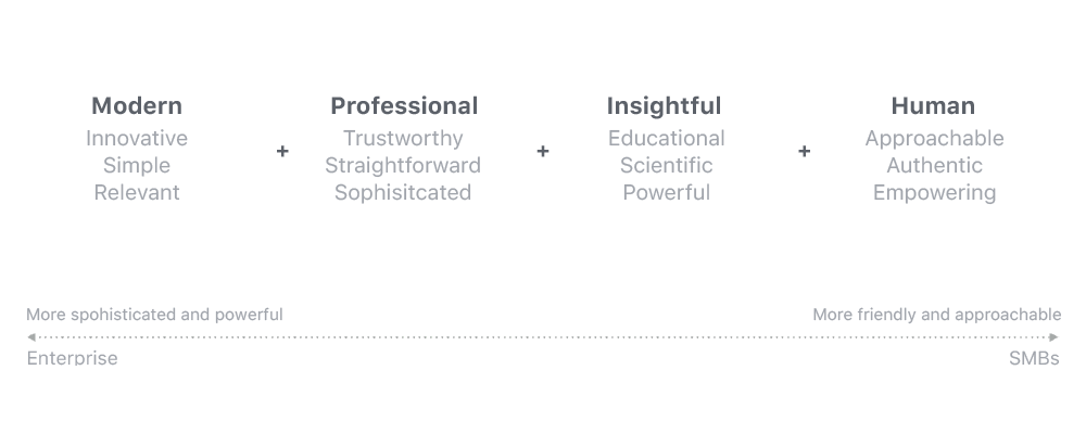
I didn’t know what the system would look like, but I knew it couldn’t be too prescriptive. It had to be extensible and flexible, with the ability to evolve as we grew. Before diving into visuals, I needed to understand how we wanted people to experience our products. I started working with our design leadership team to define our attributes. How did we want the experience to feel? We came up with a range of descriptions for different contexts, like human, professional, trustworthy, and friendly.
Aligning stakeholders
Next, I did an audit across all of Facebook’s business products, as well as our consumer illustrations and colors. I showed our different teams how disjointed the overall experience was. Then I facilitated workshops with the different teams, using dot voting and sticky-note writing to quickly identify designs we thought were successful.
Once we came to an agreement on a basic direction — one we called “abstract geometric style” — we went through many, many rounds of refinement. We had a clear direction now, but we still needed a shared way to understand how it could be applied to all the different products the system would reshape.

Tying it all together
I stepped way back to look at the system as a whole. When I revisited the exercise we’d done to define our brand attributes, I saw that they could apply across every one of the different experiences we were aiming to bring together. It was just a matter of adjusting the intensity of each attribute along a spectrum depending on the audience and the product.
For example, we wanted Power Editor, an advertising interface used primarily by professionals at ad agencies, to feel more sophisticated and advanced. On the other hand, people who use Pages are mostly small and medium-sized businesses, so the product should feel simpler and more approachable.
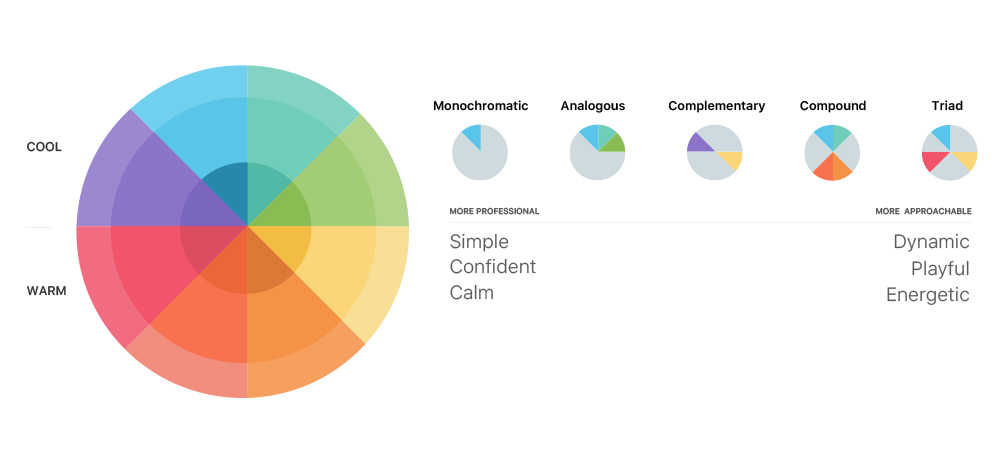
The same went for color. One audience might need it to be trustworthy and calm, while another needs it to feel friendly. I studied the color system and tried to map it to the dimensions that we developed for Facebook business. By applying dimensions like these across all the experiences the project would affect, I started to see how we could address all of our audiences in a coherent, systematic way.
That doesn’t mean it was easy. Developing a color palette that would work across all consumer and business products — holding them together without erasing meaningful differences — was one of our biggest challenges. Meeting it required a lot of collaboration between multiple teams.
We used tone-on-tone to reinforce the Facebook brand and creates more consistency across consumer and business illustrations. Within the overall scheme, we used different color schemes for different business products to create clear distinctions between the surfaces, helping people stay oriented.


Keeping it human
Color was just part of our effort to craft business tools that brought different experiences together while preserving appropriate distinctions. Facebook is all about connecting people, and if our business tools — even the most advanced ones — feel dehumanizing or detached, they won’t feel like part of Facebook.
We needed our new visual system to be simple and universal enough to connect emotionally with the breadth of people who use our tools around the world. I wrote guidelines for representing people within our visual system, including a lot of different skin tones and hairstyles to represent diversity.

The human figures also had to reflect a variety of workplaces (agency vs. restaurant, for example). Consumer figures should look like everyday people, never stiff or robotic. Across all products, people should be used to tell a story or convey a message — never randomly placed in a composition. Every illustration needed to clearly communicate how they related to our products.

Five things I learned
The farther away I get from the project’s beginning, the clearer its biggest lessons become. Some of them are specific to Facebook’s unique scale, but I hope others are useful to anyone building a visual system for a diverse range of experiences — or leading complex design projects in general. Here are the five biggest takeaways:
- Work with teams to define clear goals early on. This project had a lot of ambiguity and dependencies. During the research phase, we conducted intensive working sessions with all of our business design teams. The insights we gained helped us establish clear guiding principles.
- Take charge. Once those principles have been set, don’t overdo democracy. Prolonged, emotionally charged debates can lead to a design that mashes everyone’s ideas together and lacks a strong personality. When in doubt, refer back to the guiding principles.
- Stay in touch with moving targets. Many of our business products were being rebranded at the same time this work was in development. Communicating with the right stakeholders from these teams at the right times helped us influence their work. It also helped us better understand their design needs.
- Educate, educate, educate. A lot of my most important work focused on building a broader understanding of what the system was and why it mattered. We evangelized the system early and often, through a wide range of events and Q&As with different design teams.
- Stay involved. No matter how coherent and flexible your system is, trust that it will need ongoing active maintenance. To help keep all our moving parts on track, I’ve stayed involved, not just as a source of answers but also as a listener. Asking design teams about their challenges has enabled us to implement several improvements that have made it easier for designers to fit their work into the system.
Toward stronger connections
Not every experience across every Facebook business and consumer product strikes a perfect balance between distinctiveness and unity with the overall Facebook experience. But the visual system has helped us make a big leap toward that goal. Increasingly, our business tools don’t just work; they also feel good to use. They feel more like a part of Facebook, and more in tune with why people are using them in the first place — to make meaningful connections with other people and businesses.