
Since placeholders arrived on the scene, they have been rapidly adopted to provide hints and instructions to help users fill in forms. Whilst this sounds good, it is actually problematic due to the way the placeholder behaves — there is one ‘space’ containing two values: the hint and the value.
It pretty much comes down to the fact that the valuable information put in placeholders is not always available. And what is worse, is when they are used as a replacement for labels. Here’s why:
1. Disappearing placeholder text is easy to forget
Because the placeholder disappears as the user starts typing, the user can easily forget the requirements of the field. This is especially the case on more complex fields.
For a login form, you may be tempted to omit labels because you think the fields are obvious, but why even risk making it harder for people to use, in the name of minimalism? The aim is to make something as easy as possible.
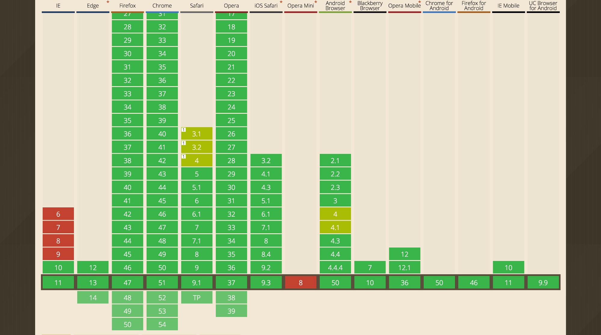
2. Not all browsers support placeholders
Whilst the majority of browsers support placeholders, some people use browsers that don’t, and remember the web is for everyone. People using a browser without placeholder support, will see a blank box — which if there are no labels, makes it impossible to fill out.
3. Pre-populated values are hard to understand
When a form is loaded with real values — as would be the case with an edit details form, for example — it’s very difficult to understand what the value means without a label. See the example below:
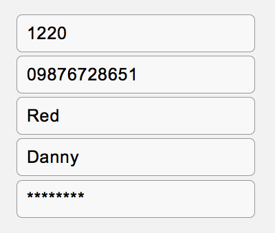
Pre-populated values without labels are hard to understand
4. Reviewing a long form is difficult
If someone has filled in a long form and wants to go back to review what they entered, the user will have to have remembered what each field wanted. Also, some browsers autocomplete entries incorrectly which can exacerbate the problem.
5. Erroneous fields are harder to fix
A form containing errors is now harder to fix, because the information lacks context without labels. For example, see the field below:

Error message lacks context when the label is missing.
The error message explains that a number is required, but not the type of number. In this case the error message needs to be unnecessarily verbose i.e. “Expiry date must use numbers only”.
However, a field with a label doesn’t suffer from such problems:

Error message with a label for context.
6. Some browsers will remove placeholder text on focus
When browsers first implemented placeholders, they would disappear as soon as the user focused. This meant that the user would have no time to read the instructions before typing, which resulted in users having to read ahead of the currently focused input.
Whilst most browsers only hide the placeholder when the user starts typing, some browsers still have this original behaviour.
7. Placeholder text may be mistaken for a value
People may scan empty fields in order to know what they have missed, but the difference in placeholder contrast is so subtle that it can make a field appear complete. This can result in a user skipping a required field, only to be shown an error later on, once the form is validated.

The difference between a placeholder and a value is subtle
8. They have insufficient contrast
Placeholder copy is afforded by being slightly greyed out which is problematic for two reasons. First, it’s hard to notice the difference in colour (as discussed above). Second, the colours are of insufficient contrast making it hard to read for people with vision impairments.
9. Screen readers may not announce them
Placeholders may not be read out by screen readers which is the visual equivalent of a meaningless blank box. Labels are always read out.
10. A missing label reduces the size of the hit area
This means that people with fine motor skill impairments will find it harder to apply focus to a field with their finger or mouse.

No label means a smaller hit area.
11. Placeholder text is limited to the size of the field
Placeholder text is cut off if it goes beyond the size of the field so you’re constrained as to what kind of hint or instruction to put there. Labels don’t suffer from this problem.
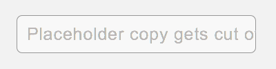
Placeholder copy gets cropped.
But it’s okay if they are used in addition to labels right?
Not particularly. Its certainly better but it’s still problematic.
If a piece of text adds value to a user experience — in this case by helping the user fill out a form , either by showing an additional hint, input format or example of what goes in the field — then it would be better if it didn’t suffer from all the problems discussed above.
On the other hand, if the placeholder is used in addition to a label, and doesn’t contain any vital information, then why have it in the first place as it’s seemingly not adding any value to the experience?
Summary
Each of the problems discussed above cause friction for people trying to fill in a form — the sort of friction that drains peoples energy — the sort of friction that a great user experience strives to eliminate.
If you’re trying to help the user, the best place to start is to always include a clear, always-visible label.
On occasion, a placeholder — in additional to label — might be helpful, but use them judiciously and if in doubt, test with different people, under different circumstances and different browsers.