
An example UI from one of our products using the Plasma design system
This case study aims to chronicle how we created a design system at WeWork. I’ll share insight into our process, product design, the tools we used to create and implement the system, and also how we document and share the system with our team.
Introduction
WeWork is a US based company that creates inspiring shared workspaces, with an emphasis on community. We design and build our own internal digital tools to meet our business needs, and to manage our global network of buildings and members. ‘Plasma’ is a design system created for these internal business tools.
Plasma as a concept was founded by one of our digital creative leads, Nick Stamas. Nick introduced our engineers to the concept of building a system in React JS and Sass, and has since lead the build of the system. I lead its design, creative direction and documentation. I also work with product designer Deena Edwards, who applies Plasma to our products.
Step 1: Design exploration
We started out experimenting with three different internal products that the system would be applied to — discovering, establishing and stress testing a style(s) and library of components and patterns. The direction, user interface (UI) and style changed over time, which I’ve attempted to capture below to show the progression and the range of products tested.

Sketch artboards showing initial explorations
Simple, clear and clean
Our internal tools are all data-heavy, web-based products. Simplicity, readability and load time are all paramount. We knew early on that we were striving for a clear and clean aesthetic.
Colour theory
The system is predominantly white, black and gray. It’s important the design doesn’t distract from the content, so subtlety is key. Brighter colours are used to convey meaning. Yellow is used for primary actions, since yellow is one of WeWork’s core brand colours. Blue is for navigational links. Red is for warnings and alerts. We also use purple as a tertiary colour, since it’s a legacy colour in our internal tools and we wanted to keep an air of familiarity in our products.
A typeface to match
Plasma uses exclusively Helvetica — a typeface known for its legibility. Most computers have Helvetica pre-installed, so no third party scripts are needed to load the font, meaning faster page load times.

Designing all states. A glimpse of our master Sketch file for the Plasma design system
Product design
I’m sure you’ve seen ‘UI kit—free to download!’ on Behance and Dribbble many times. Some of them look beautiful! But many of them are ultimately flawed unless they are designed with real products, content and data. Never fit the content to the design, the system must work with any content. Don’t just design for the best case scenario — account for all scenarios.
It is vital to create a design system using products it will be applied to, with real data and problems.
Our goal here is not to create the prettiest system, it’s to design a system that best meets our needs—business needs in Plasma’s case, but customer needs for some systems. We do of course set out to create delightful products, but only to enhance the user experience (UX).
Below is a little insight into the three products that shaped the system:
Product 1: CMS (aka ‘Maggie’)
Our CMS product allows our marketing and growth teams to add, edit and manage our buildings and markets on our core marketing website: wework.com. Before Plasma, our CMS was simply a series of HTML tables with basic CSS customisation. Plasma shaped this products’ UI and UX. Below are a small sample of UIs from this product. You can click the images to see each full size.
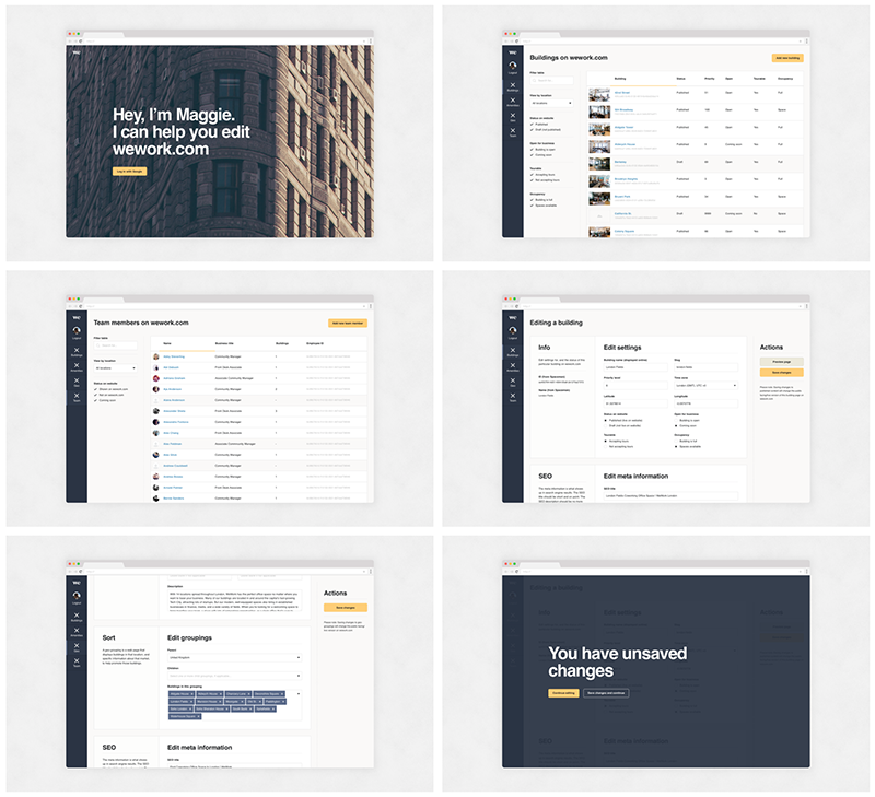
Samples from the CMS product with the Plasma design system applied to it
Product 2: Spacestation
Our Spacestation product is one of our most heavily used tools at WeWork Headquarters and in each of our buildings internationally. It’s a data-heavy product to manage a huge database of information and billing relating to our members and buildings. That’s a lot of tables, form inputs, filters and navigation — the perfect testbed for a product design system! I worked with Deena Edwards, the lead product designer on Spacestation, to concept, apply, stress test, and iterate on the system as it applied to this product.

Sample, concept UI from the Spacestation product with the Plasma design system applied to it
Product 3: Data Query
The nature of WeWork’s business means we have a lot of data! In Digital this means we have a wealth of data at our disposal that we can harness to build better products to meet our customers needs. The idea for this product came at a very opportune time — we had already begun concepting the Plasma design system and knew that this new product could both use the system, and push it further with the additional need for data viz. I worked with our Data engineering team to concept dashboards and data query tools. A few of those explorations are included below.

Design explorations for a data product, using the Plasma design system. All data shown is made up for public presentation!
Step 2: Patterns and components
After days of exploration, reviews and iterations, we arrived at a style we were happy with. The task now was to create an extensive suite of patterns and components, accounting for all states and scenarios — essentially creating a comprehensive UI kit for our team to use.
Our system is made up of foundational elements like defined text styles for headers and content, a colour palette, what we call patterns and components, and templates.
Consistent UI patterns and components make a huge difference in guiding a user through a product.
Patterns
Patterns refers to recurring or ever-present elements or practices throughout a product. Examples include navigation, cards, tables, empty or loading states, notifications, alerts and modals. Patterns are versatile, can contain components, and be paired together to make up a template.
Components
Components refers to distinctive UI elements that are used over and over throughout a product—normally actionable, sometimes to convey meaning. A few examples include buttons, inputs, selects, toggles, avatars and tooltips.

The design system (and assets for the documentation) in progress in Sketch
Follow this link for a quick tour of the master Sketch file (seen above) containing all the patterns and components for the design system.
Best tool for the job
Our tool of choice for UI design is Sketch. The features that make Sketch great for product design make it especially powerful for system design. When you’re creating hundreds of editable symbols and easily applicable text styles, Sketch’s simplicity becomes crucial.
On responsiveness
Plasma is designed to be responsive. While it’s simple to build responsive components, it’s not so simple to mockup responsively. Or so we thought. It’s important to design web UIs that work at different browser widths. Fortunately, Sketch provides the ability to set elements to respond in different ways as they grow or shrink in size. Using a combination of settings, groups and symbols, you can create a basic responsive UI in Sketch. While this won’t help you with breakpoints, it is powerful for quickly seeing how or if the design works at different browser sizes. Thus we created our library of patterns and components to be responsive.
Responsive design in Sketch
Read this article for an introduction to responsive design in Sketch.
Step 3: The power of a template
In the interest of consistency in our products, it’s important that we make it as simple as possible for our team to design with Plasma. Fortunately, Sketch’s editable symbols and text styles make it simple to distribute and maintain a design system.
It’s easy for a product’s design to go astray if our team can’t simply apply the system in their work.
We have a master (forever work-in-progress) Sketch file for all of Plasma. The last thing we want is people working from this master file, accidentally editing or deleting things! So we created a Sketch template for our team to use, hosted on Dropbox. The template has a wide array of editable symbols, all the text styles, brand colours, and a basic artboard ready to go — making it easy to quickly get set up and assemble a UI using Plasma.
Product design simply becomes a matter of combining our established patterns and components, much like lego bricks. This frees us to focus on user experience, problem solving, and building meaningful features and products.
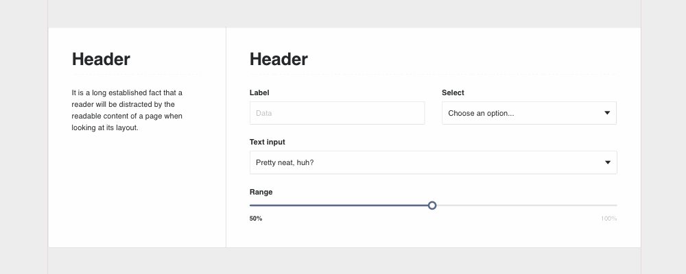
Covering all scenarios
We account for all ‘states’ in the system, and there are symbols for each of these states. For example, a form input has a placeholder, hover, focus, filled out, error and disabled state. In the example below for our multi-select component, to the right you’ll see the “multi-select / placeholder” symbol is selected. From there you can access a dropdown of all other symbols — and change the symbol to “multi-select / filled out” or “multi-select / error”. This is great for designing and mapping out product flows!

All states of form inputs, buttons etc. are accounted for in symbols (in Sketch)
Craft Library
A great tool we also use is the Craft Library plugin by InVision for Sketch. This allowed us to create a shared library of assets (hosted on Dropbox) that our team can use to drag and drop elements into their designs. If the library is updated, it auto-updates for all team members!
Having a preset library of buttons, inputs, styles, etc. reduces the risk of elements being repeatedly redesigned.

Craft Library at work in Sketch. This is a glimpse of our master Sketch file for Plasma.
Step 4: Documenting a design system
When creating a design system it’s important to be mindful that you won’t be the only designer (or developer) who works with it.
Literally documenting the design system was the biggest challenge for me on this project. Normally I create annotated specs — typically these are a series of .psd or .sketch files, to accompany the design(s). A good example of this approach can be seen in my case study for Adobe Portfolio. While specs can contain every detail imaginable, things can still be missed or misunderstood when a new or replacement designer steps into your shoes. We wanted to do better with Plasma!
How do you document a design system?
I started out reading and researching how other teams had done this. Fortunately the Internet is full of answers for this, and many companies have made their documentation public.
Here is a useful list of links to all the online design system documentation of note I found. I hope it helps :)
My initial goal, having seen so many stellar examples online, was to create a website to document the system, specs, showcase example uses, and specify guidelines for all patterns and components. It would act as a quick reference, or a bible to study in detail.
However, I didn’t want to be held back by the design, build and time constraints of creating a website for this. So to get started I simply created a new Google Document and started typing. As the document grew I realised it did exactly what we needed it to — the only reason to create a public, branded website for this would be as a ‘pride project’ for WeWork Digital, or as a resource if we open-source the system.
But for now, Google Docs proved to be the perfect medium! It’s easily accessible by all our team, plus they can comment inline, which is great for feedback. The ‘Document Outline’ feature of Google Docs, plus the ability to link/anchor to bookmarks and headings within the document, provided ample navigation. Jobs a good’un! …as we say in the North of England :)
Preview of our documentation
As the documentation is in a private Google Doc, I’ve captured some screengrabs below to give a good idea of how it was constructed, laid out, and what it contains. You can click the images to see each full size.

Plasma design system documentation in a Google Document
Step 5: Engineering a design system
As the documentation was taking shape, design needed a way of efficiently communicating and tracking the build and integration of the system to the developers. We chose (and recommend) to use GitHub for this. We created ‘issues’ for specific components — sharing previews of the design, specs and CSS/Sass to ease the development process. This way our engineers can tackle these bitesize chunks one-by-one as they’re ready, they’re held accountable, and nothing gets missed!

We use GitHub to communicate components to be built
Design and code
Our lead developer on Plasma is also a designer. Our lead designer (me) is also a developer. This is reflected in our process, and the quality of the system. Via our documentation we like to expose our designers to CSS/Sass, encouraging them to understand how things work. From a ‘learning to design with the system’ point-of-view, it helps to explicitly see and learn the values, spacing and naming conventions in the build. It also helps to bridge the gap between design and engineering.
Naming conventions
Last but not least: One of the goals of the design system is to get designers, developers and product managers all speaking the same language. We can help to achieve this with consistent, semantic naming conventions we’re all familiar with (in the design and code), be it Sass variables, font styles, colours, UI patterns and components, templates or page names.

It’s all taking shape nicely.
This is not the end
We have grand plans for Plasma. We are hard at work developing the system, and rolling it out into the Spacestation and CMS products you saw earlier. We are learning a lot in the process, and aim to gain valuable feedback from our global staff using our tools and iterate on the system. We have talked about open-sourcing Plasma, but we’re not there yet.
I hope you enjoyed this case study, an insight into our design process, the tools we use, and a preview of Plasma! :)