User interface design and web app design for smartwatches… that’s what this article is about. You might be wondering if we’re getting a little ahead of times?
Currently, smartwatches are only being used as Accelerometer, Heart Rate Sensors and GPS devices, so why do we need to talk UI design really?
Because their use as a smart internet device is rocketing up. It won’t be long before clients from all around the world start pouring in and wanting us to design apps for smartwatches.
So, we’ll design. We already know how to design. What’s the big deal? It is just a smart device like any other. What difference does it make if it’s on your wrist… it is just a mini smartphone, isn’t it? IT ABSOLUTELY IS NOT!
Smartwatch UI design is fundamentally different from any other kind of UI designing that we know of. How it is different and how can we create a stupendous user experience for smartwatches… that’s what this article is about.
Smartwatches are being met with lots of excitement in the consumer market. Business Insider anticipates a huge rise in the sales of smart wearable in the next few years.

Last year, over 4 million smartwatches were sold, but this figure is likely to spike up to around 200 million by 2020 worth almost $23 billion.
For this reason, both mobile OS giants Google and Apple have come up with design languages and guidelines for smartwatch designs.
Basics of Smartwatch UI Design
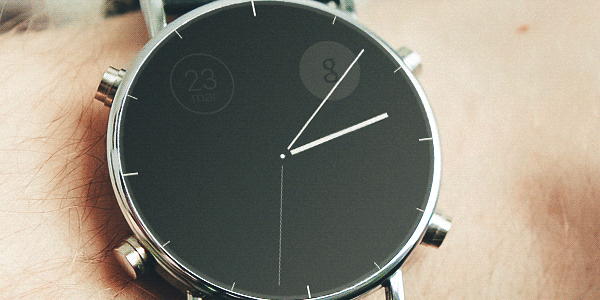
The first and most significant feature of smartwatches is the round screen.
Never before have we ever worked for round screens. All our designs were intended for cornered screens, whether we were designing for desktops, portable devices, mobiles or even TV… they were horizontals. Smartwatches are the first ever smart devices to come with round screens.
Then, of course, there is very limited space. Round screens and small screens… hmm.
If the screen sizes are small, then it means we’ll have to keep the design and the content at its absolute minimal, right? Yes, we will have to.
In the next two sections, I’ll try to figure out how to keep design and content at its very minimal. And, this is what smartwatch UI designing is all about. Presenting only the most important data and nothing else.
Minimalism: Because there is no other option
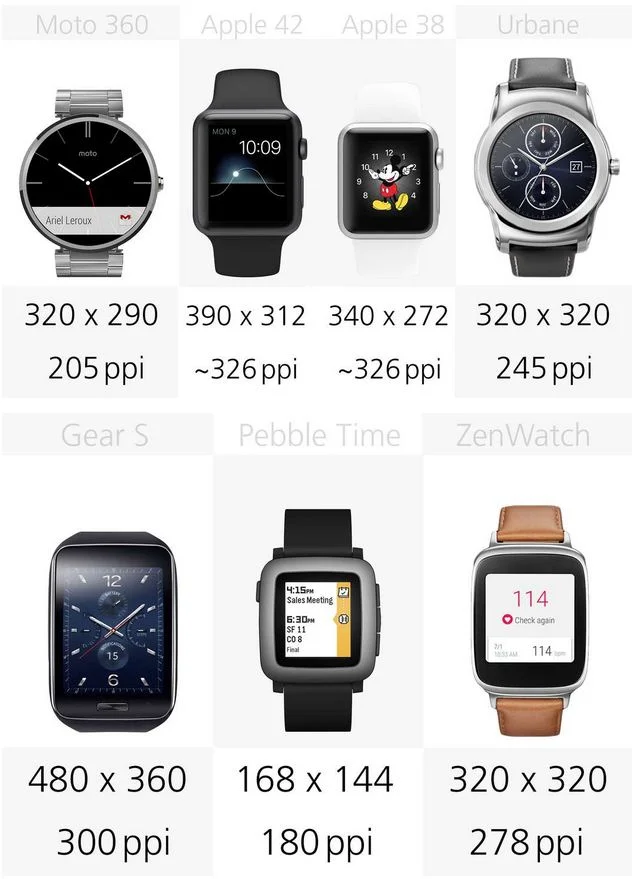
So, screen sizes are small. Let’s take a look at the resolutions of smartwatches currently in the market.
It is no secret that our attention span is decreasing rapidly. Maybe it has something to do with so many distractions we have these days, maybe it has something to do with the knowledge overflow, maybe we are just so into multi-tasking that we cannot give attention to one thing for a long period of time… perhaps all of these factors play a role, but our attention span is decreasing rapidly.
Low attention span and small screen size. What to do?
Another problem can also rise up. Keeping the wrist up for long may look stupid to the user (until people get used to it) and the arm can also start to hurt if kept up for longer than a few seconds.
Apple Glance has the answer. Glance is Apple Watch’s programming guide. It has a set of guidelines for programmers. Here’s a summary of those guidelines.
- Design for glances, not stares: you must not display large blocks of text or minimized graphics, convey only the most important information. You can make use of graphics, gestures and animations to convey this information.
- Don’t include interactive controls: any navigational buttons, switchers, sliders, and detailed menus must not be placed on the main screens.
- Don’t use any tables: this is not a hard and fast rule, but it is better to avoid them. This is because essentially, tables are made to incorporate lots of data and lots of data is exactly the thing that we need to avoid.
- Use system font for all of the text: this will help reduce load on the processor, which is significantly or lower speed than smartphones.

I should add one point of my own (that is not in the Apple Glance guidelines) which is that many people have fat-fingers. For them, we must make the graphics large enough so that easily tap-able. We must also give loads of padding to everything. This is another reason to keep the design at minimal.
Readability: because content is the king
Humans read at the speed at the speed of 4 words per second. If we want to convey our message, our information in less than a second, or in other words, in just one glance then it means we need less than 4 words here.
So, what are the basic copywriting tips for improving readability of the design? Here’s a brief rundown.
- Use fewer words: have you ever noticed that traffic signs (when they contain any word) consist of only single words. Never a sign said “don’t go ahead” but it always said “Stop.” Using fewer words amplifies the message. This is a tried and tested technique in copywriting.
- Use short words: it’s not just the word-count that you have to keep at minimal, character-count also needs to stay at minimal. For this purpose, use shorter words. For instance, “big” is better than “large” and “large” is better than “enormous.”
- Use common words: this is another major factor that greatly helps in readability. For instance, “huge” is more commonly known than “elephantine.” So go for more common words.
Now that we know how to improve readability, do tell me how this UI design of Instagram weighs on these parameters.

Understanding User’s Environment
A critical factor that we are likely to forget in smartwatch UI designing is that the fact that these devices are just entering the market and we do not have much case studies of how users will react to our apps.
Keeping users’ needs in mind is the basic feature of any design, but what are the needs of our users? Here’s a list of questions you should ask yourself while designing apps for smartwatches.
- Where will they be: in what kind of place will use your app? If yours is a fitness and exercise app, they are likely to be running or cycling at that moment? How can you increase the visibility for their situation.
- Will they be able to use it easily: if your app is about the weather, is it likely that they will be wearing gloves? If yes, should your app ever ask the user to tap?
- Vibrations: different parts of the body have different levels of sensitivity. A thing may not feel as much irritating in the palm of your hand regular vibrations of the back of the wrist can be seriously irritating. Make sure you don’t bombard your user with push notifications and announcements.
Since we don’t have any case studies, at the moment, one point becomes extremely important part of smartwatch UI designing.
Environmental Testing with Target Users.
Test your app with your target users, in the environment your app will run. This is very very very important. We cannot completely understand the user while sitting in our offices. We need testing, testing with real people in real environment.
More Concept UI Designs
Now let’s take a look at some of the concept UIs that designers have made. Please comment and tell me which designs did you like the best and which ones didn’t catch your attention, and why.