
Whether on an app screen, a web browser, or a wearable watch face, design is one of the most important drivers of consumer engagement. From flat design to Material design, I analysed what trends have evolved, and share a few of my insights with you — what are these trends? Why are they beneficial to the user? And how are they created?
Let’s look at how flat design and Material design came into play and evolved to the trends we see today.
Lighter Design

What
Instead of incorporating a wide array of gradients and shadows, shifting to a ‘flat design’ creates a lighter aesthetic in the app. This means using negative space — instead of gradients, shadows, etc. — can create a simpler interface, focusing only on having core information and removing design elements that are not productive and removing design elements that are not productive to the user flow.
Why
Lighter design removes distraction to help guide the user’s eye to meaningful content on the screen, enabling easier navigation while also providing a sleek, modern aesthetic to the brand itself.
One Typeface To Rule Them All

Shot by Brian Plemons
What
Reducing the number of fonts on a screen can reveal the power of typography. Instead of using different typeface and leveraging different characteristics — e.g. italics, bold, semi-bold — and different font sizes can better differentiate discrete areas of content.
Why
Embracing a singular typeface across an entire app drives consistency not only for branding, but also across channels — e.g. app, mobile site, website — thus optimising the mobile elements across the omnichannel experience. Also, users prefer the simplicity of having one typeface to scroll through in identifying relevant content.
Spaces & Blocks - No More Lines

Shot by Eric Atwell
What
While previously lines and dividers were used to clearly delineate specific sections or categories within a screen, adding these elements can result in dense, crowded interfaces. Straying away from lines, interfaces which leverage clustered blocks of content separated by spaces have the advantage of freeing up that space and establishing a clean look.
Why
The removal of explicit lines and dividers provides a modern look that focuses on functionality; for example, images and/or fonts can be bigger, providing visual clarity and improved ease of use. Leveraging space instead of drawing lines helps to define different sections in a non-obtrusive manner.
Spotlighted Data

Shot by Morgan Allan Knutson
What
As users’ preferences shift toward a simpler interface, usage of big fonts and striking colors get more common to make a certain data the center of focus. Highlighted data can vary according to target customers.
Why
Leveraging increased font size and/or a pop of color draws the users’ attention to a particular area of the screen — without an obtrusive, heavy-handed push or command to do so. As a result, users can access information more quickly, providing an easier navigation and information-gathering experience.
Micro-interaction

Shot by Kirill
What
Micro-interactions are small visual enhancements (for example — an animation, a sound etc.) that occur around a use case. These scenarios may include completing a transaction, favoriting an item, or prompting a pop-up message. These interactions are subtle, but they differentiate the product by pointing to the attention the right element.
Why
These micro-interactions can be leveraged as a signal to prompt the user while accomplishing a task — e.g. adjusting a setting — creating a small piece of content like a pop-up message. Apps which have well-done micro-interactions considered easier, more fun, and more engaging by their users.
Smaller Color Palette

Shot by Ari
What
The usage of simpler color schemes became a trend after the introduction of flat design in 2013, which embraces clarity and simplicity. As a result, designers and users alike prefer the usage of smaller number of colors, aiming for a clean look.
Why
Usage of color is essential in creating a certain mood, guiding the user’s area of focus, and communicating a brand. By using fewer colors, the brand identity can be reflected more clearly. In addition, users may prefer this aesthetic as it removes the distraction that too many colors can cause, and it better highlights key features, improving navigation through the app’s flow.
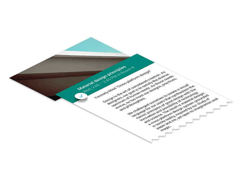
Layered Interface
Shot by Roman Nurik
What
Previously, interfaces were centered around the principle of skeumorphism, a design principle that takes cues from original structures or objects (for example, digital calendar resembling a paper desk calendar, 3D ‘depth’ on app icons, the shutter click sound of a mobile phone). Now that flat design has shifted away from this principle, it opens up the opportunity to create depth in new ways. Primarily, using layers helps create this feeling of depth and dimension, creating a more ‘tangible’ experience.
Why
An implication of flat design was the risk of being ‘too flat’ — with so much subtlety, how can the user navigate and engage, given their conditioning to a 3D physical (and previously digital) world? Layers provide the ability to show one item is on top of another by taking full advantage of the z-axis. Layering and increasing depth helps identify the relationship between different items, and draws attention to certain items.
Ghost Buttons

Shot by Gleb Kuznetsov
What
Ghost buttons are transparent buttons, having no color fill. Their borders are very thin-lined, and the shape itself is basic — such as a rectangular or squared, with right angle or softened edges. Text in these buttons are simple and minimal.
Why
These subtle buttons can grab the user’s attention while still seeming clean, trendy, and unobtrusive. It also allows for there to be a hierarchy of buttons on the screen — if there are different buttons on the screen — if there are different buttons in the same page, they may be designed and placed with prioritisation (e.g. ghost buttons for optional or intermediate steps). In some cases for material design, subtle shadows are used to help users perceive that hierarchy.
Gestures

Shot bu Javi Pérez
What
With integration of gyroscopes and motion sensors, consumer devices are able to detect movement. With this, interaction between user and the device moves beyond the click and extends real life gestures to the screen.
Why
Users are intuitive about gestures. When asked how to delete an item, users tried to move the item out of the screen regardless of age, sex and gender. Enhances user experience with less taps and more scrolling, applications become more interactive by positioning the screen more than just a touch target.
Motion

Shot by Eddie Lobanovskiy
What
Through software innovation, designers now have the ability to take advantage of controlling movement with their style sheets. Motion-based design elements can be seen in a variety of forms, including transitions, animations and even on texture to mimic 3D depth. The use of motions within the design helps users to engage with and internalise content, differentiating that element or data/object from others to highlight its importance.
Why
Motions can draw user’s attention to a specific area — or help to distract from it. By showing a visual response, it can increase engagement, delighting the user with a ‘wow’ factor.
Shorter User Flows

Shot by Jan Losert
What
Instead of navigating through multiple pages to complete a single transaction, a single screen can include those intermediate steps and reduce the time and effort spent in app. For example, a form can automatically open or highlight the subsequent input area when the user completes the previous field.
Why
Mobile users prefer to complete their transactions in an app easily and quickly while they are on-the-go. Designing the experience of the applications according to this insight minimizes the effort for the user and can increase the rate of conversion and/or frequency of app opens.
Design Standards — as Best Practice

Shot by Bill S Kenney
What
Design standards is the process of setting the visual language at the beginning of the project by determining standards such as colors, icons and global padding.
Why
Setting the standards of the design helps to create consistency within the application and between different platforms. It minimizes possible errors while bringing the project into life and makes it easier to make modifications in the future.
Prototyping — as Best Practice

Shot by Ramil Derogongu
What
A prototype is a preliminary or early working version of a product. The usage of prototypes can provide valuable insights into the functionality of design, highlighting potential changes needed in order to enhance the user experience without costing a major loss in designer time and effort.
Why
By creating these low-cost ‘experiments’, prototyping can clarify the key components of the project, including the feature scope and requirements. It leaves essential time and resources to learn from the experiment and iterate on the product in an insight-driven process.