
When Material Design was announced, I was impressed with Google’s efforts to raise their game in the design field. It’s something that Apple had always been ahead. Not anymore. I remember complaining a lot about Android design’s inconsistencies, lack of documentations, unattractive dark theme and overuse of the ambiguous Hamburger menu. Material Design solved a lot of that. It now offers a consistent design language that is lighter, more colorful, backed by solid guidelines that are well-considered.
But while the colors are pretty and the use of cards give a great sense of depth and tactility, I often asked myself, is this really better than Apple’s iOS Design as a lot of designers say it is? I’d like to give some of my thoughts on why I think it’s different, not necessarily better.
Similarities to iOS
Let’s start with the 3 core principles in iOS: Clarity, Deference and Depth.
Clarity is about text legibility, obvious icons and good contrast. Clarity can also be platform-specific. What’s clear to iOS or Android users highly depend on what they’re familiar with. An icon may be instantly recognizable to iOS users but not to Android users, and vice versa.

Depth is another principle that both platforms share. But they approach the concept differently. iOS promotes blur and gradients while Android gives priority to drop shadows and the concept of paper.
Skeuomorphism 2.0
Despite what most say, both platforms replicate real life in major ways. They’re skeuomorphic using blur, drop shadows and animations that use physics and realism of space. Skeuomorphic design was helpful to introduce new concepts using familiar metaphors, but the overly detailed textures and 3D effects definitely ran its course. As users, we outgrew it because technology is no longer so foreign to us. We’re at a phase where a leathered calendar or vinyl disc make less sense than a digital concept.
The digitalization of design makes old concepts obsolete and downright confusing.

Nobody uses these calendars anymore.
In both of these design languages, there are weaknesses.


or example, it looks off to have multiple layers of blur on top of each other. Also, the vibrancy added can be too much.
The card concept looks completely different on a circular screen. The card takes the full width. The alignment of the text feels off because there is a lot of unnecessary negative spacing. Lists are also hard to use on a circular screen since the corners hide a major part of the content.

These Android Wear faces look awesome though. This truly feels like the UI was made for a circular screen.
Content Isn’t King in Material Design
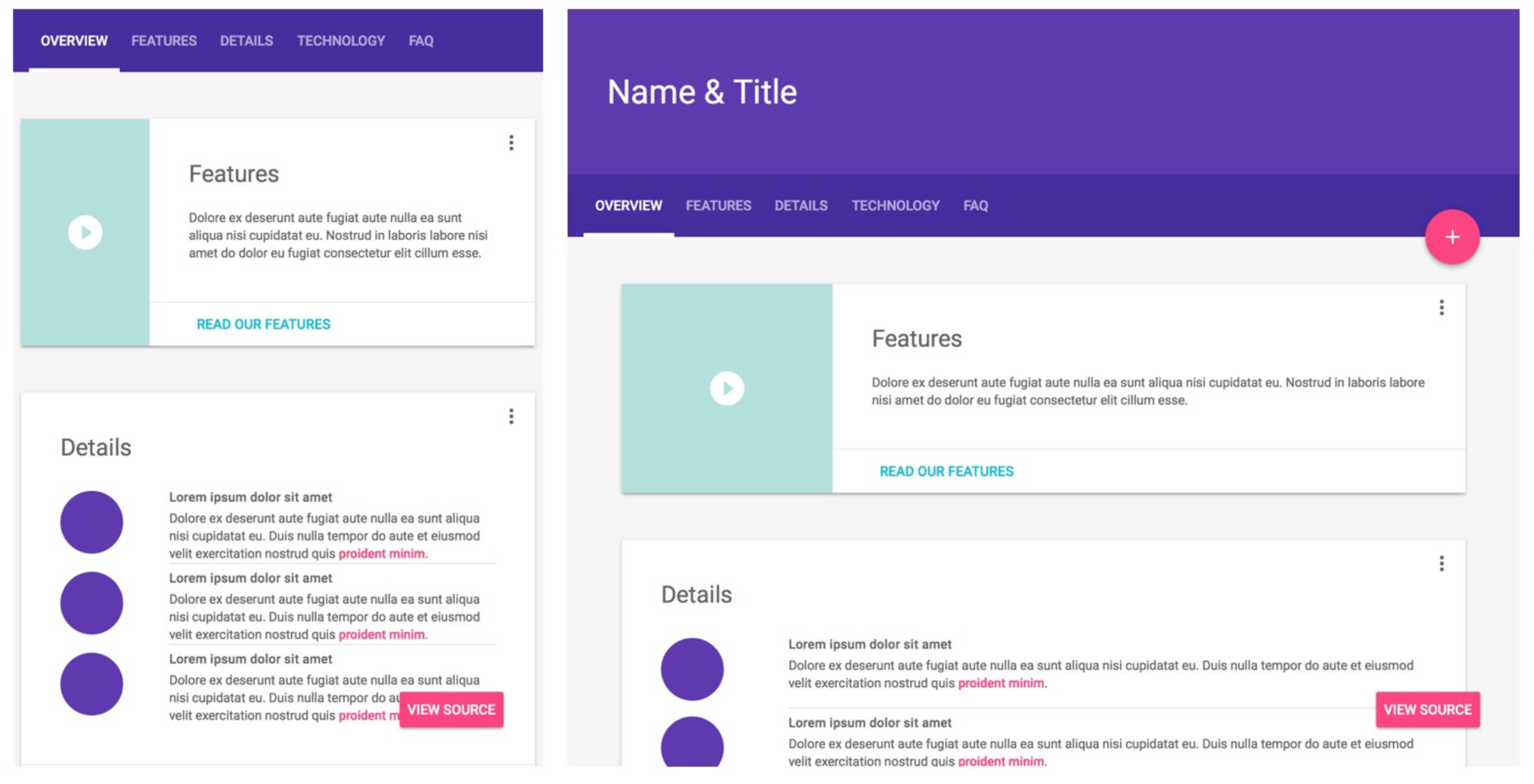
Deference is where it differs a lot. iOS gives total priority to the content while Android uses the concept of cards to make the content seem more tactile, thus loosing important real estates in the left and right portions of the screen. The overwhelming colors also take priority over the content.
The FAB hides the content and gets in the way of the interactions.

There is a strong focus on colors, navigation and call to actions.

Inversely in iOS, the focus is more on the content. The color of the UI is more neutral and contextual (they change based on the content). Vibrant colors are used minimally, mostly for actionable items.
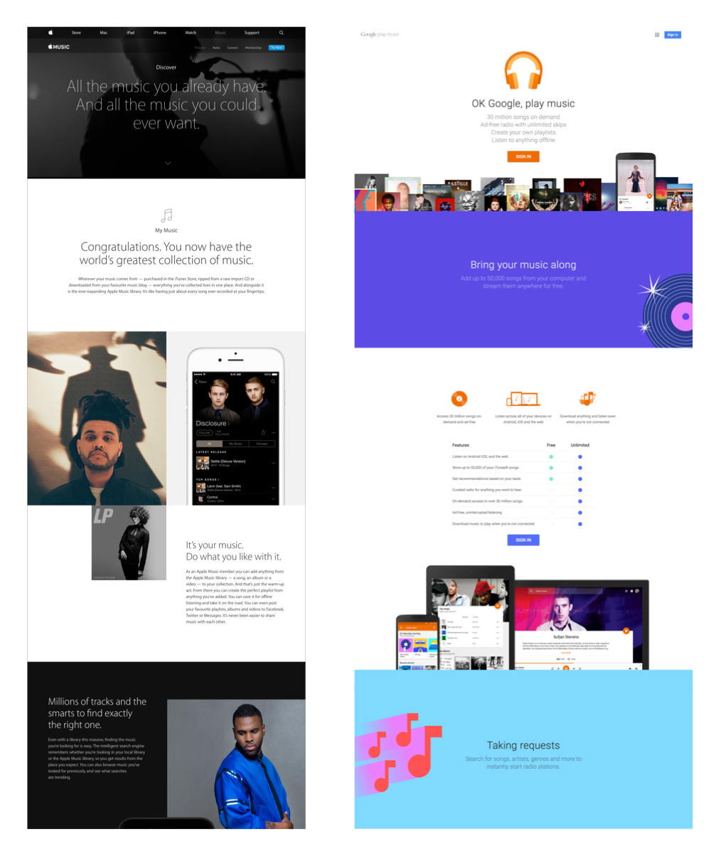
A quick comparison between Apple Music and Google Music shows that Material Design uses bright colors and illustrations a lot more. For Apple Music, the only place a bright color is used is for the “Try Now” button.
Tab bar VS Hamburger menu

There has been a long debate on whether we should use the Hamburger menu. That debate is far from over. Even Apple sparsely use it in their designs.
But it’s safe to say that we generally see them more in Android since Material Design encourages them.
iOS favors the Tab bar for navigation. Interestingly, LukeW pointed out that obvious always win. Facebook switched to the Tab bar for iOS and they saw an important increase in user engagement.

Google Inbox uses the Hamburger menu.
But there are situations where the Hamburger menu can be a good idea, like when your most important content is your front page. Options inside it need to be secondary, like settings and logout.
The Use of Colors
Material Design uses colors prominently. Yes, they’re pretty. So was the Flat UI color palette. We can all agree that pastel colors look very nice in most situations, unlike the flashy ones that come by default in CSS or Xcode.

iOS Colors (left), Flat UI(middle), Material Design Palette (right)
But Material Design uses those colors in their header, sometimes even to replace content. When you have a lot of competing colors, it de-prioritize other elements.

Is the header actionable since it’s colored? Should I be using an image instead to express what my product is about? Why is the “Goals” title the same color as the links?
Colors do have meanings, but those meanings can be quite limited (E.G. red means alert, yellow means warning, etc). Colors do express a brand, but branding shouldn’t be front and center in the UI of your app. In fact, the App Icon is the place where branding is most appropriate. So before you absolutely want to use a color alone in your header, you might want to consider something more expressive. Something that explains exactly what your app is about.
Again, that may make sense in Android, but not in iOS.
If an image is worth a thousand words, then a color is worth ten.
Platform-Specific VS All Platforms The Same
I have to admit that I used to think that having one design language that is consistent across all platforms is the best way to go. But unfortunately that lead to designing an Android app using the iOS design language. It made sense from my point of view, but ultimately it was bad for the users. Android users are simply not familiar with iOS.
Material Design’s goal to unify all platforms is a valiant effort, better than anything I’ve seen in this respect. But is it really the best way to go?
Is the FAB really appropriate for the Web? Are the cards appropriate for smaller screens?
Is the Card concept really working on Android wear, which sometimes has a circular screen? It doesn’t seem like the language considered the devices first. Instead, it feels like an afterthought.
If you look at the Apple Watch, the design was completely rethought for the Watch. This means that there are new UI paradigms that had to be considered specifically for the Force Touch, the Digital Crown, wrist detection and the black bezel.

Material Design is More Defined
Everything from how the Material should be manipulated and elevated to how the colors should be combined is explained in their guide.

How each design element should be elevated to create a consistent structure and drop shadows.

There’s a specific color palette and a way to combine those colors.

Material Design even provides an entire set of system icons.
The good side of having strict style guides is that it’s hard to go wrong. It’s like Bootstrap. It provides a consistent and convenient system. The bad side is that it limits creativity and will make most apps homogeneous.
Where Material Design Shines
Don’t get me wrong, there are a lot of things that Material Design does right. It just seems like every designer sings praises without truly considering the weaknesses.
Design is an ever-changing spec that puts people’s lives at the forefront. For as long as our lives change, design will too.
For one, their new Design spec is world-class, giving guidance on a variety of design topics that will benefit you beyond the scope of Material Design.

The concept of cards is one that generally works well across the board. It’s flexible and modular. It can definitely work with Web — designers have been using them way before Mobile came along. But I believe that the smaller the screen is, the less it makes sense.
As I mentioned before, pastel colors were hardly a new thing. But the Flat UI trend and Material Design really popularized it. We’re going back to the basics in order to achieve harmonious colors and beautiful typography. That’s a great thing. The more we know about the foundation of design, the better we can shape the pillars that come on top of it.
The animations in Material Design are elegant and delightful, albeit not as innovative as people make them out to be. Before iOS 7 came, transitional interfaces were still a fairly new concept. I’m glad that both guides are promoting smoother, more progressive animations to guide our users rather than scream at them for attention.

Meaningful animations in Material Design.
No Perfect Design Language
There will never be a perfect design language or template. The purpose of this piece is not to discourage one or the other, but to offer perspective their strenghts and weaknesses. Design is about picking the best for the intent. So go ahead, experiment and see what works for your product. Just don’t forget to consider the people and devices that you’re designing for.